Developing a recognizable editorial visual language
From the editorial job to final delivery: a practical system for independent images with a shared point of view.
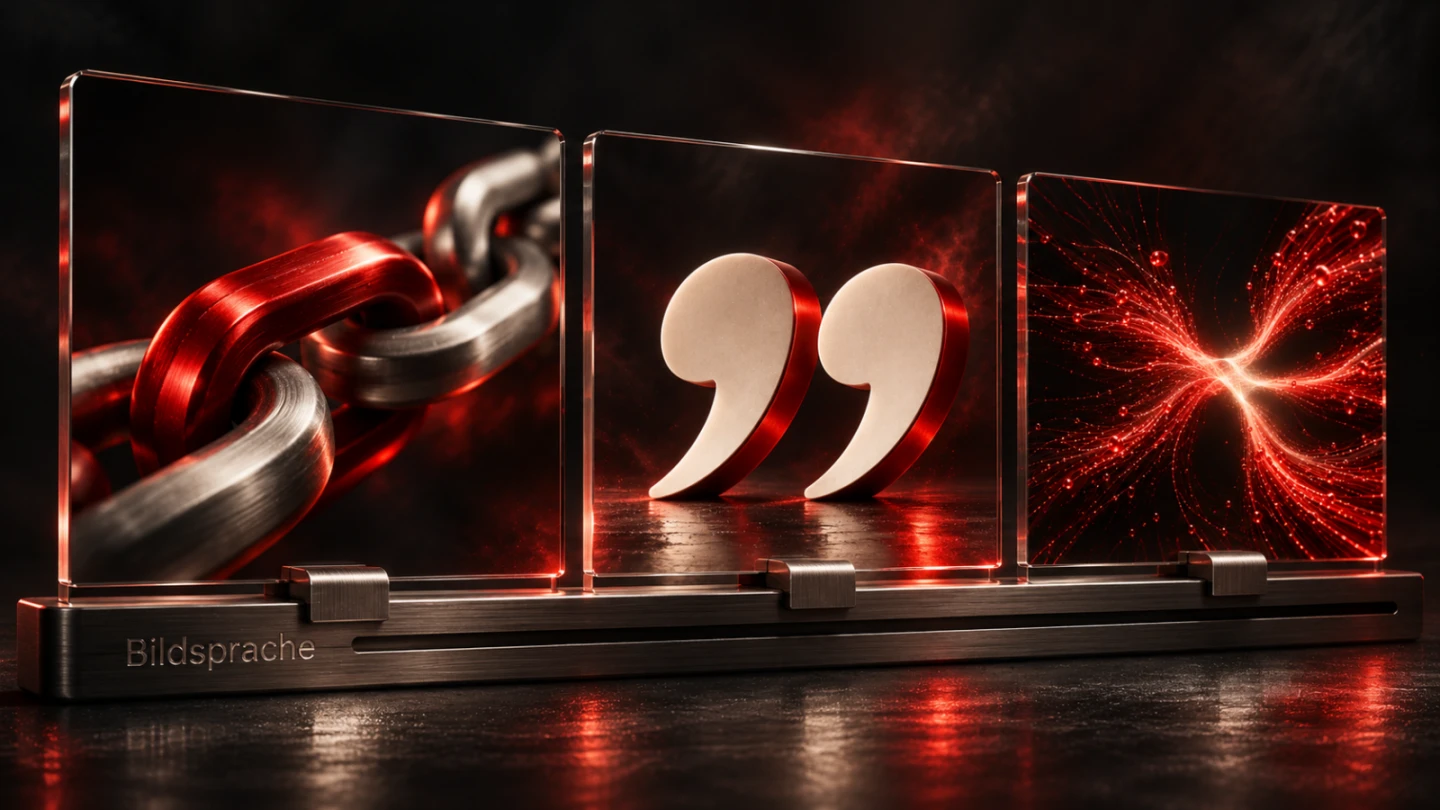
An editorial visual language becomes recognizable when different subjects follow understandable creative decisions. Giving every image the same colour is insufficient. An article about security foundations needs a different visual idea from an explanation of typography. Both can still share a standard of material quality, lighting and visual attitude. The important connection is between the specific content and a limited set of dependable rules.
This guide develops a practical way to make those decisions. Its recurring example is an explicitly fictional editorial team publishing technical service articles about digital collaboration, data transfer and maintenance. No actual client outcomes or measured recognition rates are claimed. The example shows how a general request for high-quality imagery can become a reviewable brief, a useful selection process and controlled outputs for different formats. It also separates expressive imagery from explanatory diagrams and genuine evidence.
1. Establish the editorial job before choosing the look
Start with one sentence describing what the image must do for this particular article. For an explanation of encrypted data transfer, that sentence might say: show a protected transition between two clearly distinguishable areas. A padlock has not yet been selected. The sentence first identifies a relationship. You can later ask whether a proposed composition shows that relationship or merely resembles a generic technology advertisement.
Separate an introductory image, an explanation and a record of evidence. A cover can draw attention to the article's central idea. An explanatory diagram must make a relationship understandable. An evidence image documents an actual state. These purposes allow different creative freedoms. A staged material metaphor can work as an introduction. It must not be described as a photograph of a real server. A reconstructed interface must not quietly become a screenshot of software that was supposedly delivered.
Record the boundary of the statement as well. The data-transfer image does not demonstrate guaranteed security or measured transmission speed. This brief check prevents a dramatic picture from promising more than the article can substantiate. It also gives a reviewer a specific reason to reject an appealing but misleading candidate. A coherent visual language begins with a clear editorial job, before an object, colour or viewing angle is selected.
2. Build recognition through relationships
A useful system combines a few stable features with room for variation. Stable features might include a deep dark environment, a deliberate red accent and a warm bright material edge. The object, spatial relationship and narrative viewpoint can vary. In the fictional publication, collaboration could be represented through interlocking connectors. Maintenance might reveal an accessible mechanism. Clear labelling could be explored through a precisely engraved surface. The images belong together without repeating the same prop.
Distinguish a principle from a recipe. A principle says that light and contrast must make the important detail unambiguous. A restrictive recipe says that every image contains a red cube on the right. The principle supports different subjects. The recipe quickly becomes repetitive and may displace the actual idea. Even a recurring material deserves a reason. Glass can make layering or visibility meaningful. That does not make glass compulsory in every article.
Review a proposed group together. Does it repeat a creative attitude or simply repeat its equipment? Can the subjects still be distinguished without their headlines? A useful contact sheet should support both shared origin and an individual idea in each image. This is an editorial judgement. A specified number of common colours does not itself prove successful brand recognition. If recognition is later researched, that research needs its own methods and evidence rather than an invented percentage attached to the style guide.
3. Express the visual grammar through concrete decisions
Describe lighting so another person can act on the instruction. Instead of premium and modern, specify directional main light with a softer opposing edge, visible surface texture and controlled highlights. Describe space just as clearly. Does an object actually rest on a surface? Are its contact point and shadow plausible? Should the viewpoint stay close to a detail or reveal a relationship between several parts? A reviewer can answer these questions by looking at the result.
Material instructions also need boundaries. Brushed metal has a directional texture. Frosted glass behaves differently from a transparent sheet. Raised embossing needs an edge and changes the shadow. If those properties exist only in the written brief but change arbitrarily within the picture, the material will be unconvincing. Generated imagery particularly benefits from a slow examination of transitions. Attractive overall lighting can initially hide errors in geometry or construction.
Keep the working grammar on a manageable page. A small number of annotated references is more useful than an unexplained collection. State what each reference contributes, such as its strong tonal separation or readable surface embossing. This does not automatically authorize copying third-party logos, protected characters or distinctive graphic elements. A reference indicates a direction; it is not a blanket licence. The brief should identify what remains original and what must be obtained from an authorized source.
4. Find an independent visual idea for every subject
First write down three relationships addressed by the article. For maintenance, these might be access, replacement and inspection. Develop distinct possibilities from them: an accessible service point, a precisely replaceable component or an unambiguous inspection indicator. Select the idea that communicates the most important thought with the least supplementary explanation. Adding details does not automatically make a picture more specific to its subject.
Review metaphors strictly. A padlock is understandable as an introduction to access protection. It will usually be too general for an article about helpful error messages. A mailbox tells a story about postal delivery but does not inherently explain what matters in a digital contact form. A useful metaphor remains connected to the professional argument. If explaining the metaphor takes longer than explaining the point itself, a more direct concept is usually preferable.
Maintain a small motif register for the series. Record the main objects and viewpoints already used. This makes it easier to notice that every third article features the same keyboard or seated person. The register does not ban familiar subjects. It turns repetition into a deliberate decision. A recurring object can support a recognizable continuation, but it needs that editorial function. Otherwise it becomes decoration that could accompany almost any headline in the publication.
5. Plan covers, explanations and evidence separately
| Image purpose | Suitable approach | Critical review question |
|---|---|---|
| Introduce the article | A clear staged visual concept | Is its connection to the subject immediately understandable? |
| Explain a process | A precise diagram with named relationships | Are sequence, arrows and terminology correct? |
| Document a state | An actual unchanged record with context | Are origin, time and limits of the statement documented? |
| Compare a design change | Identical content under changed design conditions | Did anything other than the discussed variable change? |
This separation prevents an attractive cover from having to do every job. An article about file versions can begin with a meaningful object scene. A real process diagram can then distinguish the original, the working edit and the export. If the article evaluates a particular application, it additionally needs a verifiable connection to the version actually examined. An invented interface does not supply that evidence, however polished it appears.
Plan explanatory imagery while outlining the text. Which passage would be unnecessarily difficult without an image? Which information must remain available in text? A diagram that merely rearranges already clear sentences into boxes may be unnecessary. In a before-and-after comparison, preserve the same content and starting conditions. Otherwise the visible difference cannot reliably be attributed to the stated design change. The team does not need to fabricate experimental measurements to explain an observable difference carefully.
6. Treat cropping as part of the composition
A strong landscape composition does not automatically become a good square card. Consider later uses during selection. An object may have sufficient space on both sides in the wide cover. A narrow portrait crop might remove the exact connection discussed in the article. The crop has then altered the statement. This is a content problem, rather than merely a question of image dimensions or export quality.
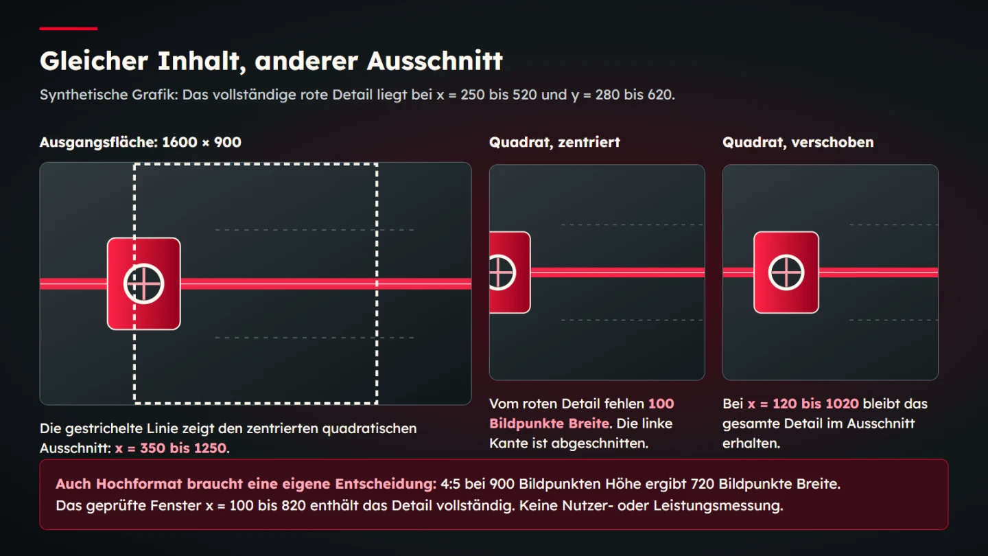
The following calculation uses an explicitly synthetic source canvas measuring 1600 by 900 pixels. Its critical detail occupies a rectangle from x equals 250 to 520 and y equals 280 to 620. A centred square crop at the same height keeps only x equals 350 to 1250. It therefore removes 100 pixels from that detail. A left-shifted square crop from x equals 120 to 1020 contains the complete detail. These numbers are construction data for the example, not measured visitor outcomes.
A four-to-five portrait format at a height of 900 pixels retains a width of 720 pixels. Its position also needs deliberate selection. Automatic centring can work, but it is not guaranteed to preserve meaning. Inspect the actual content in each output. The CSS object-position property can influence the placement of a replaced element within its area. It supports composition but cannot recover content that does not exist. A fundamentally different composition may deserve a separately prepared version rather than another positional adjustment.
7. Write labels and alternatives according to function
Keep image labels short enough to remain readable in the intended format. A cover does not have to repeat the entire article headline as embedded text. Real page text is easier to reflow, translate and enlarge. Where an explanation needs labels, they must use the same vocabulary as the article. A diagram with three similarly named states must not interchange their terms for visual convenience. Read the final small output, rather than judging only the large working file.
Alternative text depends on use. The WAI decision tree helps distinguish informative, decorative and functional images. A purely supplementary image can need an empty alternative. If an image is the only content of a link, its destination or action matters. The WAI tutorial on functional images explains this distinction. Describing the visible shape is not always an appropriate name for the action.
Complex information also belongs in accessible text. A short description can introduce the diagram, while paragraphs or a table make its important relationships available independently. The WAI tutorial on complex images describes relevant approaches. Decide this for each occurrence. The same depicted object may contribute atmosphere in one context and essential information in another. An automatically copied description cannot reliably make that judgement for every use across the site.
8. Preserve sources, usage scope and provenance
An image collection needs more than a downloads folder. Keep the original source, creator information, agreed usage scope and any necessary permissions retrievable. The file name alone is a poor record. A file can be renamed or exported in several sizes. Connect its evidence to a stable internal identifier so a later reviewer can determine which publication came from which original. The identifier should survive routine renaming and resizing.
Publishing recognizable people requires careful assessment. Section 22 of the German KunstUrhG sets out the consent principle for distributing and publicly displaying portraits. It does not provide a complete assessment for every situation. Other provisions, exceptions and data-protection considerations can matter. In practical editorial terms, possession of an image file is insufficient reason to regard a portrait as freely usable. Resolve open questions about the actual intended use with qualified advice before publication.
The IPTC Photo Metadata Standard provides properties for information such as creator, copyright notice and usage terms. Metadata supports management; it does not replace missing agreements or their substantive review. Generated imagery additionally needs a provenance record containing the tool, exact request, references actually supplied and selected output. Preserve originals and rejected versions through controlled versioning. Do not quietly overwrite them and thereby erase the history of a published asset.
9. Review image quality as professional accuracy
Examine a candidate without becoming distracted by its visual appeal. Is the depicted object internally consistent? Can the connecting parts interlock in that way? Are hands anatomically plausible and touching the correct controls? Do ports and labels match the device function being suggested? If these points remain unclear, a simpler idea is often more useful than a beautifully illuminated false depiction. Remove unnecessary complexity when it prevents a dependable review.
Separate this factual review from the visual selection. A plausible subject can be weakly composed. An impressive composition can be factually wrong. Both questions need answers. Inspect the complete image and the critical details. Small mistakes disappear easily in a preview. They become apparent in a larger display and can undermine confidence particularly strongly in a professional explanation. A technically themed image invites readers to assess its technical credibility.
Use actionable review language. Rather than saying it does not feel right, identify that the connection at the right edge cannot be understood. Rather than requesting more premium, explain that the highlight obscures the engraving. A targeted revision should change the affected aspect as narrowly as possible. Review the whole image afterwards. Even a small edit can introduce a new error or shift a previously usable crop. Saving the revised file is not evidence that the revision succeeded.
10. Control outputs and technical variants
Preserve a high-quality working version and derive the required outputs from it. Establish the composition for each aspect ratio first. Appropriate pixel dimensions and compression follow. This avoids repeatedly editing one image under several file names and gradually losing quality. The output should fit its actual use rather than a general preference for the largest possible resolution. A cover and a small list thumbnail may need different decisions even when they share the same subject.
Different sizes of the same crop are distinct from different compositions. With width descriptors in srcset, candidates describe their own widths. The browser can use these descriptions and other information to select a suitable resource. The web.dev documentation on responsive image sources explains that descriptive syntax. A different crop for a different editorial job should consequently be planned deliberately. Providing several resolutions alone does not ensure a useful composition.
Inspect the file actually delivered. Are borders baked into it? Is an important engraving still legible? Has compression damaged a bright edge? Does the crop work against both light and dark surroundings? Check the article list as well. A cover that works only in its large original view may fail at the place where most readers encounter it. Attach these observations to the asset record so the next export does not repeat the same mistake. Technical export completion and editorial approval remain separate decisions.
11. Give approval a concise set of responsibilities
A small editorial team does not need a complicated administration system. It does need identifiable responsibility for the statement, design and usage scope. One person may hold all three responsibilities, but they should still answer separate questions. The author checks the subject connection. Design reviews composition and consistency across the series. The person responsible for publication checks provenance and intended use. A clear division of questions is more valuable than a large number of vague approval stages.
- Is the image's editorial job expressed in one sentence?
- Does the concept have a specific relationship to the article?
- Are geometry, numbers, labels and any anatomy plausible?
- Do the crops actually used preserve the important content?
- Is informative content independently available as text?
- Are source, usage scope and editing history retrievable?
- Has the final delivered output been inspected?
Give each unresolved point an owner and a concrete next action. A visual approval cannot replace missing permission. A complete source record cannot fix an unsuitable crop. This separation makes the process faster because feedback reaches the person able to resolve it. It also prevents an attractive preview from being mistaken for a fully checked publication asset. A brief approval record should identify the precise version reviewed, so a later file replacement does not silently inherit that decision.
12. Develop the visual language through the published collection
After several publications, review the overall impression. Which images genuinely support their subjects? Where does a fashionable surface treatment merely repeat itself? Which topics need another narrative perspective? A contact sheet helps reveal clusters and gaps. Expand the visual grammar where a recurring decision is genuinely unclear. The system does not need to turn every successful one-off choice into a permanent rule. Too many rigid instructions can make future pictures less specific.
In the fictional technical publication, macro views might work well for material questions while processes need a broader spatial view. That does not require abandoning the common language. The rule could say: material subjects stay close, while relationships retain clearly visible endpoints. Colour, light quality and care remain connecting features. The series can then grow across different topics without forcing every article into the same scene or treating variation as inconsistency.
Document changes with examples and reasoning. Preserve earlier originals so previous publications remain understandable. Give new versions their own identifiers. A visual language is useful when another person can develop an appropriate new idea from it and explain the decision. That is a more practical standard than the length of the style guide or the number of unspecified quality adjectives in its introduction. The result is a working editorial system that can adapt while retaining a recognizable point of view.
Sources and scope
Sources were opened on 9 November 2026. The linked primary material supports the specific accessibility, format, metadata and legal foundations identified beside it. The visual grammar and editorial process are a working proposal developed for this guide. The crop example is synthetic and makes no claim about user studies or real project outcomes. Legal assessment depends on the actual image and intended use.