Developing a brand brief as a foundation for design
From business reality to a visual direction: specific criteria for distinctive and understandable brand development.
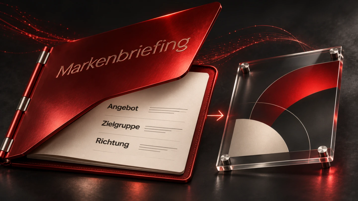
A logo, colour or image style can look convincing while misrepresenting the business. That happens when the offer and justified expectations remain unclear before design begins. A brand brief establishes a shared foundation for those decisions. It needs enough precision to support meaningful discussion of differences between proposals.
The example is a fictional workshop producing modular meeting tables for organizations using rooms in different ways. This is a conceptual method rather than a real customer reference. Characteristics and evidence require confirmation within an actual project. No invented market position, customer quotation or performance result is used.
1. Establish the reason for the work
An identity may need revision for different reasons. The presentation might no longer match the offer, a common framework may be missing or a new division may need a recognizable introduction. Those situations create different tasks. A preference for another colour does not explain the scope of the branding work on its own.
The fictional workshop wants its tables to be understood as a considered system. Existing material emphasizes individual pieces while making variants, planning and possible arrangements harder to recognize. This is an assumption within the example. A real project would examine the enquiries and content that actually support that assessment.
Record the reason in a short paragraph and include strengths worth retaining. A familiar name or recognizable product form may still be useful. This makes the redesign decision more precise. It need not automatically replace every established feature merely because the project is described as a new visual identity.
2. Describe the offer and business reality
Begin with what the organization actually does. Which products or services does it provide, and which decisions precede collaboration? For this workshop, relevant information includes formats, combinations, materials and planning a suitable arrangement. The responsible specialist must confirm which of those activities and options genuinely exist.
Boundaries matter too. Individual planning does not automatically mean every imaginable shape can be produced. A modular arrangement does not prove unrestricted interchangeability of every part. The eventual imagery should not create those expectations casually. Clarify the significant limits before developing the first proposal.
Review the description without generic quality adjectives. Is the work still understandable? Can an outsider distinguish the offer from furniture retail or general interior planning? These answers support naming, language and design. A striking visual accent cannot resolve an unclear service description on its own.
3. Understand the audience's decision situation
The workshop initially considers people planning meeting rooms for an organization. They need information about use, formats and coordination. Other people may own procurement or technical review. Identify those roles and their questions. A description based only on age or income would conceal distinctions that materially affect the communication.
What remains uncertain before a decision? People may need to understand arrangements for different room sizes or obtain material samples. Check those assumptions. Design can then reveal what supports the choice. Avoid asserting supposed audience preferences without evidence relevant to the actual people involved.
Record real contact points as well. A product page, sample case and printed proposal create different demands. A brand brief needs to know those applications. A design that works only in a large presentation image may fail in a small proposal heading or on a product label where space and context differ.
4. Position the offer through deliberate selection
Positioning here means making a relevant focus understandable. The example might emphasize the relationship between flexible room use and coordinated manufacture. This is not a general claim of superiority over everyone else. It identifies the perspective that the presentation should bring forward for its audience.
Test relevance and evidence. Does the point matter to the identified audience, and can products, workflows and information support it? An arbitrary combination of premium, innovative and personal is difficult to assess. The brief needs specific statements about the actual offer rather than qualities that could describe almost any supplier.
Positioning should not become an unnoticed service promise. If rapid delivery is central, establish its operational basis. A calm technical image style might communicate considered work without promising an unverified lead time. Separate the intended impression, the statement being made and the property that can actually be substantiated.
5. Translate characteristics into observable behaviour
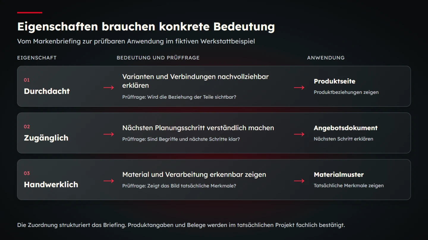
| Characteristic | Specific meaning | Possible evidence | Design question |
|---|---|---|---|
| Considered | Explain variants and connections intelligibly | Confirmed product information | Are relationships between parts visible? |
| Approachable | Clarify the next planning step | Information and a contact process | Are terms and actions understandable? |
| Craft-based | Show materials and workmanship | Approved detail photographs | Do images reveal actual features? |
This mapping connects characteristics with a task rather than prescribing a particular font or colour. Different proposals may express the same idea differently. The discussion nevertheless gains a foundation: a photograph of arbitrary glossy surfaces is not automatically good evidence of careful workmanship in this product.
Identify unwanted interpretations too. Approachable should not mean interchangeable in this example. Craft-based does not mean deliberately inaccurate or nostalgic. Explain those distinctions through real applications. A short comparison on a product page is more useful than a long catalogue of abstract opposing adjectives.
6. Separate present perception from intended development
Describe how the business is perceived now and the direction it intends to develop. Do not silently merge those levels. A desired internal characteristic does not establish an existing external perception. Record the origin and status of significant statements so the distinction remains understandable throughout the work.
A baseline review may examine existing material and suitable feedback. Look for recurring signals and specific circumstances. Do not present isolated comments as representative of every customer. Confidential or unapproved feedback should not become public branding evidence without appropriate clarification.
The intended development must fit reality too. If the workshop wants to convey structured planning, its actual process needs to support that expectation. Design can make an established strength clearer. It should not stage an invented organization whose promises cannot be met when someone subsequently makes contact.
7. Collect references with an explained purpose
A reference collection helps when each example identifies the relevant aspect. That may be clear image hierarchy, convincing material detail or a useful organization of complex variants. Such observations are more precise than liking an entire external brand. They create space for an original response to the same underlying task.
State what should not transfer as well. Another organization's mark, distinctive character or identifying features do not automatically belong in the new design. A reference clarifies direction. It does not provide blanket usage permission or an instruction to reproduce the example under a different name.
The Design Council's framework describes opening and focusing a question and evaluating possible responses. Applied to this brand task, that suggests investigation, reasoned selection and assessment of proposals against the problem. The method is a professional reference rather than a rigid mandatory process imposed on every small business.
8. Plan colour, type and imagery together
A colour works through its surroundings and use. The brief may call for a clear accent role without declaring an untested combination suitable everywhere. Page surfaces, text and actions need to work together. Later development checks actual contrast pairs and interaction states rather than approving a palette in isolation.
The WCAG explanation of minimum contrast provides a technical reference for that work. A brand brief does not replace the component assessment. GOV.UK's design system offers an example of separating colour uses within a real system. Its palette is not being imported as the required identity of the fictional workshop.
Examine type and imagery through the same tasks. A close-up can reveal workmanship while an overview explains table arrangements. Suitable typography supports information and recognition. Test the choices later with realistic text lengths, small applications and the characters required by the actual languages being published.
9. Connect language and behaviour with the visual direction
Brand perception also develops through wording and contact behaviour. A calm, precise identity sits awkwardly beside unclear action labels or sweeping superlatives. Establish the basics of address and provide short applications. More extensive voice guidance can follow as a separate body of rules once the direction is understood.
A specific sentence for this workshop might say that room size and intended use are clarified together. That describes a real next step if the business confirms it. Promising that every room idea becomes possible without limits creates a substantially different expectation. Discuss the distinction deliberately rather than judging only which sentence sounds more energetic.
Errors and limitations are part of behaviour too. If a format is unavailable, the contact process needs a clear answer. Credibility does not come only from the friendliest promotional line. The first impression, available information and actual collaboration should create one coherent expectation across the relationship.
10. Review names and identifying signs separately
Everyday discussion often uses brand to mean the overall presentation and associated perceptions. A protected identifying sign raises a more specific question. WIPO describes trademarks through their distinguishing role for goods or services. The brief should not confuse that legal dimension with an assessment of visual appearance alone.
When a name, logo or other sign is created, plan the relevant review. Looking original does not establish legal availability. An available domain does not settle that question either. This article performs no specific trademark search and offers no assessment of the protectability of an individual sign.
Record who owns the necessary checks and what must be established before use. The decision affects the project sequence. An unresolved name can later affect many applications. Legal responsibility should neither be silently assigned to a designer nor treated as resolved through an aesthetic approval meeting.
11. Identify deliverables and applications
A brand brief states the results required. These might include a basic visual system, logo versions, image rules or templates for specific uses. A broad request for a new identity leaves scope open. The team should know which touchpoints will actually be developed and evaluated before the work is accepted.
Product pages, proposal documents and material samples are important applications here. Each has different dimensions and content density. A large cover presentation says little about how a logo reads in a small document heading. Use realistic applications during review rather than relying exclusively on impressive presentation scenes.
Define handover and maintenance too. Who can edit templates, which files and rules are needed, and how will new product photographs be assessed? A coherent first result is a foundation. Without understandable use, the identity can subsequently fragment into unrelated decisions made by different people.
12. Assess proposals against intelligible criteria
Start selection with the agreed tasks. Does the proposal make the table system understandable, support information hierarchy and show materials credibly? Those questions enable a professional discussion. Personal preferences can be acknowledged without replacing the assessment of the communication task.
Separate observation and evaluation. One observation could be that a connection between parts is not visible in an image. The evaluation might be that this weakens the explanation of modularity. Investigate a suitable revision afterwards. Asking vaguely for something more modern gives the team considerably less direction.
Review several applications before approval. A proposal may be convincing as a cover but create problems in a long product description. Assess changes across the system. The brief helps preserve a reasoned direction without trying to decide every later detail through a fixed rule established before any design existed.
13. Fill a concise brand-brief template
- Reason: which change should the work support?
- Offer: what is actually delivered and where are its boundaries?
- Audience: which decision situations matter?
- Positioning: which focus is relevant and supportable?
- Characteristics: what do they mean in behaviour?
- Evidence: which material supports the statements?
- Direction: which reference aspects help and which stay excluded?
- Applications: which touchpoints need to work?
- Checks: who owns identifying signs, materials and approval?
- Assessment: which tasks guide selection of proposals?
Discuss the completed template together. Do not leave contradictions unexplored under the label of creative openness. Asking for a very restrained and maximally conspicuous result needs either a priority or an explained context. Make the terms specific enough that designers can work with them rather than guessing which request takes precedence.
14. Check the example mapping
The accompanying working file connects the three example characteristics with meaning, possible evidence and a design question. Those relationships are checked for completeness. A missing rationale or a characteristic without an application becomes a visible gap. The result identifies which statement still requires professional clarification.
This reviews the internal organization of the brief. It does not claim that a design is already effective or that real customers perceive the brand accordingly. Those questions require actual proposals and suitable investigation. A useful brief enables the next work while keeping its uncertainties visible and clearly attributed.
15. Preserve the direction during maintenance
New applications follow the initial implementation. Another product group, a different document template or a new image supplier can introduce questions not yet decided. The brief remains a reference. A responsible person checks whether the new application communicates the same characteristics or needs a reasoned addition to the rules.
A short decision record helps. Explain why one image type was chosen and another rejected. That is more useful than an unexplained folder of approved files. A later editor can understand whether a close-up should reveal material or an overview should explain modular arrangement. The right choice then follows the information task.
Keep supporting evidence current too. If the offer changes, a previous statement may need adjustment. An old product advantage should not survive in the identity simply through habit. Maintenance connects factual information with visible design. The brief remains a working foundation for understandable decisions rather than an archived document read only at the first presentation.
16. Distinguish consistency from repetition
Consistency does not require every image to contain the same object or every page to repeat the same arrangement. Shared meaning, colour roles and material treatment can support several appropriate compositions. A detail photograph and a planning overview may look different while reinforcing the same position through their respective tasks.
Document that range deliberately. Identify what must remain stable and where the application can vary. This gives later teams useful freedom while preserving the rationale. A new proposal can then be assessed against its contribution to the brand rather than rejected simply because it differs from the first approved specimen.
Sources and scope
Sources checked on 9 November 2026. These primary references were reviewed for design methodology, identifying signs and functional colour use. The workshop, characteristics and briefing template are original conceptual examples.