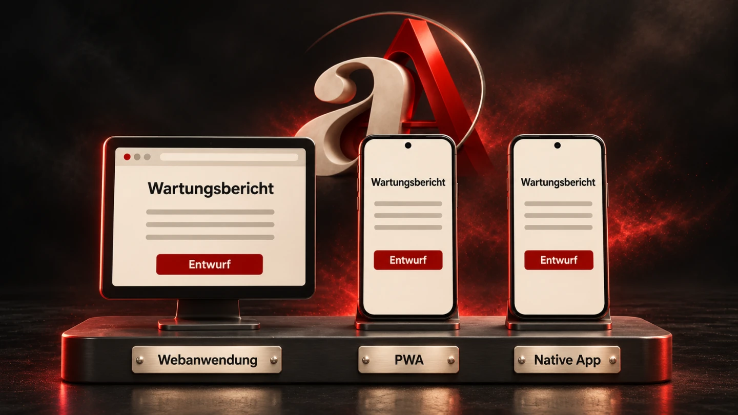
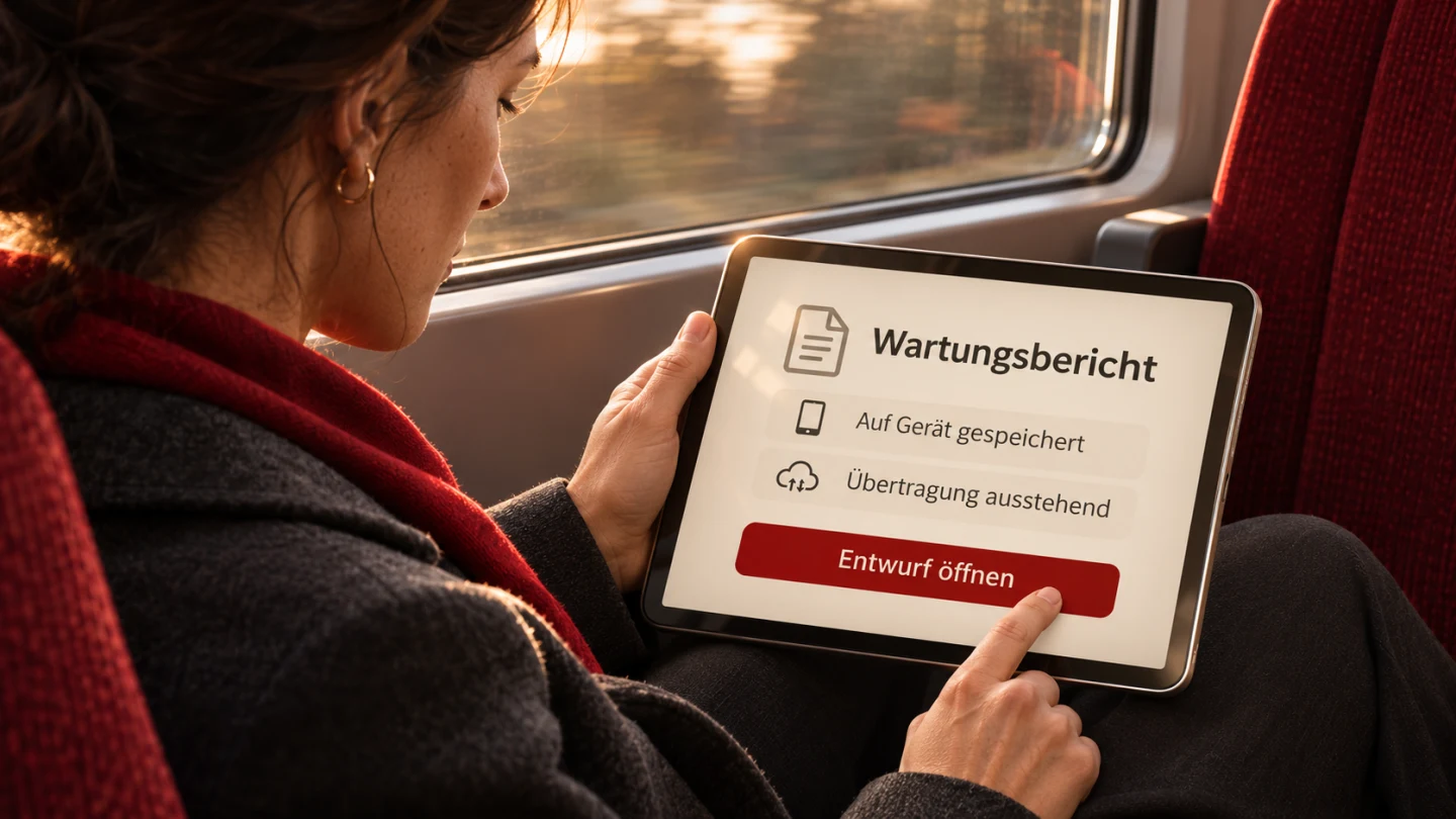
Design Android interfaces for real usage situations
Connect mobile tasks, operating conditions and confirmed state in a verifiable interface design.
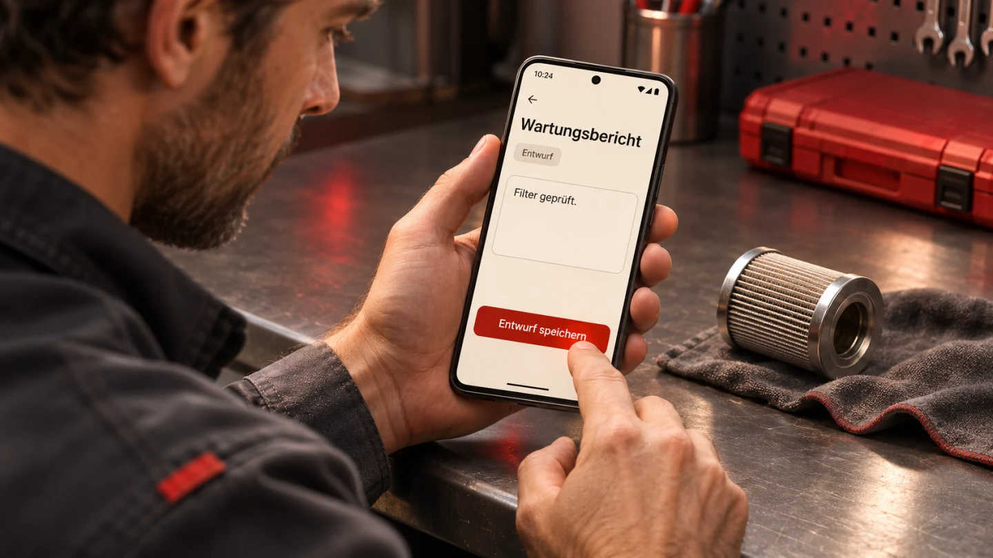
An Android interface has to support the real task
A useful Android interface helps a person complete a concrete task under actual conditions. Reachable controls, understandable state and reliable interruption handling all matter. An attractive static screen shows only part of that behaviour. In a mobile business application, people particularly need to distinguish entered content, a genuinely stored draft, an ongoing transfer and a server-confirmed submission. Those are different claims about their work.
Our original fictional example is a maintenance report. A technician records an observation near a device, saves a draft and transfers it later. Space may be limited and connectivity may fail. This is an explicitly selected scenario rather than a claimed customer deployment. It provides the basis for a task sequence, a compilable Kotlin state model and reproducible checks of the wording the interface derives from that model.
The key question is not how many features fit on the opening screen. It is which next step can be understood reliably in this situation. A short preserved draft may be more valuable than a comprehensive form whose state becomes unclear after interruption. Start with the work, environment and feedback instead of collecting decorative app screens and only later deciding what their buttons are supposed to mean.
Write down the usage conditions
For this example, the person is standing near a device with limited time to record an observation. They may not have both hands available continuously. The keyboard covers part of the interface during entry, and another work step may interrupt them. These assumptions need review with actual users before they become product requirements. The scenario makes the discussion concrete without pretending that every technician works in exactly the same way.
For every main task, identify input, outcome and a likely disruption. The maintenance input is a short note. The first outcome is a saved draft; the second is confirmed server receipt. Lost connectivity is a likely disruption. This small decomposition already shows why one generic success message would be too vague for the whole journey. The interface needs language tied to the outcome actually established at each step.
Later office use may involve different work, such as comparing many reports or giving business approval. The mobile entry screen does not necessarily need to perform all of that. An application may use different views for different responsibilities. More screen space is not merely a chance to stretch the same controls; it may support a different useful combination of overview and detail while retaining the same underlying state rules.
Derive the main action from current state
While the text contains unsaved changes, the useful action is to save the draft. Once that exact revision is stored and a connection is available, transfer can be offered. While transfer is running, the same control should not start arbitrary duplicate attempts. A matching acknowledgement produces explicit wording that server receipt is confirmed. These labels describe separate observable situations rather than visual variations of a generic completion message.
A connection indicator does not prove successful contact with a particular server. The endpoint may still be unavailable or reject processing. Our model therefore never derives confirmation from the connection hint. Confirmation is an independent state supplied by actual processing. The interface should not replace a missing result with an optimistic success message simply because the device currently reports some form of connectivity.
After a failed transfer, preserve the stored content and describe the retry as a retry. The data-processing layer separately defines when repetition concerns the same business operation. A button label cannot settle server-side duplication. The presentation model makes the next useful step clear and keeps its prerequisites distinct; the receiving workflow still has to enforce its own content, identity and repetition rules.
Separate presentation from storage and processing
The interface receives a described report state. A pure function derives display text and main-action availability without writing a file or making a network call. That separation lets us test the claims independently of the final screen. An Android application connects it to actual state ownership and data access rather than distributing the entire workflow across unrelated click handlers.
Android’s state-hoisting guidance discusses placing shared state with a suitable common owner. For this report, the text, saved revision and transfer revision must not be maintained inconsistently by independent components. The status and primary action need the same business foundation. Specific integration with a ViewModel and repository follows the existing application architecture rather than requiring a second competing state system.
A configuration change and a process terminated by the operating system are different situations. Not every visual detail needs the same persistence mechanism as valuable entered text. The data layer defines when a report revision is durably available. A value held only in working memory must not be labelled a saved draft. Verify that claim against the actual storage implementation and recovery behaviour, not merely against a retained screen instance.
Android Developers: State hoisting
Identify the revision being described
The model records a revision for current text and another for the last saved version. Equal values allow a stored-on-device message. After editing, they differ and the presentation reports unsaved changes. Revision numbers are an explicit simplifying assumption of this example. Their purpose is to bind the visible claim to the current content rather than to any earlier save operation that happened to succeed.
Transfer state also identifies its revision. If an older version is acknowledged, the interface must not claim that newly edited text is confirmed. It instead says that an older revision was confirmed. This can occur when someone continues working during transfer. A technically valid response to an earlier request would otherwise produce a misleading business statement about the contents currently shown on screen.
The pure presentation helper does not match network responses to attempts or implement concurrent-transfer control. The real data layer must do that reliably. Multi-device conflicts are also outside its implementation. Keeping this boundary explicit is useful: the model makes its visible statements precise without claiming to provide an entire synchronisation system, durable queue or server processing contract.
The compiled Kotlin example
The helper below consists of data classes, explicitly named transfer states and the present function. It was actually compiled with Kotlin/JVM and exercised through 38 isolated checks. Those checks concern presentation output, not an executed Android screen, durable file storage or a report transmitted to a real server. Those integration responsibilities need separate implementation and verification in an actual app.
Invalid revision values are rejected with require. A production state owner needs controlled handling of damaged data rather than passing arbitrary corrupt records directly into the view. The example does not silently truncate entered content and preserves it in the state object. Empty or whitespace-only text does not receive a transfer action. The server still needs its own content rules independently of this interface decision.
sealed interface Transfer {
    data object None : Transfer
    data class Sending(val revision: Int) : Transfer
    data class Accepted(val revision: Int) : Transfer
    data class Failed(val revision: Int) : Transfer
}
data class ReportState(
    val text: String,
    val revision: Int,
    val savedRevision: Int? = null,
    val transfer: Transfer = Transfer.None
)
data class ReportUi(
    val storageText: String,
    val transferText: String,
    val actionText: String,
    val actionEnabled: Boolean
)
fun present(state: ReportState, connectionAvailable: Boolean): ReportUi {
    require(state.revision >= 0)
    require(state.savedRevision == null || state.savedRevision in 0..state.revision)
    val transferredRevision = when (val t = state.transfer) {
        Transfer.None -> null
        is Transfer.Sending -> t.revision
        is Transfer.Accepted -> t.revision
        is Transfer.Failed -> t.revision
    }
    require(transferredRevision == null || transferredRevision in 0..state.revision)
    val stored = state.savedRevision == state.revision
    val currentTransfer = transferredRevision == state.revision
    val transferText = when (state.transfer) {
        Transfer.None -> "Nicht übertragen"
        is Transfer.Sending -> if (currentTransfer) "Übertragung läuft"
            else "Älterer Stand wird übertragen"
        is Transfer.Accepted -> if (currentTransfer) "Servereingang bestätigt"
            else "Älterer Stand bestätigt"
        is Transfer.Failed -> if (currentTransfer) "Übertragung fehlgeschlagen"
            else "Älterer Stand nicht übertragen"
    }
    val action = when {
        state.text.isBlank() -> "Nachricht ergänzen" to false
        !stored -> "Entwurf speichern" to true
        state.transfer is Transfer.Sending -> "Übertragung läuft" to false
        state.transfer is Transfer.Accepted && currentTransfer -> "Servereingang bestätigt" to false
        !connectionAvailable -> "Auf Verbindung warten" to false
        state.transfer is Transfer.Failed && currentTransfer -> "Erneut übertragen" to true
        else -> "Übertragen" to true
    }
    return ReportUi(
        if (stored) "Auf Gerät gespeichert" else "Ungespeicherte Änderungen",
        transferText, action.first, action.second
    )
}
Use the output in an Android view
A Compose view can use the derived strings for visible labels and the activation value for its primary action, passing the click event to the responsible workflow. The view should not independently announce that a save succeeded. Only the confirmed storage result updates the saved revision. The same principle applies to starting transfer and accepting its outcome. The displayed state follows the operation rather than inventing it.
A meaningful status change may also need an accessible announcement. The actual semantics and TalkBack behaviour belong in Android acceptance. Do not indiscriminately add descriptions that duplicate an already visible button label. Controls need understandable names and roles, while purely decorative elements should not create unnecessary navigation work. Review the complete interaction with the relevant assistive setup rather than inferring it from a visual screenshot.
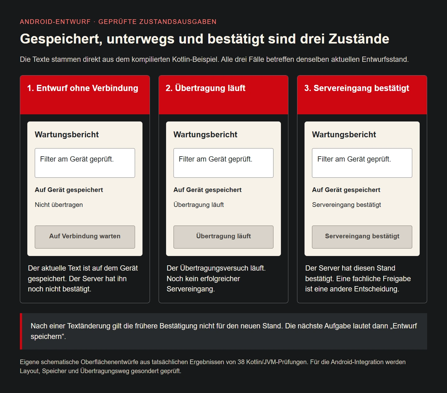
The illustration deliberately uses schematic views derived from actual Kotlin output. It is not presented as an Android runtime capture. This makes the difference between stored, in transit and confirmed reviewable before system bars, keyboard behaviour and physical-device conditions are tested. A design and a runtime record have different jobs, and naming them accurately helps everyone understand what the evidence establishes.
Take touch areas and spacing seriously
Android describes the usual 48 dp minimum for interactive targets. The visible size of a small icon and its effective touch area are distinct. Our report gives the main action an evident surface and separation from nearby actions. The actual workplace may impose further requirements. One numeric target does not by itself prove that the design is comfortable, accurate or appropriate for the people using the device.
For standing one-handed use, check that the frequent action is reachable without triggering a neighbour. A destructive operation should not share a tiny crowded position with saving. Large targets are still confusing when several similar buttons compete without clear priority. The example consequently presents one recognisable next action and keeps secondary operations subordinate. Hierarchy matters as much as the raw dimensions of each individual control.
If gloves, specialised input devices or harsh environmental conditions genuinely belong to the workflow, test them realistically. An arbitrary gloved-hand photograph would not provide that evidence. This example intentionally shows ordinary phone interaction. Additional workplace requirements are established from actual use rather than inferred from an attractive cover image. The visual should clarify the scenario without inventing operational validation.
Android Developers: Accessibility defaults
Coordinate text entry with the available workspace
The report needs a clearly labelled text control. A placeholder alone loses its identifying role after entry. A suitable input configuration can support mobile editing, while the keyboard action must match the field’s purpose. A multiline observation should not accidentally submit when someone intends to insert a line break. Verify behaviour with the selected Android text component instead of assuming every keyboard follows the same configuration.
The software keyboard can substantially change the space available. The active input and necessary feedback should remain reachable rather than disappearing behind a rigid bottom element. System bars, cutouts and keyboard insets therefore belong in layout planning. Android’s inset facilities provide technical foundations that must be integrated into the specific view hierarchy. Fixed pixel offsets applied without regard to those conditions are not a dependable general solution.
Larger text and longer translations must not obscure important states. Confirmed server receipt is more informative than a brief generic OK, and the design needs room for that meaning. Shorter wording is only better when it remains accurate. Review text scaling with real controls and their interaction, not just by enlarging a saved image. Entry, feedback and the primary action need to remain understandable together.
Respond to the window rather than the device label
An app can occupy a small window on a physically large device. The same workflow may receive more space without a different device category becoming relevant. Android’s guidance therefore focuses layout decisions on the portion actually allocated to the app. Our report may use one concentrated work view in a narrow area and an overview beside the selected report when enough useful space becomes available.
The business task remains the same. A larger arrangement should not suddenly apply different storage or confirmation rules. The pure output model is independent of that outer layout. Presentation placement determines where information goes, while the business state determines what it means. Keeping those responsibilities distinct makes later adaptations easier to assess without duplicating the entire workflow for each screen configuration.
Review small windows, landscape orientation and long content with the same underlying record. A transition should preserve the selected case and entered text appropriately. Whether a two-pane view helps depends on the task. Brief entry beside equipment may still benefit from one focused view. Available space does not have to be filled with additional features simply because a larger surface can technically accommodate them.
Android Developers: Adaptive layouts
Treat connection loss as an ordinary workflow case
The example allows a draft to be edited and saved without connectivity, with transfer as a separate step. Android’s offline-first guidance distinguishes local and remote data sources within a data layer. The concrete report implementation defines when storage is confirmed, when transfer begins and how outcomes flow back into visible state. Those are explicit contracts rather than visual effects attached to a network icon.
The Kotlin model expresses expected presentation but implements no database, queue or background worker. A real offline workflow also needs conflict and repetition rules. Which version wins after parallel editing? What happens when the server rejects an otherwise successfully transmitted payload? Choosing a modern UI toolkit does not answer these questions automatically. They belong in the data design and acceptance cases for the actual service.
For the person, the important outcomes are preserved input and an understandable state. Connection interruption must not create a false completion message. Conversely, previously confirmed server receipt should not disappear merely because connectivity is lost later. The executed checks cover precisely that distinction. Clear state communication reduces unnecessary retries without pretending that the small helper alone provides reliable end-to-end delivery.
Android Developers: Offline-first
Interpret the checks that were actually run
The 38 Kotlin checks distinguish unsaved draft, saved offline state, available transfer, in-flight transfer, acknowledgement and failure. Empty text is handled separately. Negative and future revision values are rejected. Editing after an earlier acknowledgement does not cause the new revision to appear confirmed. These cases concern the meaning of state output independently of the eventual visual design of Android components.
The illustration takes three direct outputs: stored without a connection, transfer in progress and confirmed server receipt. All concern the same current revision. Visible strings are drawn from the compiled model. That creates a verifiable business relationship, while the image remains a schematic design rather than evidence of a real Android layout or existing server connection. Its scope is stated accordingly.
App acceptance adds physical-device checks with keyboard, larger text, TalkBack, interruption and restored drafts. Storage and transfer paths are tested using actual outcomes. One screenshot cannot establish all of those behaviours. It helps assess appearance, while state transitions, persistence and processing feedback require their own observations. Keep each result tied to the question it really answers instead of treating all screenshots as functional proof.
Accept through realistic tasks rather than isolated screens
A useful task is to record an observation beside the device, save it, leave the app and later find that exact revision again. Then attempt transfer with an interrupted connection. Ask the person what is definitely available and what remains outstanding based on the interface. This tests comprehension and behaviour together rather than only asking whether they personally prefer a particular colour or card shape.
Another case edits the report after confirmed receipt. The older acknowledgement must not conceal the new draft state. A further case uses larger text with the keyboard open. Observe whether the person locates the main action and understands the feedback. Include workplace conditions where practical without describing a laboratory preview as complete on-site verification. The acceptance record should distinguish those environments honestly.
Handover identifies owners for status vocabulary, storage and failure investigation. Design and development share the same case descriptions. When a new state is introduced, update its wording, action and counterexamples together. This keeps an expanding application understandable. A useful interface is not a picture approved once; it is the visible part of an evolving workflow with explicit behaviour and evidence.
Keep scope focused on the work
This example needs no map, chat or elaborate dashboard merely to record a short maintenance observation reliably. Such features can be valuable elsewhere but should solve a concrete task. Combining more familiar interface patterns does not automatically improve an application. In the mobile situation, the question is whether necessary work can be completed with clear orientation and dependable handling of its intermediate states.
The design therefore uses a concise labelled input, a storage message, a separate transfer state and a clear next action. Those pieces can adopt the established corporate identity without changing their meaning. A strong brand colour can highlight an action; applying the same visual urgency to every piece of information and every error would weaken the hierarchy. Consistency should support the task instead of making all elements equally prominent.
The final measure is the actual workflow: people understand their current position, do not silently lose important input and receive an appropriate next step. The Kotlin helper provides one small tested core for that result. Android integration connects it to real components, durable data and traceable processing. Together those responsibilities create a usable mobile business tool, while each remains subject to the evidence appropriate to its implementation.
States and next action
| Situation | Meaning and action |
|---|---|
| New text | Unsaved changes; save the draft |
| Stored without connection | Stored on device; wait for connection |
| Transfer running | No acknowledgement yet; duplicate action disabled |
| Matching receipt | This revision acknowledged; no business approval implied |
| Edited after acknowledgement | Previous confirmation concerns the older revision only |
Android acceptance checklist
- Describe the main task and realistic interruptions.
- Separate draft, durable storage and server receipt.
- Derive wording and primary action from the same current state.
- Review touch targets and understandable accessible names.
- Test keyboard, system bars, larger text and small windows.
- Distinguish older responses from newly edited content.
- Review process termination, recovery, failure and repetition.
- Keep Kotlin logic, Android runtime and real data-processing evidence distinct.
Sources and verification scope
Primary sources reviewed on 9 November 2026. The maintenance report and state model are original fictional examples. Code was compiled with Kotlin/JVM 2.0.21 and exercised through 38 isolated cases. This does not claim Android device testing or actual storage or transfer.