Building headings, sections and useful page orientation
From readers' questions to h1, h2 and h3: an understandable structure for content and reusable components.

Headings give a website a readable structure. They identify subjects, express relationships and help readers enter a long page at a useful point. Their effect comes from wording, HTML level and visible design working together. Large text alone is not a heading. Equally, a technically marked-up heading must tell readers what they will find in the following section.
This article develops a page for an explicitly fictional bicycle workshop. Visitors need to distinguish services, understand the process and find the discussion of costs. The example does not represent an operating workshop. Its HTML is checked as an independent document. The checks establish which headings, links and levels are present. They do not replace a complete assessment with assistive technologies or observation of actual visitors. The aim is a small, understandable implementation whose boundaries are clear.
1. Organize readers' questions first
A useful outline starts outside the HTML editor. Write down the questions the page must answer. For the workshop, these include which work is offered, how a repair proceeds and how costs are discussed. These questions become the main sections. Inspection and brake service belong under services. Arranging an appointment and dropping off a bicycle belong under the process. The relationships follow the content rather than the font sizes available in a stylesheet.
Then examine the order. Someone deciding whether the workshop handles the required work needs the services before the process. A page specifically for people with an existing appointment might put drop-off instructions first. There is no universally correct order for every page belonging to a business. The particular visit matters. One organization can need several pages with different priorities because people arrive with different tasks.
Use a simple reading exercise: read only the proposed headings in sequence. Do they form an intelligible set of answers? If several sections are called Learn more, they are difficult to distinguish. If a section called Process suddenly contains the company's history, the expectation and content do not match. This review is inexpensive and reveals structural problems early. It is a planning judgement, rather than a claim that later usability has already been measured.
2. Make the page heading a concrete promise
The main heading should identify the subject of this page. In the example, Bicycle repair is more informative than Welcome or Discover new possibilities. It does not need to contain every search term and every service. An overloaded heading makes the entry harder to understand. Following sections can explain the detail. The title gains a clear purpose without having to compress the entire page into one sentence.
For a manageable business page, one unambiguous main heading in the main content is a useful editorial convention. It makes the responsibility of the page title clear and simplifies maintenance. This should not become the false assertion that any document containing more than one h1 is automatically invalid solely for that reason. The concrete example deliberately uses one h1. That is an understandable working decision, rather than a complete conformance assessment.
Distinguish the visible page heading from the browser document title. They can address the same subject while serving different purposes. The document title can additionally name the provider. The visible heading must make sense inside the page itself. Neither a company logo nor breadcrumb navigation substitutes for that clear starting point. Review both titles after an editorial change, so they do not accidentally promise different services or describe different tasks.
3. Assign levels according to relationships
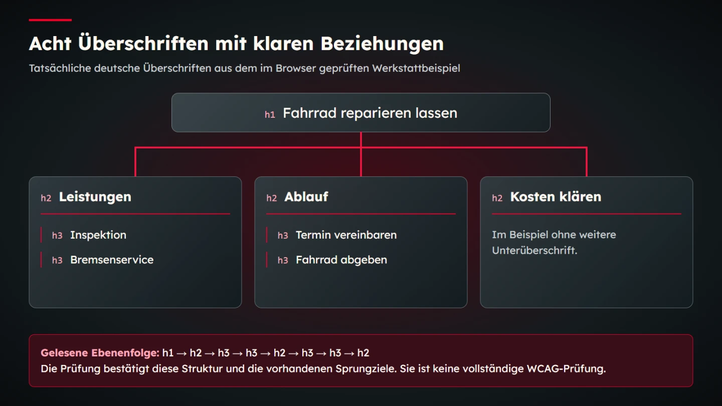
In the workshop example, Bicycle repair occupies the first level. Services, Process and Discussing costs are equal main sections and receive h2. Inspection and Brake service are subtopics of Services and receive h3. Arrange an appointment and Drop off your bicycle are h3 headings within Process. Discussing costs has no further subdivision in this short example. A section does not require another level merely because other sections have one.
Do not choose a level because its default appearance happens to fit. If a second-level heading should look smaller, change its design rather than replacing it with h4. In this example, jumping directly from h1 to h3 would add no useful relationship. Clarify the missing parent level instead. Returning from a subtopic to a main section is different: moving from h3 back to h2 is an expected part of the hierarchy.
The WAI headings tutorial explains the structural role of heading levels. Apply that principle to the actual content. The number of paragraphs does not mechanically determine a heading level. A long section can still address one topic. More subdivision helps when it expresses a recognizable relationship between independent questions, rather than simply breaking the page at visually convenient intervals.
4. Review wording independently of the layout
A heading should provide orientation without its accompanying image or preceding paragraph. Discussing costs identifies a concrete section in the example. Transparent and fair expresses an attitude but does not reliably identify the information underneath. Such language can be useful in a paragraph. As the only section name, however, it remains imprecise for someone looking for a particular answer.
The explanation of WCAG 2.2 Success Criterion 2.4.6 addresses the descriptive function of headings and labels. This cannot be reduced to a fixed minimum word count. A short word can provide an appropriate cue in context. The workshop outline is therefore assessed through concrete questions: which work is covered here, which step follows and where are costs discussed? These questions are more useful than requiring every heading to contain the same number of words.
Avoid artificial distinctions between almost identical headings. Process and How it works would be difficult to tell apart as separate equal-level sections. Divide their contents meaningfully or combine them. Repeated components can use similar titles when they perform the same function on different pages. Within one long page, however, names must lead reliably to the intended information. A heading that sounds polished but points ambiguously is still weak navigation.
5. Distinguish sections, articles and containers
HTML provides different elements for different jobs. A section can group related thematic content. A neutral container may be needed only for arrangement. A self-contained contribution is a different unit from an arbitrary layout column. The HTML Living Standard describes the relevant elements and headings. This example uses explicitly selected heading levels so its intended relationships remain visible in the markup.
Do not treat a new section element as an automatic substitute for choosing an appropriate level. In the example, h1, h2 and h3 still express the relationships directly. Equally, each paragraph does not need its own section. A semantic unit requires a content reason. If a container merely places two elements side by side, a div can be the appropriate neutral choice. Adding semantic names without a clear purpose does not automatically improve the result.
A useful question is whether the area would still deserve its own thematic name without the layout. Services does. The left half of a decorative composition may not. Too many apparently meaningful elements do not create better structure if their meaning remains unclear. The content plan and HTML should express the same relationships. Decide how those relationships will appear visually after their intended meaning is understood, rather than using the current layout to invent the content model.
6. Read a complete small HTML example
The following document contains the eight headings of the workshop example. Its navigation points to three section identifiers that actually exist. It is explicitly named as navigation within the page. The copy promises neither direct online booking nor a fixed repair quote. Appointments and costs are discussed. This keeps the wording consistent with the process that the document describes.
<!doctype html>
<html lang="en">
<meta charset="utf-8">
<title>Bicycle repair | Fictional workshop</title>
<main>
  <h1>Bicycle repair</h1>
  <p>An overview of services, the process and discussing costs.</p>
  <nav aria-label="On this page">
    <ul>
      <li><a href="#services">Services</a></li>
      <li><a href="#process">Process</a></li>
      <li><a href="#costs">Discussing costs</a></li>
    </ul>
  </nav>
  <section id="services">
    <h2>Services</h2>
    <h3>Inspection</h3>
    <p>We discuss the required scope of the inspection.</p>
    <h3>Brake service</h3>
    <p>The necessary work is assessed on the bicycle.</p>
  </section>
  <section id="process">
    <h2>Process</h2>
    <h3>Arrange an appointment</h3>
    <p>First we discuss a suitable appointment.</p>
    <h3>Drop off your bicycle</h3>
    <p>We record the agreed job when you drop it off.</p>
  </section>
  <section id="costs">
    <h2>Discussing costs</h2>
    <p>The scope and expected costs are agreed.</p>
  </section>
</main>
</html>
The paragraphs are deliberately short to keep the structure visible. A real workshop would need its actual service limits, contact routes and agreements. Adding those facts would not automatically require more heading levels. First determine which new questions deserve independent sections. Do not copy these fictional statements into a real business page without checking their accuracy. A correct structure cannot make an invented operational promise true.
7. Give equal topics an equal visual treatment
Design should support relationships already established in the outline. Equal main sections receive a dependable shared treatment. Their subtopics remain distinguishable. Font size, weight and spacing can work together. A colour change alone is often an inadequate sole signal of a different relationship. In particular, check whether the visible design encourages readers to group information differently from the markup.
Spacing contributes to the statement. If Brake service sits closer to the next main section than to its own paragraph, its association becomes uncertain. A repeated gap before headings and a deliberately smaller gap to their content can make the connection clearer. There is no universally correct pixel value. Typeface, line length and screen width influence which spacing works in the particular design. Assess the relationships in the final composition rather than approving an isolated spacing token.
Include long headings in the review. Text that fits on one line on a wide screen may need several lines on a narrow device. It must not be clipped or hidden by a fixed height. The hierarchy remains the same when wrapping changes. A mobile presentation should solve the space requirement rather than replacing the semantic level or removing important words. Shortening a heading is an editorial decision that must preserve its meaning.
8. Add orientation tools suited to the page
Headings and landmarks provide orientation at different scales. Main content, navigation and supplementary material can be identified as different areas. The ARIA Authoring Practices on landmarks explain this structural navigation. This does not mean that every small section should become another named region. A large collection of similar regions can make the overview harder to use.
Three main-section links are sufficient for the short workshop example. A lengthy handbook might need a more detailed table of contents. Such a list should point to existing targets and use understandable names. An automatically generated list must retain those targets after editorial changes or update them deliberately. Duplicate identifiers and fragments that no longer exist create avoidable dead ends. This is especially easy to overlook when the visible heading text has been improved but its links have not been checked.
A skip link to the main content performs a different job from a table of contents. It can bypass repeated page elements. The contents list opens topics within the content. Neither should be added purely from habit: both need to work meaningfully in the real page shell. Check the actual navigation with a keyboard. A visible link does not by itself establish that its target is reached reliably or that a person can continue navigating usefully afterwards.
9. Review reusable components in context
A card headed Inspection may need h3 within a services section. If the same card appears in a different context on a standalone overview, another level may be appropriate. A component should therefore not answer every embedding situation with a fixed h2. The objective is an understandable structure for the whole page, rather than individual blocks that merely look correct in isolation.
Document permitted contexts in the design system. A component can accept an explicit heading level or offer clearly defined variants. The suitable implementation depends on the technical environment and editorial tasks. What matters is that meaning is not determined accidentally by a CSS class. Font size and semantic level need independent decisions. Naming an option small should not silently imply that its heading belongs several levels deeper in the content.
Test at least one complete assembled page. Individual component previews cannot reveal whether two blocks generate the same identifier or whether a parent heading is missing. A technically valid card can create a confusing outline in the wrong context. The final review therefore belongs to the page containing all its actual regions. Include supplementary content and global navigation, because their headings and landmarks also contribute to the full experience.
10. Correct common mistakes deliberately
| Observation | Problem | Useful correction |
|---|---|---|
| Every paragraph starts with h2 | Subtopics appear to be equal main topics | Group related content and assign sublevels deliberately |
| A bold paragraph serves as the section title | Visible and programmatic structure diverge | Use a real heading at the appropriate level |
| h4 is chosen for its small font | Appearance determines meaning | Keep the correct level and style it with CSS |
| Several sections are called Further information | Destinations are hard to distinguish | Name the specific content |
Correct the content groups before correcting the markup. Automatically replacing every h4 with h2 could be as wrong as the original document. The current level alone does not reveal the intended relationship. For an accumulated page, create a small outline containing its actual subjects. You can then explain the correction and use the reasoning during later maintenance. This is more dependable than applying a global search-and-replace based solely on appearance.
Where possible, preserve existing fragment targets if other pages refer to them. A clearer heading does not necessarily require a new identifier. If identifiers change, check the affected links. A language improvement should not silently damage a working entry point. This concerns the page's contents list and known references from other articles. A maintained relationship between content and target is useful even when the display wording evolves.
11. Check the concrete output
The example's actual sequence can be read from the browser. Exactly eight headings with the agreed levels are expected. The three fragment targets and uniqueness of identifiers are checked as well. A deliberately damaged variant with h4 instead of h3 must be detected. This establishes more than the fact that some test ran successfully: it checks whether the test can recognize the particular mistake it is intended to catch.
Add an editorial review to the structure checks. Read the heading list without the paragraphs. Then inspect the visible grouping at narrow and wide widths. Use the actual accessibility tools and assistive technologies available in the review environment when that assessment is required. Reading the DOM does not replace every user experience and is not a complete accessibility evaluation. Report what was examined instead of allowing a small technical check to imply a much broader approval.
- Does the main heading identify this page's content?
- Do the main sections name distinguishable questions?
- Are subtopics assigned to the correct parent topic?
- Do visible and technical relationships agree?
- Does each contents link lead to its intended target?
- Do long headings remain fully visible at narrow widths?
- Has the complete assembled page been reviewed?
12. Preserve the outline when content changes
An outline remains useful only when it is maintained as content grows. If the workshop adds another service, first place it within the existing services section. A new main section needs a genuinely independent information requirement. The page can then grow intelligibly rather than gaining another level or an arbitrary slogan whenever more text arrives. Its structure continues to express relationships that someone can explain.
Record the intended relationships in a short content plan. The plan should not freeze every sentence. It explains which questions are treated together and why. A later writer can add a service without reinventing the structure. Technical checks can still detect duplicate identifiers and unexpected levels. Whether a new heading describes its content clearly remains an editorial responsibility. Combining these checks is more useful than expecting either automation or visual review to answer every question alone.
A good heading structure is therefore more than a one-time formatting decision. It is a dependable agreement between content, design and implementation. The workshop page demonstrates that agreement at a small scale: one identifiable subject, three main questions and appropriately assigned subtopics. A more extensive business website should preserve the same clarity while allowing its actual information needs to determine the detail.
Sources and scope
Sources were opened on 9 November 2026. The MDN reference for HTML heading elements provides additional element documentation. The workshop document and its checks are bounded learning examples created for this guide. They assert no real workshop services, user study or complete WCAG conformance.