Semantic HTML explained through a complete example page
A small event information page shows how meaning, structure and interaction fit together. Includes complete source code and a checklist for existing projects.

A web page is more than a collection of visible rectangles. A large line of text might be a genuine heading or a generic container with a large font size. Those implementations can initially look identical while behaving differently for keyboard users, assistive technologies and developers maintaining the code.
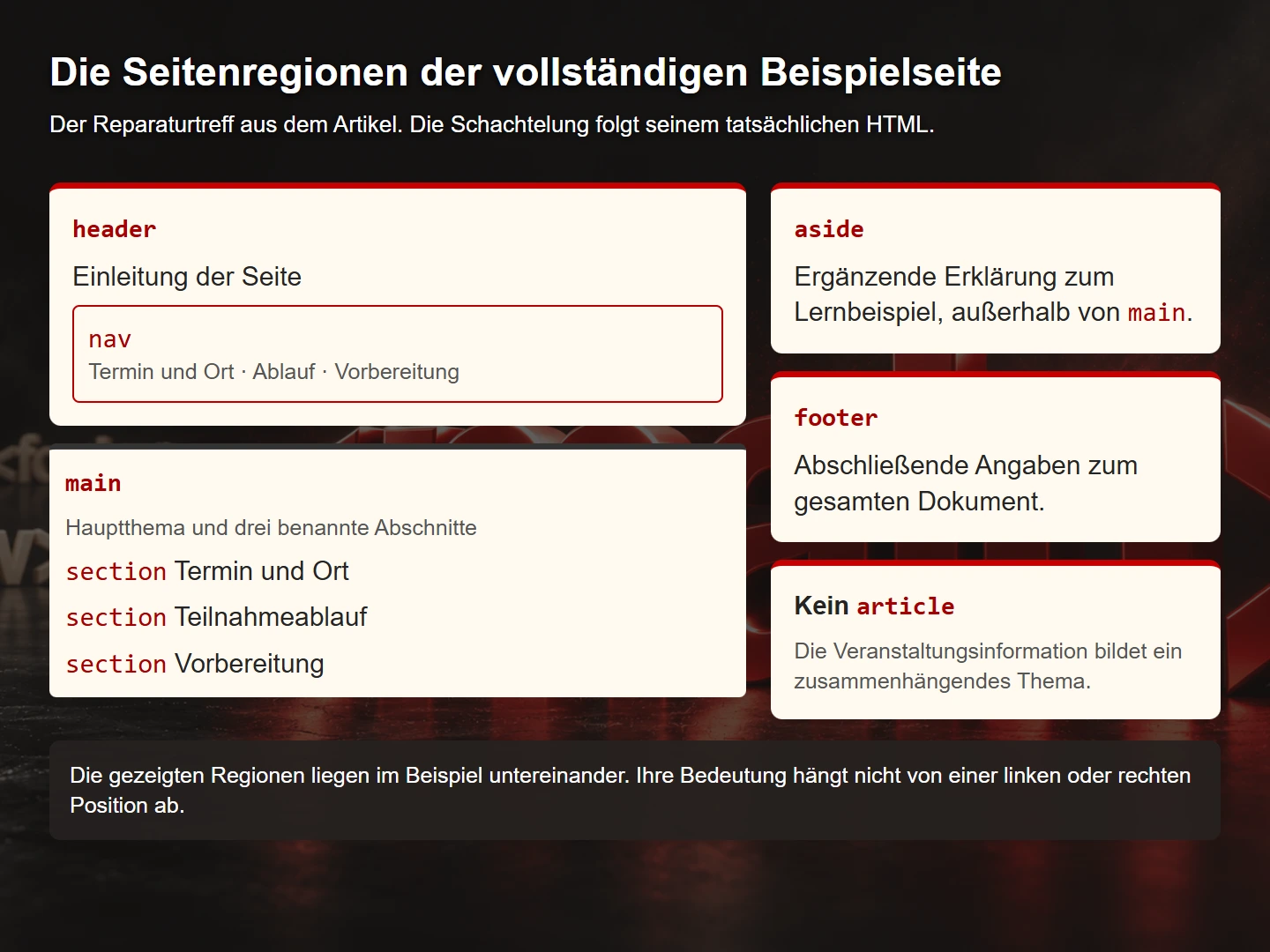
This guide builds a complete, small information page for a fictional community repair event. It needs neither a framework nor JavaScript. The example demonstrates how content, page regions and native interaction fit together. Additional examples explain forms and controls. All code is educational material rather than a security assessment of a production application.
1. Understand the content first
Choose an HTML element after identifying the content's purpose. Event dates and locations are not the same kind of information as the main navigation. An individual repair story may stand on its own. Travel instructions, on the other hand, form part of the wider event information.
Our example has three visitor tasks: find the next event, understand what happens and determine which items are suitable. Those tasks suggest the sections “Date and location”, “How it works” and “Preparation”. Additional information about the educational example follows the main content.
This planning step prevents semantic elements from becoming new names for decorative boxes. A container does not become an article because it has a coloured background. Conversely, a meaningful article may include several visually different sections. Meaning follows the relationship between content rather than the number of borders drawn around it.
Write one sentence for each region: “This region helps visitors to …”. If its purpose is difficult to state, its task may be unclear. The exercise often improves headings too. “Which items can I bring?” says more than “Information”. That improvement happens before implementation begins.
2. Distinguish the main structural elements
| Element | Typical purpose | Selection question |
|---|---|---|
| header | Introductory material for a document or section | What does this introduce? |
| nav | An important navigation region | Does this group of links support orientation? |
| main | The page's dominant content | What is this page actually about? |
| article | A self-contained composition | Could this item stand on its own? |
| section | A thematic section | Does this region have a coherent topic? |
| aside | Related but separable content | Is this supplementary to the main discussion? |
| footer | Closing information for its containing context | Which document or item does this belong to? |
| div | A neutral container | Is grouping or presentation the only purpose? |
The WHATWG HTML specification defines these elements and their intended relationships. A useful practical distinction is that an article represents a potentially independent item while a section groups a topic. A neutral div remains appropriate when no additional semantic meaning is intended.
Not every link needs a nav. A source reference within a paragraph is simply a link. Main navigation and a table of contents are more plausible navigation regions. Likewise, aside does not mean “anything displayed on the right”. Its supplementary role remains the same if CSS later places it below the main text.
3. Build a complete example page
Save this source as repair-event.html and open it in a browser. It works without other files. The event, location and date are fictional. A few CSS declarations make the page comfortable to read, while the information remains understandable without them.
<!doctype html>
<html lang="en">
<head>
  <meta charset="utf-8">
  <meta name="viewport" content="width=device-width, initial-scale=1">
  <title>Repair event: date and preparation</title>
  <meta name="description" content="A fictional learning page about a community repair event.">
  <style>
    body { margin: 0 auto; max-width: 68rem; padding: 1.25rem;
           font: 1.1rem/1.65 system-ui, sans-serif; color: #202326; }
    a { color: #a40000; text-underline-offset: .2em; }
    :focus-visible { outline: 3px solid #a40000; outline-offset: 4px; }
    nav ul { display: flex; flex-wrap: wrap; gap: 1rem; padding: 0;
             list-style: none; }
    section { margin-block: 2rem; }
    footer { margin-top: 3rem; border-top: 1px solid #777; }
  </style>
</head>
<body>
  <a href="#content">Skip to content</a>
  <header>
    <p>A fictional place to repair things together</p>
    <nav aria-label="Main navigation">
      <ul>
        <li><a href="#event">Date and location</a></li>
        <li><a href="#process">How it works</a></li>
        <li><a href="#preparation">Preparation</a></li>
      </ul>
    </nav>
  </header>
  <main id="content" tabindex="-1">
    <h1>The example neighbourhood repair event</h1>
    <p>Explore the structure of a small event information page.</p>
    <section aria-labelledby="event">
      <h2 id="event">Next date and location</h2>
      <p><time datetime="2026-12-05T14:00:00+01:00">5 December 2026, 2 pm CET</time></p>
      <p>Fictional venue: Example House, 1 Example Street.</p>
    </section>
    <section aria-labelledby="process">
      <h2 id="process">How participation works</h2>
      <ol>
        <li>Describe the problem when you arrive.</li>
        <li>Discuss with the team whether an inspection is possible.</li>
        <li>Stay with the team while working together.</li>
      </ol>
    </section>
    <section aria-labelledby="preparation">
      <h2 id="preparation">What you can prepare</h2>
      <p>Write down the fault and bring available documentation.</p>
      <details>
        <summary>Why is a fault description useful?</summary>
        <p>It helps narrow down the problem and possible inspection.</p>
      </details>
    </section>
  </main>
  <aside aria-labelledby="example">
    <h2 id="example">About this learning example</h2>
    <p>The event is fictional. This page explains HTML structure.</p>
  </aside>
  <footer>
    <p>Semantic HTML: original learning material by Agentur Zentral.</p>
  </footer>
</body>
</html>
The visible skip link leads to the main content. Navigation targets existing headings. The date is readable and also has a machine-readable representation. The expandable explanation uses a native element, so its basic interaction does not require custom scripting.
There is deliberately no article in this example. The main content is a coherent set of event information. A separate repair report could be an appropriate article. Good semantics does not mean using as many different tags as possible.
Open or save the complete HTML example page
4. Treat headings as a content outline
The headings should form a useful overview when read together. Our main heading is followed by three h2 sections. Subsections could use h3. CSS determines the visual size afterwards. A smaller type size does not require a lower heading level.
The W3C headings tutorial explains rank-based organisation. Avoid skipping levels when opening a deeper subsection where possible. Returning to a higher level when closing a subsection is a normal part of the outline.
A common component problem is a card that always renders an h3, even when it immediately follows the main heading. The component should receive a suitable level from its actual context. That choice belongs in the component interface rather than being driven only by font size.
Review the page as a list of headings. Do the statements make sense without the images between them? Are different subjects given the same vague label? Is a necessary level missing between a main topic and detail? This simple review can reveal issues concealed by a visually elaborate layout.
5. Choose links and buttons by their task
A link navigates to an address or another part of a document. A button performs an action. This distinction avoids many unnecessary custom controls. Opening a contact page is a link task. Applying a filter to the current view may be a button task.
<a href="/en/contact">Get in touch</a>
<button type="button">Apply filters</button>
The second example still needs the corresponding application logic. A label does not implement filtering. The explicit type also prevents the control from accidentally becoming a form submission button if it is later moved inside a form. Actual submission should deliberately use type="submit".
The MDN button documentation describes its properties and types. A clickable div would require additional implementation for native behaviours such as keyboard activation and focus. The appropriate native element is the simpler starting point for ordinary buttons.
Link wording belongs to semantics too. An icon without an understandable accessible name can hide its task. “Date and location” identifies a specific destination in our example. Several unrelated links labelled “Here” would make that orientation weaker.
6. Give form controls real labels
Form controls need an understandable association between their label and input. Placeholder text is not a reliable replacement. It disappears during entry and may conceal information the person still needs. A visible label should continue to explain the expected information.
<label for="item">Which item would you like to describe?</label>
<input id="item" name="item" type="text"
       aria-describedby="item-help">
<p id="item-help">For example: a desk lamp with a broken switch.</p>
The label's for value exactly matches the input ID. The help text is associated through aria-describedby. The W3C form labels tutorial explains explicit labelling as an appropriate standard approach.
A production registration system also needs validation, processing and accurate feedback. The HTML relationship solves one part of that task. Required fields should be identified understandably. Error messages should explain what needs correcting and remain associated with the relevant control.
Avoid unnecessary renaming through ARIA. If the visible label says “Item” while its accessible name says “Product description for your support request”, people using different interaction methods encounter inconsistent wording. Additional attributes should clarify relationships rather than arbitrarily replace native meaning.
7. Explain data and images in context
A sequence of steps is appropriately expressed as an ordered list. Independent prerequisites often suit an unordered list. The distinction is meaningful: must the order remain intact, or is ordering merely visual? A decorative number alone does not answer that question.
Tables describe relationships between rows and columns. A schedule containing dates, times and venues can justify a table. The overall page layout should not be constructed as one. A single event date, as in our example, is easier to understand as a paragraph.
| Content | Suitable starting point | Relationship to check |
|---|---|---|
| Repair process | ol containing li | Sequence matters |
| Items to bring | ul containing li | The points belong together |
| Multiple event dates | A table with header cells | Rows and columns remain understandable |
| An informative photograph | An image with an appropriate alternative | The meaningful information remains available |
An image may be placed in a figure with a caption when it is a self-contained illustration in the text. The caption does not automatically replace alternative text. If it contains only a credit, the image's informational purpose may still need explaining.
8. Review semantics separately from presentation
Temporarily remove the visual styling for one review. The result does not need to look polished. What matters is whether reading order and meaning remain understandable. If an important prerequisite appears after an unrelated region, the visual layout may previously have concealed a structural issue.
A second review examines interaction. Tab through the page, activate the links, open the explanation and return. Native elements provide a useful starting point, but custom styles or scripts can still interfere with their behaviour. Verify the implementation rather than assuming that a tag guarantees success.
A third review uses the accessibility inspection features in browser developer tools. Inspect the computed role and name for individual elements. This does not replace testing with a screen reader, but can expose some incorrect relationships directly. Relate each observation to a concrete visitor task.
Our example is intentionally small. Larger applications need the same questions answered in dialogs, dynamic results and error states. Correct initial markup does not guarantee that a component inserted later is equally understandable. Include those states in the review plan.
Review a semantic change through a visitor task
A practical counter-check starts with a concrete question for the example page: which service is offered, and how can someone begin an enquiry about it? Read the headings first, then examine the related paragraphs and finally the contact route. This sequence reveals whether the outline explains the information or merely names visual areas. A heading should describe the section that follows, giving readers a useful basis for deciding whether to continue. The exercise focuses on the relationship between structure and an actual information need.
Next, compare the visible organisation with the actual HTML. A panel does not become a distinct subject simply because it has a red background. A genuinely separate subject may also share its background with surrounding material. The important question concerns the content relationship. For each proposed section, explain which coherent subject begins there and where it ends. When that explanation is difficult, an additional structural division may be unnecessary. This check also makes discussions between design and editorial work more specific than a general request to add more sections.
A contact component benefits from a second question: what interaction is actually available here? Following a link to a contact page serves a different purpose from pressing a button that submits a current selection. The label and the chosen element should reflect that purpose. Also consider whether the visible label remains understandable when encountered apart from its surrounding paragraph. A brief word such as Continue may be sufficient within a familiar form sequence, while the same word repeated across unrelated cards may make the available choices harder to distinguish.
During a revision, record which information remains unchanged and which relationships are being altered. The example page might retain the same services while grouping them more clearly. That differs from adding a new service. A screenshot comparison alone therefore cannot establish that the revision preserved the intended meaning. Read the content outline again and follow the interaction route. Unchanged appearance does not prove unchanged structure, and a different appearance does not by itself demonstrate a stronger semantic foundation. Keep these observations separate so that each can be reviewed on its own terms.
These counter-checks are proposed editorial review steps, not claims about a completed user study. They connect markup review with a recognisable task. If actual interaction problems are observed later, the same task helps describe the affected point more precisely: missing orientation in the outline, an unclear content relationship or an interaction that does not match the intended action. A precise description gives the next revision a useful target.
9. A code review checklist
- A meaningful main heading identifies the page topic.
- Heading levels reflect the actual hierarchy.
- Page regions match their content purpose.
- Article and section are selected by meaning rather than background colour.
- Links navigate and buttons perform suitable actions.
- Controls have clear labels and necessary instructions.
- IDs are unique and internal references reach existing targets.
- Lists and tables represent the intended relationships.
- Reading order remains useful without CSS.
- Keyboard and assistive technology use have been checked through realistic tasks.
Describe review findings with a specific trigger. “Improve semantics” is too vague. “The registration uses a link without a destination as its submit control” identifies a particular problem and supports a targeted correction.
10. Improve an existing component step by step
An existing project does not always need a complete rewrite. Start with a clearly bounded component. Consider a service card whose entire area responds to a click. First determine whether it navigates to another page or performs an action in the current view. Only then is it clear whether it needs a link or button.
Record its current states before changing it: the normal view, keyboard focus and any expanded detail. Check repeated instances if the component appears in a list. Duplicate IDs and unsuitable heading levels often become visible only through repetition.
Change the element and then adjust its styling deliberately. A native button has browser defaults that differ from those of a generic container. It is fine to style those defaults. Removing visible focus without providing a replacement, however, can turn a semantic improvement into a new interaction problem.
Test the function again. For a link, check the actual destination and context-menu behaviour. For a button, check the triggered action and error states. Ensure that event handlers do not now run twice and remove obsolete keyboard workarounds added for the previous generic container.
A useful review explains the observable improvement: the control now has a name matching its task and works with the expected interaction. “We added semantic tags” says less because it describes an implementation technique rather than the resulting experience.
Document the corrected version as a reusable component. An example showing suitable heading levels, understandable names and verified keyboard behaviour can be more useful than a long list of abstract prohibitions. The aim is to stop the same problem being introduced on the next page.
Common questions about semantic HTML
Is div inherently bad?
No. A neutral container is appropriate for grouping or presentation without additional meaning. Problems arise when it recreates an existing concept such as a button or heading while omitting its expected behaviour.
Does semantic HTML automatically make a page accessible?
No. It provides an important foundation. Contrast, focus management, understandable wording and actual interaction must also work.
Does every section need another landmark?
The exposed meaning depends on context and naming. Choose relationships deliberately and inspect the result. Creating additional regions is not an objective in itself.
Do more semantic elements automatically improve ranking?
There is no established automatic relationship of that kind. An understandable structure supports interpretation and use of the content. It does not replace helpful information or broader technical and editorial quality.
Sources and next steps
Foundations: the WHATWG HTML Living Standard and the linked W3C WAI and MDN documentation. Checked on 9 November 2026. The repair event is an original fictional learning example. Start by reviewing headings and controls on one of your own pages, then complete a full keyboard journey.
The wider planning context is covered in What a professional business website needs to achieve. For the German legal framework, read Accessible websites and Germany's BFSG.