Flexbox and Grid through practical layout tasks
From action rows to card collections: understand layout relationships and build resilient solutions for different amounts of content.
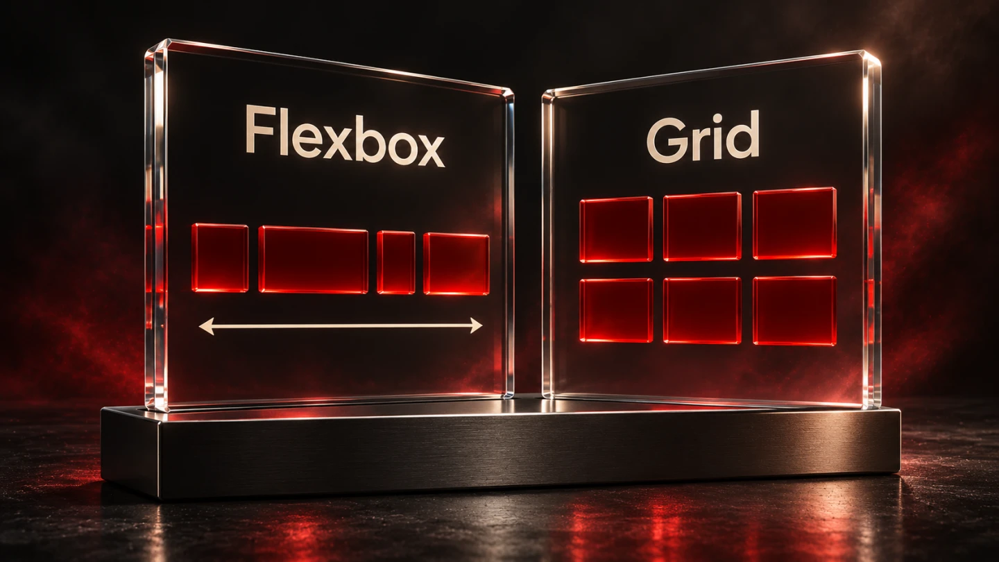
A row of buttons and a three-column service overview may initially look similar. Their requirements differ. Buttons should follow their content and wrap when space runs out. Service cards may need consistent columns across several rows. Describing that relationship first makes the layout model easier to choose and maintain.
This guide develops a fictional three-service overview. Its examples explain design decisions rather than reporting project results. You can try the code in an HTML file. Basic familiarity with HTML, CSS selectors and the box model is assumed.
1. Describe the relationship between the items
Start by asking whether items mainly follow a row or column, or whether several rows and columns must align together. A toolbar often needs a flexible row. A repeated collection of cards often benefits from a shared grid.
Flexbox can create several wrapped lines, but those lines do not establish continuous shared columns. Width distribution can differ on each line. That can be exactly what a collection of variable-length tags needs. If the next row must retain the same column relationships, Grid is usually the more suitable starting point.
The MDN explanation of layout relationships describes this basic distinction. Treat it as a decision aid rather than a prohibition on other combinations. The actual task and subsequent testing still determine suitability.
| Task | Useful starting point | Important check |
|---|---|---|
| Actions with variable-length labels | Wrapping Flexbox | Long labels and text enlargement |
| Several rows of cards | Grid | Track widths and varying content |
| An icon beside a text block | Flexbox | Wrapping and shrinking content |
| Main content with a supplementary column | Grid | Reading order on narrow layouts |
| Actions at the bottom of cards | Flexbox within Grid cards | Different amounts of content |
2. Build an action row with Flexbox
The example offers three routes: explore services, understand the process and get in touch. Labels may differ in length. They do not need identical fixed widths simply for decoration. A flexible row with wrapping matches the task.
<nav class="actions" aria-label="Next steps">
  <a href="#services">Explore services</a>
  <a href="#process">Understand the process</a>
  <a href="#contact">Get in touch</a>
</nav>
.actions {
display: flex;
flex-wrap: wrap;
align-items: center;
gap: .75rem;
}
.actions a {
display: inline-flex;
align-items: center;
min-block-size: 2.75rem;
padding: .6rem 1rem;
border: 2px solid #a40000;
border-radius: .6rem;
color: #a40000;
overflow-wrap: anywhere;
}
.actions a:focus-visible {
outline: 3px solid #202326;
outline-offset: 4px;
}The gap creates consistent space between items without special first-item or last-item margin corrections. Wrapping permits additional lines when there is insufficient width. A minimum height allows room for the label without imposing a fixed height that could cut off enlarged text.
These values are illustrative choices rather than a universal design standard. Test them with the real typeface, language and audience. Larger text or a longer translation can make a label occupy several lines. The component should accommodate that change rather than hide it.
3. Understand the main and cross axes
Many Flexbox properties refer to a main axis and a perpendicular cross axis. Their directions depend on factors including flex-direction and writing mode. Saying that justify-content is always horizontal is therefore an incomplete explanation.
For the usual horizontal writing mode and flex-direction: row used here, items initially follow a row. justify-content distributes available space along the main axis. align-items affects cross-axis alignment. Switching to a column changes how those axes map onto the screen.
The MDN Flexbox fundamentals explain these terms. A practical debugging step is to display the chosen axes in browser developer tools. Then check whether the container actually has free space for the selected property to distribute.
A common mistake is adding alignment rules to a container that is only as large as its content. Little may visibly change because no relevant space remains. Inspect actual dimensions first. Adding more properties without understanding that starting state makes the stylesheet harder to reason about.
4. Examine growth, shrinking and minimum sizes
A row containing a small icon and a long text block normally requires different behaviour for each item. The icon should retain its size. The text should use the remaining room and wrap. The CSS should express those distinct responsibilities.
.notice-row {
  display: flex;
  align-items: flex-start;
  gap: 1rem;
}
.notice-row__icon {
  flex: 0 0 2rem;
}
.notice-row__text {
  flex: 1 1 auto;
  min-inline-size: 0;
  overflow-wrap: anywhere;
}
The explicit zero minimum matters because content-based minimum sizing can otherwise prevent the desired shrinking. Long addresses and technical identifiers often expose that limitation. Here, text can wrap instead of making the entire page wider.
Apply such adjustments to the affected item deliberately. Hiding overflow globally can conceal the symptom while making information inaccessible. Also consider whether a long, indivisible value belongs in that narrow region at all or needs another presentation.
5. Develop a card collection with Grid
The service overview needs shared columns across multiple rows. Keep the content in a meaningful HTML order, then let Grid distribute cards across the available space. A grid that automatically adjusts its column count provides a useful starting point.
.service-list {
  display: grid;
  grid-template-columns:
    repeat(auto-fit, minmax(min(100%, 16rem), 1fr));
  gap: 1.5rem;
  margin: 0;
  padding: 0;
  list-style: none;
}
.service-list > li {
  min-inline-size: 0;
}
In this example the desired minimum track width is 16 rem. The inner 100 percent limit prevents that minimum from overflowing an even narrower container. The remaining space is shared using 1fr. Additional columns appear when sufficient space is available.
This rule does not solve every content problem. A data table with meaningful column relationships or a complex application can have different requirements. For a straightforward set of service cards, however, it offers a testable foundation without prescribing a fixed column count for every device category.
The W3C Grid specification defines the two-dimensional grid model. The particular combination of track size, spacing and card content here is an original example design. Its suitability still needs checking against the actual content.
6. Combine Grid and Flexbox inside a card
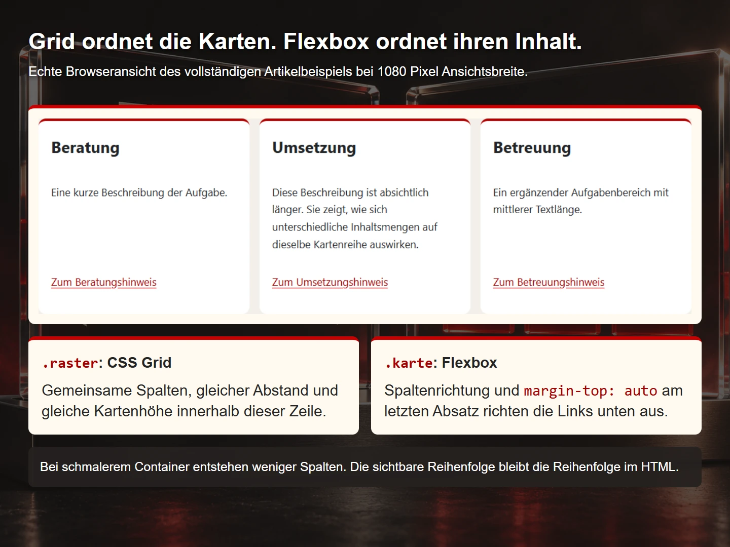
The cards contain descriptions of different lengths. Their onward links should nevertheless appear in a comparable position. Each card can use an internal flex column, allowing an automatic top margin to push its actions towards the end of the available space.
.service-card {
  display: flex;
  flex-direction: column;
  block-size: 100%;
  padding: 1.5rem;
  border: 1px solid #767676;
  border-radius: 1rem;
  background: #fff;
}
.service-card__actions {
  margin-block-start: auto;
  padding-block-start: 1rem;
}
The description is not artificially truncated. The shared outer grid and internal alignment solve different tasks. Grid expresses relationships between cards; Flexbox arranges the contents of an individual card. This division of responsibilities makes the combination understandable.
Check the box model. When a full available height is combined with padding, box-sizing: border-box provides a useful foundation. Inspect the computed size in the browser. Testing only a single short card can hide overflow that appears with realistic content.
7. Try a complete small example
The following page runs independently. Save it as layout.html. Three different descriptions demonstrate how the two layout methods work together. Resize the browser and replace the text with longer content to investigate its behaviour.
<!doctype html>
<html lang="en">
<meta charset="utf-8">
<meta name="viewport" content="width=device-width,initial-scale=1">
<title>Grid and Flexbox: a learning example</title>
<style>
  * { box-sizing: border-box; }
  body { margin: 0 auto; padding: 1.25rem; max-width: 72rem;
    font: 1.05rem/1.65 system-ui; overflow-wrap: anywhere; color: #202326; background: #f3f0e9; }
  .grid { display: grid; gap: 1rem; padding: 0; list-style: none;
    grid-template-columns: repeat(auto-fit,minmax(min(100%,16rem),1fr)); }
  .card { display: flex; flex-direction: column; height: 100%;
    padding: 1.25rem; background: white; border-top: .3rem solid #b00000;
    border-radius: .75rem; min-width: 0; overflow-wrap: anywhere; }
  .card h2 { margin-top: 0; }
  .card p:last-child { margin-top: auto; padding-top: 1rem; }
  a { color: #a40000; text-underline-offset: .2em; }
  :focus-visible { outline: 3px solid #202326; outline-offset: 4px; }
</style>
<main>
  <h1>Three fictional services</h1>
  <ul class="grid">
    <li><article class="card">
      <h2>Consulting</h2>
      <p>A short description of the task.</p>
      <p><a href="#notes">Read the consulting note</a></p>
    </article></li>
    <li><article class="card">
      <h2>Implementation</h2>
      <p>This description is intentionally longer. It demonstrates how
         different amounts of content affect cards within the same row.</p>
      <p><a href="#notes">Read the implementation note</a></p>
    </article></li>
    <li><article class="card">
      <h2>Ongoing support</h2>
      <p>An additional area with a medium-length explanation.</p>
      <p><a href="#notes">Read the support note</a></p>
    </article></li>
  </ul>
  <h2 id="notes">About the example</h2>
  <p>These services are fictional. The page only demonstrates layout behaviour.</p>
</main>
</html>
The three links deliberately lead to an existing explanatory section. There is no pretend booking system or invented success state. Replace both content and destinations with the actual services when using the pattern in a real project. Preserve a meaningful underlying reading order.
8. Align visual and interaction order
Layout techniques can rearrange items visually. The underlying reading and keyboard sequences do not automatically follow every visual rearrangement. If order matters to understanding, express that relationship in the source first.
For example, a price should not be far from its associated service in reading order merely because CSS positions it attractively on screen. Inspect the page without styling and then with the keyboard. The sequence needs to retain its meaning.
The Flexbox specification covers flexible item arrangement. Our practical editorial rule is straightforward: visually rearranging content should not replace an order required for understanding. That avoids surprising jumps between visible placement and actual focus movement.
9. Investigate common failures systematically
| Symptom | Possible cause | Next inspection |
|---|---|---|
| A card makes the page wider | Long content or minimum sizing | Inspect computed minimum width and wrapping |
| Alignment seems ineffective | The wrong axis or no free space | Inspect container size and flex-direction |
| Card text is cut off | A fixed height | Try longer text and review the height rule |
| Wrapped Flexbox rows do not share columns | Independent line distribution | Consider whether a shared Grid is required |
| Focus jumps unexpectedly | Visual reordering | Compare DOM order with the tab sequence |
Change one cause at a time during diagnosis. Fixed widths, negative margins and hidden overflow can interact in confusing ways. A small isolated example containing the problematic content often explains the behaviour better than additional corrections to the whole site.
10. Calculate track sizes transparently
A simple calculation explains why three one-third columns plus gaps can overflow. Assume a container has an inner width of 1,000 pixels. Three columns require two 16-pixel gaps. That leaves 968 pixels for the tracks, or approximately 322.67 pixels per equal column.
Three tracks of 33.333 percent would already consume nearly all 1,000 pixels before the gaps were added. Grid can distribute the remaining space with fractions without manually repeating the subtraction in every track rule.
.three-columns {
  display: grid;
  grid-template-columns: repeat(3, minmax(0, 1fr));
  gap: 16px;
}
This example deliberately remains three columns wide. It is not a complete responsive solution. It demonstrates space allocation. A real service overview also needs a decision about the minimum useful card width and when the number of columns should change.
Fractional pixels in developer tools are normal for such calculations. Their presence alone is not a layout failure. What matters is whether the overall allocation works and remains stable. Adding a fixed correction to the final track can damage an otherwise consistent relationship.
Equal fractions also do not guarantee that every possible piece of content fits comfortably. A long identifier can still require a wrapping strategy. Inspect both the computed tracks and the content they contain. The space calculation and text handling solve different parts of the problem.
11. Consider the container as well as the device
The same card can occupy different areas at the same screen width. An overview might use the full content region, while a supplementary area provides only a narrow column. Viewport width alone does not reliably describe how much room the component has.
The automatically fitting grid already responds to its available container space. Container queries can support additional internal component changes when necessary. This article focuses on the fundamental layout systems. The first diagnostic question is still how much actual room the element receives.
For a review, prepare a normal main-content view, an intentionally narrow container and enlarged text. The exact pixel numbers matter less than whether the content keeps its function. A fourth check using a longer translation can expose further weaknesses.
Document the intention as a small component rule. For example: “The overview creates as many columns as fit at the chosen minimum width. Each card retains the order heading, explanation and onward link.” That explains the design better than an uncommented collection of historical viewport breakpoints.
Avoid rigid assumptions about typical devices. A narrow window on a large desktop display can create the same problem as a mobile device. Testing based on content and available space provides a more useful foundation.
Review the card example with different content
One additional review situation is to make only one card title substantially longer. Leave the other titles unchanged and retain the same container width. This isolates a particular dependency instead of changing several conditions at once. Observe whether the title wraps inside its card and whether the following information still forms a coherent group. If a neighbouring card's link moves, describe that observation before choosing a correction. An apparently suitable fixed height may conceal the visible symptom without improving the relationship between the content and the space available to it.
Then examine the decisions inside one card. A title needs room according to its content, while an action should remain easy to locate. Those goals do not automatically require rigid pixel heights. In the supplied approach, the outer grid and the internal card structure have different responsibilities. Identify the actual goal: equal outer card heights, aligned links or simply a comfortable distance between description and action. These goals are related but are not interchangeable. An explicit decision is easier to preserve through later editorial changes than a coincidental alignment that nobody has described.
A further counter-check concerns the number of cards. Consider removing one card and then adding an extra card, while retaining the other content and spacing rules. Ask which relationship the last row should keep. Should its items follow the same column tracks as the preceding row, or should they distribute space within their own row? This intended relationship helps distinguish a shared grid from line-by-line distribution. It gives the choice a more useful foundation than a blanket instruction to fill every empty area. Empty space can be an intentional consequence of a consistent structure rather than evidence that the layout is unfinished.
Include editorial work in the review. A different language may produce longer action labels. An additional qualification may turn a short description into two paragraphs. Review those changes against the intended content relationships. A clear design can have boundaries, provided the team describes them deliberately. For example, a family of cards may require a shared information structure so that comparisons remain meaningful. That structure should be part of the editorial brief. It should not emerge as a hidden requirement only after a longer description disrupts the appearance of an otherwise carefully designed page.
Keep these proposed counter-checks separate from the tests already executed for the complete example. The content variants described here are suggestions for further investigation, not retrospectively claimed measurements. For each variant, record the changed condition, the expected relationship and the observed presentation. A later correction can then be checked against the same condition again. Choosing between Flexbox and Grid becomes a question about whether a rule preserves a required relationship across relevant changes, rather than whether one particular screenshot looks convincing. This makes the eventual decision easier for another developer or editor to understand.
12. A layout acceptance checklist
- The chosen method matches the relationship between items.
- Short, long and missing optional content have been considered.
- Addresses and technical identifiers do not create page overflow.
- Narrow containers work without relying on device labels.
- Text enlargement and longer translations have been checked.
- Source order remains meaningful.
- Keyboard focus is visible and follows the content.
- Fixed heights do not cut off important information.
- Colours and contrast have been inspected in the actual appearance mode.
- Realistic content has been used rather than only equal-length placeholder text.
Common questions about Flexbox and Grid
Does Grid replace Flexbox?
No. They make different relationships convenient to express. Both can work together within a single component.
Does every responsive grid need media queries?
Not for every task. Automatically fitting tracks can cover many simple overviews. Targeted queries still help when other content changes require them.
Why does text overflow despite flex-shrink?
Inspect the affected item's minimum size and any unbreakable content. Shrinking does not remove every content-dependent constraint.
Are equal-height cards always better?
No. They can make a comparison easier to scan, but should not cut content or create unreasonable empty areas. The decision depends on the content and comparison task.
Sources and further reading
The linked MDN guides and W3C specifications provide the foundations. Sources checked on 9 November 2026. Concrete design values and learning examples were developed specifically for this article.
Continue with Semantic HTML through a complete example and Designing understandable navigation.