Designing navigation people can understand
From content inventory to testing: connect understandable labels with relevant destinations and coherent visitor journeys.
Navigation is a small part of a website with a surprisingly large number of decisions behind it. What belongs in the main menu? Which services should be grouped? Is search necessary? How should the same structure work on a narrow screen? A polished menu bar alone cannot answer these questions.
This guide develops a process from content inventory to testing. A fictional occupational safety consultancy provides the running example. The tasks and menu labels are planning examples, not findings from a study or a universal prescription for every consultancy.
1. Inventory the existing content
Start a navigation redesign with an inventory. Record the address, title, content type and owner of each existing page. Note whether the information is current, outdated or substantially duplicated elsewhere. A menu designed around unresolved content can become a storage place for old organisational problems.
The example consultancy might have pages about risk assessments, training, workplace inspections and the organisation itself. Some explain services. Others help existing customers prepare documents for an appointment. Those different kinds of content do not necessarily need equivalent positions in the main menu.
Separate content decisions from menu placement initially. An important page can be easy to reach through an appropriate context without having its own top-level entry. Conversely, a historically prominent menu position does not automatically justify keeping it. Its role in visitor tasks should guide that decision.
| Inventory field | Example | Decision supported |
|---|---|---|
| Content type | Service description | Choose an appropriate overview |
| Audience | Small business management | Review labels and entry points |
| Currency | Requires professional review | Revise before publication |
| Relationship | Preparing for an inspection | Link from the relevant process |
2. Use visitor tasks rather than departments
Internal departments are not always meaningful outside the organisation. “Specialist unit B” helps only if the audience already knows that name. Visitors to the consultancy are more likely to need a risk assessment, arrange staff training or prepare for an existing appointment.
Write short task scenarios. For example: “You have taken over a business and want to understand what occupational safety support is available.” Another might be: “A consultation is booked and you need the preparation documents.” The two tasks may require different entry points.
Tasks should reflect the actual offer and be specific enough to assess. “Learn about us” has no clear completion point. “Find out whether training can take place at your premises” has a recognisable goal. You can later determine whether the destination page genuinely answers the question.
Prioritise tasks with the people responsible for the service. Which occur frequently? Which matter operationally or commercially? What happens if someone fails? This is a project decision. A general rule about the ideal number of menu items cannot replace that work.
3. Choose labels with predictable destinations
A navigation label creates an expectation that its destination should meet. “Solutions” can mean almost anything. “Training” is more specific in our example. “Knowledge” and “News” also imply different types of content: one suggests lasting explanations while the other suggests time-sensitive updates. The actual content should match.
Specialist terminology can be useful when the audience uses it. It does not need to be simplified indiscriminately. A purchasing manager may search for a specific professional service. An overview can add a short explanation so that less experienced visitors can also understand the term.
Avoid several similarly named routes without clear boundaries. If “Consulting”, “Support” and “Services” appear together, people need to understand what each contains. Otherwise every selection becomes a guess. A shared service overview with well-organised subtopics may be easier to use.
Review labels separately from visual design. Put the menu items and expected destinations on cards or in a plain list. Ask people unfamiliar with the organisation to describe what they expect behind each label. Their responses provide qualitative signals. A small sample cannot establish universal percentages about every future visitor.
4. Build an understandable content structure
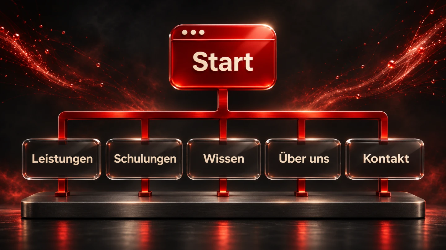
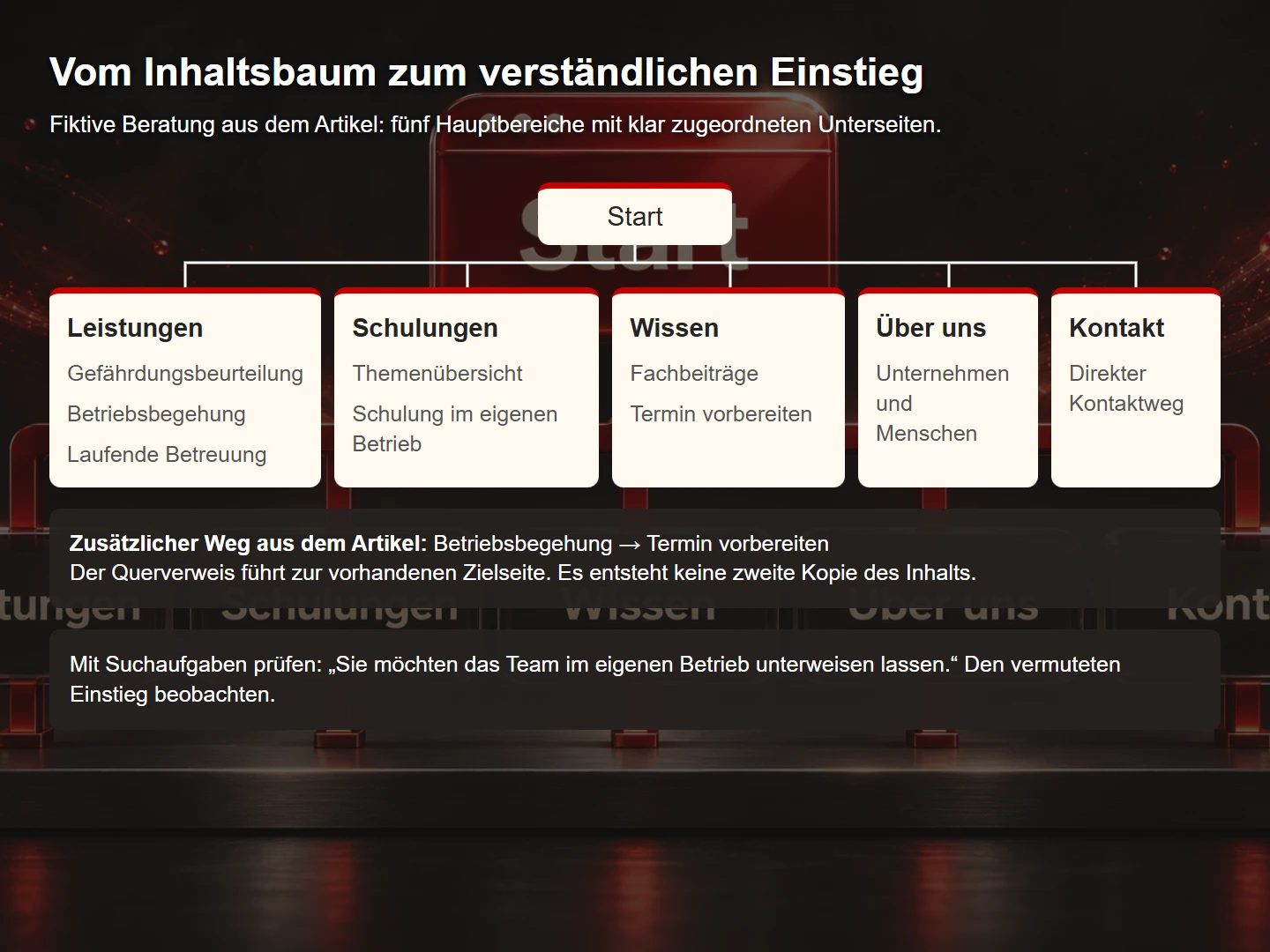
The fictional consultancy might start with “Services”, “Training”, “Knowledge”, “About us” and “Contact”. Whether training deserves a separate top-level position or belongs under services depends on its scope and significance. Both approaches can work. The distinction must make sense to the people using the site.
Home
├── Services
│   ├── Risk assessment
│   ├── Workplace inspection
│   └── Ongoing support
├── Training
│   ├── Topic overview
│   └── Training at your premises
├── Knowledge
│   ├── Guides
│   └── Prepare for an appointment
├── About us
└── Contact
This tree is an editorial proposal rather than a measured ideal. Check whether each destination has a clear home. Frequently needed cross-connections can also appear in the content. A workplace inspection page might link directly to appointment preparation.
A page can be reachable from several contexts without being recreated with almost identical information. This avoids competing versions and simplifies maintenance. Navigation can provide different paths to one professionally maintained explanation.
5. Use simple HTML as a reliable foundation
The basic form of ordinary website navigation is straightforward: a named navigation region containing links. The following fragment does not introduce specialist application-menu roles. Replace the example addresses with real destinations in the project.
<nav aria-label="Main navigation">
  <ul class="main-navigation">
    <li><a href="/services" aria-current="page">Services</a></li>
    <li><a href="/training">Training</a></li>
    <li><a href="/guides">Knowledge</a></li>
    <li><a href="/about">About us</a></li>
    <li><a href="/contact">Contact</a></li>
  </ul>
</nav>
Here, aria-current="page" identifies the actual current page. It must not remain on the same link across every view. Determine the value from the active route and complement it with a visible current-page indicator.
The W3C menu structure tutorial explains the foundations of navigation regions. Distinct names such as “Main navigation” and “Article navigation” help distinguish separate regions. Their names should communicate their respective purposes.
6. Test mobile interaction as a complete journey
Narrow screens change the available space, but content relationships should remain recognisable. If the desktop says “Services” and mobile suddenly says “Explore”, returning visitors have to learn another vocabulary. A compact presentation does not need an unrelated set of labels.
An expandable menu needs an understandable control and a recognisable state. Its links should be reachable when open and focus should not disappear when it closes. A full-screen layer introduces additional focus-management questions. For a small set of links, an openly visible list that wraps may be simpler.
Allow for different word lengths. Translations can require more space than the original wording. Text enlargement may turn a single-line bar into several lines. Include those cases in the design review rather than discovering them later through clipped labels.
Test the entire journey: open the menu, choose a destination, use the back function and select another target. A screenshot records the appearance of one state. Focus behaviour and subsequent navigation require actual interaction checks.
7. Give submenus a clear interaction model
Submenus can expose additional levels, but they also create more states to manage. Content shown only on pointer hover creates difficulties for touch and keyboard use. A slight pointer movement can also close a menu unintentionally.
The W3C fly-out menu guidance addresses these interaction questions. Define what a top-level label does: does it open a page or expand a submenu? If both functions are offered, provide distinguishable controls for the two tasks.
A useful overview page can reduce the need for deeply nested menus. It can explain and compare related subjects before linking to details. That is especially useful when visitors need to understand unfamiliar terms. A large dropdown containing twenty unexplained labels may support that task less effectively.
Limit complexity to actual need. More menu behaviour creates more states to test. A mega-menu should follow from the content and visitor tasks rather than being treated as a requirement for a professional website.
8. Investigate the structure with findability tasks
A simple structure test can happen before the final visual design. Show the content tree and give the participant a concrete task. Ask them to choose a route and explain their expectation. Observe the initial selection and points where uncertainty appears.
| Task | Observation | Possible response |
|---|---|---|
| Find training at your premises | Choice between services and training | Clarify the distinction or regroup content |
| Find documents for an appointment | Expected route for existing customers | Add a direct link from confirmation messages |
| Resolve a technical question | Understanding of the knowledge section | Clarify a category or label |
Describe the goal without giving away the menu label. “Open Training” mainly checks whether someone can read a label. “You want the team trained at your own premises” reveals which route they would select independently.
Record observations rather than retrospective assumptions. Did the participant actually go back? What question did they ask? How did they describe the destination? A small qualitative study can identify possible problems. It does not represent every audience or justify unsupported statistical claims.
9. Evaluate success using several observations
A high click count on a menu item is not automatically positive. People may need that route because the home page leaves something unclear. A low count is ambiguous too: the content may be unimportant or the label may not be understood. Context determines what the number can tell you.
Combine usability observations, questions received by staff and suitable usage data. Task completion and the quality of the answer matter. Quickly finding a page is of limited value if the necessary information is missing from it.
The following priorities are an editorial working aid rather than a statistical scale. They organise possible responses. The team still needs to judge significance for its own offer and audiences.
| Priority | Observation | Typical response |
|---|---|---|
| Immediate | An important destination cannot be reached | Repair the link or interaction failure |
| High | People repeatedly expect the wrong destination | Review the label and grouping |
| Planned | The route is understandable but unnecessarily long | Add a useful contextual connection |
| Optional | A purely visual refinement | Address during design review |
10. Consider navigation and search discovery together
Internal linking explains relationships to visitors and supports the discovery of content. Important pages should be reachable through meaningful real links. A scripted clickable area without an appropriate address is not an equivalent foundation for navigation.
Google's guidance on crawlable links explains suitable link elements and informative anchor text. For our example, the risk assessment page should be linked from an appropriate service context and offer useful related detail.
Avoid automatically linking every recurring keyword. Each connection should provide a useful next step. A preparation guide can lead to the relevant service description. A link on every occurrence of “safety” may create distraction rather than orientation.
Link wording, page titles and destination content should describe the same subject. This consistency supports both human interpretation and automated processing. Extra metadata cannot repair a menu that promises something its destination does not provide.
When introducing a new menu label, check whether the same subject remains recognisable in the destination title and opening paragraph. A clear link can still disappoint when the destination uses unrelated terminology or answers a different question. Include arrival in each findability task: has the person reached the expected information, and can they identify a useful next step? This counter-check connects navigation with the content people actually need. It avoids improving labels while leaving visitors disoriented immediately after the click, and gives editors a concrete reason to review both ends of an important link.
11. Introduce changes in a controlled way
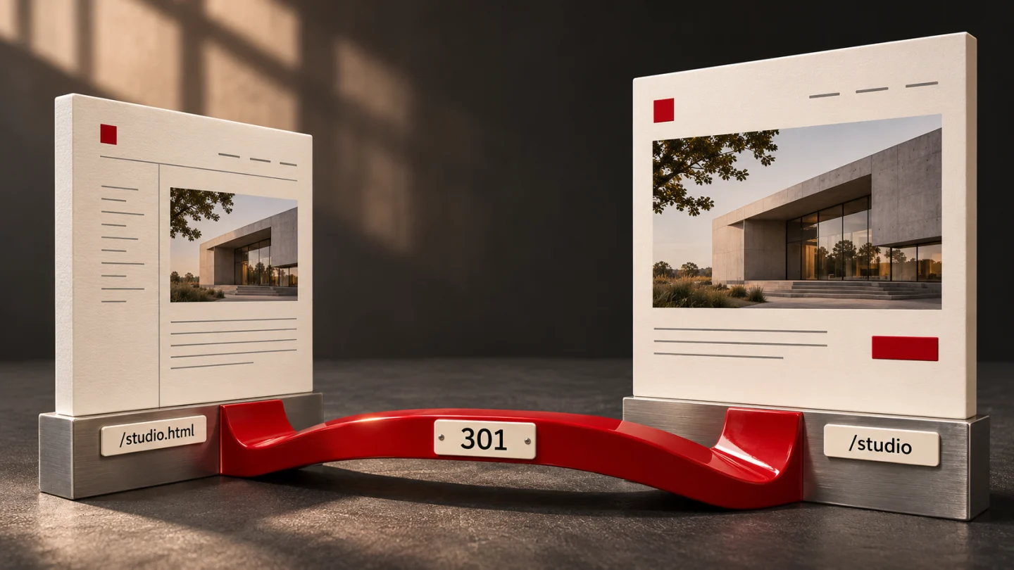
Navigation can change without changing addresses. First decide whether a URL change is genuinely necessary. Each additional change expands the review scope. If addresses do change, map old destinations to appropriate new ones and configure redirects.
Record the main visitor journeys before release and repeat them afterwards. Include entry through search engines, direct email links and references in older articles. Those visitors do not necessarily begin on the home page.
Assign responsibility for future content placement. If every new service is added to the main menu without review, the original organisation gradually disappears. A short editorial rule can help preserve the structure and make later additions more consistent.
12. Divide work between the main menu, breadcrumbs and search
The main menu does not have to do every orientation job. Breadcrumbs can explain where a detail page sits within a multi-level structure, particularly for people arriving directly from elsewhere. They should show the content hierarchy rather than merely reproducing the visitor's recent browsing history.
Our example might use “Home, Services, Risk assessment”. The middle link leads to an overview where related services can be compared. The current page remains identifiable without necessarily linking to itself.
Section navigation has another role. Within the knowledge area, it may organise topics or content types. Not every section label belongs in the main menu. Visitors should understand whether they are changing pages within an area or leaving that area altogether.
Search supplements those routes when the volume of content and visitor tasks justify it. Useful results require more than a technical match. A title, short explanation and possibly content type should help people judge relevance. An unsuccessful search needs another useful route, such as a topic overview or contact option.
The footer provides a reliable place for recurring organisational and legal information. It is not a substitute for service navigation. Reconsider a structure where a central visitor task is reachable only through a dense group of general footer links.
Document this division of responsibilities: the main menu opens major areas, section navigation organises their contents, breadcrumbs explain position and search supports specific terms. The rule gives future contributors a practical basis for assessing new additions.
A navigation acceptance checklist
- Existing content and important audiences have been identified.
- Typical visitor tasks are specific enough to test.
- Labels create reasonable expectations about destinations.
- Overviews and detail pages have clear relationships.
- Frequently needed cross-connections appear in the content.
- The current page and expanded states are recognisable.
- Mouse, keyboard, touch and enlargement have been checked.
- Mobile and translated versions retain understandable labels.
- Destinations, redirects and older references work.
- Someone owns the placement of future content.
Common questions about navigation
How many main menu items are ideal?
No single count fits every offer. Distinct tasks, understandable labels and a testable structure matter more. A few vague labels are not automatically better than a slightly larger set of precise entry points.
Can search replace navigation?
It usually plays a supplementary role, especially for people who already know a term. A clear structure also helps visitors exploring an unfamiliar offer.
Should Contact always appear in the main menu?
An easy-to-reach contact route is useful for many businesses. Whether it appears as a menu item, a highlighted action or both depends on the design and tasks.
Sources and further guides
Foundations are the linked W3C WAI tutorials on menu structure and fly-out interaction, plus Google Search Central on links. Checked on 9 November 2026. The content tree, task scenarios and priority table are original editorial examples.
Continue with Semantic HTML through a complete example, Requirements for a professional business website and Planning redirects for a relaunch.