Visual hierarchy: guiding visitors through a page
Use scale, contrast, grouping and clear content to create an understandable journey. Includes a design workflow and concrete review questions.

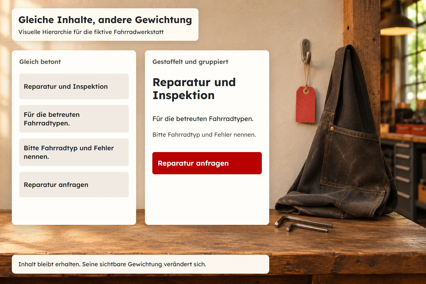
A home page can contain all the required information and still be difficult to understand. When the offer, promotion, company history and newsletter demand equal attention, visitors have to decide the priorities themselves. That effort can obscure a simple question: am I in the right place?
This guide shows how a content inventory becomes an understandable visual journey. A fictional bicycle workshop offering repairs, inspections and advice provides the running example. The alternatives are editorial design proposals. They do not represent customer measurements or claimed increases in enquiries.
1. Identify the visitor question before adding emphasis
Design needs a reasoned sequence. The workshop may want to highlight its history, a new service and an available inspection appointment simultaneously. Someone with a broken bicycle is more likely to need the service scope, acceptance conditions and contact route. A large anniversary number does not answer those questions.
Write down the main visitor question before designing: “Can this workshop repair my bicycle, and what should I prepare before making contact?” That identifies the essential information. The type of work must be recognisable. The supported bicycle types and relevant limitations need explaining. A suitable enquiry route should then be available.
This prioritisation does not make other content worthless. History can support confidence and a personal story can shape the brand. Those elements become useful where they support a decision. Visual hierarchy translates an editorial priority into an observable arrangement.
A practical rule is that every strongly emphasised element needs a sentence explaining its significance for the current task. If that explanation is difficult, the emphasis may reflect an internal preference more than a visitor need.
2. Use three importance levels for an initial sketch
Our initial model distinguishes three levels. The first answers the main question. The second explains prerequisites and supports the claim. The third offers additional detail. This is an editorial working model, not a mandatory number for every interface.
| Level | Workshop example | Design purpose |
|---|---|---|
| Orientation | Repairs and inspections for the bicycle types actually supported | Make the offer clear early |
| Decision | Acceptance conditions, required information and process | Explain relationships and reduce uncertainty |
| Detail | History, supplementary notes and related guides | Deepen interest without displacing the main entry |
The priorities can change on a detail page. Someone who has opened the inspection description may no longer need a general introduction. The precise service scope becomes more important. Develop the hierarchy for each task and page type rather than applying the home-page arrangement everywhere.
The home page does not need to answer every possible question in full. It needs enough orientation to help people choose the right next content. An overloaded first screen can fail that job just as easily as a large, vague slogan with no explanation.
3. Use size as a relationship
A large title can mark an entry point, but its effect depends on its surroundings. If every heading is enormous, the distinction disappears. If supporting text becomes tiny, the title remains dominant while the necessary explanation becomes hard to read.
Start with a few deliberately chosen sizes. A main heading, section headings and a comfortable body size already provide a useful foundation. Add differences only when they serve another content role. A card label does not necessarily need a new size if weight and spacing already explain the relationship.
Exact values depend on the typeface, line length and viewport. Two fonts set to the same CSS size can have visibly different proportions. Check real words and paragraphs rather than relying exclusively on an alphabet specimen.
In the workshop design, a concise main heading may communicate more strongly than an oversized sentence. If a word breaks awkwardly on a narrow screen, review the wording before simply making the whole heading smaller.
4. Reserve contrast for orientation
Contrast attracts attention. It can involve light and dark, large and small, or still and moving elements. A strong accent colour is particularly noticeable in a restrained environment. Giving every card a different highlight creates competing signals.
The enquiry action might receive the strongest colour emphasis. Technical notes remain legible but do not use the same action styling. A warning may need a distinct shape and label so that it is not mistaken for an ordinary contact button.
Do not sacrifice legibility to establish hierarchy. The W3C explanation of text contrast describes a minimum of 4.5:1 for ordinary text under the relevant AA criterion and 3:1 for qualifying large text. Its conditions determine how a particular example is assessed.
Less important does not mean difficult to see. Supporting information can recede through placement, grouping and a quieter style while remaining readable. That distinction is useful when discussing a design with stakeholders who equate reduced prominence with reduced visibility.
5. Make relationships visible through proximity
People should be able to tell which explanation belongs to which heading. A heading placed closer to the preceding paragraph than to its own text communicates a contradictory grouping. These small problems can affect the rhythm of an entire page.
Use spacing deliberately rather than treating it as leftover space. A short scale can assign different roles: tight spacing within a content unit, larger spacing between independent sections and sufficient separation before a new decision. The relationships matter more than maximising every gap.
For the workshop, an acceptance time and its restriction belong together. “By prior arrangement only” should not appear detached from the service it qualifies. A technically accurate sentence can become practically misleading if the visual grouping suggests a different relationship.
The Nielsen Norman Group overview of visual hierarchy discusses scale, contrast and grouping as design tools. Our workflow turns that broad idea into task-specific decisions and observable review questions rather than treating it as a fixed recipe.
6. Give each decision situation a primary action
A page can offer several useful routes, but should explain when each route is appropriate. Equally prominent contact, shop, download and newsletter controls in the opening section leave that decision unresolved. The apparent abundance of choice can hide the task the page is meant to support.
“Request a repair” might be the main action on the repair page. “View the service scope” can be a supporting text link. Newsletter registration represents another intention and may fit better in a later editorial context.
The primary action must create an accurate expectation. “Book an appointment” suggests a different level of commitment from “Request an appointment”. Strong styling should not conceal an unresolved business process. The wording follows what actually happens next.
Review the states after activation as well. Emphasising the first click offers little value if the destination is confusing or submission feedback is missing. Hierarchy supports a sequence of decisions rather than ending at the first screen.
7. Treat images as content
An image often claims more attention than a paragraph. It therefore needs a specific purpose. An actual workshop photograph can explain the environment. A technical illustration can describe a repair process. An arbitrary decorative image may instead obscure the message.
Image size should match significance. Turning a secondary illustration into the largest surface creates the wrong emphasis. Conversely, a small piece of evidence can disappear even though it answers the reader's most important unresolved question.
Inspect the crop on small screens. If the meaningful detail disappears, the image may become decoration only. Provide suitable text alternatives for its information. A visual sequence should not make the content available solely to people who can see the composition.
Generated images can explain abstract concepts when their role remains clear. They should not imply that invented staff, premises or results actually exist. The cover for this guide deliberately uses abstract material forms for that reason.
8. Align visual and semantic structure
Large text is not automatically a heading. HTML should express the same content organisation as the visible design. Otherwise different interaction methods can reveal different structures. The appearance and document hierarchy should reinforce one another.
The W3C headings tutorial explains their role in organising and navigating content. Choose heading levels from the content relationship, then apply the desired visual size through CSS.
<section aria-labelledby="preparation">
  <h2 id="preparation">Prepare your repair enquiry</h2>
  <p>Describe the bicycle type, observed fault and how to reach you.</p>
  <a class="action-primary" href="/contact">Request a repair</a>
</section>
This is a structural example. The address and service details must match the actual project. The class can emphasise the contact link while preserving its role as a link. A later visual adjustment does not require changing the heading level.
9. Define mobile priorities explicitly
Desktop layouts often arrange content side by side. Narrow screens usually require a sequential presentation. The reading order needs a reasoned sequence; simply stacking a coincidental source order can place supplementary detail before the essential answer.
Begin with a coherent linear content version before using larger screens to express additional relationships. Avoid CSS arrangements that make visual order conflict with keyboard navigation. An action pulled forward visually may otherwise appear unexpectedly late in the interaction sequence.
The W3C explanation of reflow describes making content usable under its stated conditions without losing information or requiring unnecessary two-dimensional scrolling. In our example, the title, qualifications and actions should still belong together when the presentation is enlarged.
Include long names, translations and actual error messages in the review. A polished sample containing only short words does not demonstrate that the hierarchy remains stable in everyday use.
10. Review the hierarchy with concrete questions
A brief look at a page can be a useful initial design exercise. Ask what offer was apparent and what next step stood out. Without a defined method and suitable sample, this qualitative activity does not establish reliable success rates.
Follow it with a complete task. Someone might need to establish whether their bicycle is supported and what information an enquiry requires. Observe whether the emphasis helps at the relevant points or directs attention elsewhere.
| Review question | Possible problem | Possible response |
|---|---|---|
| Is the offer clear early? | An image or slogan hides the actual service | Clarify and appropriately emphasise the main statement |
| Does a qualification belong visibly to the offer? | A restriction appears unrelated | Adjust grouping and spacing |
| Is the next step understandable? | Several equally strong actions compete | Separate tasks and revise action emphasis |
| Does the structure survive on mobile? | Secondary information appears first | Revisit sequence and reflow |
11. Explain changes through observations
A review becomes more precise when observation and proposed response are separate. “Make the button larger” is already a solution. The underlying observation might be that an enquiry action disappears among three other red elements. Reducing competition may solve that problem more effectively than increasing size.
Record the task, observed uncertainty and intended behaviour for each change. Repeat the same journey afterwards. A different crop might improve the overall emphasis while removing the important technical detail from the picture.
Do not judge attractive fragments permanently in isolation. A card that looks excellent on its own may dominate the wider system. The relevant measure is whether the complete arrangement supports the visitor's task.
Useful documentation therefore explains why a particular statement is emphasised in this project and which observations support that choice. It does not need to present a project decision as a universal design law.
12. Record reusable design rules
A successful hierarchy should remain recognisable across later pages. That does not require identical layouts. Reuse the meaning of the design tools and the relationships between them. A strongly filled action should not suddenly identify an optional aside on another page.
A small system can define important spacing, type levels and action variants. This CSS sketch is a starting point for experimentation, not a set of universal recommended values. Check it with the actual font and content.
:root {
  --space-tight: .5rem;
  --space-group: 1.25rem;
  --space-section: 3rem;
  --text-body: 1.0625rem;
  --text-title: clamp(2rem, 4vw, 3.5rem);
}
.content-section { margin-block: var(--space-section); }
.content-section h2 { margin-bottom: var(--space-tight); }
.content-section p { max-width: 65ch; }
.page-title { font-size: var(--text-title); line-height: 1.15; }
.action-group { display: flex; flex-wrap: wrap;
                gap: var(--space-group); align-items: center; }
The system also needs usage guidance. “Primary action” describes a task. “Red button” describes only an appearance. The task description helps another contributor decide which variant suits a new piece of content.
The repair enquiry can be primary on the workshop's service page, while a link to preparation documents supports it. On a page dedicated to preparation, the document list itself may become the central content. Reuse means consistent rules applied in a deliberately chosen context.
Keep a small set of review cases with the system: a narrow viewport, a long title, several content lengths and relevant display modes. After a font change, those cases can be inspected again. The system does not guarantee error-free pages, but makes changes assessable against known requirements.
Separate necessary relationships from creative flexibility. A label must remain connected to its content. An image or section arrangement may change as long as the main task remains understandable. That combination allows a recognisable identity to accommodate varied material.
13. A pre-publication checklist
- The main visitor question is defined for each page type.
- The strongest entry explains a specific offer.
- Type sizes and weights have meaningful roles.
- Supporting information remains readable.
- Spacing expresses the intended relationships.
- Action labels match the actual process.
- Images support information rather than merely fill space.
- Heading structure and visible emphasis agree.
- Mobile reading order and keyboard order remain coherent.
- Enlargement, light/dark modes and longer text have been checked.
- A concrete task has been completed from start to finish.
- Changes are documented with an observation and purpose.
Common questions about visual hierarchy
Must the most important element always be at the top?
It should be recognisable where the task requires it. An action may only make sense after necessary prerequisites have been explained. Early orientation still matters.
Is a strong accent colour sufficient?
No. Its effect depends on the surrounding composition and competing signals. Labels, position and context must work too.
Can a quiet design have a strong hierarchy?
Yes. Clear proportions, deliberate spacing and precise content can guide people without adding many decorative stimuli.
Review the hierarchy as a whole when content changes. A new workshop service may deserve a place beside the established main action, but that does not mean every announcement needs equal emphasis. Record which task takes priority and which information first establishes suitability. This keeps the reasoning understandable as the actual content evolves over time.
Maintain a small set of realistic content variations for future reviews: a longer service name, an additional prerequisite and a more descriptive action label. Check each variation in the same narrow and broad views. This reveals whether scale and spacing still express meaningful relationships or merely accommodate the original short specimens. Document the assessment against the visitor task. A quieter-looking composition by itself does not establish that orientation has improved.
Sources and further reading
The linked W3C WAI explanations of headings, contrast and reflow and the Nielsen Norman Group overview were checked on 9 November 2026. The workshop example, review matrix and design workflow are original editorial tools.
Continue with Requirements for a professional business website, Understandable navigation and Semantic HTML through a complete example.