What a professional business website needs to achieve
From the first visitor question to a successful enquiry: assess content, design and technology through specific tasks.
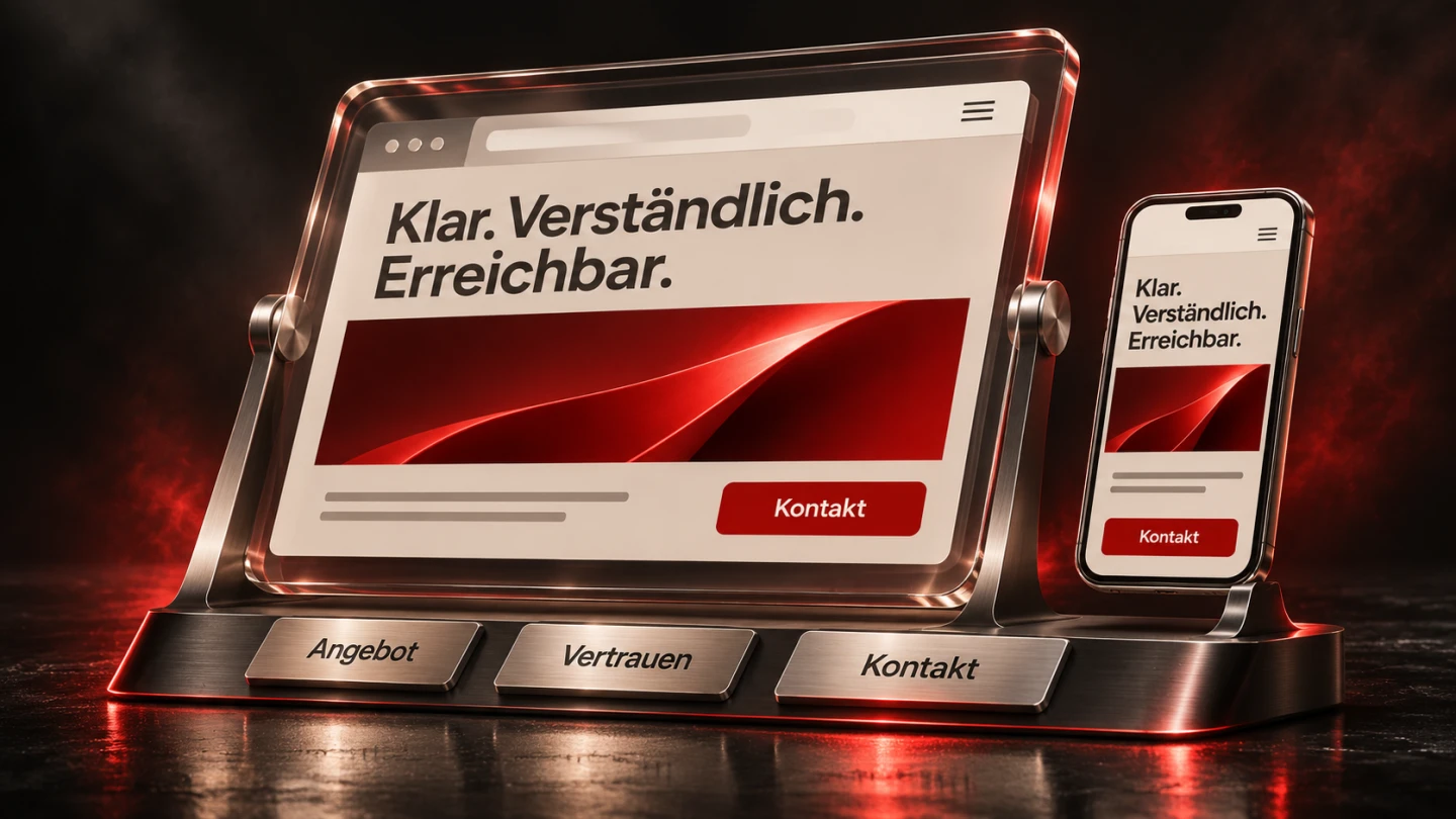
A business website can look impressive and still fail its main purpose. Visitors may recognise the industry without understanding which problems the company solves. Attractive photographs may leave the actual service scope unclear. Someone ready to enquire may lose their message after an unexplained form error.
Professional quality comes from content, design, development and maintenance working together. This guide provides a practical way to assess that combination. A fictional company maintaining commercial ventilation systems serves as the running example. It illustrates planning decisions rather than reporting customer results. The method also applies to consultancies, trade businesses and many other services.
1. Start with a specific task
“We need a modern website” expresses an aspiration rather than a task. A more useful brief for the maintenance company is that commercial property managers should understand which systems are supported, whether their building is in the service area and what information is needed for an initial enquiry. That statement immediately informs navigation, page content and the contact process.
Job applicants form another possible audience. They need information about daily work, qualifications and hiring contacts. Their questions differ from those of a purchasing manager. Giving both journeys identical emphasis in the first screen can make the page harder to understand. A clear primary route and a recognisable careers route may serve both groups better.
Create a task card for each important journey. Record the audience, situation, main question, required evidence and intended next action. “More enquiries” is too broad to guide implementation. A relevant service enquiry containing enough information for a first response is easier to assess. The card becomes a reference when deciding whether another feature or section is necessary.
| Planning question | Maintenance company example | Website implication |
|---|---|---|
| Who is visiting? | Technical property managers | Describe specific services |
| What is uncertain? | Whether this system is supported | Explain system types and limitations |
| What evidence helps? | A documented maintenance process | Show the workflow and required records |
| What should happen next? | A useful initial enquiry | Provide suitable fields and an accurate confirmation |
2. Explain the offer without assuming prior knowledge
Companies describe their work from an internal perspective. Visitors may not share that vocabulary. A heading such as “Integrated system solutions” leaves the actual service open to interpretation. “Maintenance of commercial ventilation systems in Braunschweig and the surrounding area” identifies the work, application and geographic scope. The company must first confirm that the statement is accurate.
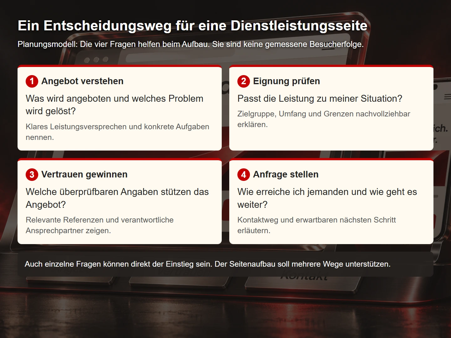
A useful service page answers five questions: Who is the service for? Which problem does it address? What is included? How does the engagement work? What information is needed for an initial assessment? Pricing can support that decision if its assumptions and limitations are clear. A starting price should not imply that complex projects are covered by the same amount.
Arrange the page around the reader's decision. Introduce the task and offer, explain scope and process, then provide evidence and a contact route. A detailed company history can be valuable, but should not obscure urgently needed service information. Clear structure makes room for depth without giving every paragraph the same visual emphasis.
A practical editing technique is to annotate each paragraph with the visitor question it answers. Check whether the answer appears elsewhere, whether it needs evidence and whether the wording is specific enough. Paragraphs with no identifiable purpose should be revised or removed. Length is useful when it resolves uncertainty.
3. Design orientation as a connected journey
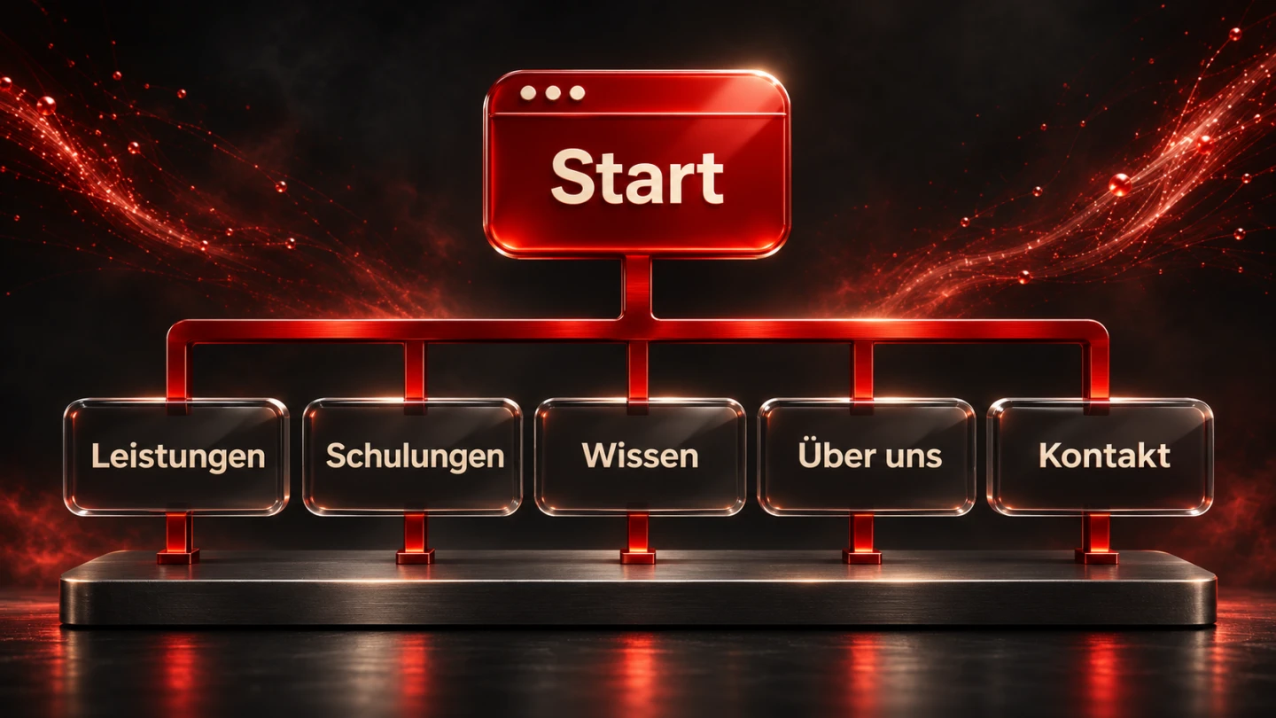
Navigation does not have to mirror the organisational chart. An internal label such as “Northern business unit” may mean little to an external visitor. “Maintenance”, “Inspections”, “Service area”, “About us” and “Contact” could be more useful for the example company. The final wording should follow the services the business actually provides.
Each page needs a recognisable place in the wider site. A service description may link to its process and a relevant case study. A technical article may explain which records make an enquiry easier to assess. Contact should be available where a visitor has enough information to act. A constantly visible call to action cannot replace that relationship between content and intent.
Link labels should communicate their destination. “Prepare a maintenance enquiry” is more informative than “More”. Several identical labels pointing to different destinations make selection harder. Return journeys matter too: a visitor arriving directly at a detail page should be able to find the appropriate overview.
The W3C page structure tutorial explains how meaningful regions and headings support orientation. In practice, the visible design and underlying HTML should communicate a coherent structure rather than two different interpretations of the content.
4. Build confidence with verifiable information
Specific information gives people more to assess than general assurances. “Highest quality” is difficult to evaluate. A documented process, relevant qualifications and genuine contacts offer more substance. Images, captions and text must agree. A generated person should not be presented in a way that suggests they are an actual employee.
References need context. What was the starting situation? Which part of the work did the company undertake? What does the result demonstrate? A photograph of equipment does not by itself establish maintenance quality. An anonymised process description may be more informative when a customer's identity cannot be published, provided the case is real and the description is authorised.
Numbers need particular care because they can sound authoritative. More enquiries after a relaunch do not establish that design alone caused the change. Seasonality, advertising and changes in the offer may also contribute. An analysis should distinguish what was observed from what can reasonably be attributed to a specific intervention.
For the fictional business, a confidence section might combine an actual contact person, an accurate service area and a documented example process. An unsupported response-time promise would create an additional expectation that the organisation might not consistently meet. Useful evidence is relevant to the decision rather than simply impressive.
5. Treat contact as a complete transaction
A form becomes useful when the whole journey works. That includes understandable fields, server-side validation, actual delivery and an accurate response. Visitors need to know whether their message was received and whether further action is required. A well-designed submit button is only one small part of the process.
Request information needed at this stage. The maintenance enquiry might reasonably ask for a name, reply channel, location and description of the issue. Full equipment documentation can follow later. Too many mandatory fields increase the effort before the visitor understands the benefit of making contact.
Explain errors near the relevant field. “Check your input” does not identify what needs correcting. Preserve information already entered where appropriate. If transmission fails, do not display a delivery confirmation. An acknowledgement email is a separate delivery event and needs its own error handling rather than being assumed to succeed.
Booking systems and fixed quotation processes may need different steps. In every case, the wording should set accurate expectations. “Request an appointment” should not turn into a claim of a confirmed booking when a person still needs to approve it. The visitor-facing state must correspond to the actual business process.
6. Include accessible interaction from the start
Professional websites support different devices and ways of interacting. Keyboard navigation, magnification and assistive technologies are relevant examples. Important information should remain usable for someone with reduced motor control or in bright surroundings. The precise legal obligations for a particular service are a separate assessment.
Begin a basic manual check without a mouse. Is focus visible? Can every important control be reached? Can a menu be closed again? Does the sequence match the content? Then inspect text enlargement and narrow layouts. Shrinking a desktop design is not the same as making a page usable on a small screen.
Informative images need suitable alternatives. Decorative images should not clutter the experience with unnecessary descriptions. A diagram also needs an explanation of the relationship it communicates. A nearby table or paragraph can provide the same information in another form. Colour and spatial arrangement alone may not convey the complete meaning.
For the example company, a concrete test task is: “Using the keyboard, determine whether a system at your location can be serviced and send a test enquiry.” Navigation, input and feedback must work together. An automated score cannot fully demonstrate that this complete task is achievable.
7. Assess technical quality through realistic use
Technical quality becomes visible during interaction. Content should appear promptly, elements should remain stable and controls should respond. A fast server is only part of that experience. Oversized images, unnecessary scripts and changing font dimensions can still make a site awkward to use.
The web.dev explanation of user-centred performance metrics distinguishes different aspects of perceived speed. Select representative pages and document the test conditions. A powerful development computer and fast office connection do not automatically represent the audience's devices or network conditions.
A practical optimisation process starts by finding the observed bottleneck, identifying its cause and measuring again under comparable conditions. Resizing the image that dominates the initial screen may make a meaningful difference. Installing another optimisation tool will not fix that file if it continues to be delivered unchanged. Keep the tested address, date and conditions with the results.
Operations also belong to quality. Who receives error reports? Who checks contact after an update? When was a backup last restored successfully? Without named responsibility, small problems can remain unnoticed. Recoverability is demonstrated by a tested process rather than by the presence of a backup folder alone.
8. Connect discoverability with useful information
SEO starts with a sensible information structure. Important services need clearly described tasks and an appropriate place in the site. Titles and descriptions should accurately introduce their pages. Adding phrases does little when the content does not answer the question that brought someone there.
Google's SEO Starter Guide covers useful content and understandable linking. A practical editorial question is whether readers can find the main answer and continue to relevant detail. Clear terminology and supported claims also make the material easier to interpret beyond the immediate page.
A concise answer at the beginning should introduce rather than replace the detailed explanation. A maintenance page might summarise the service scope, then explain exclusions and prerequisites later. Prices, locations and technical terms should remain consistent throughout the page and across related documents.
Search engines may assemble their own title links and snippets. A meta description is therefore an editorial suggestion rather than a guarantee of a particular display. Similarly, a clear structure does not guarantee that an AI system will cite the page in an answer. The content must stand on its practical value to readers.
9. Use a simple quality matrix
A matrix can organise observations. The following scale is our planning aid, not a scientifically validated instrument or an industry standard. Score specific tasks rather than a vague impression of the entire site. A critical failure remains critical even when unrelated areas score well.
| Score | Observation | Example |
|---|---|---|
| 0 | Task cannot be completed | The contact form does not send |
| 1 | Possible only through a substantial detour | The service area requires a phone call |
| 2 | Possible with avoidable uncertainty | Part of the service scope is unclear |
| 3 | Clear and reliable | Scope, prerequisites and contact are understandable |
| 4 | Also verified and maintained | A documented test and responsible owner exist |
Record the observation, evidence and next action for each assessment. “Navigation: 2” is too brief to guide improvement. A note explaining where actual test participants looked and what prevented them from succeeding is more useful, provided the test genuinely took place. Do not invent participant behaviour to make an assessment sound evidence-based.
Prioritise failures that block important tasks, then frequent uncertainty and unnecessary effort. Visual refinements can improve the brand experience once the core journey works. The purpose of the matrix is to support decisions, not to create a flattering overall number.
Record which visitor task should be checked again after a later change. Turning one service offer into a choice between several services affects more than the amount of copy. Entry points, navigation and the enquiry route still need to work together. A short account of the original task helps future editors recognise these dependencies, particularly when they were not involved in the initial project decisions.
10. A practical acceptance checklist
- Main audiences and their tasks are documented.
- The offer, scope and limitations are understandable.
- Visitors can move from information to an appropriate action.
- References, qualifications and numerical claims are supported.
- Contact has been checked through success and failure paths.
- Mobile layouts, keyboard use and text enlargement have been tested through real tasks.
- Images, fonts and scripts have been assessed for their actual loading impact.
- Titles, descriptions and internal links match the content.
- Required legal information reflects the offer and technical operation.
- Maintenance, responsibility, backups and restoration are organised.
Acceptance should use concrete examples. A screenshot records an appearance. A tested journey demonstrates whether a task can be completed. Both types of evidence are useful, particularly for forms, search and multi-step processes.
11. Use a small content skeleton as a working document
The central task can already be expressed in a simple HTML outline. The following text is deliberately illustrative. This outline does not process enquiries and still needs verified company information. It demonstrates how the offer, prerequisites and next step can form a coherent piece of content.
<main id="content">
  <h1>Commercial ventilation maintenance</h1>
  <p>We first check whether your equipment fits our service scope.</p>
  <section aria-labelledby="scope">
    <h2 id="scope">Scope and prerequisites</h2>
    <p>Describe the equipment types and locations actually supported.</p>
  </section>
  <section aria-labelledby="enquiry">
    <h2 id="enquiry">Prepare an initial enquiry</h2>
    <p>Include the location, equipment type and a short description.</p>
    <a href="/en/contact">Send a maintenance enquiry</a>
  </section>
</main>
The sequence can be reviewed before visual design begins. A missing prerequisite is easier to spot when it is not surrounded by decorative elements. If the link leads to a general contact page, the visitor should not lose the service context. A preselected enquiry category may help if it remains understandable and can be changed.
This approach offers no fixed percentage of time saved. Its practical value is that content problems can be addressed before visual refinement. Existing sites benefit too: reduce an important page to its essential outline and identify which information is absent. Another colour palette or cover image cannot resolve that gap alone.
Finally, assign an owner and review date to each important task card. The team then knows who updates changed services and corrects obsolete information. A professional business website is both a designed offer and an ongoing responsibility.
Common questions about business websites
How many pages does a business need?
Enough to explain its distinct offers and visitor tasks. A small, clear site can be sufficient. Several independent services often need separate explanations. Page count alone says little about quality.
Does every page need a contact button?
An accessible contact route is useful. The specific next action should fit the reader's situation. An explanatory article may first lead to a more detailed guide rather than immediately asking for an enquiry.
How should success be measured?
Start with the task. Relevant, actionable enquiries may matter more than total form submissions. For service content, a question answered completely can be valuable. Visitor numbers alone do not demonstrate either outcome.
Can AI create the entire website?
AI can support structure, text, design and implementation. Company information, technical accuracy and actual functionality still need verification. A convincing draft does not replace acceptance testing.
Sources and further reading
This guide combines an original planning method with the linked W3C WAI, Google Search Central and web.dev foundations. Sources checked on 9 November 2026. The fictional company, task card and assessment scale are editorial examples.