Checking whether a logo works at small sizes
From source bounds to a conditional release decision: inspect small applications and read diagnostic enlargements accurately.

A logo often receives its most generous review on a large presentation slide. Its everyday jobs can be much less forgiving: a small browser tab, a compact navigation bar, a narrow invoice footer or a modest label. A shape that looks elegant at a large scale may lose an important opening when reduced. A carefully drawn name may become an uncertain texture. Checking these situations requires actual applications rather than another attractive large mockup.
The useful question is specific: does this approved variant remain suitable for this particular task at this particular size? There is no universal pixel dimension that settles every logo. Geometry, lettering, background, output and context all affect the decision. The method below uses an original geometric teaching sign with two overlapping frames. It is not a customer identity, an available trademark or a demonstrated result from a recognition study.
1. Define the small application before inspecting the drawing
Begin with a list of places where the identity will actually appear. A browser tab and a header link are different jobs even if both contain a small image. The tab may provide only a compact sign beside a page title. The header may need the complete organization name and an understandable route to the home page. Treating both as the same export hides the decisions that matter.
For each application record the available width and height, the background, any neighbouring text and the purpose of the sign. Specify whether a complete name is necessary or whether an already established symbol is suitable. An organization that has not built familiarity cannot assume that removing its name preserves identification. A reduced mark can be technically clear while remaining unhelpful to its audience.
Check the real space rather than the ideal design-file space. Navigation can become narrower when text grows, translations change or an account control appears. A small logo should not force a page into horizontal overflow. If the layout requires a smaller variant, define the switching condition and inspect the whole component. The image and the surrounding interface form one application.
2. Inspect the source before blaming the size
A generous empty border inside a file can make the visible sign much smaller than its declared dimensions suggest. Conversely, a contour near the edge may be clipped by an incorrectly chosen drawing area. Open the source and establish where the visible geometry sits. Record whether the supplied dimensions describe the artwork itself or a larger protective area.
For SVG, the MDN viewBox documentation explains the relationship between a user-space rectangle and its viewport. The four values describe a starting point and dimensions. They do not guarantee that the visible paths fill that rectangle. A viewBox is therefore worth inspecting before producing several apparently different exports from the same unsuitable bounds.
Keep a clearly identified master. Small-size adjustments should be named variants with an understandable purpose. Editing whatever copy happens to be open makes later comparisons unreliable. A useful handover distinguishes the master geometry, the small application variant and the actual delivered file. File names and revision notes are simple safeguards against approving one drawing while publishing another.
3. Identify the shape that carries the identity
Before simplifying anything, describe the features that make the sign itself. These might include an opening, the relationship between two strokes, a particular silhouette or a distinctive letter. A decorative detail can sometimes disappear without changing the central idea. Removing a characteristic opening can instead turn the sign into a different shape.
This distinction needs design judgment. Counting paths or removing the smallest objects automatically will not reveal which relationships are meaningful. A technically tidy result may flatten precisely the feature that differentiates the identity. Compare candidates with the brief and with larger approved uses. The goal is a purposeful small variant rather than an unrelated simplified icon.
Increasing stroke weight is also a tradeoff. It can make a contour more visible while narrowing the negative spaces around it. Nearby elements may join. The outside shape may feel heavier than the name. Review the whole relationship after each change. A larger number in a stroke setting is an adjustment to inspect, not a general improvement score.
4. Use a bounded geometric example
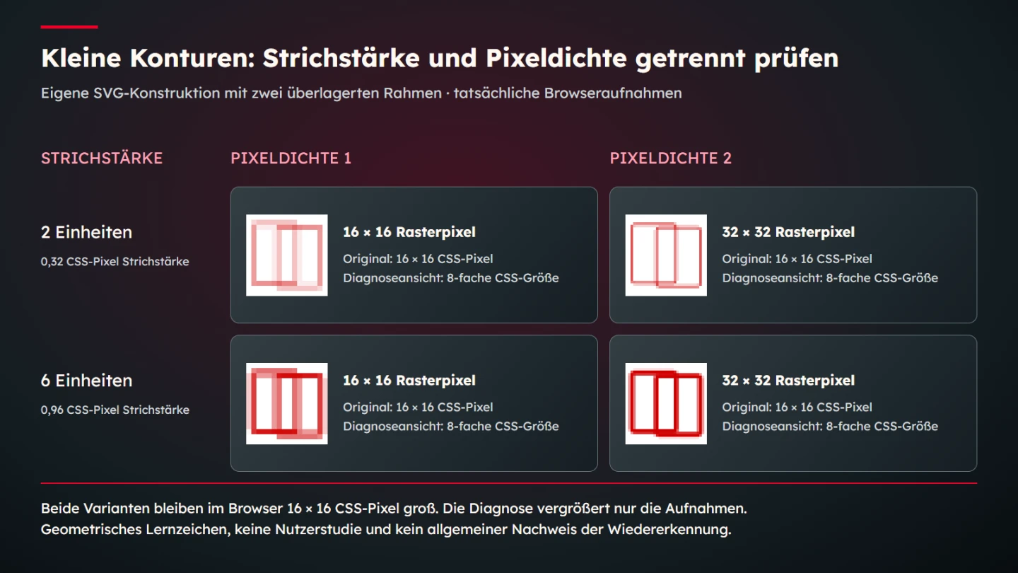
The teaching sign uses two rounded rectangular outlines inside a square coordinate system. Its construction is deliberately simple enough to reproduce. One version has strokes two coordinate units wide. A comparison version changes only that width to six units. The positions, dimensions, corner radii and colour remain identical. This isolates one design variable without claiming to represent every kind of logo.
<svg xmlns="http://www.w3.org/2000/svg" width="16" height="16"
     viewBox="0 0 100 100" role="img"
     aria-label="Geometric teaching sign">
  <rect x="8" y="12" width="54" height="72" rx="4"
        fill="none" stroke="#d00000" stroke-width="2"/>
  <rect x="38" y="16" width="54" height="72" rx="4"
        fill="none" stroke="#d00000" stroke-width="2"/>
</svg>
At a square output size of sixteen CSS pixels, one coordinate unit corresponds to 0.16 CSS pixels in this example. The nominal stroke widths therefore become 0.32 and 0.96 CSS pixels. These are geometric calculations from the chosen dimensions. They are not measured recognition thresholds. A width below one CSS pixel is not automatically invisible and a width close to one is not automatically suitable.
The browser must distribute the drawn boundaries across its raster output. Their placement relative to the pixel grid matters alongside their nominal thickness. Look at the openings and overlaps as well as the outer edges. The heavier variant changes those relationships even though only one source attribute was edited. A successful adjustment must keep the intended structure understandable.
5. Separate CSS dimensions from pixel density
A sixteen-pixel CSS box does not necessarily become a sixteen-by-sixteen-pixel screenshot fragment. The browser can use a higher device pixel ratio. The MDN devicePixelRatio reference describes the relationship between physical pixels and CSS pixels. Documenting both values makes an image comparison much easier to interpret.
For the controlled captures in this article, a sixteen CSS pixel box produces a sixteen-pixel-wide raster at a configured ratio of one and a thirty-two-pixel-wide raster at a configured ratio of two. Both represent the same CSS layout size. The larger source raster is not evidence that the website allocated twice as much layout space to the sign.
Keep the environment limited and explicit. These captures show a particular browser rendering under chosen settings. They do not represent every monitor, browser, operating system or viewing distance. A physical device check can add useful evidence for an important application. A controlled browser comparison remains useful because the source and settings can be reproduced and individual changes can be traced.
6. Keep original viewing size separate from diagnostic enlargement
First look at the sign in the intended layout size. Does the overall form remain coherent? Does the necessary name remain readable? Is the sign distinguishable from nearby controls? Resist enlarging it immediately. A comfortable magnified view can conceal a problem that is obvious at ordinary scale.
Then inspect a diagnostic enlargement when you need to understand the raster edges. The explanatory figure magnifies the sixteen CSS pixel captures to an image area representing eight times that CSS size. A source captured at ratio one is enlarged from sixteen raster pixels; the ratio-two source begins with thirty-two. Their different source dimensions are labelled explicitly.
The MDN image-rendering reference describes scaling behaviour including pixelated rendering. Here that setting supports an enlarged examination of existing pixels. It is not applied as a supposed cure for a weak production logo. A diagnostic display explains the sample; it does not replace a check at the intended original size.
7. Create a small decision table with bounded conclusions
A useful review table connects a question to evidence and keeps the resulting statement narrow. “The source rendered at the requested dimensions” is a reproducible technical observation. “People recognize the company immediately” is a different claim that these captures cannot establish. Recording the distinction makes a review more credible and helps the next person continue it.
| Question | Useful evidence | Conclusion to avoid |
|---|---|---|
| Was the intended geometry used? | Source attributes and selected variant | Every exported file must be identical |
| Was the layout size correct? | Measured browser box and CSS size | The screenshot size alone proves layout size |
| What does the raster contain? | Actual capture and labelled diagnostic view | A larger capture is a larger interface logo |
| Is the application understandable? | Review in its surrounding component | Technical rendering proves audience recognition |
| Will a physical process reproduce it? | Process specifications and an appropriate proof | A browser capture approves embroidery or engraving |
Record the decision alongside the observation. A reviewer may retain the original sign, select a stronger variant or redesign a difficult junction. Explain which relationship improved and what new compromise appeared. A short reason is more useful than an unexplained pass mark. If the evidence is inconclusive, specify the additional application or proof that would resolve it.
8. Check the name as a separate part of the system
A sign and a name can fail at different sizes. The symbol might remain distinct while fine letter details become uncertain. Alternatively, a clear wordmark may identify an unfamiliar organization more effectively than an isolated symbol. Inspect the combination and its permitted separate uses rather than treating the whole export as an indivisible picture.
Pay attention to actual characters and spacing. A slogan in the same file may become unreadable long before the main name. If a small variant removes the slogan, document that as an approved version instead of allowing arbitrary cropping. For names containing accents or other distinctive characters, inspect those details in the actual delivered artwork.
A useful review asks what a first-time visitor can read without a presentation explaining it. Familiarity with a design can make its intended wording seem more obvious than it is. Informal feedback can reveal confusion, but do not turn a few comments into a quantified recognition rate. Describe who reviewed what and keep any resulting conclusion proportionate to that exercise.
9. Include backgrounds and approved reverse versions
A transparent file can look excellent on one surface and nearly disappear on another. Check the backgrounds that the real application permits. Dark navigation, light document paper and a photograph require different attention. A preview on a convenient neutral artboard is not enough when the file will actually sit on changing content.
Use deliberate reverse or single-colour versions where they belong in the identity system. Do not assume that inverting all colours preserves the intended visual weight. Fine negative spaces can appear different when light and dark areas exchange roles. The purpose of the check is to approve a concrete combination, including its surrounding area.
Protective spacing also matters at small scale. An otherwise clear sign can become difficult to separate from neighbouring navigation or a border. Check the actual component spacing rather than adding empty pixels to an export without explanation. That distinction helps maintain consistent placement across image files, inline SVG and other delivery formats.
10. Review the functional link as well as the visible sign
When the logo links to the home page, its visible drawing is part of a functional element. The WAI guidance on functional images explains that the text alternative should communicate the image's function. An attractive raster comparison does not establish whether that link has a useful accessible name or can be reached and activated.
Inspect the actual markup in context. Nearby text or the link's own naming can affect what assistive technology receives. Avoid redundant announcements created by independently naming every nested piece without considering the combined result. A standalone educational SVG label is not automatically the correct accessible naming pattern for a production home-page link.
Keep a visible keyboard focus indication and verify that the whole interactive element behaves as intended. A visually small sign does not require a tiny clickable region. The surrounding link can provide an appropriate interaction area without changing the sign's proportions. These checks concern the finished navigation component and complement the graphical review.
11. Treat physical production as a separate output condition
Screen pixels are not a production specification for stitching, engraving, foil or print. A browser can show fine paths that a particular process cannot reproduce reliably. Ask the supplier about the actual material and technique. Relevant questions include the smallest reproducible feature, allowable gaps and whether the supplied file contains suitable outlines or paths.
A proof made with the intended process can reveal filled openings, broken fine details or material effects that a digital preview cannot establish. Record its scale and conditions. A photograph of that proof can document it, but the photograph's own enlargement must not be confused with the physical item's original size.
This does not require inventing a universal minimum line width in millimetres. Different techniques and materials have different constraints. The practical result should connect an approved variant to an actual production requirement. If no supplier specification or proof exists, describe the remaining uncertainty instead of borrowing a convenient number from an unrelated process.
12. Document a minimum size as a conditional decision
A useful minimum-size note names the variant, application, background and unit. For a website, record CSS dimensions where they govern the layout. For print, record physical dimensions and the relevant production conditions. Keep the reason alongside the number so that future adaptations preserve the purpose of the restriction.
The teaching sign here does not produce a universal sixteen-pixel recommendation. Its captures provide a repeatable comparison between two particular strokes at chosen sizes. A real identity may require a different construction, a separate small sign or a larger allocated area. The review should be allowed to change the layout when simply shrinking the artwork would damage its purpose.
Version the decision when the drawing changes. An old size note attached to a new variant can become misleading even if the file name looks familiar. Keep the approved source, delivered export and review evidence together. That makes a later refresh easier to evaluate and prevents another team member from repeating an already resolved experiment without knowing why it mattered.
13. Use a concrete release checklist
Finish with a review of the actual delivery rather than the most flattering preview. Open the final file in the target component, confirm the chosen size and inspect its surroundings. A file conversion or an accidental replacement can invalidate an earlier review. The final check should therefore refer to identifiable files and conditions.
- The master and the approved small variant are identified.
- The visible drawing area contains no unintended border or clipping.
- The original application size has been inspected.
- Important contours, gaps and any required name remain understandable.
- Permitted backgrounds and reverse versions are included.
- Diagnostic enlargements are labelled as enlargements.
- The functional link, naming and keyboard focus have been checked in context.
- Physical production has its own appropriate specification or proof.
- The minimum-size decision states its conditions and limits.
A small logo is therefore not approved by counting pixels alone. A sound review connects the source, geometry, output and intended task. The teaching sign makes that relationship reproducible without pretending to measure recognition. A real identity deserves the same clarity together with its own design history, permissions and actual applications.
Sources and technical scope
Sources checked on 9 November 2026. The linked MDN and WAI primary sources were opened. Geometry, stroke widths and capture sizes are original teaching parameters. The captures do not constitute a user study, trademark assessment or universal approval for every screen and production process.