Comparing wordmarks, symbols and combined logos
From a website header to small identification: assess design variants and handle legal questions separately.
A logo can work mainly through a name, through a symbol or through a defined combination of both. The useful choice depends on its job. Does an unfamiliar name first need to become readable? Does an application require a compact shape? Should an existing symbol be connected to an explicit sender? Answers come from actual contact points rather than a ranking of supposedly more modern logo types.
This article compares three design approaches using the explicitly fictional name WERKBEISPIEL for a modular workplace furniture provider. The name and symbol are learning material. No availability as a business name or trademark has been established. The examples concern design decisions and their review. They replace neither a clearance search nor legal assessment of an actual sign. The same fictional lettering is retained in both language versions to keep comparisons consistent.
1. Separate design terminology from trademark forms
Designers often call a styled name a wordmark. German legal terminology needs a separate distinction. The DPMA overview of trademark forms distinguishes a word mark without graphic treatment from word/figurative forms, which can include particular typography, and figurative signs. A design label does not decide the legal subject of protection. The discussion here concerns German trademark categories rather than claiming identical terminology in every jurisdiction.
For practical design work, use three unambiguous terms: name treatment, symbol and combination. A name treatment visibly presents the name. A symbol provides a graphic form without spelling it out. A combination defines a particular relationship between the two. These terms are sufficient for discussing size, spacing and application. Any later filing is considered separately using the representation actually intended for it.
This separation helps at the briefing stage. Otherwise a request for a wordmark can produce very different expectations. One person means custom lettering. Another means protection of the name independent of styling. Both concerns can matter, but they are different tasks. Record what the design must decide and which question needs qualified legal assessment. Keeping the questions distinct prevents a visually polished presentation from silently becoming a legal assurance it cannot provide.
2. Start with the applications
List the actual places of use before drawing. For WERKBEISPIEL, these are a website header, a proposal document, a small profile image and identification on a piece of furniture. Each creates different requirements. The website header needs a readable name. A round profile image calls for a compact composition. A narrow metal label on furniture has different production conditions from a screen image.
Give each application a principal question. For the proposal, who is the sender? For the profile image, is the composition distinguishable inside the available shape? For furniture identification, which lines and gaps can the actual manufacturing process reproduce? The answers need not result in four unrelated logos. They identify which variants one coherent system genuinely needs. They also provide a concrete basis for comparing proposals instead of relying entirely on preference.
Distinguish confirmed applications from assumptions. An exhibition presence that has not been planned need not dominate the first decision. An invoice document already in daily use is a concrete case. This weighting prevents the team from selecting an impressive large composition whose everyday small version performs poorly. The identity is developed for the business's actual operation rather than only for a presentation slide shown at a comfortable size.
3. Assess a name treatment through readability
The central benefit of a name treatment is its immediate linguistic information. WERKBEISPIEL can be read, spoken and passed on. The letter sequence must remain identifiable for that to work. A distinctive intervention can support this task, but should not create unnecessary ambiguity. A letter understood only after an explanation may become an obstacle in ordinary contact. Character should arise through deliberate construction rather than through avoidable uncertainty about the name.
Inspect the lettering at different sizes and without its presentation setting. Is it understandable on a light document and a dark surface? Do internal letter spaces remain open? Do neighbouring characters merge into another apparent shape? Examine the actual name. A type specimen using short sample words is insufficient when the chosen name is substantially longer. The relevant object is the complete lettering people will encounter, including its particular repeated forms and rhythm.
Length affects the system as well. A long name in a narrow header needs sufficient width, an explicitly allowed alternative arrangement or an additional compact variant. Unlimited shrinking does not automatically solve the problem. Record which proposal preserves the complete name. An improvised abbreviation changes the sender information and deserves its own decision. It should not appear accidentally because a developer or document author needed a convenient fit.
4. Assess a symbol according to its job
A symbol can offer a compact form that fits some applications more readily than a long name. It does not automatically explain who stands behind it. A newly introduced provider therefore needs a deliberate decision about where the symbol may appear alone. A platform may show the full name beside a small profile picture. An otherwise unlabelled object may lack that context. The same symbol can consequently be appropriate in one place and insufficient in another.
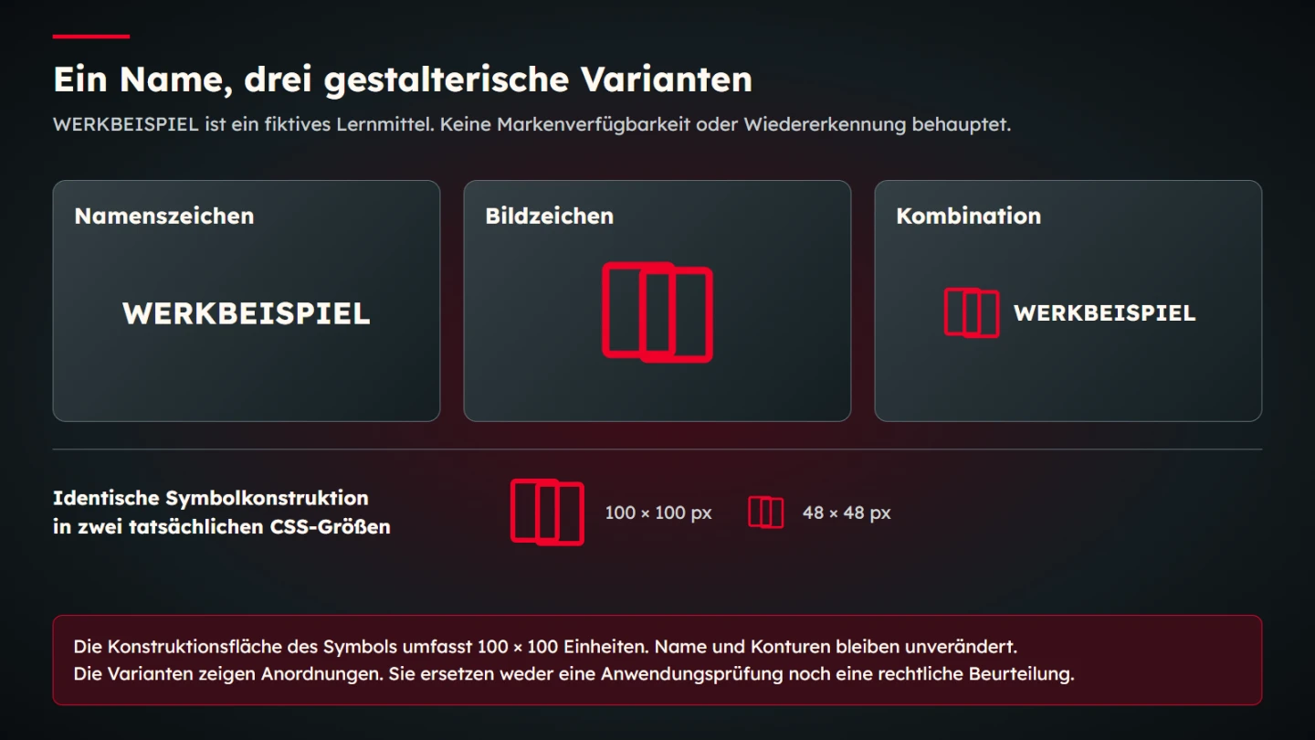
The learning example uses a simple pair of interlocking frames to suggest modularity. This does not claim that the form is unique or legally available. The first design question is whether its construction remains perceptible. Inspect the narrowest gaps, line endings and visual balance at the intended scale. An elaborate explanation of the symbolism cannot replace this visual review. A story about a shape is useful only if the shape itself remains usable.
A symbol also need not depict every service or product. A furniture provider does not necessarily need a table, chair and room in one sign. Too many objects can produce an unclear silhouette. Decide which characteristic the symbol should carry and which information belongs in text or wider imagery. A logo is one part of a public identity, rather than a complete service description compressed into a small graphic.
5. Design the combination as a defined relationship
A combined logo connects the linguistic information of the name to a graphic form. That creates another design task: the two elements must work together. A symbol's optical height is not automatically equivalent to its numerical height. A dense graphic can appear heavier than lettering with the same bounding height. Assess the actual relationship rather than deciding solely from equal measurements. Numerical construction supports a decision but does not remove the need to look.
Establish a primary arrangement first. The example puts the symbol to the left of the name. Another arrangement may suit narrow spaces, but it needs a reason and a record. If every application reinvents the relationship, the shared identity fragments. A small variant register distinguishes approved alternatives from improvised rearrangements. It also helps external producers work with the intended assets rather than reconstructing them from a screenshot.
A descriptive line needs a clear role too. It can explain the offer but becomes unreadable quickly at small sizes. Separating the logo from explanatory copy is often a useful option. The explanation can then remain real, readable text. A tiny embedded tagline is a weak substitute for an understandable service statement on the page. Decide where the extra information belongs rather than making the logo carry it at every size.
6. Compare the approaches through the same questions
| Approach | Design strength | Question still to review |
|---|---|---|
| Name treatment | The name is immediately present | Does its length work in the small application? |
| Symbol | A compact graphic silhouette | Is the sender clear in this particular context? |
| Combination | Name and graphic feature appear together | Do proportion and spacing remain coherent across applications? |
This comparison is not a scorecard with a universal winner. WERKBEISPIEL could use a combination in the website header and the approved symbol in a small profile field. The rationale is then that the full name remains identifiable elsewhere in that context. An invoice may need the name more than an isolated symbol. The concrete job determines the application. Different approved forms can belong to one system when their use is deliberate.
State whether each judgement is an observed rendering or an assumption. A visible line in a browser view is an observation. Claiming that people will remember a symbol permanently needs other evidence. This article invents no recognition percentage. Important decisions can benefit from research with appropriate participants, provided its conditions and findings are actually documented. A visual inspection and a study of recognition answer different questions and should not inherit each other's authority.
7. Review scale through explicit design parameters
The native learning diagram gives the symbol a construction area of 100 by 100 units. The combination places the name beside it. Another view uses the same construction at a reduced size. These are expressly design parameters. They measure neither logo quality nor visitor recognition. Their purpose is to make comparison conditions understandable and reproducible. No successful user outcome is inferred from the numbers.
For a real review, use the actual required presentation. A bounded profile image, a website header and a document footer are different situations. Inspect each result directly. A mathematically scalable file can still lose important distinctions when displayed small. The response is an appropriate approved variant or an adjusted application. Merely confirming that the file is vector-based does not establish that the small result communicates clearly.
A minimum size is therefore a documented application decision. It should identify the relevant variant and where it was examined. A blanket value detached from output conditions is of limited use. Printing, engraving and screen display can have different limits. Dependable guidance arises from the actual production process and inspection, rather than a seemingly universal millimetre figure added to a guideline without supporting examples.
8. Define spacing and background variants
A logo needs sufficient separation from neighbouring content. The spacing keeps its shape clear and prevents accidental association with another element. The example uses a defined reference unit from its construction area. That makes the rule reproducible. It does not prove that this exact amount is right for every brand or application. Review the relationship where the mark actually meets headings, page edges and other identifiers.
Prepare appropriate light, dark and single-colour variants. A dark outline disappears against a dark background. A red element may lose separation on red. An approved reversed version addresses such conditions more deliberately than an improvised shadow or white box. The chosen background therefore belongs to the application review. It is not merely a final decorative choice made after the identity has supposedly been checked.
The WAI explanation of WCAG 1.4.3 includes an exception for text forming part of a logo or brand name. That is not a design recommendation to make a sign difficult to perceive. Ordinary interface labels and other page text do not automatically become logos either. Separate the identifier from additional information and assess the function of each. A legal or standards exception should not obscure a practical readability problem.
9. Make use as a link understandable
A website logo often links to the home page. That link needs an understandable name. The WAI tutorial on functional images explains that purpose or destination matters for an image performing an action. A description such as red frame symbol may fail to identify the link's job. The specific context determines which information is already available as text and which the image alternative must contribute.
In the example, WERKBEISPIEL home page is a useful name when the image is the link's only content. If equivalent understandable text already appears inside that same link, avoid redundant announcements. This belongs to the actual implementation. A correctly exported asset cannot prescribe one accessible name for every later use. The same image can function differently in a header, an editorial discussion or a download list.
Review the visible activation area as well. A small symbol can sit inside a sufficiently large interactive area. Focus must remain visible in the real header. The logo's visual clear space is not automatically an operable button area. Examine presentation and interaction together so the identity works as more than a static picture. Include the actual surrounding elements rather than assessing a cropped logo specimen alone.
10. Keep legal assessment as a separate workstream
A convincing design is not a clearance search. The DPMA recommends researching earlier rights and identifies different relevant sources. One exact search is not the entire question. No result in a simple search does not automatically establish freedom to use the sign. A real project needs an assessment fitting the sign, goods or services and territory concerned.
The DPMA information about examination explains that conflicting earlier sign rights are not examined automatically during the application procedure. Registration is therefore not blanket collision clearance. The sample name is expressly not offered as available. No application is prepared or initiated through this guide. These limited distinctions prevent a design discussion from quietly implying legal conclusions.
A simple record helps collaboration: design selected, search commissioned and legal assessment completed are different states. Identify the responsible person and exact version considered. If legal assessment assumes another representation, coordinate that with design. An outdated draft must not be passed on as the currently assessed version. Keeping the version relationship clear is an operational task even when specialist advice is supplied by somebody outside the design team.
11. Name files according to use
Handover should make approved variants identifiable. Name the arrangement, colour version and intended background. WERKBEISPIEL-combination-dark is more understandable than logo-final-new3. An accompanying index explains the purpose of each file. Someone else can then select the correct version without opening every asset and guessing. The naming scheme should make ordinary use easier rather than becoming a technical taxonomy that only its author understands.
Supply suitable editable or vector-based working material and the required exports. Actual destinations determine which formats are needed. A print supplier may require something different from a web application. Preserve the source. Repeatedly saving a compressed raster image is not a useful way to recover a high-quality working original later. A clear source-to-export relationship also helps when a changed colour or spacing rule must be applied consistently.
Keep the origins of font and image elements and the agreed usage conditions retrievable. Possession of a file does not document an entire rights chain. For individually drawn material, record the agreed uses as part of the handover too. This article promises no universal licensing solution. It recommends keeping actual usage foundations alongside the approved design version so future production decisions can be made from evidence rather than assumptions.
12. Record a reasoned decision
- Which applications determine the first selection?
- Where must the complete name stay readable?
- In which contexts may the symbol appear alone?
- Which arrangement is the primary version?
- Which sizes and backgrounds were actually inspected?
- Which single-colour or reversed form is approved?
- How is the logo named and operated when used as a link?
- Which search and legal assessment happened separately?
- Which files and usage records belong to handover?
Use concrete applications to justify the decision. For WERKBEISPIEL, the combination in a normal header could connect the name to the modular symbol. A profile field could use the symbol when the full name remains visible alongside it. This rationale can be reviewed later. It is more useful than declaring that a symbol inherently looks more modern than lettering. It also explains why one application legitimately differs from another.
Preserve the reasoning during changes. If the name grows or another language is introduced, revisit the affected application. A new profile format may require another fit. That does not automatically demand a complete redesign. First identify which specific rule no longer works and which adjustment preserves the shared relationship. Maintaining a usable identity means understanding its decisions, not treating every original measurement as permanently correct regardless of context.
13. Develop an existing identity deliberately
For an existing identity, begin with an inventory. Which version actually appears on documents, products and digital profiles? Are there several similar files whose differences nobody can explain? Compare those versions before selecting another approach. A seemingly small change in spacing or symbol proportion can otherwise introduce another uncontrolled variant. Identify the real applications and their owners first, rather than treating the most recently modified file as automatically authoritative.
Separate a specific presentation problem from a complete redesign. If the name becomes too small in a narrow header, a suitable arrangement may help. That does not automatically require replacing the symbol. If the existing symbol loses its essential form at small sizes, however, renaming a file will not solve it. Demonstrate the design cause in the actual output. This makes it possible to explain which elements stay and which need adjustment.
Use equal conditions for old and new versions: the same document, profile shape and background. A large new proposal on an attractive surface should not compete with a tiny poorly exported old file. That would mix several changes. Show the actual differences in lettering, symbol and relationship instead. Keep the observations descriptive rather than turning them into an invented prediction of commercial success.
Give implementation a clear handover state. Preserve earlier originals while identifying future variants unambiguously. Tell participating producers which form belongs to which application. Legal and contractual questions about the change remain separate. A visual improvement alone does not establish that every existing use can continue without further consideration.
Sources and scope
Sources were opened on 9 November 2026. The linked DPMA and WAI primary material was actually consulted. The comparison, construction values and variant model are original editorial learning material. WERKBEISPIEL is neither a real client reference nor a cleared trademark recommendation. Legal decisions require assessment of the actual proposed use.