Develop icons and illustrations as a coherent system
Develop a clear shape language and review motifs through their actual purpose, size and naming.

A coherent system of icons and illustrations emerges from recognisable decisions. Lines, corners, proportions, colours and detail belong together without making every subject identical. Small interface symbols need different solutions from larger explanatory graphics. A shared visual language should organise those differences and support the actual content.
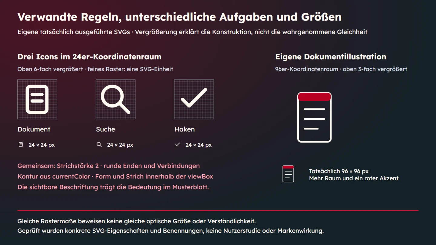
This guide develops an original SVG system containing document, search and check shapes together with a larger document illustration. The geometry was written for this article rather than copied from an icon library. Its twenty-four-unit grid and two-unit stroke are deliberate teaching choices. They are neither universal rules nor evidence of identical perceived size in every environment.
Start with meaning and use
Identify the job of each motif. Does it indicate an action, classify content or supplement an explanation? Those roles require different treatment. A search symbol beside a labelled action differs from an illustration that communicates independently in an article. The drawing alone does not determine its function.
Define intended sizes and backgrounds. A motif inspected only on a large design canvas may lose its defining features in small navigation. A detailed illustration need not use the same few lines as a compact icon. Planned application provides the reference for deciding which properties should be shared.
Name a small set of common rules
The icon example uses a shared coordinate space, open outlines, round line endings and round joins. Colour follows the surrounding text. These choices are visible and technically inspectable. They constrain the design usefully without forcing every subject into the same silhouette.
Record the purpose behind a rule. Rounded ends may support the intended character. An open outline may complement the typography. An accent can identify a particular part. Reasoning helps with later additions. A list of numbers alone does not explain which differences are permitted or necessary.
| Rule area | Teaching choice | Still to examine |
|---|---|---|
| Coordinates | Icons use a viewBox from 0 to 24 | Room for geometry and stroke |
| Outline | Stroke width 2 with round endings | Legibility at the intended size |
| Colour | Outline uses currentColor | Appropriate contrast against the background |
| Larger illustration | Its own 96-unit coordinate space with related forms | Detail and composition suited to its purpose |
| Meaning | Visible names and clear text relationships | Understanding in the actual context |
Distinguish the grid from optical size
A common grid provides a technical foundation. It does not guarantee equal perceived size. A circle and a narrow document can appear different in weight within the same area. Filled area and the direction of a diagonal also influence the impression. Examine motifs together in their intended application.
The viewBox describes SVG coordinates and their mapping to the display area. Visible width is specified separately. Here the small icons are displayed at twenty-four pixels, and the technical checks verify that dimension. No measurement of equal perceived size or comprehension study is inferred from it.
The outline is part of the geometry
A line has visible thickness in addition to its centre path. Placing a path exactly on an edge can push some of the stroke beyond the available area. Leave room deliberately. The example additionally checks that shapes, including the considered half-stroke allowance, remain inside their coordinate area.
Round endings and joins are concrete properties too. They affect short lines and sharp changes of direction. Use them deliberately and consistently where appropriate. A new shape should not acquire square endings merely because it came from another file. Accidental differences weaken the shared language.
Use colour as a role
currentColor derives the example outline from the surrounding text colour. It is dark in a light environment and light in a dark environment. The motifs do not need independently maintained geometry for each variant. That relationship is useful when an icon accompanies labelled content in the same visual role.
An accent can still have a purpose. The larger document illustration includes a red upper area. This is a teaching decision rather than an official Agentur Zentral colour specification. Every additional colour should have an identifiable job. Giving each new motif a different arbitrary colour produces a collection rather than a coherent system.
Read the original SVG example
The three small motifs appear beside visible German names. They are not clickable and perform no actions here. Their SVG content is treated as a decorative supplement rather than independently named imagery. The larger illustration receives its own short name. Different treatment follows from the different roles in the example.
<div class="specimens">
  <span class="specimen"><svg class="icon" width="24" height="24" viewBox="0 0 24 24" fill="none" stroke="currentColor" stroke-width="2" stroke-linecap="round" stroke-linejoin="round" aria-hidden="true"><rect x="6" y="4" width="12" height="16" rx="2"/><path d="M9 9h6M9 13h6"/></svg>Dokument</span>
  <span class="specimen"><svg class="icon" width="24" height="24" viewBox="0 0 24 24" fill="none" stroke="currentColor" stroke-width="2" stroke-linecap="round" stroke-linejoin="round" aria-hidden="true"><circle cx="10" cy="10" r="6"/><path d="M14.5 14.5 20 20"/></svg>Suche</span>
  <span class="specimen"><svg class="icon" width="24" height="24" viewBox="0 0 24 24" fill="none" stroke="currentColor" stroke-width="2" stroke-linecap="round" stroke-linejoin="round" aria-hidden="true"><path d="M5 12 9 16 19 6"/></svg>Haken</span>
</div>
<svg class="illustration" width="96" height="96" viewBox="0 0 96 96" fill="none" stroke="currentColor" stroke-width="2" stroke-linecap="round" stroke-linejoin="round" role="img" aria-labelledby="document-illustration-title"><title id="document-illustration-title">Dokument mit drei Textzeilen</title><rect x="28" y="16" width="40" height="60" rx="4"/><rect x="28" y="16" width="40" height="10" rx="4" fill="#b80024" stroke="none"/><path d="M36 36h24M36 48h24M36 60h16"/></svg>
The document combines a rounded rectangle and two lines. Search combines a circle and handle. The check is a simple open path. They share outline decisions while retaining their own geometry. The larger illustration uses a larger sheet, three lines and an accent area. No existing brand symbol is redrawn.
An illustration is more than an enlarged icon
A larger graphic can explain relationships that a tiny icon cannot carry. It may use additional space, components or a more developed composition. That freedom should follow from the subject. Adding shadows and decorative objects does not automatically improve an explanation. Ask which part supports the reader's question.
The larger document uses its own ninety-six-unit coordinate space. It continues the related line and corner language without simply changing the width of the small file. Stroke thickness is deliberately defined in its own design. This does not establish a universal rule that lines must remain unchanged whenever an illustration grows.
Compare both scales with the actual typography. A line can look too fine in one context and too heavy in another. Adjusting it is a design judgement about the real result. Mathematical scaling can prepare that decision without replacing it completely.
A familiar shape does not establish meaning
A check mark can mean selection, confirmation or a completed state. The shape alone does not choose among them. On this specimen sheet it is simply named Haken in German. In a real action, visible or accessible wording should describe the actual purpose. Naming only the shape may be insufficient.
The same applies to document and search shapes. A document can mean a file, report or content category. A magnifying lens can indicate search or enlargement. Decide from context. Where confusion is possible, an appropriate label can help more than another small adjustment to the drawing.
Separate decoration from independent information
WAI distinguishes decorative additions from images with their own information or function. A purely supplementary shape should not cause redundant announcements. A functional image needs an understandable purpose. The example applies that principle to its actual inline SVGs. External image files use the corresponding HTML mechanisms.
The larger SVG has a title and an appropriate aria-labelledby reference. MDN describes the title as a short accessible SVG description. Its reference must point to the existing element. Repeated instances need unambiguous naming relationships rather than accidentally duplicated identifiers.
A title is not a complete accessibility assessment. Context, contrast and other requirements remain to be checked. The browser evidence here verifies the named image role and decorative handling of the smaller motifs. It makes no claim of identical output across all assistive technologies or universal understanding by every audience.
What was actually checked
The example was exercised at viewport widths of 360 and 960 pixels in light and dark colours. Checks covered small display dimensions, coordinate spaces, computed outline properties and shape boundaries. The arrangement produced no horizontal overflow in those cases. Small and large motifs come from the same actual SVG source used for the example.
Exactly one independently named image role was found for the illustration. The smaller SVGs beside visible names did not appear as additional images. This checks a concrete programmatic relationship. It does not establish whether a particular person interprets a motif correctly in an intended production task.
Make optical corrections traceable
If a motif feels out of place, describe the observation first. Is it too small, too dense or missing a recognisable feature at the intended size? Those diagnoses call for different corrections. Enlarging everything may strengthen a silhouette while violating intended margins or clipping its outline.
Change a justified property and compare again in context. Keep the original version available for the decision. Use the same size, colour and environment. Otherwise, the apparent improvement may come from presentation rather than geometry. Record the chosen departure and its reason so later work can understand it.
Extend an existing system deliberately
Do not begin with an extensive wish list of new symbols. First establish which meanings already exist. Another name may describe the same concept. Conversely, one existing shape may be carrying two incompatible meanings. Organise the concepts before drawing additional geometry.
Then take a new motif through the same decisions: meaning, intended size, coordinate space, outline, colour role and naming. Examine it with its neighbours. An attractive isolated drawing can be too detailed or heavy for the set. Continue the common character while allowing the motif to fulfil its own purpose.
Prepare a usable handover
A handover should identify current files, their meanings and intended sizes. Add the rules guiding future changes. If several variants exist, make their applications recognisable. A folder full of similarly named SVGs creates selection errors even when each individual file is technically clean.
Show motifs in genuine application examples. An icon next to its intended label explains more than an isolated large view. Review an illustration with the paragraph it explains. That reveals whether it adds information or merely fills space. A system connects meaning and presentation through concrete uses.
Choose examples that expose the rules
A useful specimen page includes more than several easy shapes. Include a rounded form, a narrow form and a diagonal if those occur in the real set. Those differences reveal whether the shared rules remain useful. The three original icons here deliberately have different silhouettes rather than pretending that one geometry can establish every case.
Inspect the actual small size before relying on an enlarged demonstration. A large grid helps explain construction but changes the visual impression. Both views have a purpose. Label enlarged construction views as such and retain a genuine-size example so the audience can distinguish explanation from application.
When adding an illustration, name its explanatory task. A larger document picture is a modest teaching example of related line and corner decisions. A complex service story would need a more specific composition. The shared language can continue without forcing every illustration to become a magnified interface icon.
Prepare a focused system review
Before drawing, collect concrete questions. Which concepts recur in the application? Which genuinely need a visual symbol? Where will visible labels remain? Which illustrations need to explain independently? Those answers prevent a decorative collection whose supposed uses are invented only after the files exist.
Review the shapes beside the intended typography. An isolated symbol can feel balanced and then appear too fine next to heavier text. A longer label can change available space. Context supports the decision that actually matters. A large view on a neutral canvas shows only part of the intended application.
Keep enlarged construction views distinct from genuine-size specimens. Enlargement can explain coordinates and line endings. It does not establish small-size recognition. Both views are useful when their roles are clear. A technically precise grid should not be mistaken for a measurement of how people understand a tiny icon.
Check export and design together
A technically correct SVG can be unsuitable visually. An attractive design can also lose its intended outline or naming through an incorrect export. Review both layers. Are the expected coordinates and attributes present? Does the shape retain its defining feature at the intended size? Does its relationship resolve correctly in the actual document?
If several output formats are required, preserve their connection to the authoritative source. A raster version may derive from the approved vector. Changes then need to reach the affected exports. Leaving an old bitmap beside an updated SVG creates accidental differences. The handover should identify that dependency instead of relying on someone to remember it.
Document exceptions deliberately
A particular shape may need a departure from normal margins. Make that decision consciously and review the set again. Changing a number does not automatically make the exception wrong. The problem arises when its purpose disappears and later work treats it as a new universal rule. Connect the decision to its scope.
A small icon may omit a feature that is useful in a larger illustration. Related form language does not require every detail to appear at every size. Ask which information the particular view should convey and which detail merely adds noise. Appropriate difference can strengthen rather than weaken the system.
Do not turn attribute consistency into a brand-recognition claim. The examples show selected rules and their application. They provide no measured recognition result. Investigating that property would require an appropriate study. Technical equality of particular values cannot answer that different question.
Questions for maintenance
How many motifs are needed? As many as the actual tasks justify. A larger count is not evidence of quality. Before adding one, determine whether an existing meaning applies or whether a genuine new distinction is necessary. That keeps the collection understandable and avoids duplicates with unclear use.
When should a shape change? Revise it when a concrete application or system decision requires it. A new size or background may expose a problem. Examine that condition before redrawing the entire collection. A targeted correction can be more appropriate than an unexplained complete replacement.
Shared-language checklist
- Each motif's meaning is established before drawing.
- Common outline, colour and proportion rules are named.
- Actual content is checked at intended sizes.
- Geometry and stroke have room inside the coordinate space.
- Larger illustrations receive appropriate detail.
- Decoration and independent information are distinguished.
- Visible labels and accessible names fit the purpose.
- Optical corrections are compared in the same context.
- New motifs are assessed as part of the set.
- Current files, variants and responsibilities are documented.
A concrete handover question might concern a new print symbol. If an explicit action label already accompanies it, the drawing can be supplementary. If the image alone carries the action, its purpose needs an appropriate name. The same geometry can therefore need different text treatment in different uses. Record that decision at the actual application rather than inferring it from a filename or assuming one label always fits.
Sources and review date
Sources were checked on 9 November 2026. WAI explains decorative images and functional images. MDN describes SVG title, line endings, viewBox and currentColor. All sample motifs and system choices are original designs for this article.