Building a visual identity across website, app and print
Connect recognizable foundations with appropriate applications, from screen views to actual print-production requirements.
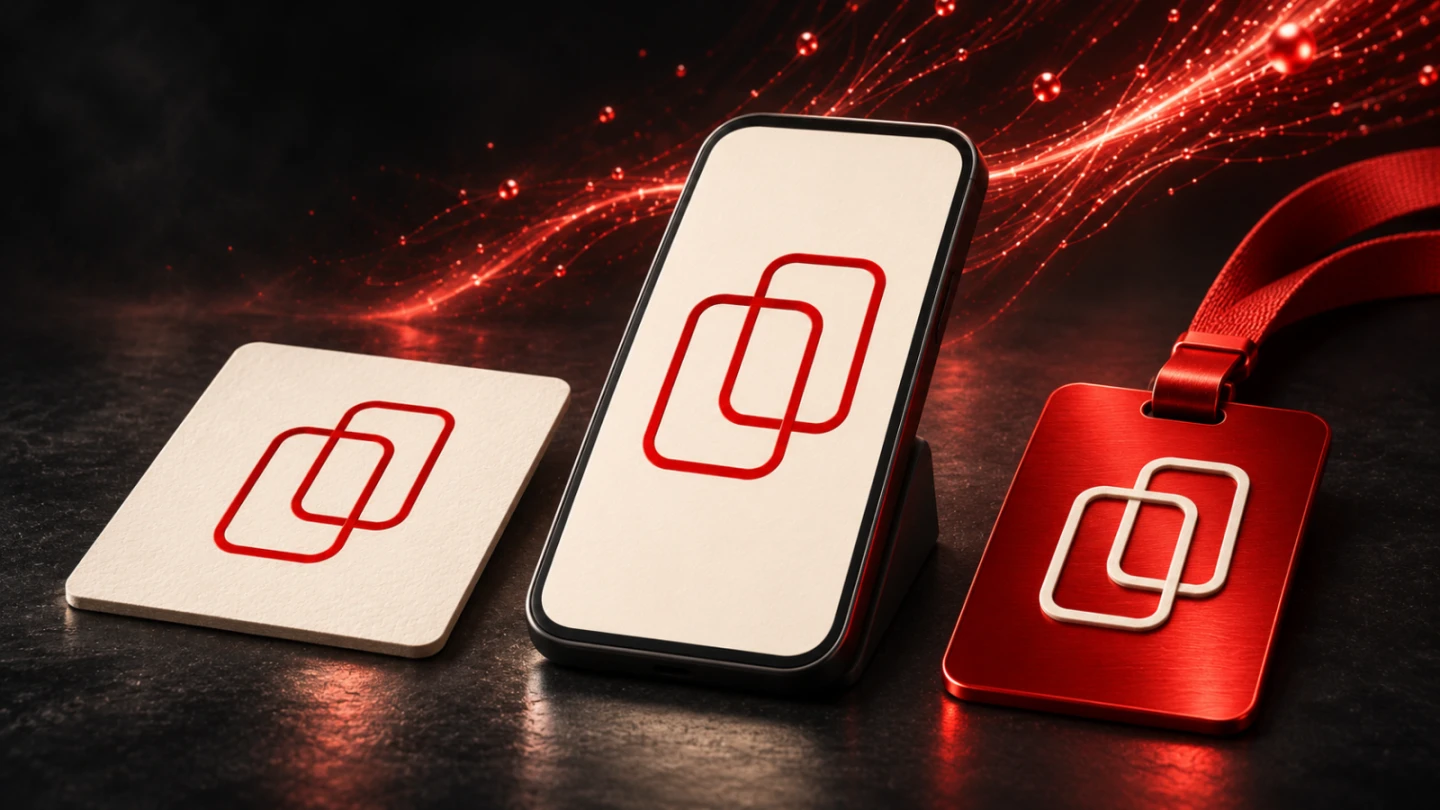
A visual identity should belong together across a website, an app and printed material. Those applications do not need to look identical. A browser window, a small home screen and a printed document have different tasks and conditions. Recognition depends on understandable shared decisions and appropriate translations into each medium.
The difficult work starts when a design meets another context. A wide wordmark does not fit unchanged into every app icon. A screen colour alone does not define a dependable print equivalent. A digital control needs different treatment on paper. This guide develops a practical foundation and uses an original teaching identity to demonstrate actual wide-screen, narrow-screen and print-CSS outputs. It does not claim a native app implementation or a physical print proof.
Define what should remain shared
Start with the features carrying the identity. They may include a sign, a particular wordmark, restrained colour distribution and characteristic proportions. Make the list specific. A general instruction such as modern and premium does not explain which decision needs to survive in a narrow application or a one-colour document.
Distinguish fixed elements from adaptable relationships. The construction of an approved sign can be binding, while its distance from an edge depends on the layout. A type family may belong to the identity while size and line height follow the medium. This distinction avoids trying to repeat one template unchanged everywhere.
Record the initial decisions on a manageable reference page. Identify the available variants, important relationships and reasons for exceptions. An extensive manual is helpful only when its applications have been reviewed. A small traceable system is easier to use reliably than a large collection of decorative examples without a clear rule behind them.
A shared voice belongs in the foundation too. Product names, terminology and tone should connect. An app does not need to display the same long paragraphs as a brochure. The purpose of each text determines its length. Dependable terms and an appropriate form of address can preserve the connection without mechanically duplicating content.
Record applications as distinct tasks
List actual places where the identity will appear. On a website, these may include the header, article page and form. In an app, the launcher icon, navigation and working view can have different requirements. Print introduces specific items such as a letterhead or information card. A single entry labelled digital or print is too broad for practical planning.
For each application, record the format, content, necessary variants and intended production route. A small icon may need only a sign, while a document for new contacts needs a readable name. The selection is an informational decision. It depends on what people already know and what orientation they need at that particular point.
Inspect the smallest and most demanding applications early. They reveal limits hidden by a generous presentation canvas. If a fine contour loses its character in a small icon, the system should provide a justified variant. Improvised cropping or thickening late in production can instead create several uncontrolled versions of the same identity.
Also record what has only been designed as a view and what has actually been implemented. An attractive app mockup does not establish native behaviour. A PDF does not prove successful output on the intended paper. Precise naming keeps design, technical output and reviewed real applications distinguishable.
Make website and app related but appropriate to their platforms
An app has interaction patterns and platform conventions that deserve consideration during customization. Apple's branding guidance connects a recognizable identity with familiar components and restrained use of brand elements. A useful practical question is whether customization supports the content or makes familiar interaction unnecessarily difficult.
A brand colour can emphasize an important action. If the same colour dominates every surface and secondary control, that emphasis can lose its purpose. Decide through roles rather than colour coverage alone. Which surface is neutral? Which information needs attention? Which action should be understandable as the next step?
The launcher icon is its own application. The Android adaptive-icon documentation describes different masks and platform-dependent presentation. A rounded tile drawn in a design document therefore does not prove that the sign appears correctly across devices. Inspect the actual intended outputs and masks rather than relying on one attractive preview.
A website can express the same identity through different spatial choices. A broad header offers more room for the wordmark, while a narrow view still needs understandable content and navigation. Treat this rearrangement as design work. A reduced copy of the large layout is not automatically the best mobile application.
Handle colour and material without promising identical results
A display presents colour under different conditions from printed material. A stored number alone therefore does not describe its eventual appearance. Collaboration needs explicit colour spaces, output conditions and profiles. A generic conversion table without that context can suggest a degree of accuracy that has never been checked.
The International Color Consortium introduction to the profile format explains how device profiles support colour-data transformations. For an identity, colour management is a distinct part of the output process. It should not be replaced by an assertion that one hexadecimal value must look identical on every material.
Agree production conditions with the actual supplier. Paper, process and any finishing belong to the application. An appropriate proof can support assessment under those conditions. A screenshot of a colour is not an equivalent substitute: it is another capture with its own display conditions rather than a physical production sample.
Document approved equivalents precisely. A print version confirmed for a particular item has not automatically been reviewed for every other material. A deliberately one-colour version is not necessarily an inferior copy. It can be an appropriate approved application when the essential features remain intact and production constraints are considered.
Produce a small teaching identity in actual outputs
The example uses an original teaching identity named WERKBEISPIEL. It is not a real customer brand or an assertion about legal availability. Its sign consists of two offset rectangular outlines. The simple construction makes comparison easier and does not reproduce an existing identity.
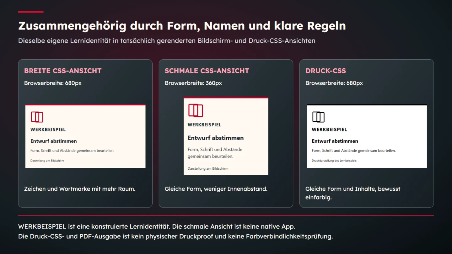
The demonstration retains the same name, geometric form and short content in three outputs. The broad and narrow versions are HTML/CSS views. The narrow version demonstrates a different space constraint and is explicitly not presented as an executed native app. The third view uses the print rules from the same CSS.
.identity {
  font-family: system-ui, sans-serif;
  max-width: 36rem;
  padding: 1.5rem;
  border-top: 6px solid #b80024;
  background: #fffaf3;
  color: #192329;
}
.identity .mark { color: #b80024; }
.identity .wordmark {
  font-size: 1.4rem;
  font-weight: 700;
  letter-spacing: 0.06em;
}
.identity .print-note { display: none; }
@media (max-width: 400px) {
  .identity { padding: 1rem; }
  .identity .wordmark { font-size: 1.1rem; }
}
@media print {
  .identity {
    background: #ffffff;
    color: #000000;
    border-color: #000000;
  }
  .identity .mark { color: #000000; }
  .identity .screen-note { display: none; }
  .identity .print-note { display: block; }
}
The print version deliberately changes to monochrome. The geometric sign, name and substantive sentence remain intact. Only an explanatory media note changes between screen and print. This is a decision in the demonstration, not a claimed universal requirement. A real document can have different needs.
The MDN guide to printing explains print styles. This example checks that behaviour in the browser and also generates a PDF. The technical output does not assess offset printing, a paper surface or a colour-managed production proof. It confirms the named CSS-output distinction.
Identify what remains equal and what changes
The check compares actual content and selected computed properties. In the configured wide-screen setup, internal padding is twenty-four pixels. In the narrow version, it is sixteen. The wordmark receives the specified size for each condition. The sign is not replaced by a newly invented shape simply to make another output look convenient.
The print view is checked for black values and a white background while retaining the content. This demonstrates one specific medium-dependent adaptation. Success does not establish fully consistent brand perception; that effect would require another kind of investigation. Here, the result is a traceable technical and design relationship.
| Element | Shared foundation | Deliberate adaptation | Further review |
|---|---|---|---|
| Sign | The same geometric construction | Monochrome print version | Actual small applications and production |
| Name | Identical spelling | Size appropriate to available width | Legibility with actual typefaces |
| Colour | A named identity role | Appropriate medium-specific output | Profiles, backgrounds and materials |
| Layout | Recognizable hierarchy and spacing | Different spatial arrangement | Long content and real devices |
| Interaction | Consistent terms and tasks | Platform-appropriate behaviour | Actual implementation and states |
The table also supports review discussions. A visible difference is not automatically an error. First establish whether it is a justified adaptation. An accidentally misspelled name or an unapproved sign instead concerns the shared foundation itself. Distinguishing these cases makes approval more specific and avoids arguments about consistency without identifying what changed.
Hand over files so the appropriate version is findable
An identity is not transferred through rules alone. It needs usable files with clear roles. Name the version intended for each application. A transparent screen asset, a monochrome version and an approved production file serve different purposes. A folder containing many nearly identical export names provides little guidance about which one to choose.
Keep editable sources and approved outputs separately identifiable. Someone needing another size should be able to find the suitable master. A repeatedly reduced and recompressed copy is a poor starting point. Handover should therefore explain which file may be edited and which output has already been reviewed for a specific use.
Version information helps manage changes. Revising a sign does not require silently overwriting earlier files. A traceable new version can be assigned to affected applications so a team can identify documents still using the previous one. A filename such as final-final does not explain that relationship or its approval history.
For typefaces and imagery, handover also needs the actual basis for intended usage. This article does not replace review of individual licence terms. The practical information question is which files exist and for which applications they were actually acquired or approved. An attractive brand manual does not resolve an unclear source.
Decide exceptions through actual applications
An app using a different body typeface does not automatically lose its identity. The relevant question is which relationship changes and why. A platform-appropriate reading presentation may coexist with characteristic headings. Inspect actual views rather than judging the decision solely through two isolated type specimens.
In print, a margin or monochrome treatment can be justified by the task. Check whether essential elements remain intact and information is arranged appropriately. The objective is not pixel-for-pixel equality between unlike media. It is a traceable connection combined with suitable reading and use conditions.
A brief decision note is often enough. Name the application, difference and reason. Later extensions can then refer to an existing judgment instead of changing the system unnoticed with each new file. Necessary exceptions also become easier to discuss without reopening every foundational decision.
Divide release review by medium
A shared identity requires several concrete checks. Review the website at actual widths with its content. Review an app in its real implementation and intended platform conditions. Assess printed applications through their production conditions. Success in one medium does not substitute for review in another.
- Shared features and their meanings are identified.
- Necessary variants have clear applications.
- Small and difficult outputs were inspected early.
- Website and app retain understandable platform-appropriate interaction.
- Screen values are not presented as universal print equivalents.
- Production files and profiles suit the actual output.
- Editable sources and approved exports are findable.
- Justified differences are documented.
- Design, CSS demonstration, native implementation and physical proof remain distinguishable.
- The next change has an identifiable owner.
A dependable identity connects a clear foundation with deliberate adaptations. The teaching views illustrate that relationship using the same elements under different output conditions. For a real project, they lead to concrete questions and review tasks. Quality comes from making those relationships understandable and assessing each actual application.
A compact handover record for the teaching identity
The example can be documented specifically. The name is WERKBEISPIEL in all three views. The two frames retain their positions and proportions. The screen sign uses the stated red, while the print rule deliberately renders the same form in black. This record identifies exactly the elements whose relationship can be checked.
The narrow view uses a browser width of 360 pixels and the broader one uses 680. These are test parameters, not a complete device list. They demonstrate a difference in available space. An actual app would additionally need review on intended devices with their text settings and interaction conditions. The label narrow CSS view keeps that boundary explicit.
The isolated print comparison retains the broad view's browser width so it does not simultaneously introduce another width breakpoint. The change being examined is the output medium and its associated colours and notes. The generated PDF is an additional technical artifact; its existence does not verify a particular printing press or material appearance.
A real handover record adds actual filenames and responsible people. Identify which file is the source and which is an output. If an agency delivers a production document, the corresponding production agreement should be findable. If developers adopt an icon, they need its actual approved variant. The documentation should match the files that genuinely exist.
Trace a change through the shared system
Suppose the teaching identity's name changes later. That decision affects every application displaying it. A new screen colour, however, does not automatically alter an independently approved monochrome print version. First identify which shared decision changed, then determine which outputs actually require renewed review.
A small impact list can separate the name, sign geometry, screen colour and print version. Record affected applications and the necessary checks for each. That is more precise than a general instruction to put the new design everywhere. It also prevents a deliberately limited change from accidentally altering other approved elements.
Inspect content consequences as well. A wider wordmark can change wrapping even with the same font size. Another label can require more room in app navigation. Matching numerical values cannot settle those effects. Put updated content into the actual application to see whether the intended relationship still works.
If an exception is required, explain it specifically. A particularly narrow use may need an existing sign variant, with the complete wordmark shown elsewhere. Keep that choice traceable rather than circulating it as an unnoticed new default asset. The identity can then grow with its tasks without branching accidentally whenever another medium is added.
Finally, inspect the design without its presentation frame. The name and sign need to work within the application itself. A polished device mockup or elaborate montage can attract attention while concealing an unclear file or unreadable label. The explanatory figure therefore shows the simple actual rendered views and their changed output rules directly.
Sources and limits
Sources checked on 9 November 2026. Apple's guidance was read through its official Markdown version. The linked Android, MDN and ICC primary sources were opened. WERKBEISPIEL and its geometry are original teaching materials without a customer connection or legal-availability claim. Browser and PDF output do not replace a native app review or a physical print proof.