Compress and deliver images at the right size with srcset and picture
Plan formats, pixel dimensions and layout together and inspect the image resource actually selected by the browser.

A cover photograph can look excellent on a large screen while transferring far more data than a phone needs. A heavily compressed file can be small while losing the detail required for a product view. Reliable image delivery connects three decisions: the content people need, the space it actually occupies and the file suitable for that space. Changing the file format alone does not complete that work.
This guide develops a practical workflow around those decisions. A complete HTML example offers AVIF, WebP and JPEG at several widths. Its layout descriptions were checked in Edge using real encoded image files. The learning asset is an original synthetic graphic, not a photographic benchmark. The results demonstrate this example's behaviour rather than general savings, loading speed or visual superiority. Sources and technical explanations were reviewed on 9 November 2026.
Start with the image's role in the page
A picture in a card collection performs a different job from the main illustration of a detailed article. The card needs an understandable crop at a small size. The article can expose finer material detail. An explanatory diagram must keep its labels legible. Define these roles before an export tool converts every original to the same width.
For each role, record the greatest actual display width, the relevant narrow layouts and the necessary crop. Check whether the visitor can enlarge the image. An enlarged product view is a separate need; the large file does not necessarily belong in every overview. An additional detail request can be associated with the act of opening the larger view.
This inventory prevents two common mistakes: transferring an oversized file for a small card and enlarging a card thumbnail until it becomes blurred on the detail page. The image role therefore belongs to the component definition. A later layout change must revisit the export assumptions and the HTML descriptions instead of treating images as permanently solved.
Distinguish file pixels, bytes and layout width
A file's width describes the image pixels available in it. Its file size describes stored bytes. The width measured in the layout is expressed in CSS pixels. These values are connected but not interchangeable. A different encoding can reduce the bytes while leaving the same pixel dimensions. The resulting file can still be unnecessarily large for a narrow card.
A simple planning calculation helps: a slot measuring 360 CSS pixels, at an assumed ratio of two device pixels per CSS pixel, corresponds to 720 image pixels across. This is guidance, not an instruction forcing every browser to fetch exactly that width. Browser selection, cached resources and other decisions may influence which candidate is used in practice.
The MDN responsive images guide distinguishes resolution switching from changes of crop. For implementation, honestly describe the available slot. A blanket description of the entire viewport width is wrong for an image that occupies only one limited column on a desktop. Accurate source dimensions do not compensate for a misleading description of the layout.
Choose a small and justified set of widths
The example offers widths of 480,960,1440 and 1920 image pixels. These values are not a universal web standard. They cover the particular slots planned here, up to 960 CSS pixels, and provide a larger option for higher pixel density. A website combining 320-pixel cards with a very wide panorama may need a different set of intermediate sizes.
| Example view | Actual image slot | Calculated demand at density two |
|---|---|---|
| 390 CSS-pixel viewport | 358 CSS pixels | 716 image pixels |
| 760 CSS-pixel viewport | 696 CSS pixels | 1392 image pixels |
| 1440 CSS-pixel viewport | 960 CSS pixels | 1920 image pixels |
This table describes the example's geometry, not performance measurements. Its key fact is the limit of 960 CSS pixels in the wide layout. A wide screen does not require an equally wide image in this component. Conversely, a narrow screen at higher pixel density may benefit from a resource substantially wider than its CSS slot.
Select formats for the actual content
Several lossy encodings may suit photographic material. Sharp graphics, transparency and fine lettering require additional consideration. The web.dev introduction to raster images explains how image content affects compression. A smaller file is not automatically a better representation of what the reader needs to see.
| Content | Useful assessment | Typical problem |
|---|---|---|
| Editorial photograph | Visually compare AVIF, WebP and, where appropriate, JPEG | Skin, materials and fine textures become excessively smooth |
| Screenshot with small text | Check readability at its intended use | A small preview does not replace a readable product record |
| Precise diagram | Use a native vector or a sufficiently detailed raster version | Compression or downscaling makes labels unreadable |
| Cut-out object | Inspect transparency, edges and background transitions | Dark fringes become visible only on a light background |
A quality setting of 80 does not represent identical visible quality in every format. Two tools may also interpret the same number differently. Store the encoder and settings with the export rules. Change defaults after comparing a representative selection, rather than making one conveniently compressible photograph the standard for an entire collection.
Derive variants from a suitable master
Keep a usable master separate from the delivered variants. New sizes should come from that source rather than an already small file that has undergone several lossy saves. Renaming JPEG to WebP does not change its encoding or improve it. The real format, file extension and delivered content type need to agree.
Before deriving variants, check orientation, the intended colour handling and essential visual information. An export should not unexpectedly rotate or lose important contrast. Remove unnecessary private metadata from the public file. Necessary evidence and rights information should nevertheless remain in the internal documentation rather than disappearing with the public copy.
If the master is already smaller than the desired output, enlarging it does not create newly captured detail. Choose deliberately between limiting the display, selecting another image and obtaining a suitable source. For small text, technical connectors and documentary product evidence, artificially invented details are not an adequate replacement for the original information. The image's purpose determines how much interpretation is acceptable.
A complete picture example
The following example represents one immediately visible illustration. Every variant shows the same crop and aspect ratio. Its paths belong to a learning implementation: the associated files must actually be served at those addresses. The source order offers AVIF first, then WebP and finally JPEG. The contained img element remains necessary for the image description and fallback resource.
<picture>
  <source type="image/avif"
    srcset="/bilder/detail-480.avif 480w, /bilder/detail-960.avif 960w, /bilder/detail-1440.avif 1440w, /bilder/detail-1920.avif 1920w"
    sizes="(max-width: 700px) calc(100vw - 32px), (max-width: 1100px) calc(100vw - 64px), 960px">
  <source type="image/webp"
    srcset="/bilder/detail-480.webp 480w, /bilder/detail-960.webp 960w, /bilder/detail-1440.webp 1440w, /bilder/detail-1920.webp 1920w"
    sizes="(max-width: 700px) calc(100vw - 32px), (max-width: 1100px) calc(100vw - 64px), 960px">
  <img src="/bilder/detail-960.jpg"
    srcset="/bilder/detail-480.jpg 480w, /bilder/detail-960.jpg 960w, /bilder/detail-1440.jpg 1440w, /bilder/detail-1920.jpg 1920w"
    sizes="(max-width: 700px) calc(100vw - 32px), (max-width: 1100px) calc(100vw - 64px), 960px"
    width="1920" height="1200" alt="Red circle and pale outlines on a dark grid."
    fetchpriority="high" decoding="async">
</picture>
The w descriptors must match the files' real intrinsic widths. They are not desired CSS widths. The sizes descriptions identify the planned slot. Because every format group has its own candidate list, the corresponding slot description appears on both source elements and on the img element. A layout change must update all three instead of fixing only the first visible occurrence.
The MDN picture reference describes selection by type and conditions. Each declared format must match the delivered file. Do not rely on the browser automatically repairing a missing preferred file by trying the next format group. The failure case later in this guide illustrates that distinction in an actual browser run.
Make the CSS agree with sizes
The narrow image slot leaves a total of 32 pixels outside the image horizontally. From a viewport width of 701 pixels, that becomes 64 pixels in total. Above 1100 pixels, the slot remains 960 pixels wide. The CSS implements precisely this geometry. It is deliberately small so that the relationship between the layout and its HTML description stays inspectable.
* { box-sizing: border-box; }
body { margin: 0; font-family: system-ui, sans-serif; }
.bildbereich { width: calc(100% - 32px); margin: 32px auto; }
picture { display: block; }
img { display: block; width: 100%; height: auto; }
@media (min-width: 701px) {
  .bildbereich { width: calc(100% - 64px); }
}
@media (min-width: 1101px) {
  .bildbereich { width: 960px; }
}
The img element fills its available slot. Automatic height preserves the aspect ratio. The HTML width and height attributes describe the image's proportions and help reserve space before loading. They do not require a display width of 1920 CSS pixels. The MDN img reference explains these attributes and their roles.
If the real page later adds padding, a sidebar or a maximum text-column width, review the calculation. A syntactically valid sizes value can still describe the layout incorrectly. A useful check therefore measures the actual slot in the browser and compares it with the declared value. A successful image request alone cannot establish that this relationship is correct.
Observe what the browser actually selects
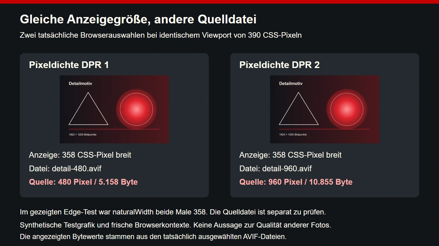
The example combined three viewport widths, two pixel densities, three offered format groups and both language editions. That produces 36 normal cases. Each began in a fresh isolated browser context so that a previously loaded large image would not distort the observation. Actual encoded files were delivered to the browser with their matching content types.
The checks covered successful decoding, the offered format group, measured slot width, preserved aspect ratio and the image resource actually requested. One additional case made the preferred AVIF file unavailable. In total,183 individual conditions passed across 37 cases. These results describe this controlled example and this Edge execution, not a complete compatibility assessment of every device.
For the WebP and JPEG cases, earlier source groups were removed from the offered markup. The same browser consequently received shorter source lists. This does not emulate the full implementation of an older browser. It verifies that each offered group can work with the actual files and the intended layout. Keeping that limitation visible prevents a narrow functional test from becoming an unsupported compatibility claim.
A format fallback does not repair every delivery failure
In the additional failure case, the HTML continued to offer AVIF first. The selected AVIF resource, however, returned a missing response. In the executed Edge test, decoding failed and no decoded natural width was available. A WebP or JPEG resource was not fetched as an automatic repair. This observed behaviour is a practical reason to verify every published candidate address.
A common production mistake is incomplete deployment: the HTML already names a new version while only some variants exist. Another is a mismatch between file extension and content. Both can occur with excellent-looking markup. Check the bytes actually delivered rather than treating a filename in the export directory as sufficient evidence of a valid resource.
A reliable release makes the complete variant set available first and then switches the corresponding HTML. Old paths can remain available for the agreed recovery process. That order avoids placing visitors between two incomplete states. It also makes a later rollback easier to reason about because the old markup still refers to a complete and known collection.
Inspect the selected resource in your tools
The currentSrc property identifies the image resource selected by the browser. Compare it with the actual network requests. Obtain the CSS width from the element's measured box. naturalWidth is not a substitute for that measurement: the intrinsic size exposed by the browser for responsive images should not simply be equated with the source file's raw pixel width.
const image = document.querySelector("picture img");
await image.decode();
console.table({
  source: image.currentSrc,
  layoutWidth: image.getBoundingClientRect().width,
  pixelDensity: window.devicePixelRatio
});
This console check assumes a successfully decodable image. If decode fails, inspect the response status, actual format and content first. Increasing the CSS width does not repair a resource the browser cannot display. For repeatable comparisons, use fresh page contexts or deliberately controlled cache conditions instead of repeatedly resizing an already populated browser tab.
Changing the crop is a separate editorial decision
The example's resolution variants show the same content. A real image sequence may need a different crop in a narrow view. A wide group photograph with a tiny subject does not become more understandable merely because its file is smaller. Plan a crop that preserves the intended information and associate it with the relevant conditions instead of reducing only the pixel count.
Inspect every crop for missing faces, essential product details and labels. If the narrow version shows different content, its shared text alternative still needs to make sense. Avoid variants whose central claim changes with the screen. The technical mechanism should support an understandable presentation of the same information rather than randomly distributing different facts to different readers.
A complete explanatory screenshot often needs treatment different from a decorative cover. It may need to remain uncropped and provide a readable detail view. Filling a rectangle is not a useful goal when doing so removes a relevant control, visible version number or documentary detail. Apply the component's purpose before applying a universal crop rule.
Consider loading behaviour and total image weight together
An immediately visible main image should not be delayed by inappropriate lazy loading. Images farther down the page may often be deferred. The right timing depends on their role. web.dev discusses this prioritisation and the difference between the moment of loading and relative fetch priority.
The example gives its immediately visible image a high-priority hint. That does not guarantee first place in every network sequence. Assigning the same priority to every image would make the genuinely important one harder to distinguish. Likewise, asynchronous decoding is not a replacement for deciding whether a resource should be lazy loaded.
Assess the whole image sequence. Twelve individually sensible files can still create too much work at initial navigation. An overview might need fewer initially requested previews or a different information hierarchy. Technical compression should not obscure that editorial decision. Removing an unnecessary initial image can sometimes be a more appropriate choice than making every existing image slightly smaller.
Approve visible quality at important details
Compare exports at their intended display size and inspect critical details separately. Look at lettering, outlines, gradients, skin and fine materials. A calm background may compress beautifully while another image suffers at the same settings. An automatic byte limit cannot replace this review. The goal is usable information at an appropriate cost, not the smallest possible file regardless of content.
A small representative review set helps with repeated work. Include a detailed photograph, a dark image with gradients, a transparent edge and a precise explanatory graphic. These do not constitute a complete image-quality measurement. They do reveal whether a changed export rule works only for a convenient special case. Keep the checked outputs so that a later encoder change can be assessed against concrete examples.
The learning graphic in this article tests source selection and geometry. It was not used to determine the best photographic format. Its recorded file sizes apply only to these assets and settings. They do not support general percentage savings for other websites or image collections. A colourful synthetic test area cannot stand in for a portfolio of real photographs.
Preserve meaning and discoverability
Compression should not remove the image's meaning from the page. An informative image needs an appropriate description in its particular context. A decorative image may have an empty text alternative. A complex diagram can require an explanation in the page text as well. The W3C WAI decision tree helps distinguish these situations.
For search, sensible embedding, accessible image resources and a comprehensible context remain relevant. Google's image SEO documentation recommends ordinary HTML image elements and a usable fallback src address. No particular extension or filename guarantees a search position. Good delivery and meaningful content should support one another.
Describe the actual image instead of inserting a list of desired keywords. A useful alternative for a technical illustration explains what the image contributes to the page. It does not need to repeat the entire caption or article title. Loading behaviour, readability and accurate interpretation are connected parts of the reader's experience rather than separate competitions.
Maintain export and verification as one workflow
An automated export should connect the master, output widths, format, settings and generated paths in an understandable way. A small manifest containing dimensions and hashes can expose accidentally mixed versions. The web.dev guide to automation covers generating the image resources and their corresponding markup together.
Where practical, derive the HTML from the same variant definition. That reduces conflicting source lists. A check can establish that every declared width matches its file and every publication address is available. A browser check then verifies that the component really occupies its planned slots. These checks complement visual review rather than replacing it with metadata alone.
- The image's role and important crop have been defined.
- A suitable master remains available as the source.
- Variant widths correspond to real display requirements.
- Format, extension and content type agree.
- Width descriptors and sizes agree with files and CSS.
- Immediately visible main images and later images load appropriately.
- Every candidate resource has been completely deployed and checked.
- Important details remain readable at the intended size.
- Text alternatives and captions describe the actual information.
- A layout change triggers another check of image delivery.
Begin with one frequently used component
Select a common image slot and measure it in the relevant layouts. Generate suitable variants, observe browser selection and approve the visible result. Only then apply the checked rule to other comparable components. Different jobs can retain different crops and export settings. A product record and a decorative panorama do not become equivalent simply because both use an img element.
Reliable progress comes from connecting design, files and actual rendering. A small file helps when it delivers the required information. A complete candidate list helps when it matches the layout. The browser exercise tests whether those assumptions meet in this particular implementation. Continuing quality review then gives new images and later layout changes the same care instead of leaving them to an old export preset.