Fluid font sizes and spacing with CSS clamp()
From two design states to a controlled CSS rule, including calculated boundaries, changed text settings and explicitly scoped evidence.

The CSS clamp() function bounds a preferred value with a minimum and maximum. Font sizes or spacing can therefore respond fluidly within a deliberately chosen range. Three separate decisions matter: what is the smallest useful value, how should the value change in between and where should further growth stop? The function implements those choices but does not establish why they are appropriate for the content.
This article develops an original example heading with a formula that can be checked independently. It adds a spacing rule, real browser checks and an explicit description of what the evidence covers. Every dimension is a teaching design value. A mathematically correct curve establishes neither comfortable reading nor complete accessibility. Actual text presentation and operation need additional checks in the environment where the component will be used.
Understand three values with different responsibilities
A typical expression is clamp(minimum, preferred, maximum). If the preferred value lies within the intended bounds, it is used. Below that range, the minimum applies; above it, the maximum applies. The middle argument can contain a relative contribution. That dependency creates the fluid change. Three identical fixed values would not produce dynamic behaviour merely because they were placed inside a function associated with responsive design.
For a heading, the lower bound might come from a narrow view in which the page topic should be recognisable early. The upper bound might come from a broad view in which a long title should not overwhelm everything around it. A transition is designed between those states. This reasoning is more useful than copying a collection of numbers whose original purpose is unknown in the new site and whose effect has never been assessed with its actual wording.
Separate technical bounding from a design promise. A font size can reliably remain between 24 and 40 pixels while still being inappropriate for a particular title. A word containing many wide characters behaves differently from a short label. Suitable bounds therefore belong to the content, font and integration context. They are not a universal property of good websites and should not become unexplained rules applied identically to every type of text.
Choose the property and its basis first
Font size, internal padding and spacing between sections serve different purposes. A larger title may improve orientation. Larger card padding can simultaneously reduce the width available for copy and create more wrapping. One shared fluid formula for all properties would be an untested simplification. Begin with a clearly bounded role and assess its effect on the information actually needed, including how that role interacts with the rest of the surrounding layout.
Also consider what the change should respond to. A viewport-relative unit follows the CSS viewport. A container-relative unit can follow the space available to a component. These bases are not automatically interchangeable. A broad screen can contain a narrow card area. A title calculated from the whole window may grow inappropriately there even though the browser evaluates the formula correctly. The missing decision concerns context, not arithmetic.
Our main example deliberately uses a viewport-related heading. It belongs to a broader content area and should grow between two defined design states. That assumption is recorded. A small reusable recommendation card would need a separate investigation of its appropriate basis. clamp() does not choose that basis for the developer. It processes the supplied values and cannot know whether their relationship matches the intended visitor task.
Build a complete original example rule
The heading below has a bounded fluid size. Its first declaration provides a straightforward base value, followed by the enhanced function. If the second declaration is unsupported at the syntax stage, the first remains available. This is a limited statement about this construction. It must not be generalised to every later problem involving CSS variables, where a value can become unsuitable only after substitution and calculation have occurred.
.fluid-title {
  font-size: 1.5rem;
  font-size: clamp(1.5rem, calc(1rem + 2vw), 2.5rem);
  line-height: 1.15;
  margin: 0 0 1rem;
  overflow-wrap: anywhere;
}
.text-area {
  max-width: 66ch;
  padding-inline: 1rem;
}
The rule does not restrict the title to a fixed number of lines. Longer wording can wrap and grow vertically. That does not prevent every poor arrangement, but it creates a useful basis for testing variable content. Applying overflow: hidden as a quick repair could remove precisely the words visitors need to understand the offer. A tidy fixed card height should not conceal missing information or be mistaken for successful responsive behaviour.
The class describes a visual role. The appropriate HTML heading level depends on the document. An element does not become the first heading merely because its lettering is large. Equally, meaningful subdivision should not be replaced by a paragraph class that happens to look suitable. Fluid sizing supplements content structure. A later visual adjustment should not quietly change that structure or introduce inconsistent heading relationships between different page templates.
Calculate the actual example values
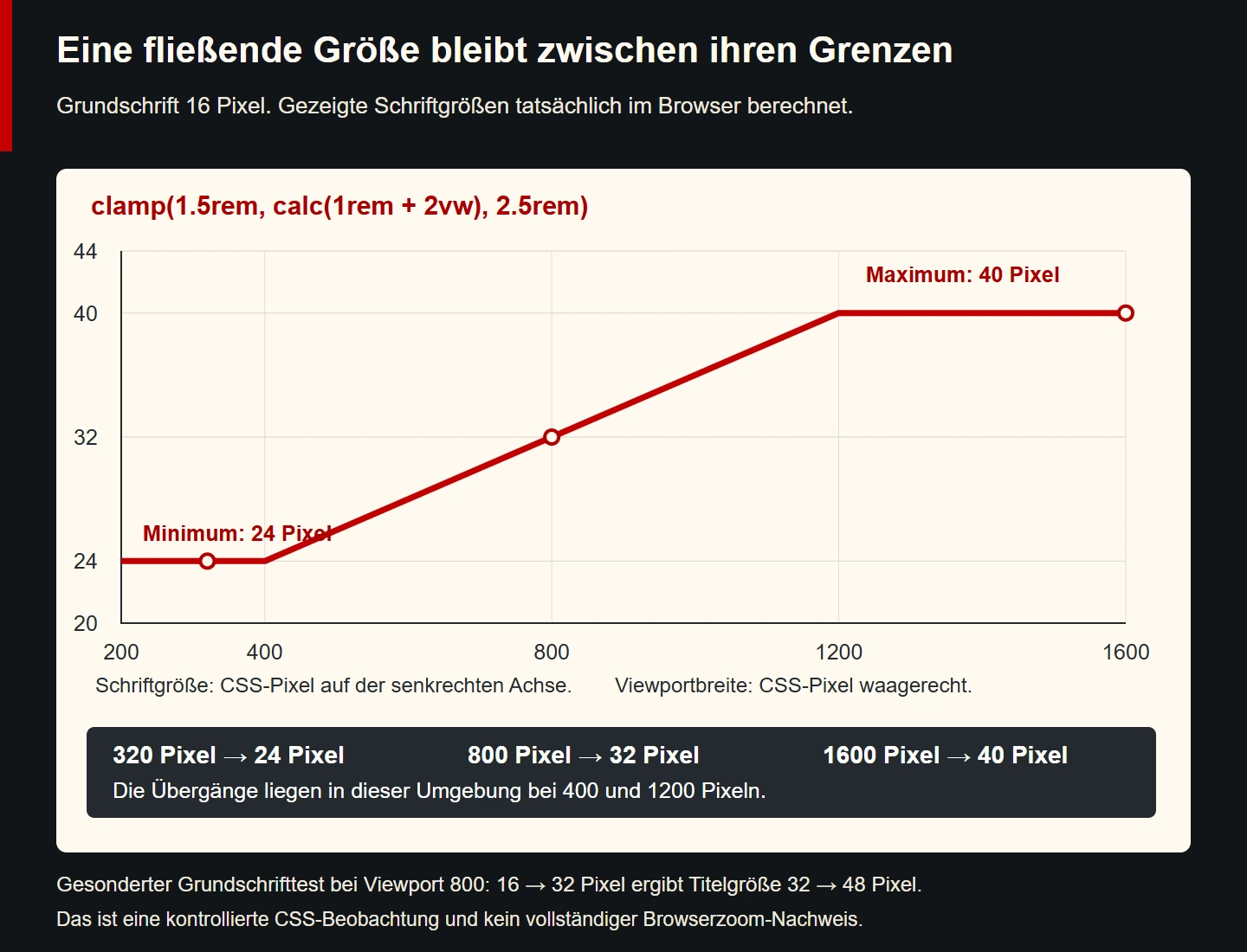
With a 16-pixel root font, the bounds are 24 and 40 pixels. The middle expression consists of 16 pixels plus two percent of viewport width. At 800 pixels, that is 16 plus 16, giving 32 pixels. It lies between the bounds and is therefore used. The calculation is small enough to check independently of the visual design, providing a useful reference against which actual browser measurements can be compared.
| Viewport width | Middle expression | Result | Active region |
|---|---|---|---|
| 320 pixels | 22.4 pixels | 24 pixels | Minimum |
| 400 pixels | 24 pixels | 24 pixels | Lower boundary |
| 800 pixels | 32 pixels | 32 pixels | Fluid region |
| 1200 pixels | 40 pixels | 40 pixels | Upper boundary |
| 1600 pixels | 48 pixels | 40 pixels | Maximum |
These figures describe CSS pixels under the stated test conditions. They are not millimetre measurements for a physical phone or recommendations for every heading. Changing the root font changes the rem contributions. Changing window width changes the preferred expression too. A correctly labelled graphic needs to identify those assumptions so that one particular observation is not presented as an unconditional promise about every possible rendering environment.
Check values immediately beside the transitions as well. At 399 pixels, the result remains at its lower bound. At 401 pixels, it starts growing above that bound. Growth ends at 1200 pixels in this example. These boundary checks establish whether the formula, expectation and actual browser calculation agree. One attractive screenshot at an intermediate width could easily conceal a lower or upper bound that was not what the designer intended.
Derive a formula from two design states
If the desired development is already known, its middle straight line can be derived. Our example asks for a 24-pixel font at a 400-pixel viewport and 40 pixels at a 1200-pixel viewport. The font grows by 16 pixels across a width increase of 800 pixels. That ratio is 0.02, corresponding to a viewport contribution of two vw. The remaining constant contribution is 16 pixels. The arithmetic explains the relationship between the chosen states.
With the selected 16-pixel root font, that constant contribution can be written as one rem. This produces the example's middle expression. Bounding it prevents the straight line from continuing indefinitely outside the selected range. The starting and ending states remain design choices. The calculation explains how to connect them; it does not establish why those exact font sizes would be appropriate for this content, font family or surrounding page arrangement.
Whenever a formula is derived, document its starting assumptions. If the root font or desired end sizes later changes, the old relationship is not automatically preserved. A brief note identifying the two design states is more helpful than an apparently mysterious decimal in the stylesheet. It enables deliberate revision and prevents repeated adjustment of individual numbers based only on whichever screenshots happen to be visible during a particular review.
Check the influence of the root font
At a 20-pixel root font, the example's bounds become 30 and 50 pixels. Its preferred expression now includes 20 pixels plus two vw. At an 800-pixel viewport, that gives 36 pixels. The fluid region therefore begins and ends at different widths. The original transitions at 400 and 1200 pixels must not be described as permanent properties of the formula independently of the root setting used to calculate them.
This dependency is neither automatically wrong nor automatically the desired solution. Relative contributions can support useful adaptability, but their particular effect must fit the page task. Use the same copy and change one setting at a time. This distinguishes wrapping caused by the root font from wrapping caused by available width or another font file. Otherwise a review may attribute an improvement to the formula when the actual cause was an unrelated change.
A computed font size also does not describe the actual letter dimensions of a font family. Two fonts with the same CSS value can appear differently wide and tall. Test the intended fallback font as well. Failure to load a web font must not remove information or make an important action unreachable. The sizing formula remains one part of the whole typographic system, alongside letterforms, text length, line height and the available space.
Distinguish enlargement from fluid growth
Increasing window width and a person's request to enlarge text are different operations. A rem contribution does not prove a particular enlargement effect for the whole page. In the controlled example at an 800-pixel viewport, changing the root font from 16 to 32 pixels increases the computed heading from 32 to 48 pixels. That is a factor of 1.5 in this case rather than automatic doubling. The observation needs to be described accurately.
The W3C explanation of WCAG 1.4.4 addresses the ability to enlarge text to 200 percent without losing content or functionality. An actual assessment needs an available enlargement mechanism and the complete rendered outcome. Our root-font calculation is one controlled observation. It is not a complete browser-zoom test or a final conformity assessment of the eventual site. Those different kinds of evidence should not be merged merely because both involve a larger-looking heading.
During enlargement, inspect the consequences: are the heading and link fully visible, can controls and feedback still be reached and does a fixed wrapper create unnecessary overlap? An appropriate correction may concern the formula, the layout or both. The purpose is a usable presentation for the actual task. Passing an arithmetic comparison alone cannot answer that question, even when every measured numeric value is precisely what the CSS expression predicts.
Give spacing its own justification
Spacing between larger sections may need a different development from heading size. The following example uses a minimum of two rem and a maximum of five rem. Its preferred value follows four percent of viewport width. With a 16-pixel root font, the bounds are 32 and 80 pixels. The selected experiment therefore limits spacing on large views rather than allowing its viewport contribution to keep growing without a defined stopping point.
.content-section {
  padding-block: 2rem;
  padding-block: clamp(2rem, 4vw, 5rem);
}
Assess spacing together with adjacent elements. Large internal padding plus additional section margins can create an unexpectedly large combined gap. Each individual function may still be working perfectly. Responsibility for separating two content groups should therefore be recognisable in one place. Several simultaneously fluid rules make it harder to determine which one actually creates the visible space and which needs adjustment when a particular transition feels excessive.
Card padding also needs a separate review. Large edge areas on narrow views leave less room for text. A generous upper bound may be suitable on a broad screen while its lower bound is too large for a small integration area. Select values according to the content area required, rather than judging them only from a pleasing design-tool view. The same numeric range does not have the same practical effect in every surrounding layout.
Recognise conflicting bounds and unsuitable value types
The function is not a freely sortable list of three numbers. Its lower and upper arguments have fixed roles. Contradictory ordering does not automatically produce the narrow range somebody might expect. In a simple technical case, clamp(30px, 20px, 10px) produces 30 pixels. An alleged ten-pixel maximum therefore does not protect against an accidentally larger minimum. This behaviour deserves a direct test rather than an assumption based on the argument names.
A design system should identify and correct that configuration as an inappropriate specification. Record the intended relationship and check it after changes. This is particularly useful when several people maintain size roles. An output that happens to look acceptable can conceal contradictory inputs and later affect another component unexpectedly. Visual review and a basic consistency check complement one another; neither needs to be replaced by a complicated scoring system.
Values must also be appropriate for the property and calculation. An angle between length arguments does not form a suitable font-size expression. Such a declaration can be tested deliberately in a bounded syntax experiment. In a real design rule it should not arise in the first place. Meaningful names and clearly scoped tokens help more than an unnecessarily nested expression whose units and intended result nobody can explain confidently.
Use CSS variables with clear ownership
Repeated roles can be stored as custom properties. Their names should describe a purpose, such as a main title or section spacing. A purely numeric name makes later usage harder to understand. The variable forms part of an agreement: where is it defined, which values are permitted and where may it be overridden? Those questions remain relevant even when the complete formula fits into one short line of CSS.
:root {
  --type-title: clamp(1.5rem, calc(1rem + 2vw), 2.5rem);
}
.page-title {
  font-size: 1.5rem;
  font-size: var(--type-title);
}
An existing variable can still hold a value inappropriate for the property. If --type-title is later set to broken, the second declaration initially remains recognisable as a variable reference. Its problem appears during calculation. The first font-size declaration is not automatically a rescue. In the controlled experiment, where the surrounding inherited size is 16 pixels, the result falls back to that inherited size rather than the earlier 24-pixel declaration.
A fallback argument inside var() is not a complete type check of a variable that already exists either. A missing definition differs from an existing unsuitable value. Check actual tokens at their usage points. The technical ability to override a custom property does not establish that every replacement is meaningful or acceptable within the existing design agreement. A narrow test using a broken value can expose that distinction without introducing it into production styling.
Review context, content and bounds together
A useful test surface contains short and long headings, several paragraphs and at least one operable action. For the fictional consulting site, the same title class is used with a short heading and then a longer German page title. The text is not shortened simply to preserve a preferred screenshot. Instead, wrapping and spacing are assessed for their ability to retain complete understandable information under the defined conditions.
Check multiple widths and changed text settings. A larger value on a narrow page may create additional lines and move a contact route further down. That is not inherently wrong. Problems arise when important content is clipped, overlaps or becomes unreachable. Flexible height and clear content order are therefore often as important as a suitably bounded font size. The formula should support the task rather than demand that the content fit an arbitrary fixed picture.
Record what was actually observed. Browser, CSS viewport width, root font, particular text and computed size provide a reproducible basis. Saying that something “looks fine on a large screen” does not. A simulated root-font change should likewise not later be described as testing every real zoom mechanism. Useful evidence remains accurate about its actual scope, allowing a future reviewer to decide which additional tests are still relevant.
Introduce an existing size role gradually
For an existing site, begin with one role and record its prior presentation. Change the page title first, for example, while leaving paragraph text, card padding and section spacing in their established roles during the comparison. This makes it easier to tell whether the new title behaviour has the intended effect. Simultaneously changing all spacing would make a new improvement or defect harder to attribute to the decision that actually caused it.
Use a small fixed collection of representative content, including a long German title, a short label and a translation with a different word length. Review the collection again after an adjustment. If a formula looks appropriate only for one carefully chosen example, the role has not yet been understood sufficiently. Let the next decision follow the actual discrepancy rather than adding arbitrary decimal places to the preferred expression until one screenshot appears acceptable.
Give an accepted role a brief justification and reproducible checks. Revisit that basis when the font family or page layout changes later. Fluid sizing then remains a maintained part of the system, rather than an unexplained special rule copied indefinitely because nobody understands its effects. The useful outcome is a design decision other people can review and adapt, supported by actual behaviour rather than confidence in the apparent sophistication of the formula.
Checklist for bounded fluid sizes
- Is the purpose of the affected type role or spacing clear?
- Are the minimum, preferred development and maximum justified separately?
- Does the reference basis fit the actual integration context?
- Are the assumptions behind a derived formula documented?
- Have boundaries and values immediately beside them been checked?
- Are root-font changes and actual enlargement mechanisms assessed separately?
- Do long text and interactive elements remain complete and reachable?
- Are contradictory bounds and unsuitable custom-property values detected?
- Does the evidence describe only the conditions actually tested?
Sources and technical review date
Sources checked on 9 November 2026. The primary references explain the function and requirements relating to text enlargement. The CSSWG document is a working draft. Formulas, sample content and controlled cases in this article were developed independently.