Design tokens for colour, spacing and typography
Connect recurring design decisions with checked components and build a manageable token system for design and development.

A colour appears in several buttons. A spacing value recurs across cards, dialogs and forms. Headings use the same size in different places. When these decisions exist as isolated values across many files, every change becomes a search for relationships. Design tokens give recurring decisions names so a team can record which value applies and what job it performs.
A token is not a complete design system by itself. A neatly named colour does not explain appropriate usage or establish whether a component is usable. The important connection joins meaning, implementation and a checked example. This article develops a small foundation for colour, spacing and typography. Its component comparison is actually rendered from the published CSS and makes no claim about measured production outcomes.
1. Identify recurring decisions before naming them
Start with the existing design or actual website. Which colours, distances and type sizes recur? Which differ for a good reason? An inventory should capture both. Two cards can happen to use the same spacing without performing the same design role. Conversely, slightly different values may reveal an accidental inconsistency worth investigating.
Look at the application alongside the number. Internal spacing structures a card's content. External spacing separates regions. Even if both currently share a value, they may need independent decisions later. Naming should support that distinction. A long catalogue of every number found in the code is not automatically a useful design foundation.
A small website can begin with a limited set. Record frequently used decisions and the components that depend on them. Attempting completeness immediately can produce many names without clear responsibility. A manageable system is easier to review and can grow when an actual requirement provides a reason for another role.
2. Distinguish base values from semantic roles
A base value describes a design selection such as a particular red. A semantic role describes its purpose, such as the background of a primary action. The two levels can be connected, but they answer different questions. The base belongs to the palette; the role connects that selection to a particular use.
This helps with later changes. Revising the action colour need not revise every decorative red element. A role named color-action can deliberately point to another base value. If the same brand value is used directly everywhere, expressing that boundary becomes more difficult and the consequences of a change become harder to isolate.
Several additional layers are not necessary for every case. A simple project can start with a few meaningful roles. The relevant question is whether naming explains a real decision. Indirection without practical value merely increases the amount of searching. A useful structure reveals relationships while preserving distinctions that matter to future changes.
3. Build a small executable CSS example
CSS custom properties can make these decisions available within a website. The MDN introduction to custom properties explains their definition, use and cascade. This example has one brand value, two action roles, a spacing base and two type sizes. It is a deliberately limited set for the demonstrated component.
:root {
  --color-brand: #b80024;
  --color-action: var(--color-brand);
  --color-action-text: #ffffff;
  --space-unit: 0.5rem;
  --space-component: calc(var(--space-unit) * 3);
  --font-body: system-ui, sans-serif;
  --font-size-body: 1rem;
  --font-size-title: 1.5rem;
}
.demo {
  font-family: var(--font-body);
  font-size: var(--font-size-body);
}
.demo .card {
  padding: var(--space-component);
  border: 1px solid #8b9499;
  background: #ffffff;
  color: #192329;
}
.demo h3 { font-size: var(--font-size-title); }
.demo .button {
  display: inline-block;
  background: var(--color-action);
  color: var(--color-action-text);
  padding: var(--space-unit) calc(var(--space-unit) * 2);
}
.demo.compact {
  --space-component: calc(var(--space-unit) * 2);
}
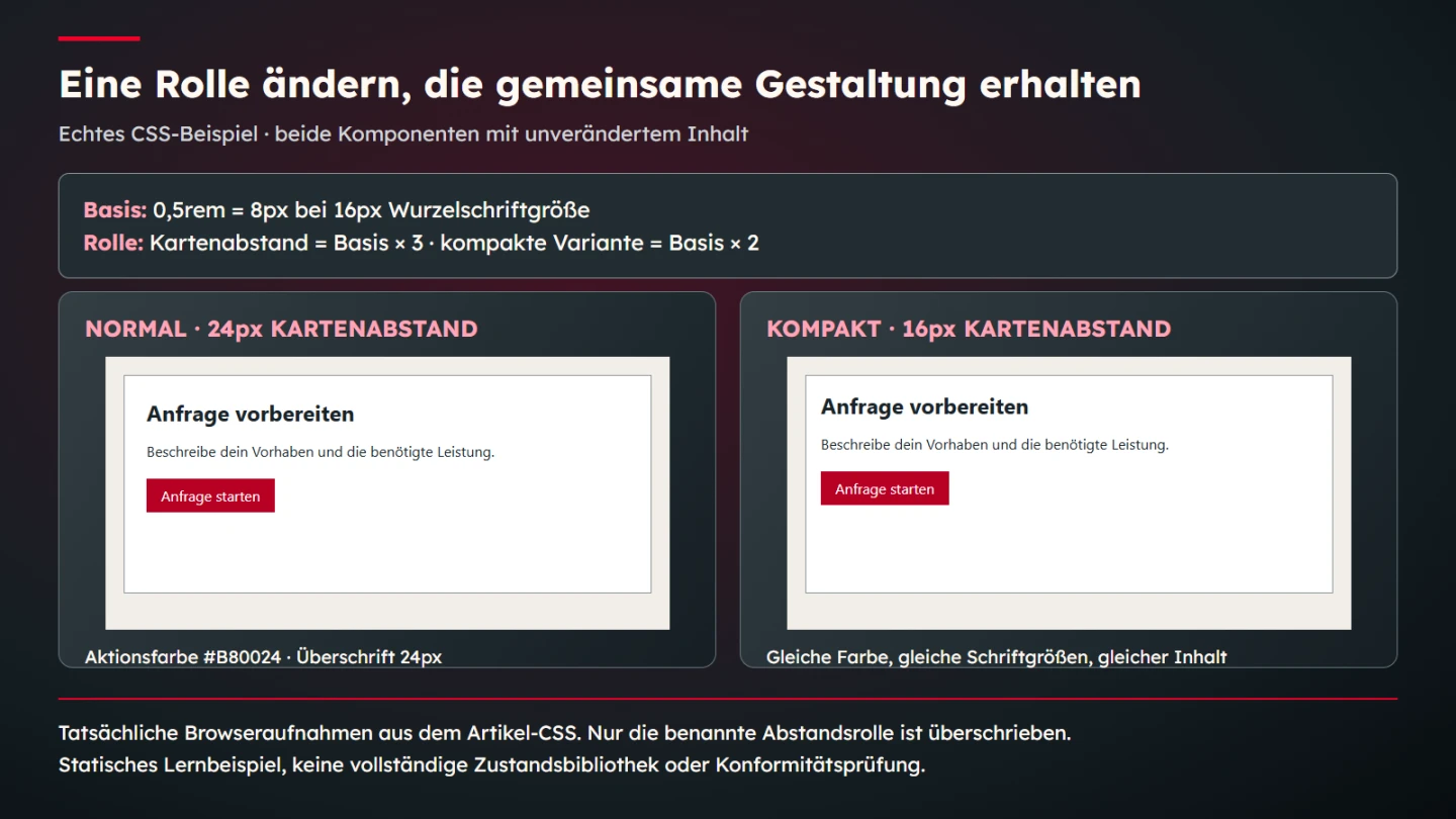
With a root font size explicitly set to sixteen pixels in the test setup, half a rem becomes an eight-pixel base. The normal card padding is twenty-four pixels and the compact version uses sixteen. These are original teaching parameters. They are neither a general standard nor a recommendation for every component or application density.
4. Limit the meaning of an override
The compact variant overrides only card spacing. Colour, font sizes and content remain the same. That makes one change traceable. The property is used within the affected region. The example does not provide a complete density mode for an application; such a feature would require consideration of additional components and their interaction behaviour.
The cascade is part of this behaviour. A value supplied in a parent region or through a more specific rule can affect the result. Finding the token's original definition is therefore only part of reviewing a change. Inspect the value that actually reaches the component. Computed styles provide a concrete place to check that relationship.
A shared name does not guarantee a shared effect. A component may retain a fixed value or override the property within its own scope. Such exceptions should have understandable reasons. Hidden exceptions make maintenance difficult because a central list can suggest a stronger connection than the implementation actually provides.
5. Treat spacing as a set of relationships
A spacing scale offers a bounded selection. It can simplify decisions and align similar uses. The scale still needs to fit the information structure. Spacing within a group performs a different task from separation between major sections. Values become meaningful when their application supports those relationships rather than merely following a numerical pattern.
The example multiplies one simple base because that makes the calculation easy to follow. It does not require every distance to be a multiple of that unit. Optical corrections can be appropriate in some relationships. Make them deliberate decisions rather than leaving unexplained one-off numbers scattered through the code.
Inspect a compact version with realistic content as well. Less internal space may bring a card together, but it may also crowd a long label. An attractive example containing two short words proves little about a longer translation. Review the scale with the components and text lengths that the actual project needs.
6. Do not reduce typography to a size list
A font-size token captures only part of a typographic decision. Family, weight, line height and available width also affect the result. Two headings can share a nominal size while appearing quite different in different typefaces. Tokens organize those relationships; they do not replace inspection of the rendered type.
A semantic role such as heading or body text can involve several properties. Simple CSS may name them separately, while another tool can represent a composite value. The important point is that contributors understand which properties belong together and which applications need review when a related decision changes.
Keep visual styling distinct from document structure. A large line is not automatically the correct heading level. The semantic outline requires its own reasoning. A type-size token should not encourage choosing heading elements solely because they happen to have the desired visual appearance in the current stylesheet.
7. Review colour roles together with their backgrounds
A single colour value does not define a contrast ratio. That requires the colours actually meeting in the rendered application. Review text and background roles as a combination. Transparency, overlays and changing surfaces can alter the result. An isolated palette swatch cannot settle those cases.
The WAI explanation of WCAG 2.2 Success Criterion 1.4.3 describes a general minimum of 4.5 to 1 for ordinary text and 3 to 1 for large text, with the conditions and exceptions explained there. This particular requirement is distinct from a complete accessibility assessment. One suitable pair does not establish that an entire component is accessible.
In practice, inventory the combinations actually used. A brand colour may work as an accent yet be unsuitable for small text on a particular surface. Semantic roles help separate those applications. They make the intended relationship easier to describe but do not remove the need for contextual review.
8. Treat states as additional design decisions
A button may need default, focus, hover and disabled states. Their differences must be meaningful. One action-colour token does not explain every state. Add roles when they serve a concrete purpose. A large stock of unused state values is an unreviewed reserve rather than a demonstrated component system.
Inspect states in an actual component view. Focus needs to remain apparent in its surroundings. A disabled state should not be presented through wording that suggests an available action. The token list records values, while the application determines whether the state is understandable and usable. Both aspects belong in a sound review.
The small demonstration intentionally shows a static action appearance. It does not include a complete state library or connected enquiry delivery. These boundaries prevent a colour example from being mistaken for a finished functional module. A real application would require its own necessary states, behaviours and checks.
9. Distinguish an exchange format from browser implementation
Design tokens may be shared across several tools and platforms. A CSS custom property is one specific browser mechanism. An exchange format performs another task: describing values and relationships for tools to process. These levels can be connected, but they are not the same file format and are not automatically interchangeable.
The Design Tokens Format Module 2025.10 describes an exchange format published as a Community Group Report. Its own status section says that it is not a W3C Standard. That distinction matters when selecting a technical foundation. The word standard should not become an imprecise quality label.
A small CSS project therefore does not necessarily need an additional toolchain immediately. Sharing decisions between platforms or design tools can justify a defined interchange process. Check the actual import and export capabilities of the tools involved. Similar token terminology does not establish that a round trip preserves every intended value and relationship.
10. Choose names for purpose and future changes
A name should support usage. color-red describes an appearance; color-action describes a role. Both can be useful when their level remains clear. A name such as color-red-action can mix the two and become misleading when actions need a different colour. The name should not make a legitimate change harder to express.
Spacing can use named roles or understandable scales. space-component is sufficient for a small teaching example. A larger application may require a clearer distinction between the component and relationship concerned. Let naming grow with actual scope. It does not need to represent every hypothetical expansion in advance.
Avoid unnecessary abbreviations as well. Saving a few characters rarely justifies a name that is difficult to interpret. A short description of common uses and intentional limits helps handover. It explains when the role applies and when another decision is required, rather than leaving colleagues to infer the meaning from a number.
11. Map existing values progressively
On an existing website, begin with a manageable component. Map its values to the chosen roles and compare the presentation before and after. Keep the first change traceable. Renaming everything simultaneously makes unexpected effects more difficult to locate and can hide disagreements about what values actually mean.
If the intention is initially to preserve appearance, that becomes a concrete review question. If a deliberate design change is also intended, name it separately. Technical consolidation and visual redesign are different decisions. Combining them without distinction makes a visible difference harder to explain later.
Record remaining exceptions. A historical special case may not need immediate removal, but its existence should be understandable. This creates an accurate picture of coverage. A central token list without knowledge of actual applications can otherwise imply a consistency that the existing website has not yet achieved.
12. Use a small change-specific review plan
Changing a shared decision can affect several locations. Select representative applications for review, including short and long content, narrow and wide views and necessary states. The plan should follow the token's meaning. A typography change needs different examples from a spacing adjustment confined to one card.
| Decision | Concrete check | Do not infer |
|---|---|---|
| Action colour | Computed colour and actual combination | The entire application is accessible |
| Card spacing | Normal and compact internal padding | Every dense interface is suitable |
| Type size | Computed value and wrapping with content | All translations were checked |
| Semantic mapping | Affected components and exceptions | Every identical colour has the same role |
| Exchange file | Actual import and export | Every tool is losslessly compatible |
The teaching example checks computed values and unchanged content. Its normal and compact cards differ in the named internal spacing. This limited exercise explains the mechanism. It does not establish complete design-system coverage or a measured saving in development time attributable to tokens.
13. Connect ownership with documentation
A shared value needs an understandable decision process. Who may change its meaning? Which applications need review? Where is the reason recorded? These questions can matter more than a large token count. Without responsibility, even a technically tidy list can grow in contradictory directions.
Concise documentation records the name, meaning, value, common use and known exceptions. A substantial revision should identify affected components. That allows someone to understand a decision rather than merely find it. Keep documentation aligned with actual usage and update it when a change alters the relationship it describes.
- Recurring decisions are identified through actual applications.
- Base values and semantic roles are distinguished.
- Names describe the meanings the project genuinely needs.
- Colour combinations and states are reviewed in context.
- Spacing and typography have been inspected with realistic content.
- Computed values match the intended example.
- Exceptions and technical limits are documented.
- Exchange formats are not confused with browser mechanisms.
- Changes have a clear owner and a recorded reason.
Tokens can then provide a manageable connection between design decisions and implementation. Their value lies in understandable relationships, reviewed components and deliberately bounded changes. A larger list is not automatically better. The important point is that the named decisions are used dependably in the actual website.
14. State units and their reference explicitly
The CSS Values working draft provides technical unit definitions. A value of one rem refers to the root element's font size. It is not inherently equivalent to sixteen pixels. That number applies in this test because the root font size is explicitly configured accordingly. If the reference changes, derived spacing changes too. This may be intentional, but documentation should describe the relationship accurately.
Other units can serve different purposes. A percentage depends on a reference established by the property using it. A fixed pixel value captures another decision. A token name does not erase these differences. Check whether the chosen value and unit make sense at every intended use. Sharing a name across incompatible applications creates only apparent consistency.
The example makes that relationship checkable. With a twenty-pixel root font size in the isolated test, half a rem becomes ten pixels. Normal card padding becomes thirty pixels and compact padding becomes twenty. Those are consequences of the published calculation, not proof that every real interface already behaves correctly when text size changes.
15. Distinguish an invalid value from a missing value
The CSS Variables specification describes variable substitution. A variable fallback is not a general validation mechanism for design decisions. A role can exist while containing a value unsuitable for the property using it. A technically valid value can also be inappropriate visually. A missing definition, an unsuitable type and inadequate contrast are different problems requiring different checks.
Do not rely on the central list alone. Open the rendered component and inspect its computed properties. If a new value seems to have no effect, the cascade, selector or an invalid use may be involved. Trace that relationship before introducing another fixed exception that merely hides the underlying cause.
Release ultimately concerns what visitors see and use. Technical checks provide specific evidence, but they do not replace design review with appropriate content. A small system with explicit limits and traceable examples is easier to maintain than a large collection whose real effects nobody can confidently identify.
Sources and technical scope
Sources checked on 9 November 2026. The linked MDN, WAI and DTCG primary sources were opened. The exchange format is identified specifically as version 2025.10. CSS values and demonstration cards are original teaching parameters, not a universal scale or a complete conformity assessment.