Style forms, selects and buttons consistently
Connect typography, geometry and colour roles without erasing selection mechanisms or interaction states.

Consistent forms help people orient themselves. Labels, spacing, borders and buttons feel related when their rules are understandable. A text field, select and checkbox nevertheless perform different jobs. Styling should not erase those differences until their function becomes harder to recognise. A useful CSS system connects shared design decisions with the strengths of native controls.
This guide develops that connection through an original teaching example. It includes a keyword field, subject select, checkbox and a genuinely functioning reset button. It performs no search and sends no data. Checks cover styling, native input states and resetting in light, dark and browser-emulated forced colours. They do not provide a general accessibility certification.
Begin with the relationship between tasks
Identify which controls belong together in the interface. A short search form can have different requirements from a long data-entry workflow. Shared styling should still follow named rules. Which font is used? What distance separates a label from its field? How are boundaries visible? How does an action differ from an input?
These decisions create a small shared language. They prevent each new component from inventing unrelated values. The goal is not identical appearance. A select should still look like a choice. A checkbox should communicate a binary state. A button should name its action. Consistency arises through relationships rather than removal of every distinction.
Set the font and sizing model first
Native controls do not automatically start with the same font as surrounding content in every situation. The example explicitly applies font: inherit to inputs, selects and buttons. They then receive the font definition of the common component area. This connects the elements without prescribing one particular typeface for every project.
A coherent sizing model also helps. With box-sizing: border-box, padding and borders participate in the declared size. The rule is scoped to the component area so its reach remains inspectable. A global change in an established project can affect unrelated content and should not be introduced casually just to style one new form.
Named values support reasoned changes
The example names surface, field background, text, border, accent and focus roles through CSS properties. Those names explain more than a loose collection of colour values. A dark variant can replace the relevant roles while structure and function remain independent. The colours are teaching values rather than a publication of an official Agentur Zentral colour specification.
Spacing deserves the same care. A shared distance between fields and a smaller distance between label and input create recognisable groups. These distances differ intentionally. They communicate which text belongs to which control. Making every gap identical would not automatically improve consistency and could weaken the grouping of related content.
A minimum height is not a rigid text container
The text field, select and button receive a minimum block size of three rem. At the tested root size of sixteen pixels, that corresponds to forty-eight pixels. Their actual height may grow when content or padding requires it. A minimum is not an instruction to crop a longer label inside a fixed box.
This teaching dimension is not a blanket legal statement or automatic proof of every target-size requirement. It is an explicit design choice for this extract. A real interface must consider actual interaction areas, spacing, content and usage. One CSS number does not assess the complete usability of a form.
Preserve the native select deliberately
A select brings its native interaction mechanism. Its closed appearance can be styled within certain limits. The opened picker can vary by environment. This example does not attempt to reproduce every part identically. It connects font, surface, border and minimum size while retaining an identifiable native choice control.
For that reason, appearance: none is not a universal starting rule. MDN explains that changing appearance can make a control invisible without removing its functionality. If native visual clues are removed, the implementation must responsibly restore recognisability and handle relevant states. A missing select arrow does not constitute a finished custom component.
Checkboxes need different proportions
A checkbox does not become a better input by occupying the same full width as a text field. Here it remains a compact native control beside its visible label. The row provides an appropriate gap and aligns the two parts. It is not forced through the general styling class used for the text field and select.
The accent is set through accent-color. This property affects particular native controls and states rather than recolouring every widget automatically. The browser still contributes to the result. Inspect the actual checkbox in its intended state instead of assuming that the presence of a declaration establishes identical rendering everywhere.
Labels belong to the component
A form's design does not stop at the field border. Its label explains what to enter or choose. The example uses actual for and id relationships. The checkbox sits inside its label. Both approaches connect visible text with the relevant control. The relationship must resolve correctly in the real document.
A placeholder is not an equivalent replacement for this persistent explanation. It can disappear during entry and serves a different purpose. Visual proximity alone does not prove a programmatic association. WAI treats form labelling as a substantive requirement. Shared fonts and attractive spacing support that task without replacing it.
The complete teaching markup
This is a bounded styling exercise. Keyword and subject labels give the controls a comprehensible subject. The only implemented action is native resetting. There is no result list and no asserted filtering effect. That boundary keeps the example accurate while still allowing real input and state checks. German labels intentionally match the native explanatory image.
<section class="form-demo" aria-labelledby="demo-title">
  <h2 id="demo-title">Eingaben gestalten</h2>
  <form>
    <div class="field"><label for="keyword">Suchwort</label><input class="control" id="keyword" name="keyword" type="text" value=""></div>
    <div class="field"><label for="subject">Thema</label><select class="control" id="subject" name="subject"><option value="all">Alle Themen</option><option value="html">HTML</option><option value="css">CSS</option></select></div>
    <label class="choice"><input id="code-only" name="code-only" type="checkbox">Nur Codebeispiele</label>
    <button class="action" type="reset">Auswahl zurücksetzen</button>
  </form>
</section>
Organise CSS around shared roles
The rules are limited to .form-demo. The .control class identifies the text field and select; .action identifies the reset button. Shared properties sit together while function and colour remain distinct. The checkbox has its own row rule. Differences stay visible without losing the common foundation.
.form-demo {
  --surface: #fffaf3; --field: #ffffff; --text: #192329;
  --border: #66757d; --accent: #b80024; --on-accent: #ffffff;
  --focus: #192329; --space: 1.25rem;
  color-scheme: light;
  box-sizing: border-box; max-inline-size: 35rem; padding: 1.5rem;
  color: var(--text); background: var(--surface);
  font: 1.125rem/1.5 Arial, sans-serif;
}
[data-theme="dark"] .form-demo {
  --surface: #192329; --field: #26343b; --text: #fffaf3;
  --border: #a7b5bc; --focus: #fffaf3;
  color-scheme: dark;
}
.form-demo *, .form-demo *::before, .form-demo *::after { box-sizing: inherit; }
.form-demo h2 { margin: 0 0 var(--space); font-size: 1.5rem; }
.form-demo form { display: grid; gap: var(--space); }
.form-demo label { display: block; }
.form-demo .field label { margin-block-end: .375rem; }
.form-demo :is(input, select, button) { font: inherit; }
.form-demo .control, .form-demo .action {
  min-inline-size: 0; min-block-size: 3rem;
  border: 2px solid var(--border); border-radius: .5rem;
  padding: .625rem .75rem;
}
.form-demo .control { inline-size: 100%; color: var(--text); background: var(--field); }
.form-demo .choice { display: flex; align-items: center; gap: .625rem; }
.form-demo [type="checkbox"] { accent-color: var(--accent); margin: 0; flex-shrink: 0; }
.form-demo .action { color: var(--on-accent); background: var(--accent); cursor: pointer; }
.form-demo :is(input, select, button):focus-visible {
  outline: 3px solid var(--focus); outline-offset: 3px;
}
@media (forced-colors: active) {
  .form-demo .action { border-color: ButtonText; }
  .form-demo :is(input, select, button):focus-visible { outline-color: Highlight; }
}
This organisation supports diagnosis. If every field has cramped padding, inspect the shared rule. If only the action looks wrong, the field foundation need not automatically change. Selectors should express responsibility. High specificity is not a substitute for an understandable division of styling concerns.
Light and dark are related applications
The dark variant replaces surface, text, border and focus values. The accent remains the same teaching colour. Both variants use identical content and HTML, making the effect of colour roles visible. They are not independently maintained forms whose behaviour could drift apart as one receives updates.
The example also sets an appropriate color-scheme. Native parts can then account for the intended environment. This does not promise that every browser draws every component identically. Actual appearance and operation still require review. A dark field background alone does not define a complete dark form design.
Focus adds visible interaction information
The shared focus rule uses :focus-visible and an outline outside the control. It is dark in the light variant and light in the dark variant. It identifies the current interaction position. It is neither an error state nor a verdict that the entered value is valid. Keep those meanings distinct.
Check the outline near layout boundaries too. An ancestor that clips overflow can obscure it. A sensible stylesheet value therefore does not prove visible presentation. The teaching example actually reaches the keyboard position and checks the focus styling. The surrounding production website needs its own examination.
System colours are an operating condition
Forced colours can change presentation through a restricted system palette. Treat that as a usage condition. The example allows the adjustment rather than disabling it broadly with forced-color-adjust: none just to preserve the selected brand-like accent at any cost.
The targeted addition concerns the button border and focus colour. System colours such as ButtonText and Highlight adapt the indication to the environment. MDN describes limited corrections as an appropriate use of the media feature. Browser emulation supplies evidence for that environment, not a photograph of a physical device with particular operating-system settings.
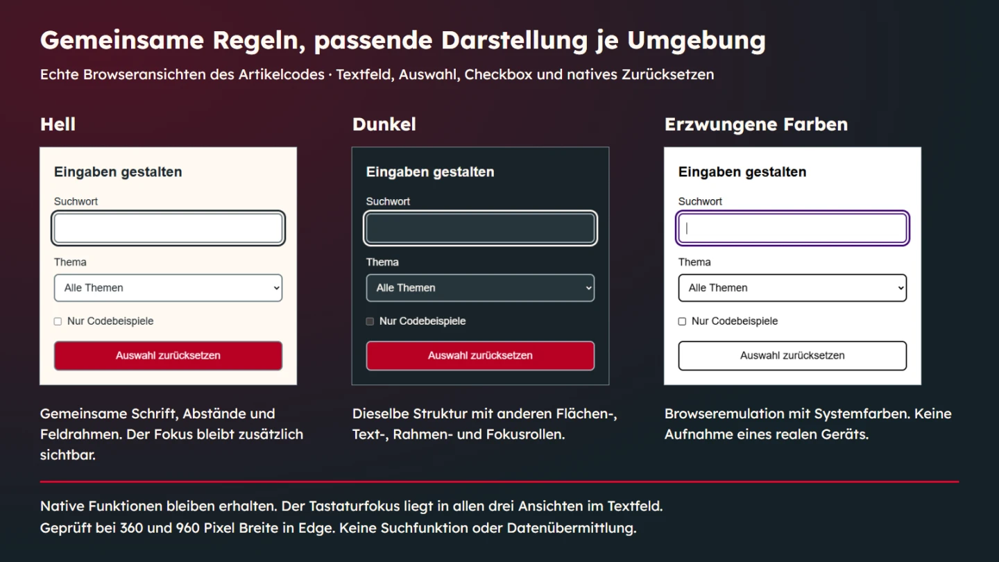
What the executed checks establish
The component was exercised in the installed Edge environment at viewport widths of 360 and 960 pixels. Light and dark variants were combined with normal and forced colours. Checks covered minimum size, font, border, focus and overflow. Keyboard interaction entered text, selected a different subject and toggled the checkbox.
The reset button restored the original native values. The text field became empty, the subject returned to all topics and the checkbox became unchecked. That establishes the described reset behaviour. It does not demonstrate a search, delivery of a message or complete verification of all form properties.
| Check | Example foundation | Limit |
|---|---|---|
| Shared geometry | Minimum height, font and borders of larger controls | No claim of identical native pickers |
| Focus | Keyboard position and visible outline | No complete assistive-technology assessment |
| Colour variants | Light, dark and browser-emulated forced colours | No physical-device capture or universal colour measurement |
| Reset | Restoration of initial values | No sending or filtering of results |
Unify an existing interface carefully
Inventory the controls and states that actually exist. Which rules are shared and which differences are accidental? Look beyond colour. Typography, padding, labels and focus can produce larger inconsistencies. A manageable inventory separates the common foundation from justified exceptions rather than assuming that every difference is a defect.
Change one bounded group and check real content. A new height can alter wrapping of a long label. A different border can change how a field boundary appears against a dark background. Review the application rather than only the isolated sample. Consistency is established in the actual context.
Keep behaviour separate from visual similarity
A reset control and a submit control may share size and border rules while performing entirely different actions. Their labels must preserve that difference. The example's reset is useful precisely because it has a real native effect without pretending to send anything. A production form should describe its actual action just as accurately.
The same applies to disabled, read-only and invalid states. They are not interchangeable shades of grey or red. Each describes a different condition. Before adding their styling, define when the state exists and how people understand it. An attractive state gallery cannot substitute for the application's actual rules.
Trace a mismatch to the responsible rule
If a checkbox suddenly inherits text-field proportions, inspect the selector first. A broad rule for every input can reach elements that perform a different job. The best correction may be a more accurate shared rule rather than another override elsewhere. The example separates the large-control class from its checkbox for precisely that reason.
Font can be shared while full width and minimum height are not. Apply that reasoning property by property. A screenshot that happens to look correct is not a sufficient foundation for a global rule. The responsibility should remain understandable when a second form or a different control is introduced.
Next examine the cascade. Later styling from another area may replace the intended value. Inspect computed properties in the browser rather than inferring the outcome from one file. Record the purpose of a justified exception so a future consistency pass does not accidentally remove it as an apparent inconsistency.
Use realistic text lengths
A short sample label can conceal a cramped layout. Include realistic longer labels and option text in a project review. Check for clipping, overflow and weakened grouping. A button that still fits its box may nevertheless fail to communicate if its label becomes unreadable. Those are questions about actual content rather than the dimensions of an empty rectangle.
A minimum height can accommodate content growth more gracefully than a rigid height. The example allows the action to grow, but that does not prove every long string will look appropriate. Available width, wrapping and surrounding layout still matter. Check the intended languages and real text instead of measuring only an empty control.
The documented pixel relationship assumes the tested sixteen-pixel root size. Changing that base changes rem-based dimensions. That may be desirable, but a number from the original test is not a measurement of the new configuration. Keep reported conditions attached to the values they explain.
Distinguish interface states from business outcomes
A field can have focus while containing an error. A checked box does not prove that a setting has been saved. A changed select is not a successful search. Define these meanings before adding state classes. Visual feedback should describe the condition actually established by the application rather than turn every responsive element into a success message.
This example performs no professional validation. It imposes no special keyword length and checks no server-side permission. Do not add a success claim merely because the control reacts. Native input initially establishes its own local state. A business conclusion requires the corresponding real processing and verification.
Prepare a small design acceptance view using the controls that actually occur in the project. Show relevant states and real labels. Identify what is shared intentionally and which differences explain function. This gives reviewers concrete decisions to discuss instead of asking whether the form looks modern in general.
Then review the component in its real page context. A narrow column or different background can reveal problems absent from the isolated sample. The sample is a useful foundation rather than proof of every possible embedding. At handover, identify the authoritative rules so another copied stylesheet does not quietly recreate the original inconsistencies.
Design checklist
- Input, choice and action retain recognisable roles.
- Fonts, sizing and spacing follow named common rules.
- Visible labels are correctly associated with controls.
- Native clues are not removed without a suitable alternative.
- Focus, light and dark are checked as concrete states.
- System colours remain usable with targeted adjustments.
- The implemented action matches its label.
- Documented findings remain within the tested scope.
Pay separate attention to the opened select. Its closed control and native picker are different presentations. The explanatory captures here show the closed component. Requiring a particular opened-picker appearance would need additional checks in the intended environments. A common field width does not establish identical lists everywhere. This distinction helps avoid a common acceptance mistake: approving a static sample as if every interactive presentation had already been examined. Keep the record specific about what was visible and what action was actually performed.
Sources and review date
Sources were checked on 9 November 2026. MDN explains appearance, accent-color and forced-colors. The WAI form-labelling tutorial covers the related text associations. The CSS values and reset component are original teaching examples.