Responsive components with CSS container queries
Develop a reusable maintenance card and verify different integration locations, boundary values and text settings.

Container queries adapt a component to the space available in its surrounding container. A card can therefore use a different layout in a broad content area and a narrow sidebar, even when both appear on the same screen. For size queries, an ancestor establishes an appropriate container context. The conditional rule then styles elements within that context. The relationship makes the component's available space an explicit part of its design.
The practical benefit concerns reusable components. This article develops an original fictional maintenance card and checks it at different container widths. HTML, CSS and test cases belong together. The dimensions are deliberate design choices for this example rather than universal device boundaries. The aim is a dependable component whose information remains available even when the additional layout enhancement is not applied. The example is a controlled teaching component, not a finished service module.
Understand one component in different locations
Imagine a service overview with detailed cards in its main area and a narrow collection of recommendations alongside it. An existing media query might switch every card to a horizontal layout when the browser is wide. That may suit the main area, but the small recommendation card does not gain enough internal space merely because the overall window is large. Its location and the screen width answer different questions about the constraints under which its content must appear.
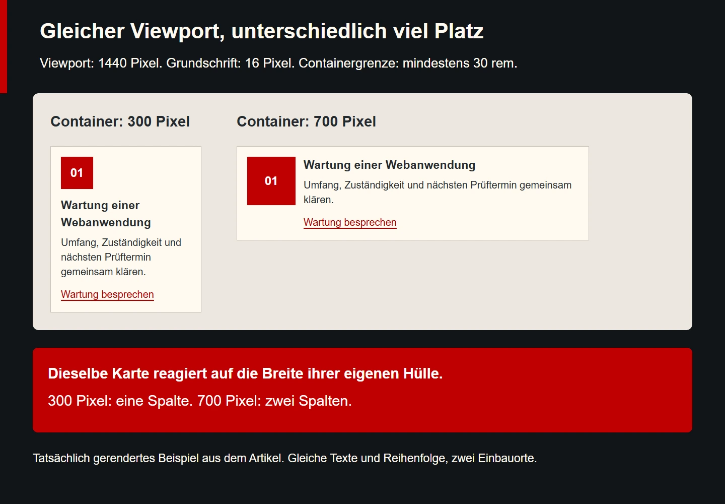
A rule based on an available container can express this distinction directly. In the example, the card remains stacked while its own surrounding space is narrow. Its decorative mark and text switch to two columns only when that space reaches a suitable width. The browser window can stay unchanged. The card does not need to know whether it is being used as a recommendation, search result or part of a broad service overview.
This does not imply replacing every media query. Global navigation, the page-wide content arrangement and responses to particular output conditions may still need a different basis. The useful question concerns responsibility: should the whole page respond or should a component respond to its available space? Once that is clear, the choice of rule becomes easier to explain than a general preference for whichever syntax happens to be newer.
Separate the container from the element being styled
Our example gives an outer wrapper the class service-slot. The actual card sits inside it. This distinction makes responsibility visible: the wrapper provides the available space and the card adapts its presentation accordingly. The size context is established through container-type. The container shorthand can additionally give it a name. A meaningful name helps identify the intended relationship later in a larger stylesheet.
The size condition concerns an eligible ancestor of the element being styled. Declaring only the card itself as a container and then expecting that condition to resize the same card does not express the intended relationship. An extra wrapper is often the simplest construction. It receives space from the surrounding layout, while the inner component can respond to that space without having to redefine the responsibilities of the entire page.
The extra wrapper does not need an invented semantic role. An ordinary div is appropriate. Content meaning belongs to the suitable heading, explanation and link inside the card. A layout-related container class should not introduce an unnecessary landmark or another heading level. Visual reuse and understandable document structure need to work together, including when the same component appears in a different part of the site.
Begin with a complete original HTML component
The following HTML uses deliberately limited content. The number in the red area is decorative and hidden from assistive output. It provides no information that is missing from the text. The heading level needs to fit the eventual surrounding page. This example places the card inside a section that already has its own heading, so the card uses the third level. That choice must be reconsidered if its context changes.
<div class="service-slot">
  <article class="service-card">
    <div class="service-card__visual" aria-hidden="true">01</div>
    <div class="service-card__content">
      <h3>Wartung einer Webanwendung</h3>
      <p>Umfang, Zuständigkeit und nächsten Prüftermin gemeinsam klären.</p>
      <a href="/kontakt">Wartung besprechen</a>
    </div>
  </article>
</div>
Content order stays the same in both layouts: mark, heading, explanation and link. There is no second mobile version containing different wording. This makes maintenance simpler and avoids contradictory statements between locations. Changing the number of visual columns alters neither the link's purpose nor the order of the substantive information. The contact destination is merely an example route within the existing site rather than a new processing feature implemented by this snippet.
Design the base presentation before adding the condition
The base rule creates a single-column card. It does not need a successful container query to remain readable and operable. At a container width of 30 rem, the enhancement creates two columns. The first reserves six rem for the decorative mark. The second uses minmax(0, 1fr) to share the remaining space appropriately. This particular arrangement is then checked using real text rather than being assumed suitable simply because the CSS parses successfully.
.service-slot {
  container: service-card / inline-size;
  min-width: 0;
}
.service-card {
  box-sizing: border-box;
  display: grid;
  grid-template-columns: minmax(0, 1fr);
  gap: 1rem;
  padding: 1.25rem;
  border: 1px solid #c9c1b9;
  background: #fff9ef;
  color: #242a2e;
}
.service-card__visual {
  display: grid;
  place-items: center;
  width: 4rem;
  aspect-ratio: 1;
  background: #bf0000;
  color: #ffffff;
  font: 700 1.5rem/1 sans-serif;
}
.service-card__content { min-width: 0; }
.service-card h3 { margin: 0 0 .5rem; overflow-wrap: anywhere; }
.service-card p { margin: 0 0 1rem; }
.service-card a { color: #a90000; text-underline-offset: .2em; }
.service-card a:focus-visible { outline: 3px solid #bf0000; outline-offset: 4px; }
@container service-card (min-width: 30rem) {
  .service-card {
    grid-template-columns: 6rem minmax(0, 1fr);
    align-items: start;
  }
  .service-card__visual { width: 100%; }
}
Colours and spacing here provide a clear presentation of the example. An existing design system should use its appropriate roles and variables rather than acquiring a second competing palette for one component. The important behavioural parts are the declared container, the single-column base and the narrowly scoped extra rule. Those parts should remain identifiable when the example is adapted. Visual styling can change while the responsibilities of wrapper and card stay clear.
The condition specifies a minimum width and includes its boundary. With a 16-pixel root font in the chosen test environment, 30 rem corresponds to 480 pixels. A card inside a 479-pixel container remains single-column. At 480 pixels the enhancement applies. These figures describe the specific test arrangement. Different text settings and additional integration contexts belong in the checks for actual use rather than being silently covered by that one result.
Derive the switching point from the content
Start with a narrow wrapper and enlarge it gradually. Observe when a two-column arrangement genuinely becomes useful. Short wording may fit beside the mark earlier than a longer translation. A large decorative area can consume space without helping the visitor's task. The switching point should therefore follow the intended function rather than a copied list of familiar phone widths. A recognisable device category is not evidence that this particular card has enough room.
Several considerations matter together for our card: the full heading should remain readable, the explanatory text should not become an uncomfortable narrow strip and the link should retain a clear relationship to its explanation. Measuring the column count cannot answer all those questions. It confirms only that the conditional rule was triggered. Reviewing the actual content remains an additional task, even when the technical measurements are exactly as expected.
Record the decision briefly. For example, two columns become appropriate when the tested heading and its explanation retain enough useful room after space is allocated to the mark. This reasoning helps with later changes. If the decorative area becomes substantially larger or the copy expands, the original assumption needing review is immediately recognisable. The numeric boundary then has an understandable purpose rather than appearing as an unexplained constant that future developers are reluctant to touch.
Understand how the container declaration affects sizing
A size context affects how the browser can handle dependencies during size calculation. This horizontally arranged example uses inline-size. The surrounding layout should determine the wrapper's available width, rather than its changing descendants defining that width in turn. Otherwise a condition that changes those descendants would create a poorly defined design dependency. The separation is part of the construction, not an incidental extra line added only to enable special syntax.
Do not select the broader size setting merely out of habit. It concerns both size directions and may require additional decisions. A wrapper whose height previously followed its content needs different consideration from a deliberately bounded display area. Ordinary text cards often need only an adaptation to their available width. The existence of an additional option is not a reason to introduce restrictions that the content and its surrounding layout do not require.
If a component becomes unexpectedly small after the change, first inspect the space allocated from outside. Is the wrapper a narrow flex item? Does another grid constrain it? Does an ancestor impose an unexpected minimum size? The visible card is not automatically the cause. A size condition can make existing layout relationships more obvious, exposing assumptions that were previously concealed by a particular content sample or by a fortunate combination of screen width and text length.
Control named and nested containers
The name service-card identifies the intended size context in our example. A larger site may also have a container for an entire results list. A card should deliberately respond to the wrapper intended for it. A meaningful name and a documented position help prevent an inserted intermediate wrapper from unexpectedly changing the basis of an unnamed condition. Naming supports comprehension when several reusable components share the same part of a page.
A container name is not a globally unique identifier like an HTML ID. Multiple locations can contain suitable containers using the same name. Their relationship in the ancestor tree remains important. With nested components, inspect which actual wrapper an affected element can use. Two identical names without clear responsibilities need explanation just as much as arbitrary inconsistent class names. A label alone does not remove the need to understand the structure.
A small isolated case is useful during diagnosis. Remove additional nesting first and check one wrapper with a controlled test width. If the condition works there, restore the real surrounding structure gradually. This distinguishes incorrect syntax from selection of a different wrapper. Adding another unrelated media-query override often hides the original problem instead of explaining why a component responds differently at its two integration points.
Retain the base without the container enhancement
A useful base presentation protects the visitor's task if the additional condition is not applied. Our card remains stacked, its link remains present and its wording does not change. For a technical check, the container enhancement can deliberately be removed. This exercises the base construction but does not establish the behaviour of every older browser. That distinction belongs in the evidence, particularly when a team uses a modern browser to simulate a simpler stylesheet.
Check the browsers and embedded views actually required for the project separately. A familiar feature may be absent or differently supported in a particular older environment. Current documentation and an appropriate target test are more useful than claiming identical support everywhere. This article concentrates on size queries. Other kinds of container condition have their own prerequisites and are not treated here as interchangeable features merely because they use related terminology.
An additional @supports condition can explicitly isolate an enhancement. It does not prove that the eventual workflow is correct. Supported syntax and appropriate content are different test subjects. If the straightforward base already fulfils the task, every enhancement does not require another elaborate fallback design. Limited responsibilities make the component easier to maintain and give the team a clearer explanation of what remains available when an optional improvement is unavailable.
Check text settings, content length and operation
A two-column switch must not cut off information. Test long words, multiline headings and a more descriptive link label. min-width: 0 and a suitable wrapping rule can address common minimum-size problems. They still do not replace checking actual copy. A card may remain technically inside its container while producing such uncomfortable text wrapping that the chosen arrangement should be revised. Geometric containment and useful presentation are separate observations.
Keyboard operation remains necessary regardless of column count. The link must be reachable and its focus indicator must not be clipped by an ancestor. Document order should remain appropriate to the task. This example uses no CSS order property. Different visual positions should not quietly create a contradictory sequence for other output methods. A small layout enhancement should preserve the useful relationships already expressed in the original markup.
Changed text settings need their own test. A larger root font can affect available space and the interpretation of relative measurements. Check their actual interaction rather than treating one pixel boundary as a permanent promise. Fixed heights are particularly sensitive to changing copy. Our card sets no height and can grow with its content. That is a deliberate boundary of the example and an important part of understanding what its successful tests actually demonstrate.
Build a small reproducible test record
| Case | Expected behaviour in the example | Additional observation |
|---|---|---|
| 300-pixel container | One column | Full copy and reachable link |
| 479-pixel container | Still one column | No early switch |
| 480-pixel container | Two columns with 16-pixel root font | Minimum includes its boundary |
| 700-pixel container | Two columns | Useful text width |
| Same viewport, two locations | Different layouts possible | Local available width matters |
| Enhancement removed | Readable stacked base | Copy and link remain |
The table separates measurable behaviour from design judgement. A browser can establish whether one or two columns were calculated. The actual visible copy must additionally be reviewed for readability. When recording a defect, include the integration location, wrapper width, text settings and affected language version. This makes the observation reproducible rather than preserving it only as an ambiguous report that something “looks broken on mobile”.
The accompanying illustration uses the same content inside two differently sized wrappers at one unchanged wide viewport. This controlled arrangement makes the distinction from a screen-only condition visible. The picture does not claim comprehensive browser coverage. Its value is a comparison of one component under two precisely identified space constraints. Additional target environments require their own appropriate cases and cannot be inferred from the existence of an attractive screenshot.
Add container-relative lengths deliberately
Container-relative lengths can complement the conditional arrangement. The cqi unit relates to an eligible container's inline size. For a horizontal example container 300 pixels wide, two cqi corresponds to six pixels. At 700 pixels it would be 14 pixels. This straightforward calculation explains the dependency. It does not establish that such spacing is an appropriate design choice for the card or that it will remain useful at much larger widths.
A fluid value often needs lower and upper bounds. An additional example could use clamp(.75rem, 2cqi, 1.5rem) for the gap. At a 16-pixel root font, its bounds would be twelve and 24 pixels. That is a separate extension rather than the fixed gap specified in the main example above. Its effect should be explored in a distinct variant so that a later observation can be attributed to the particular choice being tested.
With nesting, do not assume that a named query and a relative length necessarily use the same container. The unit looks for an ancestor eligible for its relevant size direction. An added inner wrapper can therefore establish an unexpected basis. If fluid spacing behaves surprisingly, inspect the actual container structure. A name used in another rule does not automatically make the origin of a length value obvious or remove the need for a controlled inspection.
The main example deliberately keeps its gap at one rem. This makes the observed column switch attributable to the size condition. In a further trial, change and document one additional decision at a time. An unexpected text arrangement can then be connected to a new column width or gap, rather than requiring several simultaneous modifications to be disentangled. The discipline is simple but useful when testing a reusable component with multiple integration locations.
Bound the migration of an existing component
Rebuilding every card in an existing site is rarely the best first experiment. Select a component with a clear task and two genuinely different integration locations. Record its current content, link purpose and basic operation. Add the wrapper and narrowly defined layout condition. This makes it possible to assess whether the new dependency helps or whether changed content is obscuring the comparison. A successful isolated component can then inform a deliberate broader adoption decision.
Inspect existing selectors when adapting it. An old sidebar rule may still impose another width. A previous media-query override may later override the container rule again. Stylesheet order and specificity remain relevant. Working new syntax does not cancel existing CSS. Remove unnecessary special cases only after their earlier purpose is understood and the new variant has actually been checked. Otherwise an apparent simplification can discard a condition required at another integration point.
Finally, give the component a short implementation note describing its wrapper, name, expected space allocation and tested boundaries. This is more useful than a collection of isolated screenshots without context. When another location is added, developers can check deliberately whether it meets the same prerequisites. Reuse becomes a reasoned technical choice rather than copying visible styling and hoping that the relationship between surrounding layout and inner content happens to remain suitable.
Checklist for reusable container components
- Is it clear why the component should respond to its local space?
- Are the wrapper and styled element separated appropriately?
- Does the wrapper receive space predictably from the surrounding layout?
- Is the intended container identifiable in nested integrations?
- Does the base work without the extra enhancement?
- Is the switching point justified by actual content and its task?
- Have values just below and exactly on the boundary been checked?
- Do long copy, keyboard focus and changed text settings remain usable?
- Are required target environments tested within an explicitly limited evidence scope?
Sources and technical review date
Sources checked on 9 November 2026. The primary references below explain size contexts and query syntax. The CSSWG document is a working draft and is identified accordingly. The card, design choices and controlled test cases in this article were independently developed.