Maintainable CSS with a clear component structure
Connect intended changes with checked effects through clear names, purposeful variants and appropriate cascade review.

Maintainable CSS makes changes understandable. Someone changing one action's colour should be able to identify which other elements are affected. Neither an exceptionally short file nor a complicated architecture establishes that by itself. What matters is a clear relationship between a design decision, component, state and the rule that actually applies.
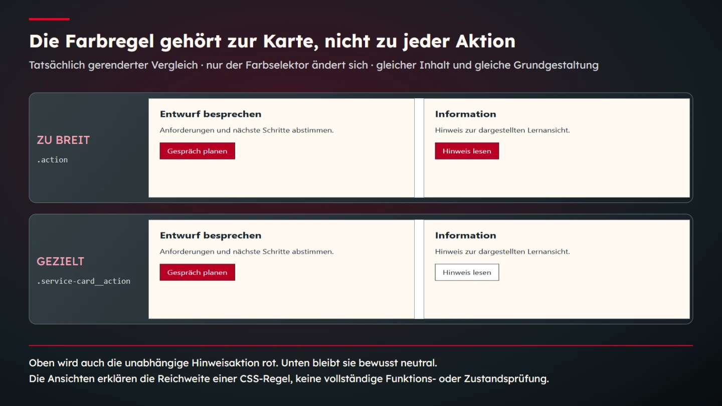
This guide develops a manageable component-CSS approach through an original example containing a service card and an independent notice. An overly broad colour rule changes both actions. A targeted rule leaves the notice neutral. The difference is actually executed in a browser and shown in the explanation. No measured time saving or universally best architecture is claimed.
Describe the change as a concrete task
Before adding a rule, establish the intended change. The action inside the service card should use the brand colour is more precise than Make the buttons nicer. It identifies the subject and scope, creating a boundary that can be checked. Styling the notice action remains a separate decision rather than an accidental consequence.
Consider a component through its task, content, presentation and any behaviour. A service card can appear in several layouts without losing its basic role. Its current position inside an arbitrary section is therefore often a weak naming foundation. Moving it later should not make its meaning incomprehensible.
Record intended dependencies. Several components can share a font without needing to share an individual action colour. Maintainability does not mean consolidating every similarity immediately. It means distinguishing shared decisions from independent ones deliberately and recognizing that distinction in actual use.
Inspect the cascade before introducing another exception
An unexpected result can have several causes: a selector does not match, another region overrides it, a property is inherited or ordering affects the outcome. The MDN cascade introduction explains the processing foundation. Immediately appending a stronger rule may hide the visible symptom while leaving its cause unclear.
Inspect the actual element to identify the effective declaration and other contributing rules. Computed background colour is a concrete observation; a filename suggesting main stylesheet does not prove priority. Browser tools expose these relationships, but deciding which rule ought to apply still requires a substantive design judgment.
A small example is easy to inspect comprehensively. An existing website often includes additional styles. The demonstrated structure is therefore a learning choice rather than a promise of complete isolation. Global rules, inheritance and integrations still need review within the actual environment.
Name components and their parts clearly
Names should explain roles. In this example, service-card, service-card__title and service-card__action belong together, while notice and notice__action describe another region. This is one possible convention. Its value comes from shared understanding and consistent application, not from the character sequence creating a technical boundary.
Avoid naming a role only after its current colour or screen position. A red action may become dark, and a right-hand card may move below another region in a narrow view. Names should survive such legitimate changes. Purely presentational helper classes may follow other criteria when their role is explicit.
Named parts support targeted selection. A service-card__action rule selects the intended component action in this setup instead of selecting unrelated actions merely because they are buttons. That boundary is easier to inspect than a long chain of sections, columns and deeply nested element types tied to incidental markup.
Build a small shared foundation
Both learning components use a general action class for shared geometry and neutral appearance, plus their named component relationship. A genuinely shared decision stays shared while brand colour applies only to the service card. The content is constructed and belongs to no actual customer product.
<section class="service-card">
  <h3 class="service-card__title">Discuss the design</h3>
  <p>Agree requirements and next steps.</p>
  <button class="action service-card__action">Plan a conversation</button>
</section>
<aside class="notice">
  <h3>Information</h3>
  <p>A note about this teaching view.</p>
  <button class="action notice__action">Read the note</button>
</aside>
.service-card,
.notice {
padding: 24px;
border: 1px solid #8b9499;
background: #fffaf3;
color: #192329;
}
.action {
font: inherit;
padding: 10px 16px;
border: 1px solid #192329;
background: #ffffff;
color: #192329;
}
.service-card__action {
background: #b80024;
color: #ffffff;
}
.service-card--compact { padding: 16px; }Neutral action values belong to the shared foundation. The following targeted rule changes only the service-card action. Both selectors have the same class specificity here, making their order relevant within this bounded setup. Do not shorten that observation into the incorrect general statement that the last CSS line always wins.
Execute an overly broad rule as a counterexample
The comparison changes only the final colour selector from service-card__action to action. Values remain identical. Brand colour then also reaches the notice action, a difference actually observed in the browser. Content and shared geometry are not exchanged to make the comparison more dramatic.
The issue is not that a shared class is inherently wrong. The shared class has a deliberate job for font, spacing and neutral appearance. The individual colour change has narrower scope. A useful structure makes that distinction expressible. A general prohibition on shared classes would miss the actual relationship.
The check compares computed colours and unchanged content. The targeted version keeps a white notice action with dark text, while the broad version makes it red with white text. This does not establish complete accessibility or validate the whole website. It confirms this rule's specific reach in the demonstrated structure.
Do not turn specificity into a permanent competition
The MDN specificity guide explains selector weighting within the relevant cascade conditions. Maintenance requires understanding why a declaration takes priority. Repeatedly adding more IDs, nesting or important declarations can make the next change less predictable without clarifying the intended design.
A short class can therefore provide a useful starting point, but it is not an independent quality score. A precise selector needs to fit the actual structure. Avoid unnecessary reliance on incidental containers so an extra content wrapper does not invalidate component styling without a meaningful reason.
States and variants need understandable relationships with the base as well. The compact service card changes internal spacing only. It should not silently restyle the notice action. Separate responsibilities make these effects reviewable. A variant with no named purpose would simply become another unexplained exception.
Use cascade layers as an explicit ordering decision
@layer defines cascade layers and can make groups such as foundations and components explicit. Use it through an understood priority decision. Adding layers alone does not make existing rules correct or fully modular.
Account for important declarations and rules outside layers. Normal author declarations outside layers have different precedence from layered rules. Migrating an existing site therefore requires review of the actual combination. Moving only some files into layers while overlooking the rest can create unexpected effects.
The small teaching case does not need an additional layer structure. It first demonstrates the relationship between a shared foundation and targeted component styling. A larger project may benefit from documented ordering, but scope should follow a real problem rather than a desire to introduce as many architecture terms as possible.
Use deliberately low-weight selectors with a clear purpose
The :where() pseudo-class can group selection conditions without adding their specificity weight. That can suit intentionally easy-to-override defaults. The actual cascade still matters; this is not a general mechanism that automatically grants every later design the appropriate priority.
Explain the default's intent. Is it a restrained starting appearance? Should components regularly replace it? Document that decision. Otherwise someone may later strengthen the rule accidentally or an intended invariant may disappear without review. Technical weakness and substantive optionality should not be confused.
Use a real application rather than an isolated rule collection. Show a component using the foundation and a justified difference. Readers can then identify what remains shared and what can change. An abstract specificity recommendation does not replace inspection of that actual relationship.
Organize files through understandable responsibilities
One file per component can be useful but is not the only maintainable solution. A clearly organized single stylesheet may suit a small website. What matters is whether rules are findable and changes retain their intended scope. Many small files with unclear assembly can be as confusing as one disorganized large file.
Record where foundations, components, variants and justified exceptions live. Output order needs to match the intended responsibility model. Filesystem order can suggest a sequence that differs from actual inclusion. The delivered page is therefore the decisive review location rather than the folder view alone.
Give exceptions clear ownership too. A temporary correction should not quietly grow into a second complete component definition. Maintaining one decision in several places needs a reason. Otherwise the next change can easily reach only one copy while the others preserve contradictory behaviour.
Migrate existing styles progressively
An existing website does not need every class renamed at once. Select a bounded component and record its intended presentation. Then map its rules clearly. Identify any deliberate visual change separately. Technical reorganization and visual redesign are different decisions even when they occur in the same project.
Review neighbours alongside the affected component. Here the notice is part of the control area because a broad selector changes it. Looking only at the service card could show a correct result while hiding an unintended effect outside the crop. Let possible consequences determine the review region.
Remove old rules only after establishing their use. A class absent from the current view may exist elsewhere. Guessing that code is unnecessary does not support dependable cleanup. Focused search and appropriate views help establish actual coverage before a decision is made.
Choose checks appropriate to the change
Spacing changes need attention to wrapping and spatial relationships. Colour changes concern affected elements and states. Selector changes require the actual match set to be correct. A review plan should reflect those differences. One preview file does not automatically answer every question.
| Change | Suitable check | Limit |
|---|---|---|
| Action colour | Compare affected and intentionally unaffected actions | No complete state approval |
| Compact variant | Check padding and unchanged content | No claim about every viewport |
| Selector | Actual matches and computed values | No automatic substantive correctness |
| File sequence | Actually included output | Folder names do not establish precedence |
| Architecture migration | Representative applications and known exceptions | One success does not cover the entire site |
The learning checks use both language versions with identical CSS. They inspect normal and compact cards plus the broad counterexample, comparing selected computed colours and padding. The native figure presents actual views. This explains a concrete dependency rather than inventing a general maintainability metric.
Hand over rules with their reasons
Brief documentation should explain shared decisions and component-specific responsibilities. The neutral action foundation and targeted brand colour provide a small example. Another contributor can evaluate the next change against the same intent. A class name alone would not fully communicate that reasoning.
State known limits too. The example contains no complete state library or connected button functions. Buttons are inspected as presentation elements. A production application needs interaction, focus, states and real behaviour in addition. Accurate CSS targeting does not complete those responsibilities indirectly.
- The intended change has a clear scope.
- Shared foundations and individual roles are distinct.
- Names remain meaningful through reasonable layout changes.
- The effective cascade has been inspected.
- Variants alter the intended properties.
- Intentionally unaffected neighbours are reviewed.
- Exceptions and file ordering are traceable.
- Architecture choices follow actual needs.
- Teaching presentation and production functionality remain distinct.
- The next change has understandable ownership.
Maintainable CSS therefore grows from explainable relationships. The service card receives its colour without silently reinterpreting an independent notice. Shared geometry remains deliberately shared. This small case illustrates an approach that can be extended through explicit decisions and reviewed effects rather than architecture slogans.
Investigate an unexpectedly red notice action
Suppose the notice action turns red after a revision. Do not first ask which extra rule can quickly restore its old appearance. Identify the declaration actually setting the background. Here the search reaches the latest colour rule using the general action class, explaining the unintended reach.
A new notice__action rule could restore this particular output without making the broader colour decision correct. Other actions with the shared class could remain affected. First decide whether colour belongs to the foundation or the individual component. Then align the correction with that scope.
The teaching case intends a service-card colour, so the rule is bound to service-card__action again. Both actions are then reviewed together. The card gets its intended appearance and the notice retains its neutral foundation. This is a narrow checkable statement, not evidence that every unrelated rule was reviewed.
The case also explains why a small file comparison helps. A single selector change makes the cause discussable. Simultaneously changing names, values, typography and layout makes attribution harder. Small changes belonging to one substantive decision can therefore be easier to review, without claiming a measured universal speed improvement.
Distinguish variants from accidental exceptions
The compact variant has a named purpose: reduce card padding from 24 to 16 pixels. Action colour and content remain unchanged. That relationship can be tested directly. A class changing colour, border, typography and neighbouring spacing without explanation would represent a broader and different decision.
A variant need not change only one property. A justified component type may need several differences. Its meaning should then be explicit. Compact would be misleading if the class also introduced another content role. Design and naming should describe the same decision rather than hiding a conceptual change behind a convenient modifier.
Review naming boundaries when extending the component. A new element within a card does not automatically deserve the main action's class. It may perform another task and need another decision. Naming cannot prevent misuse by itself; it makes the assignment visible and therefore easier to discuss.
Preserve intent during handover. Editable source, named components and inspected views belong together. A finished screenshot cannot explain which rule may change, while an isolated stylesheet does not show every visual effect. Their relationship makes the next revision assessable.
A compact review note can record both expected outcomes. Targeted colour leaves the notice neutral; the deliberately broad rule turns it red too. Normal and compact card variants retain their content. These concrete statements are sufficient to repeat the learning check later and are more useful than claiming the whole codebase is now modular and future-proof.
Computed values are useful evidence because they describe the rendered element rather than only a rule that appears in a file. They still need context: a white background is appropriate for the notice here because that was the stated decision. The same value would not independently establish correctness in another component. Keep the expected role beside the observation so a later reviewer can understand why a particular difference was considered intentional or unintended.
Sources and scope
Sources checked on 9 November 2026. The linked MDN primary sources were opened. Classes, components and cases are original teaching parameters. Checks concern selected browser CSS effects. No universally best architecture, complete state assessment or measured commercial effect is claimed.