Helpful form errors and accurate confirmations
Connect wording, presentation and behaviour: explain known errors and confirm only the state actually reached.
An error message appears at a moment when a website needs to be especially useful. Someone has already invested effort and wants to complete a next step. A red outline with the word Error explains too little. Helpful feedback identifies the problem, connects it to the appropriate field and offers a meaningful correction. Confirmation requires equal care because it should claim only the state actually reached.
This guide connects wording, presentation and behaviour through an executed form example. The small demonstration checks an email input's format. It sends no message and confirms no mailbox exists. That limited task makes clear why input errors, technical problems and successful delivery require different feedback. The cases are original teaching examples without customer information.
Identify the kind of feedback before writing it
Not every interruption is an input error. An empty required field concerns missing information. An unaccepted format concerns the supplied value. An unavailable service does not prove someone filled out the form incorrectly. Establish these distinctions first. Otherwise the interface may demand a correction that cannot resolve the underlying problem.
List the actual states possible in the planned workflow. Examples include missing input, format mismatch and completed checking without a detected format issue. A real sending function would have additional states. This list supports appropriate wording. One general message for everything saves initial copywriting effort while leaving visitors to discover what it means.
The WAI explanation of Success Criterion 3.3.1 addresses identifying automatically detected input errors and describing them in text. Its 3.3.3 explanation concerns known correction suggestions under the stated conditions. These specific requirements do not constitute a complete assessment of a form.
An editorial sequence follows naturally: what was detected, which input does it concern and what can someone usefully change? A technical problem adds another question: what next action is genuinely possible under the circumstances? These questions produce more precise messages than merely choosing between a red warning and a green confirmation.
Name the problem and the next action
Invalid input does not identify the expected information or useful correction. A message directly beside the field can be specific. In the learning example, an empty email field receives Enter an email address. A format mismatch receives a format example. Different situations have different messages because their next actions are not identical.
A format example is not an instruction to enter that exact address. It illustrates the expected kind of input, so explain that role in the wording. The example name@example.org provides orientation only. Real feedback should not require unnecessary technical vocabulary such as parser failure or validity state. Those labels rarely help the person correcting the field.
Avoid blame. The form itself may have explained its expectations poorly. A factual request for the required change is more useful than accusing someone of making a mistake. Friendly wording need not become a long apology. A short, specific sentence can be respectful and direct at the same time.
Do not promise what the check cannot know. Browser acceptance of an email format does not establish mailbox existence. Feedback should therefore not claim the address is reachable without an appropriate foundation. That distinction matters for confirmations as much as errors: a small technical success should not become a broader assurance through careless wording.
Connect the message, field and focus
Feedback needs to be findable where it is relevant. The WAI form-notifications tutorial covers feedback near controls and overall messages. A small single-field example can use a specific adjacent message. A longer form may also need an understandable summary that links to affected inputs.
Visible proximity alone does not reliably express the relationship for assistive technology. In the example, aria-describedby connects the help text and, when applicable, the error message to the field. aria-invalid identifies the detected state. These relationships support the visible explanation; they replace neither a persistent label nor useful wording.
Focus supports orientation. Following an error, the single-field example focuses the affected input so correction is immediately possible. A larger summary might justify another deliberate focus strategy. Check the actual sequence and next action. Calling focus in code alone is not a complete demonstration of accessible interaction.
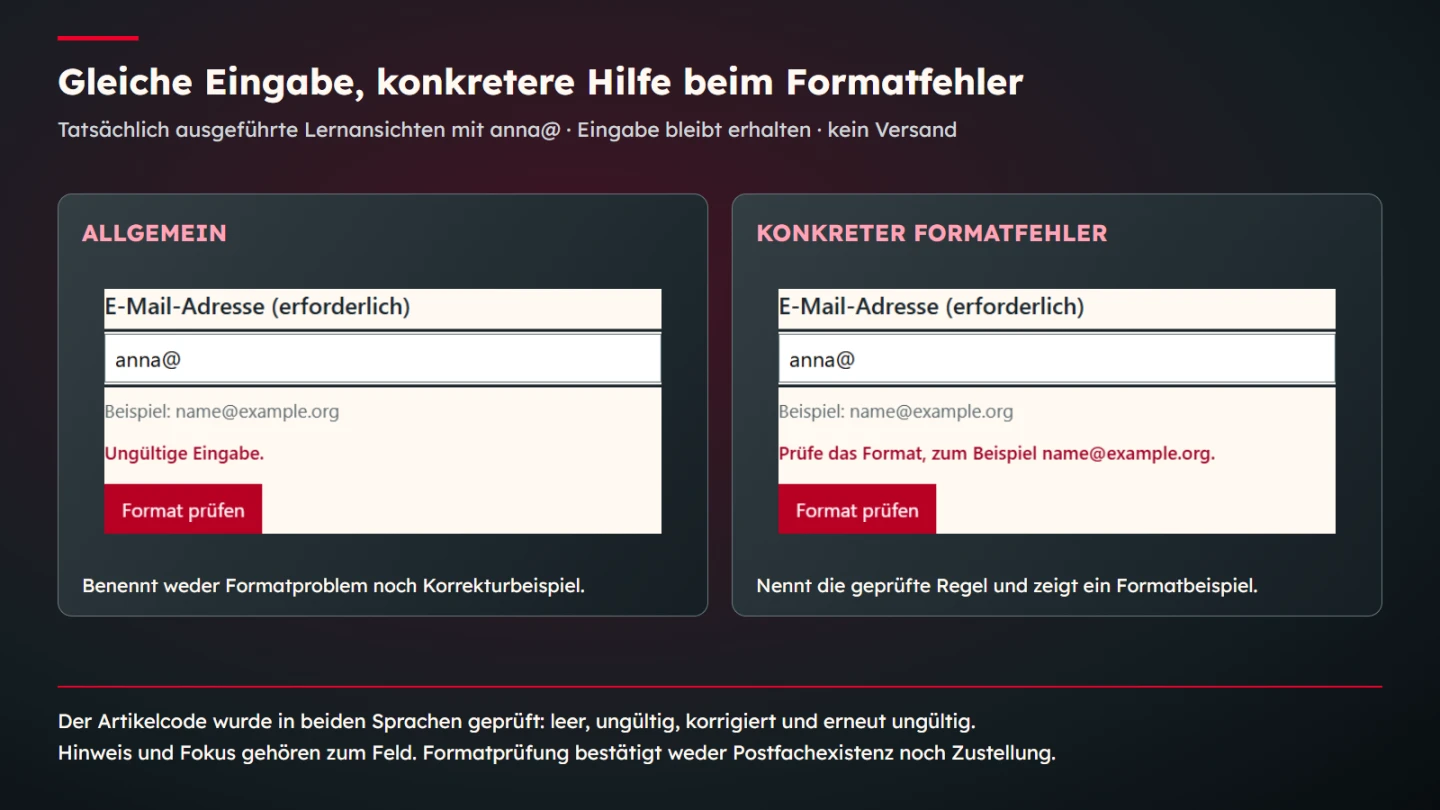
Preserve existing values. Someone correcting a missing item should not need to retype information that was already suitable. Here anna@ remains in place during error feedback, which the browser check confirms. A real form needs corresponding preservation after server-side responses as well as within an isolated JavaScript example.
The executed teaching example
The button deliberately says Check format rather than promising delivery. The form has a permanently labelled required email field, a help text and a separate error region. It uses selected ValidityState properties to distinguish missing input from format mismatch. The browser supplies those underlying states.
<form id="demo" novalidate>
  <label for="email">Email address (required)</label>
  <input id="email" name="email" type="email" required
         autocomplete="email" aria-describedby="email-help">
  <p id="email-help">Example: name@example.org</p>
  <p id="email-error" hidden></p>
  <button>Check format</button>
  <p id="feedback" role="status"></p>
</form>
<script>
const form = document.querySelector("#demo");
const field = document.querySelector("#email");
const error = document.querySelector("#email-error");
const feedback = document.querySelector("#feedback");
form.addEventListener("submit", event => {
  event.preventDefault();
  let message = "";
  if (field.validity.valueMissing) {
    message = "Enter an email address.";
  } else if (field.validity.typeMismatch) {
    message = "Check the format, for example name@example.org.";
  }
  error.textContent = message;
  error.hidden = !message;
  field.setAttribute("aria-invalid", String(Boolean(message)));
  field.setAttribute("aria-describedby",
    message ? "email-help email-error" : "email-help");
  feedback.textContent = "";
  if (message) {
    field.focus();
  } else {
    feedback.textContent =
      "The format is accepted for this example. Nothing was sent.";
  }
});
</script>
The example prevents normal submission and makes no network request. novalidate leaves presentation to this workflow while the inspected validity states remain available. The code concerns exactly the two described cases for one field. A real form with additional rules needs its own appropriate checks rather than assuming this small example covers them.
Each new check updates or removes the previous error. After correction, an obsolete message should not continue claiming the field is invalid. Its technical relationship is reset too. Testing therefore includes the transition after a correction as well as the first error state.
The accepted-format message remains explicitly bounded. It reports format checking and says nothing was sent, which is necessary in a teaching example. A real delivery interface should accurately describe its available function and derive feedback from actual processing. Do not copy the demonstration's outcome wording into a real sending confirmation without reviewing that relationship.
Bind confirmation to the state actually reached
A confirmation asserts something about a process. The input was checked differs from The enquiry was accepted. Handover to a delivery system does not automatically establish that a person read the message. Identify which state the actual processing can confirm and let that state determine the wording.
For email transport, RFC 5321 describes SMTP replies and responsibilities. That transport context differs from browser validation. A visitor-facing form does not need a protocol lesson, but it needs the accurate limited statement: a click and accepted input format do not demonstrate successful delivery.
| Known state | Suitable feedback describes | What does not follow |
|---|---|---|
| Format checking completed | Input meets the inspected rules | A mailbox exists or a message was sent |
| Enquiry genuinely accepted | The application confirmed its intended receipt | A person has read the enquiry |
| Processing failed | The intended action could not be confirmed | The person's input must be wrong |
| Further handling planned | The genuinely agreed next step | An unspecified response deadline applies |
Mention a response period only when it is actually established and fits the process. A friendly promise to reply immediately can otherwise create an expectation nobody confirmed. Useful feedback names the next step concretely and accurately. Unsupported urgency does not make it more helpful.
Communicate status changes without unnecessary interruption
Dynamic feedback can appear without a complete page reload. The WAI explanation of Success Criterion 4.1.3 addresses programmatically determinable status messages without focus transfer. Here the feedback region has role=status, identifying its intended purpose in the markup.
Distinguish that from an executed screen-reader assessment. The documented browser checks inspect the role, content and state transitions. They do not claim coverage of every browser and assistive-technology combination. Actual release review should examine appropriate interaction using the intended tools and conditions.
Avoid contradictory simultaneous messages. An old red error beside a new positive result leaves uncertainty about the current state. The same happens when several regions describe one problem differently. Update feedback consistently. A recognizable colour alone cannot resolve conflicting assertions.
Messages also need enough persistence to be read. Briefly flashing text can be missed. When an action requires another step, the relevant instruction should remain available in context. Assess that behaviour in actual use. Animation or a timed hint does not replace the information someone needs to proceed.
Check specific errors and correction transitions
Begin with the empty field and verify that it is identified as missing required information. Then use anna@ as a format mismatch. Preserve the entered value and connect the message to the field. Finally, check a format-compatible example without turning acceptance into a claim about an existing address.
Another run examines error followed by correction. The old message disappears, aria-invalid changes appropriately and the help text stays associated. These details are easy to miss when only photographing an attractive state. An executed sequence shows more than an isolated static pattern.
The explanatory comparison uses the same value and form structure. A deliberately general message is compared with the specific format message, isolating what the wording contributes. This is not a measured completion-rate improvement. The evidence concerns actual text, retained input and the stated behaviour.
A real form adds server-side responses, interruptions and its actual delivery function. Do not replace those cases with an assumed success message. A review plan should follow the real workflow and identify its limits. A small complete teaching example provides a traceable foundation rather than a substitute for that work.
Review language, relationship and behaviour together
Helpful feedback connects three layers. Wording explains the state, presentation makes the message findable and behaviour supports the next action while preserving the information. One layer cannot reliably compensate for another missing layer. A technically associated field still needs an understandable message.
- Missing input, format errors and technical failures are distinct.
- The message identifies the affected input and detected state.
- A useful known correction is provided.
- Feedback and field are connected visibly and programmatically.
- Focus and keyboard behaviour were checked in the actual sequence.
- Previously entered values remain available.
- Correction removes obsolete error states.
- Status regions have an appropriate identifiable role.
- Confirmation claims only genuinely known outcomes.
- Teaching code, browser checks and real delivery remain distinguishable.
Here that means a specific format message at the relevant field and a deliberately limited completion statement. A real enquiry needs the same accuracy through actual processing. Errors and confirmations are not incidental copy: they explain what happened and how someone can sensibly continue.
Bring several affected fields together clearly
The single-field example intentionally keeps the relationship small. A longer form may benefit from an overall summary identifying affected inputs and providing orientation. Please correct two items is only an introduction. The substantive feedback should identify which fields are meant and what can be changed.
Suppose an extended teaching view contains a missing message and an email format mismatch. These are different problems. A summary could name both fields and link to their respective instructions, while each field retains its own specific explanation. This is a planning scenario, not a claim that the published one-field code implements and tests that extension.
Keep the sequence consistent with the actual structure. If email precedes message, the summary can follow that order. This reduces unnecessary translation between different arrangements. Still check that keyboard and focus navigation work. An attractive list with ineffective links would not provide the intended assistance.
After partial correction, the summary should reflect the new state. If only the message is missing, the obsolete email error should not remain. Wording, links and technical attributes need coordinated updates. A consistent state is more useful than several independently refreshed notices. Include this transition explicitly in a real form's review plan.
Choose validation timing deliberately
Feedback during typing can help or arrive too early. An email address is often incomplete while someone is still entering it. An immediate error after the first character can present a normal writing phase as a problem. Choose timing according to the task and actual use rather than assuming that displaying red text earlier is inherently beneficial.
This example checks after explicit button activation, making the moment clear. Other applications may check after a field loses focus. They then need suitable updating after correction. The person should understand which input the feedback concerns and when that input is assessed again.
Keep help and error text distinct. A persistent format example supports preparation, while an error describes a detected state. Replacing one with the other without explanation can remove orientation. The code therefore preserves the help and adds the error relationship only when relevant.
Review technical-interruption wording too. If the actual processing state is uncertain, the message should handle that uncertainty accurately. Do not justify another action through a confidently asserted failure that has not been established. A real application first needs the available state information and appropriate next action clarified; copy should follow those facts.
Finally, compare feedback with the rest of the form. A delivery-promising button followed by a format-only result would be inconsistent. Here the action name, executed check and outcome agree. That simple relationship is a useful starting point for reviewing a more substantial real function.
Also test the reverse sequence. Someone may replace an accepted value with anna@ and check again. The former positive message should disappear rather than remain beside an error. The example clears its status region before each result. Checking both directions establishes whether feedback consistently reflects the current input instead of preserving a stale successful state.
Review the exact wording against the known state
Consider two apparently similar messages: Check your email address and Enter an email address. The second identifies an omission; the first could refer to many different issues. Neither should be selected solely because it fits a preferred character count. Match the wording to the detected condition, then inspect it in the actual field context where a person will encounter it.
A technical-failure message needs the same discipline. If the application cannot confirm receipt, it should not blame a correct address. Conversely, a confirmed format mismatch should not be hidden behind a vague service-unavailable notice. In both cases, the message ought to follow the state the system genuinely knows rather than a generic wording chosen for every interruption.
Keep a small copy register for the relevant states when several people maintain the form. Record the condition, visible message and intended next action. Updating this alongside the implementation helps prevent a later wording change from introducing a new promise. The register is a working aid; the final review still needs the actual rendered behaviour and the correct current state.
Sources and limits
Sources checked on 9 November 2026. The linked WAI, MDN and RFC primary sources were opened. The form is an original isolated learning example. Checks concern selected browser states and feedback. No messages are sent, mailboxes verified or complete conformity assessments across assistive technologies claimed.