Contact forms with fewer unnecessary barriers
From the purpose of each required field to actual submission status: a guide for design, editorial work and technical review.

A form connects two workflows. Visitors want to communicate an issue and receive an appropriate response. The business needs enough information to continue meaningfully. Too many compulsory fields burden the opening conversation. Too little understandable information may create avoidable follow-up questions. The solution is deliberate selection combined with consistent handling.
The example is a general project enquiry for a fictional design business. The first message does not replace a complete project brief. The team needs a return channel and an intelligible account of the request. Text and form views are learning material, with no invented abandonment rates or supposed customer results.
1. Identify the next handling step
Begin with the person reading the enquiry. What must that person know to provide a useful first response? In this example, an email address and the request itself are necessary. A name helps with addressing the visitor but need not be compulsory. A complete postal address has no established purpose at this initial stage.
Make that decision for the actual business. A callback needs a telephone number. A specific repair might need an appliance type and location. Neither situation means every potentially interesting detail belongs in the opening form. Its information requirements follow its purpose rather than a general preference for gathering more customer data.
Describe the handling route in a short sentence: a responsible person reads the message and clarifies the next steps. If that process does not exist reliably, an attractive form will not repair it. Plan design and operational responsibility together. A published response-time promise must be realistic within everyday business operations.
2. Give every field a reason
| Information | Purpose in this example | Decision |
|---|---|---|
| Email address | Allow questions and a response | Required |
| Message | Explain the request | Required |
| Name | Support personal addressing | Optional |
| Telephone number | Relevant for a requested callback | Omit from the basic form |
| Postal address | Unnecessary for initial project clarification | Ask later if needed |
The table records a decision for this example rather than a universal field count. A complex assignment may require more preparation. Consider whether a different form or a later structured follow-up serves that purpose better. A brief contact request and a detailed project questionnaire are different tasks.
Identify optional fields explicitly. An empty optional field must not subsequently be rejected as missing mandatory information. Server processing needs to implement the same decision. A contradiction between the visible label and validation rules creates an avoidable problem that visitors cannot solve through careful reading alone.
3. Keep labels visible and persistent
Give each field a visible label that remains after text has been entered. A placeholder alone is an unreliable substitute because it disappears during typing. Establish the association between label and control in HTML. The WAI tutorial explains that relationship as a foundation for understandable forms.
Short guidance should explain only what is additionally needed. A message hint might identify the information that helps the first assessment. It should not become a hidden long questionnaire. If several separate answers are indispensable, consider whether distinct understandable fields would represent the task more clearly.
Use the audience's vocabulary. Return channel or enquiry classification would be unnecessarily technical in a general contact form. Email address and your message are easier to interpret. Labels do not need originality. Their purpose is to make the expected entry clear without giving visitors an additional language puzzle.
4. Design the states together
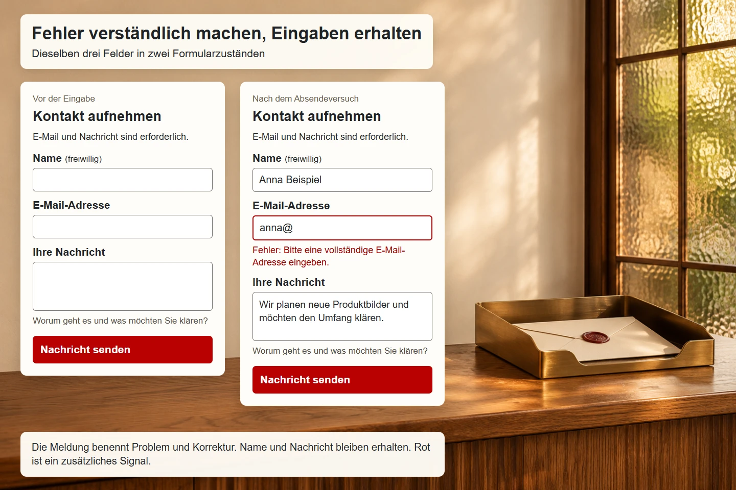
The figure shows the same fields before entry and with a specific error message. The message identifies the affected field and a possible correction. It is more than a red border. Other entered information remains available. This relationship matters more than making one warning colour as visually prominent as possible.
Design at least the initial state, focus, invalid input, submission in progress and result. Distinguish an issue recognized locally from a value rejected by the server. A single image of an empty form is insufficient for professional approval. The complete route needs to remain comprehensible through those changes.
When a message changes the height of a section, avoid confusing movement or overlapping content. Test longer error explanations in narrow views. The previously entered message should remain readable. Useful error handling preserves the effort visitors have already invested rather than forcing them to reconstruct the request.
5. Start with a small HTML foundation
The following excerpt demonstrates the association between labels, guidance and fields. The target /kontakt represents a server route to implement within the project. This excerpt does not itself deliver messages. Production use additionally requires complete processing, appropriate protective measures and agreed information about data handling.
<form method="post" action="/kontakt">
  <p>Email address and message are required.</p>
  <label for="contact-name">Name (optional)</label>
  <input id="contact-name" name="name"
    autocomplete="name" maxlength="120">

  <label for="contact-email">Email address</label>
  <input id="contact-email" name="email" type="email"
    autocomplete="email" required maxlength="254">

  <label for="contact-message">Your message</label>
  <p id="message-help">What is the request and what would you like to clarify?</p>
  <textarea id="contact-message" name="message" required
    maxlength="4000" rows="7" aria-describedby="message-help"></textarea>
  <button type="submit">Send message</button>
</form>
The length limits are example settings to assess against actual enquiries. A longer field is not automatically more helpful. A very short message allowance can prevent a useful explanation. Browser and server should apply the same meaningful limits so a locally accepted text is not subsequently rejected without an understandable reason.
6. Use input assistance for its actual purpose
Appropriate controls support browser capabilities. An email address benefits from type="email". Suitable autocomplete tokens indicate the expected information. The exact assistance depends on the browser and user settings, so the design should not assume that automatic completion will always be available.
A syntactically plausible address does not establish that a mailbox exists or belongs to the person entering it. Browser validation catches certain input problems but does not provide dependable delivery or identity verification. Decide what assurance the contact task actually needs. Requiring registration would change a simple opening conversation into a different interaction.
Do not restrict names and messages to a narrow collection of supposedly normal characters. International names, accents and varied writing conventions need consideration. Where technical limits are necessary, justify and explain them. Validation should address specific problems rather than treating the diversity of real visitors as an error.
7. Explain errors at a useful time
Display an error when checking is meaningful. Marking empty required fields red immediately on arrival provides little help. An attempted submission can identify missing details. Additional checks during entry should avoid treating every unfinished address as a completed mistake while someone is still typing.
A message explains what is wrong and how to correct it. Enter an email address such as name@example.com is more specific than invalid value. Technical codes should not be the only visitor-facing explanation. When several fields have problems, a summary linking to the affected controls may provide useful orientation.
Make the relationship between a field and its message available in the document as well. After server rejection, return previously acceptable values using safe handling. Manage focus deliberately so feedback can be found. WAI guidance on form notifications supplies technical context, but it does not replace testing the complete interaction.
8. Treat server validation as a separate responsibility
Browser checks can be bypassed. The server therefore validates submitted information against defined rules again. Distinguish missing fields, unexpected data types, excessive length and values unsuitable for the task. Implementation depends on the application. A decorative green tick in the browser does not establish a security property.
Subsequent use of the information also requires appropriate treatment. Encode content safely for its output context. Do not insert an untrusted address directly into mail headers. Confidential configuration and credentials do not belong in visible example code. Review production contact as a complete processing route rather than an isolated collection of fields.
When a framework already exists, investigate its established mechanisms first. Rebuilding protective measures independently increases the number of components requiring maintenance. Technical acceptance records the controls actually implemented. Passing a straightforward input test should not be presented as proof of comprehensive application security.
9. Distinguish abuse protection from visitor obstacles
Public forms may receive automated or abusive submissions. Select server controls and limits according to the actual risk. An additional visible challenge should not automatically be the first response. It can burden legitimate visitors too and needs its own accessibility assessment.
CSRF protection and spam prevention address different problems. OWASP's CSRF guidance discusses measures against unwanted state-changing requests. It does not establish general protection from automated unsolicited messages. Record the purpose of each measure rather than describing the form with a broad unsupported claim such as fully protected.
Hidden checks can have side effects as well. An unsuitable extra field may be touched by browser assistance or assistive tools. Observe and investigate false positives. A dependable form combines technical controls with a route that legitimate people can use reliably to communicate their request.
10. Describe submission status honestly
Several states separate submission from handling. A request may have reached the server, entered a queue or been passed to a mail service. None is equivalent to a person having read the message. Confirmation should describe the state actually reached in language understandable to the visitor.
If transmission fails, preserve the message where feasible. Requiring the same detailed explanation again creates unnecessary work. An error can explain another attempt or an available alternative contact route. Never display success simply because an animation or timer has completed. The result must come from actual processing.
Account for repeated clicks too. Disabling a button during a pending request can help, but it needs to become usable again after failure. Server processing determines how duplicate requests are recognized and handled. A visual button state alone does not prevent information from being submitted more than once.
11. Test the whole route on mobile
On a phone, the keyboard, viewport and field position interact. Keep the focused control and relevant guidance reachable. Fixed bars must not cover the entry area or submission action. Test a genuine narrow layout with longer content rather than an empty form containing no feedback messages.
Arrange fields like a comprehensible conversation. The return channel may come first, or the request may lead if the context supports it. What matters is the actual structure. Do not transfer a two-column desktop arrangement without review. Labels and controls should remain visibly connected in the smaller presentation.
Enlarged text changes wrapping. Error messages grow and buttons require more space. Review every state under those conditions too. An experienced team member completing the form quickly says little about its clarity without prior knowledge or with an alternative input method.
12. Clarify information and legal requirements for the purpose
Visitors should understand why information is needed and what follows contact. Assess specific information duties and legal grounds for the actual service. This article does not supply a universal answer about when consent is required. An arbitrary extra checkbox cannot replace that substantive assessment.
A contact request and a newsletter subscription are different purposes. If both are available, their meaning and operation should remain recognizable. Avoid unclear options suggesting that a request depends on a general marketing subscription. The actual arrangement requires appropriate professional and, where necessary, legal responsibility.
Particularly sensitive information also needs a deliberate decision about the suitable channel. A general text area is not automatically appropriate for every subject. Decide which requests can sensibly be handled here and which alternative may be necessary. Explain those boundaries in language that helps visitors choose the right route.
13. Conduct a meaningful review
- Every required field has a defensible handling purpose.
- Labels remain visible throughout entry.
- Required and optional information are clearly distinguished.
- Browser assistance and suitable input types are considered.
- Errors identify the field, issue and possible correction.
- Previously acceptable content remains after a failure.
- Server checks and abuse controls are actually implemented.
- Submission, failure and duplicate attempts have been reviewed.
- Confirmation matches the real processing state.
- Keyboard use, narrow views and enlarged text have been tried.
Include concrete tasks and expected results. Someone should be able to prepare a valid message without supplying a name. An incorrect address should be understandably correctable. An intentionally triggered delivery failure must not produce success feedback. These cases exercise different parts of the route and should be documented separately.
14. Learn from real follow-up questions
After publication, collect recurring issues such as missing essential details, misunderstood labels and technical delivery failures. Investigate those causes separately. A low number of usable enquiries does not automatically justify more compulsory fields. The preceding service page may explain the offer unclearly, creating a problem the form cannot solve on its own.
Interpret measurements in context. Opening a form is not the same as beginning an enquiry. Attempting submission does not establish successful handling. Define events and check actual measurement before using metrics. This example intentionally supplies no unsupported target values or abandonment percentages.
The central maintenance route connects editorial, technical and handling teams. Consider changes to required fields, confirmations and responsibility together. A contact form then remains a dependable invitation to communicate. Reducing barriers means making necessary steps understandable and treating inevitable errors helpfully.
15. Keep a small regression scenario
Maintain a fictional test enquiry that contains no real customer data. Use it when changing field requirements, mail configuration or layout. The scenario should include a valid message, an address error and a simulated processing failure. Record what must remain visible and which result the visitor should receive in each case.
Keep front-end validation separate from delivery verification. A browser test can show that required fields behave correctly and labels connect to controls. It cannot establish that a production mailbox receives messages. A delivery check needs its own authorized environment and evidence. Reporting these results separately makes the limits of testing clear without understating what has been verified.
Finally, review operational ownership after staff or service changes. A working form can still fail its purpose if no one handles the destination. Confirm that the responsible role, response wording and available alternative route remain accurate. The form belongs to a real communication process, and its usefulness depends on that process continuing beyond the visible submit button.
For each revision, record the observation it addresses and how the revised route will be assessed. A qualitative task review may provide appropriate evidence without a public success percentage. Revisit the same scenario after the change and check that no new contradiction appears. Field selection can change over time, but the decision should remain grounded in the first handling step and agreed with the people responsible for responding.
Sources and scope
Sources checked on 9 November 2026. These primary references were reviewed for labels, validation, notifications, input assistance and CSRF protection. Field selection and wording are editorial decisions for the fictional scenario.