Planning a homepage: the offer, trust and next steps
A working guide from the opening offer to the mobile view, using reviewable decisions rather than a standard collection of modules.

The homepage is often the broadest entry to a company website. It serves people with different levels of knowledge. Some want a specific service, while others first need to establish whether the provider fits their situation. Returning visitors may simply need contact details. These tasks require a recognizable structure and a deliberate selection of content.
This guide uses a fictional business maintaining commercial coffee machines. The example demonstrates a planning method rather than presenting a real client reference. It contains no invented reviews, enquiry increases or customer measurements. Its central question is what a restaurant needs to know before it can make a useful maintenance enquiry.
1. Establish the role of the entry page
Before designing the page, decide its role within the complete website. A specialist business can explain its offer directly. A company with several very different divisions may need to distribute visitors between them first. Treating both situations identically would conceal important differences. A homepage is therefore not a fixed collection of compulsory modules.
The fictional maintenance business receives a specific objective: restaurant operators should recognize whether their commercial machine and location broadly fit the service. They can then prepare a maintenance enquiry or open the detailed service description. This objective provides a firmer basis for selecting text, images and links than a general desire to look modern.
Other tasks remain available with appropriate emphasis. A vacancy matters to job applicants but is not the principal entry for a restaurant manager arranging maintenance. Press information may be accessible through navigation. Prioritizing the main task does not make other content unimportant. It establishes a defensible order for the people the page is primarily intended to help.
2. Collect visitor questions with their evidence
Useful starting points include actual conversations, search queries and existing contact enquiries. Personal information should not be copied into planning documents indiscriminately. Gather recurring information needs instead: which appliances are supported, where the business operates, how an enquiry proceeds and which details are needed to prepare the work.
Give each question a source and a working status. A team assumption should remain identifiable as an assumption. A repeatedly documented support question has a different foundation. This produces a reviewable content list and prevents one person's preferences from being presented as established knowledge about every visitor.
The fictional example begins with assumptions that would require checking before a real implementation. That distinction is useful in ordinary projects too. A team can propose an initial sequence and identify its most consequential uncertainties. Not every wording decision requires a large study, but important ambiguities deserve attention before visual production becomes expensive.
3. Explain the offer in an understandable sentence
The opening content should identify what is offered and whom it serves. One draft for this example is maintenance of commercial coffee machines for hospitality businesses within the supported service area. Actual appliance categories and locations would need to replace the general wording. Broad promises about passionate solutions do little to establish that practical fit.
A heading need not contain every detail. It can establish a clear focus while the following paragraph explains scope and boundaries. The two must work together. Someone reading only the heading and introduction should form an accurate basic understanding of the offer. Resolve contradictions between those elements before selecting a prominent image.
Review the sentence without the brand name or decorative picture. Is it still clear? Could maintenance be confused with repairs, equipment sales or emergency response? Those distinctions materially affect an enquiry. Writing can be warm and distinctive while remaining precise about the actual service and its availability.
4. Build the sequence around decisions
A possible order begins with the offer and audience. Important suitability conditions follow, then a relevant service overview and supporting evidence. The next step explains how to prepare an enquiry. This sequence follows the fictional business's task rather than claiming to be a universal formula for every industry.
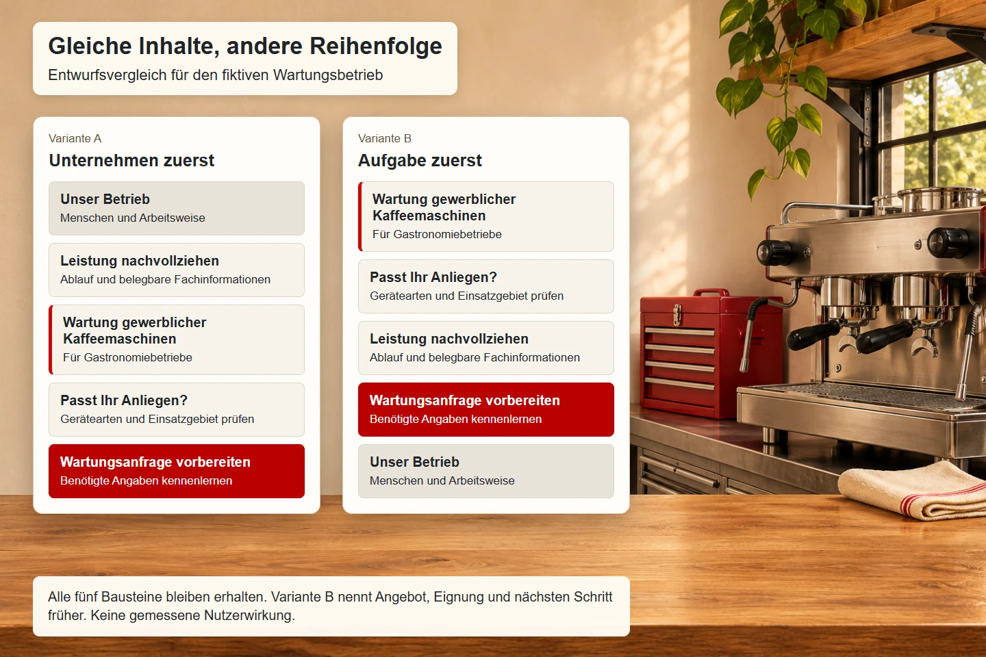
The illustration compares the same content blocks in two arrangements. The first places company presentation and supporting technical information before practical service identification. The second makes the offer, suitability and next step available earlier. It is a design comparison, not evidence of improved usability or a guaranteed increase in enquiries.
Review the order as a simple written outline first. Give each section one central statement and an appropriate route onwards. Once that sequence makes sense, decide image sizes and columns. This lets the team discuss information needs without treating every content change as an argument about visual taste.
5. Keep the first view focused
The initially visible area varies with the device, text size and browser. A fixed screen height is therefore not a reliable editorial boundary. A clear priority still helps: the offer, a brief explanation and an appropriate action should not disappear behind a purely decorative composition, especially in a narrow viewport.
In the example, imagery receives as much space as its contribution to understanding justifies. A photograph can establish a commercial setting but should not imply support for appliances or services the business does not provide. A precise caption may be more informative than a generic promotional sentence. Even a strong image needs to serve the actual information task.
Awards, news and company values all compete for attention near the opening. Assess whether each helps the first decision. A relevant qualification may be useful. A collection of unexplained badges is less convincing. Selective, substantiated information creates a clearer introduction than the largest possible number of simultaneous signals.
6. Build trust with concrete information
Trust is not an isolated interface component. It grows from consistent details and checkable substance. Relevant material for the fictional business could include supported appliance categories, a clear explanation of maintenance work and a transparent enquiry process. Those details must come from actual business information. A decorative trust symbol cannot supply the missing substance.
A reference should explain the work actually performed. A logo without context says little about scope. A short account of the assignment, contribution and verifiable result is more useful. Customer names, images and statements require the appropriate permissions and rights checks. This is an editorial requirement to verify their use, not a blanket claim of legal permission.
Boundaries can improve understanding too. If particular appliance categories are excluded, the page should not imply universal coverage. A clear limitation helps visitors judge suitability and can prevent enquiries based on a mistaken expectation. Such effects should be examined within the individual project rather than expressed as an unsupported general success rate.
7. Match evidence to the specific claim
| Claim | Relevant evidence | Weak shortcut |
|---|---|---|
| Particular machines are supported | A current list and service description | An unrelated machine photograph |
| The process is understandable | Actual steps and prerequisites | An unexplained promise of simplicity |
| Relevant expertise exists | Verified qualifications or work descriptions | An invented starting year |
| Customers have received support | An approved reference with scope | An unsupported praise quotation |
Apply this mapping to every significant assertion. Where evidence is missing, narrow the wording, postpone the claim or remove it. Large numbers deserve particular care. A count of supported machines requires a clear definition and traceable source. Different periods, categories or counting methods must not silently be combined into one impressive total.
A homepage can be persuasive without testimonials. Clear service information, an identifiable contact and good answers to practical questions can provide useful reassurance. Invented praise would weaken the entire presentation. Build the concept around reliable material already available rather than making it depend on evidence the business would first have to obtain.
8. Name the next step accurately
An action should describe where it leads. Prepare a maintenance enquiry means something different from book an appointment. If the destination is simply a contact form, its label should not suggest a confirmed booking. A service overview can be a useful alternative for visitors who first need to check appliance categories or prerequisites.
The main route depends on the audience's readiness. For a service requiring explanation, an information page may be a better continuation than immediate contact. Returning customers may need a direct telephone number. Multiple routes are reasonable when their differences are clear. Identically emphasized buttons with vague labels create unnecessary competition between those tasks.
Nearby text can explain which information is required or who handles the enquiry. Only promise a response time that the business can reliably support. A short realistic explanation is more useful than friendly wording that regularly becomes untrue in everyday operations. The action and its destination should set the same expectation.
9. Use headings and links as a structural framework
The heading sequence represents the organization of the content. A main heading identifies the entry. Sections address the offer, prerequisites, process and evidence at appropriate levels. Visual size alone does not provide that structure. The WAI heading tutorial explains how meaningful headings also support navigation within a page.
Link wording should clarify its destination. Check supported appliances communicates more than repeated instances of learn more. The WCAG explanation of link purpose addresses link text together with programmatically determined context. For editorial review, the practical question is whether someone can understand the expected information before opening the destination.
Navigation and primary content need appropriate semantic regions as well. This does not mean displaying technical region labels throughout the design. It means marking up page areas correctly in the document. Review keyboard operation, focus order and understandable naming on that foundation in the actual implementation.
10. Adapt mobile content deliberately
The content priorities remain relevant on narrow screens. A three-column service overview may become a readable vertical sequence. Important suitability conditions should not slide below a long stream of images. Review both broad and narrow layouts using the same realistic text rather than a compact mobile specimen that conceals actual content length.
Condensing content means removing repetition and unnecessary detours. It does not mean hiding decisive restrictions. An unsupported appliance category matters just as much on a phone. Telephone numbers, opening hours and contact routes must still describe the actual service. Limited space is not a reason to publish a contradictory short version.
Keep document order understandable. Purely visual reordering can make spoken content follow a different sequence from visible components. Cards containing actions particularly deserve review. With enlarged text, the mobile layout should retain meaningful relationships without overlapping elements or hidden controls. The conceptual sequence and responsive design need to be evaluated together.
11. Give search and answer systems clear facts
A comprehensible homepage helps people first. Search engines and answer systems also need clear relationships, but that does not require artificial vocabulary. The provider, offer, audience and relevant service area should be described consistently in visible content. Important facts should not exist exclusively inside an image or decorative animation.
Google's documentation describes an emphasis on helpful content for people. That does not establish a ranking guarantee for this proposal. It does support an editorial focus on actual questions and checkable information. Repeating keywords or listing interchangeable place names does not make an ambiguous service easier to understand.
Write the page title and description after the concept so they summarize the real content. They should not promise services absent from the page. Frequently asked questions can help when the questions are genuine. Their inclusion does not guarantee a particular search presentation or a mention by an automated answer system.
12. Prepare a qualitative review
Give reviewers concrete tasks rather than broad questions about taste. Ask whether a particular appliance is likely to be supported and which information an enquiry requires. Observe search routes, misunderstandings and incorrect expectations. Keep recorded observations separate from the team's interpretations and proposed solutions.
A small qualitative test does not produce a representative percentage for the entire audience. It can reveal particular ambiguities. If someone interprets maintenance as immediate emergency service, inspect the wording that created that expectation. Choose a revision that addresses the misunderstanding rather than simply adopting the most popular visual alternative.
Internal specialists should also review the page, with a different responsibility. They verify appliance categories, processes and responsibilities. They do not automatically represent a new visitor's perspective. Combine both views to produce an accurate proposal whose central information can be understood without specialist knowledge of the business.
13. Assign responsibility for current information
A homepage remains reliable only when operational changes reach its content. Assign a responsible role to every time-sensitive item, including the service area, contact details, qualifications and references. A general responsibility for everything makes it easy for a particular change to escape attention. Specific ownership supports meaningful maintenance.
Document details repeated across several pages. The service area may appear on the homepage, service description and contact page. Those statements must remain consistent after a change. A shared technical data source can help, but it does not replace editorial review of the meaning of that information in different contexts.
New announcements should not gradually displace the homepage's principal task. Before adding a module, ask whether the content belongs here and which existing information will receive less space as a result. That decision keeps the structure understandable over time. Maintaining priorities matters as much as adding fresh material.
14. Review before approval
- The opening identifies the actual offer and intended audience.
- Important prerequisites are reachable before making an enquiry.
- Every central claim has a checkable foundation.
- References and image usage have the necessary approval.
- Actions describe the following step without an inaccurate promise.
- Headings and links form an understandable structure.
- Narrow layouts and enlarged text retain important content.
- Contact routes have been checked as complete tasks.
- The page title and description match the visible offer.
- Responsibilities for later updates are documented.
Approval should answer specific questions: what can this provider offer, whom does it serve, what supports those statements and what happens next? Clear answers provide a dependable foundation for visual work. Colour, typography and imagery can then reinforce the information order instead of disguising a decision the team has not yet made.
15. Record the reasoning behind the order
A useful handover includes more than a screenshot. Record why each major section appears where it does and which visitor question it answers. If the service area moves, for example, the next editor should know whether its placement addressed a documented misunderstanding or simply an initial assumption. Both are legitimate states, but they should not be confused.
Keep rejected alternatives when they explain a meaningful tradeoff. A large company-history panel may have moved down the page to make supported appliances easier to find. That reasoning helps a later content owner avoid recreating the same problem. The record should remain concise enough to use while planning an actual update.
Finally, define which observations would justify revisiting the concept. Repeated enquiries for unsupported equipment might indicate unclear scope. Difficulty locating a contact route could indicate an ambiguous action label or navigation position. Investigate the actual cause before adding another prominent button. A homepage develops most coherently when each revision responds to a known information problem.
Sources and scope
Sources checked on 9 November 2026. These primary references were reviewed for page structure, link purpose and helpful content. The fictional business and proposed sequence are editorial examples without claimed measurements.