HTML forms with appropriate input types and labels
Develop an enquiry form from its business purpose to a reproducible browser review.

Start with the task before choosing a control
A clear form connects three decisions: what a person needs to enter, how HTML supports that entry and what processing follows. A visible label gives the control a lasting identity. Its input type describes the kind of value. A specific instruction explains an expectation that would otherwise be unclear. These decisions belong in the first design rather than appearing only after the person encounters an error.
Our running example is an enquiry to a fictional repair business. This business needs a reply email address and a message. A name and telephone number may help the conversation but remain optional in this particular workflow. That is an explicit assumption of the example, not a universal contact-form requirement. A booking service or an insurance claim could need a different set of details for a different reason.
When reviewing an existing form, start with a field inventory. Record the purpose of every question, the receiving process and what happens if the value is missing. A telephone field then becomes an operational decision: will anyone actually call this person or is an email response sufficient? Adding a required attribute takes seconds. An unnecessary question creates work for every visitor and for the people maintaining the service.
Separate identity, value type and explanation
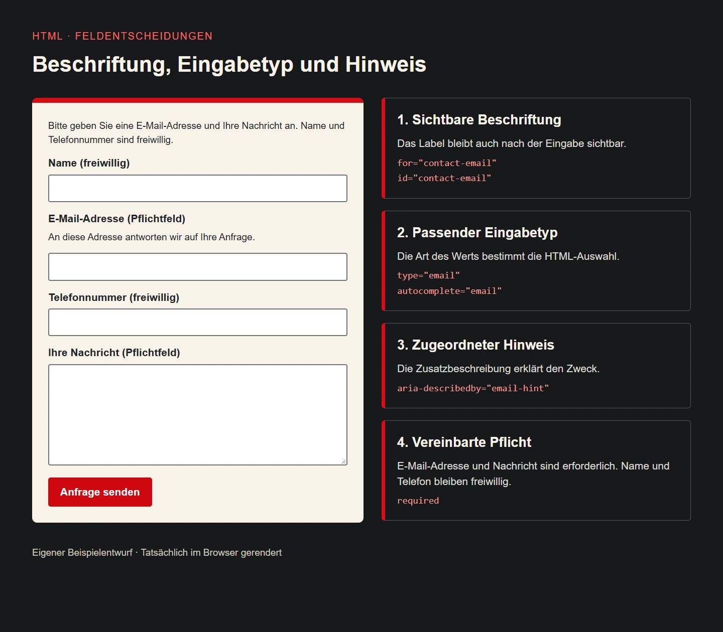
The reply field in our example has the visible label “E-Mail-Adresse” in its German demonstration interface. Its type is email. The nearby instruction explains that the business will reply to this address. The label identifies the information, the type supports entry and basic format checking, and the instruction explains the purpose. The interface works better when these three jobs stay distinct and each piece is easy to find.
A label such as “Contact” is less precise: it might mean a person, an address or a telephone number. An empty box identified only by an envelope symbol leaves even more interpretation to the visitor. In our design, an icon could support the text but would not replace the field identity. A short concrete name usually does more useful work than an extra decorative feature or a long explanation detached from its input.
Clear expectations also make correction messages easier to write. A missing reply address calls for a request to enter that address. A generic “Invalid data” message gives the person much less help. There is still a distinction between an address with acceptable syntax and an address that can actually receive a reply. Reachability would require an additional process and should never be inferred merely from the input passing a format check.
Keep labels visible and associate them explicitly
For an ordinary text control, the example uses a label with for and an input with the corresponding unique id. This is a direct association that can be inspected and exercised. The separate name attribute identifies a submitted value. An id and a name have different responsibilities even when a project chooses identical strings for both. Our deliberately descriptive identifiers make their roles easier to review during handover.
Placeholder text is not a durable substitute for a visible label. In ordinary rendering it disappears after entry, leaving someone returning to the form with less context. A persistent label still answers the question of what the value represents. A useful formatting example may supplement that label when there is a genuine ambiguity. Important requirements should not exist exclusively in faint text inside an empty control.
Reusable components require unique identifiers in the complete page. Copying an isolated form component twice can otherwise connect a label to the wrong occurrence. Our acceptance check therefore includes the surrounding search, newsletter and any dialog rather than examining one field in isolation. Activating each visible label should focus the intended control. A component that looked correct in its own preview still needs this integration check.
Choose types from the meaning of the value
The reply address uses type="email", the optional telephone number uses type="tel" and the free-form name uses type="text". A textarea provides room for the actual message. These choices follow the information being collected. They avoid treating a telephone number as a quantity or asking someone to edit a detailed repair description in a single narrow line. Mobile keyboard behaviour is then a useful additional device check.
A customer reference containing leading zeros is often an identifier rather than a number for calculation. A related identification form would normally start with a text control. inputmode="numeric" can suggest a convenient keyboard without turning that identifier into a mathematical value or validating the business rule. An actual item quantity may justify a numeric input. The presence of digits alone is not the deciding criterion.
Telephone input does not impose one universal telephone-number syntax. Our fictional business could receive an international enquiry, so a narrow invented pattern would risk rejecting a usable contact. The example deliberately avoids such a pattern. If a real service requires a specific regional structure, explain the restriction visibly, justify it from the workflow and test the server rule against representative accepted and rejected examples.
Make required information a deliberate contract
The introduction identifies the two required details. Their labels also state that they are required, while the other two explicitly say they are optional. The required attribute expresses the same distinction in HTML. That gives the person a readable rule and the control a programmatically available property. An unexplained red asterisk would add a convention that this small form does not actually need.
Agree required fields with the team handling the enquiry. If a technician needs a callback number only after an appointment has been agreed, it may not belong among the mandatory details of a first general enquiry. A later focused question could fit the process better. Conversely, a genuine safety or identification requirement should not be concealed to make a layout look shorter. The interface must represent the actual operational agreement.
A compact acceptance matrix follows from that agreement. A meaningful message and a suitable reply address with an empty name and telephone number must be accepted by the example rules. A missing message or reply address must fail. A message consisting only of whitespace needs a separate server-side business decision because an HTML attribute cannot decide whether the text offers useful information for a repair enquiry.
Use a complete small HTML example
The following snippet presents the input structure for the fictional repair business. The /anfragen action represents an endpoint that must be implemented and connected to the actual application. Its presence in the markup is not evidence of message delivery or storage. A real interface should report successful submission only after the receiving process has established the relevant success state. Entry structure and completed processing are separate parts of the service.
The length limits are chosen values for this example, not universal contact-form limits. They make the boundary explicit so that the receiving implementation can apply the same agreement. Before adopting them, review realistic names, contact details and equipment descriptions. A visitor should not lose an international name or a necessary description merely because an arbitrary value happened to look tidy in a demonstration. Frontend and server limits need coordinated ownership.
<form action="/anfragen" method="post">
  <p>Bitte geben Sie eine E-Mail-Adresse und Ihre Nachricht an.
     Name und Telefonnummer sind freiwillig.</p>
  <label for="contact-name">Name (freiwillig)</label>
  <input id="contact-name" name="contact_name" type="text"
         autocomplete="name" maxlength="120">

  <label for="contact-email">E-Mail-Adresse (Pflichtfeld)</label>
  <p id="email-hint">An diese Adresse antworten wir auf Ihre Anfrage.</p>
  <input id="contact-email" name="contact_email" type="email"
         autocomplete="email" required maxlength="254"
         aria-describedby="email-hint">

  <label for="contact-phone">Telefonnummer (freiwillig)</label>
  <input id="contact-phone" name="contact_phone" type="tel"
         autocomplete="tel" maxlength="80">

  <label for="contact-message">Ihre Nachricht (Pflichtfeld)</label>
  <textarea id="contact-message" name="contact_message"
            required maxlength="4000" rows="6"></textarea>
  <button type="submit">Anfrage senden</button>
</form>
Attach instructions to the relevant control
The explanation of the reply address appears immediately before that input and has its own id. aria-describedby refers to it while the label stays concise. This avoids forcing the field identity and its longer explanation into a single unwieldy title. If the wording changes later, its association must remain correct. An instruction attached to the wrong input can actively mislead someone even when every individual sentence sounds reasonable.
Not every field benefits from extra help text. “Name” is sufficient for this enquiry unless the process specifically needs a legal name or a particular organisational identity. Repetitive explanations beneath every input make the form longer and reduce the visibility of the instructions that really matter. Write assistance where a person has a concrete uncertainty to resolve. Review the result with plausible repair enquiries rather than arbitrary filler.
Conditional controls need a consistent state contract too. If a later version offers a callback option, a hidden telephone field must not remain required by accident. Visibility, requiredness and receiving logic need to change together. One explicit state model is easier to maintain than several small scripts that independently hide, disable and validate controls after different interactions. Test repeated switching as well as the initial view.
Plan autofill as assistance rather than a dependency
The example supplies autocomplete="name", autocomplete="email" and autocomplete="tel" for the corresponding personal information. These are defined technical tokens rather than translations of the visible labels. An invented local-language token is not an equivalent replacement. The user-facing wording can remain natural in each language while the technical purpose stays consistent. Correct purpose metadata complements a readable interface instead of taking over its communication role.
Whether a particular browser offers a saved value depends on its environment and stored information. The workflow therefore retains a complete manual route, including correction of a previously supplied value. Autofill also creates a practical integration case: logic that only reacts to individual typing events may overlook controls that already contain values. Review the actual completed form state rather than assuming every value must have arrived through the same sequence of keys.
A shared computer creates additional operational questions about personal information and saved browser data. Those questions belong to the actual deployment context. A single autocomplete setting is not a comprehensive privacy or convenience guarantee. For this component, we first verify the correct purpose tokens and ensure that manual entry remains usable. Device-specific saved-data behaviour can then be checked as part of the service acceptance plan.
Treat correction as a designed state
The first version uses the browser’s native constraint validation. This can catch missing required values and obvious reply-address format problems before a normal submission. If a project adds a custom error interface, it must implement the same business agreement. Labelling a value optional and then rejecting its absence on the server creates a contradiction that no amount of visual polish can fix. Agree the rule before designing its error presentation.
When the server returns a problematic email value, preserve the person’s entry so that it can be corrected. Identify the affected field and explain the next useful action. aria-invalid="true" can describe its current error state, with aria-describedby referencing both a continuing instruction and a specific error when appropriate. Remove stale error associations after successful correction. A red border on its own does not explain what happened or what to do.
Avoid treating every incomplete first keystroke as a final failure. An address is naturally unfinished while someone is typing it. Our repair business gains little from displaying urgent warnings for every intermediate state. Choose feedback timing deliberately and exercise keyboard use, repeated attempts and focus changes. The useful outcome is a successful understandable correction, not the largest possible collection of visible warnings.
Inspect what the form actually submits
A form’s technical contract includes the names and values that reach the receiving application. The four controls in the example have explicit name attributes. An id alone does not create the corresponding named form-data entry. A disabled control is also treated differently from a normal enabled control during ordinary form-data collection. These details become particularly important when an interface locks fields during a multi-step process.
Our browser check constructs FormData from the actual example and examines its keys and values. This is more reliable than assuming everything visible will be present in the request. An additional isolated identifier test confirms that a text value beginning with “0017” retains those characters. The enquiry itself does not ask for a customer reference. The test explains a design distinction without making the public form collect unnecessary information.
A value assigned by JavaScript does not prove that the downstream process handled it. The application still needs to expect the agreed names and respond predictably to unusual input. When renaming a field, review both ends of the contract. Changing only its human-readable label should not automatically change the interface consumed by the server. Maintaining language and data keys separately makes later editorial work safer.
Leave room for real content and reading preferences
The initial layout uses one column. Labels precede their inputs, associated instructions stay nearby and the submission button follows the message. This simple reading order is easy to assess on a narrow screen and with enlarged text. A complex grid would not add a useful business distinction here. A different arrangement should follow a concrete relationship between fields rather than a desire to make a short form look more elaborate.
Long names, larger text settings and translated labels must not disappear inside rigid heights. Controls need readable text, discernible boundaries and visible keyboard focus. If a later design introduces a related set of choices, fieldset and legend can provide their shared context. That group description does not automatically replace each individual option’s understandable name. New styling deserves the same scrutiny as the original field structure.
The explanatory illustration in this article is rendered from the actual example in a browser. It shows the visible form and identifies its relevant attributes alongside it. The cover is a symbolic editorial still life with a different job. Mood and material richness belong in the cover; an explanation of a technical association needs a precise reproducible relationship. Keeping those jobs clear helps prevent decorative imagery from becoming misleading technical evidence.
Run a small acceptance session with explicit limits
Start with an empty form and activate each label. Focus should move to the expected control, then follow the document order through keyboard navigation. A meaningful message with a syntactically acceptable reply address and empty optional fields should pass native validation. A missing required value or clearly inappropriate address should fail. Particular international addresses need additional investigation in the real receiving environment rather than a broad compatibility claim.
Next inspect the submitted data, the control attributes and the layout at narrow widths. Use invented information throughout this exercise. A desktop Edge run does not establish the virtual-keyboard behaviour of a physical phone or compatibility with every assistive-technology combination. Test those environments separately where relevant. Automation should answer named questions and preserve its evidence rather than being presented as a universal accessibility certificate.
Handover also needs a short list of operational decisions: who reads the message, what acknowledgement the sender receives, how an interrupted connection is handled and which details appear in logs. A well-labelled form cannot resolve those questions alone. It does provide a coherent foundation on which processing, security and truthful feedback can be built without having to reinterpret the meaning of every field.
Questions that arise during implementation
Should a postal code use a numeric input? An identifier often starts more appropriately with a text control. Leading zeros and international formats belong to the address model. inputmode can suggest a numeric keyboard without redefining the value as a quantity for arithmetic. The receiving system must still specify supported countries and formats. Choose the control only after understanding that requirement, not simply because a familiar local example contains digits.
Does every form need custom JavaScript validation? No. HTML already provides useful entry support for many ordinary cases. Add custom logic to address a specific missing behaviour rather than recreating the browser by default. It must never substitute for server checks. In this example, correct labels, requiredness and submitted names are the first priorities. A more elaborate feedback layer needs a demonstrated benefit in the actual enquiry workflow.
Do correct labels make the entire form accessible? They are an essential part of the result but do not settle every question. Focus, correction, enlargement, contrast and the complete processing journey still require review. Test the whole interaction rather than awarding approval to an isolated control. A sound field component becomes a dependable contact route through its integration with the rest of the service.
Results from the concrete example
The displayed HTML was exercised in desktop Edge with 39 checks covering label targets, unique IDs, required values, types, autofill, instruction association, form data and keyboard order. Layout checks used widths of 320, 390 and 1440 pixels and enlarged control text. These observations describe this example and browser environment, not production delivery or a comprehensive review of every assistive technology.
The address a@b passes this HTML syntax check, while anna@ does not. The telephone input also accepts letters without a separate pattern, and a whitespace-only message passes native required validation. These are useful distinctions for the receiving team: browser entry assistance does not establish reachability or decide whether the enquiry contains a useful message.
Field decisions at a glance
| Information | HTML | Required in example |
|---|---|---|
| Name | text, autocomplete=name | No |
| email, autocomplete=email | Yes | |
| Telefon | tel, autocomplete=tel | No |
| Nachricht | textarea | Yes |
Handover checklist
- Every question has an agreed purpose.
- Every visible label targets the correct control.
- Required and optional information remain consistent throughout the workflow.
- Types, names and autofill tokens match the data contract.
- Instructions and current errors refer to the correct field.
- Keyboard interaction, narrow layouts and larger text have been reviewed.
- Server checks and truthful completion feedback have defined owners.
Sources and technical review
Primary sources reviewed on 9 November 2026. The repair business and its field rules are original illustrative examples.