The barriers people actually encounter on websites
From missing labels to unnoticed errors: a practical introduction to perceivable, operable and understandable digital services.

A page can look clear on your own screen while remaining difficult for others to use. A keyboard user may be unable to open a menu. Enlarged text may push a submit control out of reach. Someone who does not perceive an error message may not understand why registration failed.
This guide explains common barriers through a fictional training registration journey. The situations are editorial examples, not findings from a user study that actually took place. It provides a practical starting point. Comprehensive technical and, where relevant, legal assessment requires an appropriately scoped evaluation.
1. Begin with the task
The starting question is more than whether a page looks orderly. A person registering for training needs to understand the offer, choose a date, provide information and recognise what happens after submission. Each step can involve different barriers.
Write down a complete journey. Start with a realistic entry, such as a direct link to the training page. Then check whether the information and controls needed for completion are available. Testing only the home page would miss much of the task.
The W3C introduction to web accessibility centres use by people with different abilities. In a project, this means examining specific content and interaction. The presence of one technical feature does not establish that the whole journey succeeds.
A useful objective is: “Registration can be completed with a keyboard and an invalid entry can be corrected understandably.” This is more specific than a broad “accessible form” judgement. It can be observed and divided into practical checks.
2. Consider different ways of using the service
People use digital services in diverse circumstances. Some use assistive technologies consistently. Others have temporarily reduced dexterity or cannot hear audio in a noisy environment. A person's requirements cannot reliably be inferred from a single characteristic.
The W3C resource Diverse Abilities and Barriers describes this variety. A practical response is to consider several ways of accessing the same information. Someone may combine magnification, keyboard use and speech output.
| Situation | Possible barrier | Access to investigate |
|---|---|---|
| Operating without a mouse | A menu opens only on hover | Keyboard access and visible focus |
| Substantial text enlargement | Important content is clipped | Reflow and reachable controls |
| Speech output | A field has no meaningful name | A programmatically associated label |
| Video without audible sound | An explanation exists only in speech | Suitable captions and alternatives |
| Greater orientation needs | Unclear terms and changing processes | Understandable structure and consistent feedback |
These are possible situations rather than fixed categories of people. Evaluation should follow the functions actually offered and the variety of ways they may be used.
3. Keep information perceivable
An important notice may be visually present yet difficult to access. Weak contrast, small fixed text and states communicated only through colour can create problems. A fully booked training date should not be identifiable only by a barely distinguishable shade.
Useful identification combines presentation with meaning. A date can be labelled “Fully booked”. A required field needs an understandable label and explanation. The information remains available when a particular colour cannot be distinguished.
Examine information embedded in images too. A graphic timetable may fit the brand but needs an accessible informational version. Alternative text saying only “Training schedule” does not communicate dates, duration or location.
The appropriate alternative depends on the content. A short visual statement may need a concise description. Extensive data may be better provided in a table or explanatory text. The alternative should convey the necessary information rather than merely acknowledge that an illustration exists.
4. Avoid dependence on one input method
Many people use a keyboard or other input assistance for some or all interactions. A control responding only to a mouse gesture can be unusable for them. Implementation needs to match the control's real function.
Links navigate to destinations and buttons perform actions. Native HTML elements provide an important foundation. A generic container does not acquire those characteristics from its appearance. Custom controls require deliberate implementation and verification of expected behaviour.
Sequence matters as well. If focus moves unexpectedly after opening a section or disappears behind an overlay, the next step becomes unclear. Review opening, using and closing a component rather than only its default view.
For registration, perform a concrete journey: select a date, move to the first field, correct an entry and reach the next control. Record the input used and visible state. A screenshot alone cannot demonstrate that sequence.
5. Examine enlargement and narrow layouts together
Responsive design adjusts to available space and can also help people enlarging content. A single mobile screenshot still does not establish usability under magnification.
Check whether longer labels wrap, text overlaps controls or essential guidance leaves the usable area. A fixed bar can occupy much of the remaining height. The page needs to support the task, not merely fit its decorative container.
In registration, dates and session labels must remain understandable together. A fixed-height button that clips text is not resolved solely by offering a large target. A multi-column arrangement can also lose meaningful order if elements are only rearranged visually.
Include transitions between layouts. A menu opened at one size may remain in an unexpected state after resizing. The visitor still needs a route through the task. These cases illustrate why a list of viewport widths does not replace interaction testing.
6. Give forms understandable relationships
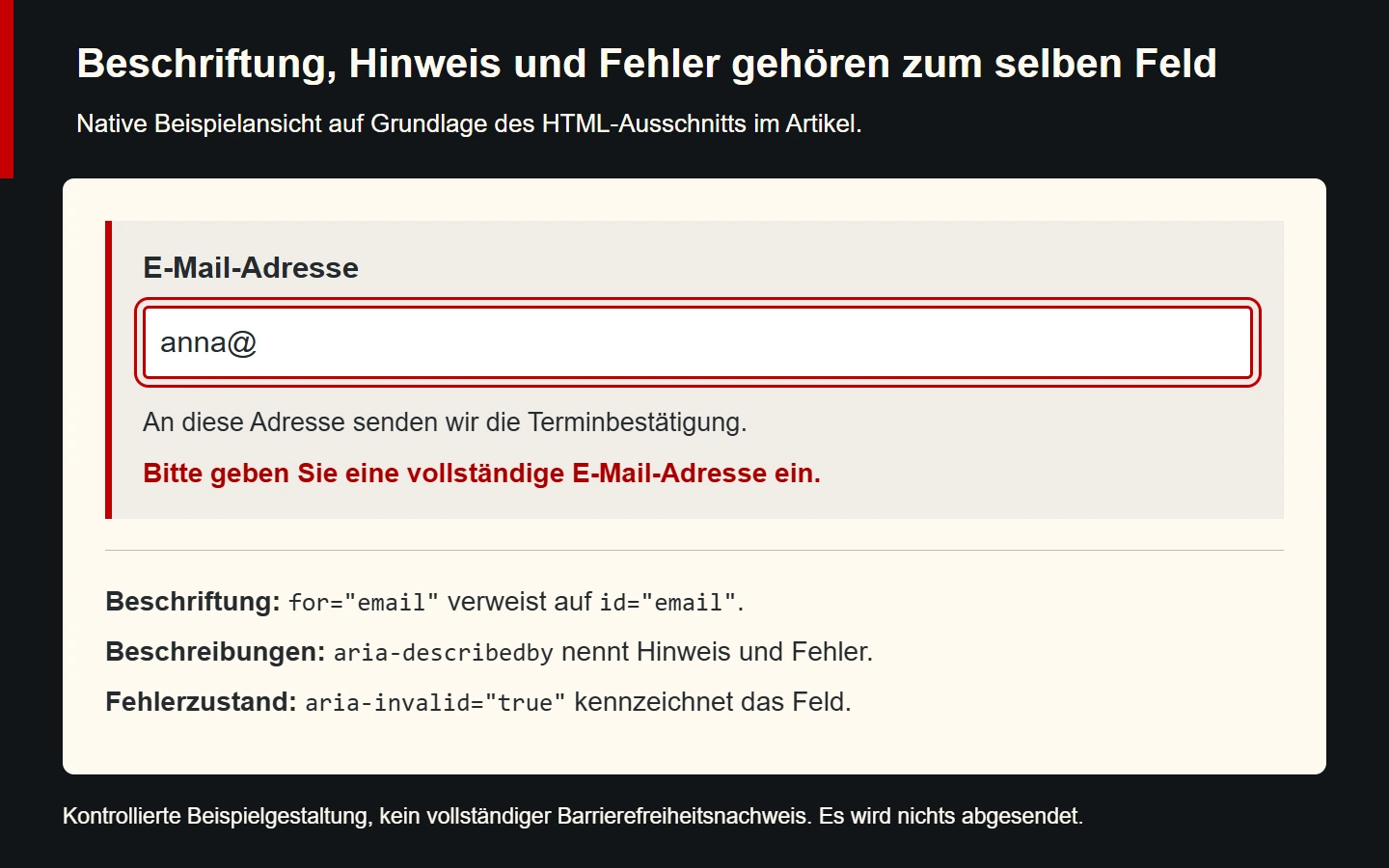
A field should explain what information it expects. Visible wording and technical association belong together. Placeholder text alone is often inadequate because it disappears while the person types.
The W3C guidance on form labels explains appropriate associations. In an error state, users also need to identify the affected field and understand how to improve the entry.
<label for="email">Email address</label>
<input id="email" name="email" type="email"
       aria-invalid="true"
       aria-describedby="email-help email-error">
<p id="email-help">We send your appointment confirmation here.</p>
<p id="email-error">Enter a complete email address.</p>
This HTML represents an example error state rather than complete form processing. The label is associated with its field and the help and error text are referenced by ID. In an application, actual validation must set the state and update it appropriately after correction.
The fragment establishes relationships but does not prove how every screen reader announces a dynamically inserted error. That depends on the wider form, update behaviour and interaction context. Verify both discovery of the problem and the route back to correction. Adding more announcements without considering that sequence can make feedback repetitive or confusing. The goal is information that arrives at the useful moment and remains available when the person needs to review it.
The full journey raises additional questions. Are existing entries preserved? Does successful transmission receive an accurate confirmation? Can an error be resolved without re-entering everything? A correctly named field matters, but is only part of a usable transaction.
7. Understandability involves wording and process
Unclear language and unexpected changes can create barriers. “Continue” can be appropriate when the next step is explained. If it unexpectedly completes a binding booking, the action no longer matches the expectation.
The training page should distinguish an appointment request from a confirmed booking. Conditions, costs and required information should be understandable where the person makes a decision. Hiding essential prerequisites in a long general document makes the task harder.
Use specific instructions. “Correct your input” does not identify the cause. “Add the building number” suggests a particular correction. Technical vocabulary is useful when appropriate to the audience and explained where needed.
Consistent names help too. Different names for the same session in navigation, the form and confirmation can create uncertainty. A shared terminology list supports linguistic and technical consistency across pages.
8. Provide suitable alternatives for images and media
Alternative text follows the image's function in its particular context. A decorative motif has a different role from a linked image, diagram or photograph showing an essential detail. The same file may need a different appropriate alternative in different contexts.
The W3C alternative-text decision tree supports that assessment. A decorative background on our training page differs from a graphic travel guide whose key information also needs to be available as text.
For audio and video, identify which information travels through which channel. Captions can convey speech and important sounds. An essential action communicated only visually also needs an appropriate accessible equivalent.
Review the usefulness of the alternative itself. Automatically generated descriptions can support drafting while missing important details. Approval needs to relate to the actual image and its informational purpose.
9. Prioritise barriers without averaging away critical failures
A defect preventing registration has different significance from a minor editorial uncertainty. Prioritisation helps organise work, but a serious failure should not disappear numerically because many unrelated checks passed.
| Observation | Effect on the task | Practical response |
|---|---|---|
| Submit cannot be reached with a keyboard | The task may fail entirely | Correct the control and focus sequence |
| Error text has no field association | Correction becomes harder | Add the relationship and useful wording |
| Session details exist only in an image | Essential information is absent from another output | Provide an equivalent informational version |
| Confirmation uses an unclear term | The outcome is difficult to interpret | Align wording with previous steps |
This is an editorial working aid rather than a formal conformance assessment. Record each finding with its trigger, affected function and observed consequence. That supports targeted verification of the correction.
Consider reused components. A form defect may affect many pages. Relevant uses need review after correction, without assuming that one successful instance proves every variant correct.
10. Combine automated checks with actual interaction
Automated tools can identify some problems systematically. They do not fully establish whether a label is meaningful or a process understandable. A missing text alternative differs from an existing but inaccurate description.
The W3C Easy Checks explicitly describes preliminary checks as a limited starting point. Passing that review is not a complete demonstration of accessibility.
Combine technical findings with manual tasks. Review keyboard registration, enlarged presentation and whether the content answers the actual booking question. When involving people with different ways of using the web, prepare and interpret their feedback appropriately.
Simulation has limits. Closing your eyes or disabling an input device does not reproduce the experience of someone routinely using suitable assistive tools. Such exercises can raise awareness without establishing a complete user evaluation.
11. Distinguish requirements from evidence
The WCAG reference provides structured access to success criteria and techniques. A specific evaluation still needs an agreed scope and relevant requirements. Naming a standard is not the same as applying it.
Technical quality and legal applicability are also different questions. Determine separately which rules apply to the organisation and service. An offer outside a particular legal duty may still benefit from improved access.
Avoid broad promises such as “fully accessible” without the corresponding assessment. State which pages, states and functions were tested using which methods, alongside the known limits of that evidence.
A useful report might identify the URL, form state and interaction method. “Keyboard registration including error correction was checked” says more than a single unexplained badge. The result remains connected to the actual task tested.
12. Include accessibility in ongoing maintenance
New content can introduce new barriers. A replacement image may lack a suitable description. A heading may skip a level or a longer label may be clipped. Accessibility therefore belongs in editorial and technical maintenance.
Define short checks for common changes. After changing a form, review its keyboard journey and error state. After changing an image, compare its meaning with the alternative. After translation, inspect length and meaning.
Provide a handling route for visitor feedback. A reported barrier should identify the task and be investigated traceably. A general reply without examining the particular interaction does not resolve the problem.
The lasting value comes from understandable components and verifiable working practices. A sound foundation reduces repeated problems when it is preserved during extensions. Accessibility is ongoing quality work rather than a one-off decorative addition.
13. Communicate changes within a page
Many tasks change state without loading a new page. Dates are filtered, a price updates or confirmation appears after submission. People need to recognise what changed and what they can do next. A purely visual message in an unexpected position may hide that information.
For registration, assess intermediate states as well. While a selection is processed, it should be understandable whether the operation continues or has completed. Repeating an action should not unintentionally create several independent transactions. Technical duplicate handling needs to agree with visible feedback.
After an error, people need to find the affected context again. A general notice at the top can be missed when the problem is further down. Review meaningful wording, field relationships and focus through the actual journey. Apply technical attributes deliberately rather than treating them as a blanket replacement for appropriate components.
List the main states of important functions: initial view, processing, correctable error and success. This exposes what has been evaluated and what remains. For an apparently simple registration process, that state inventory can be more informative than many isolated screenshots of the default view.
A first barrier-review checklist
- A complete important visitor task has been selected.
- Information remains available through different presentations.
- Important meaning is not communicated only through colour.
- The task can be followed with a keyboard.
- Focus and expanded states are recognisable.
- Enlargement does not conceal essential controls.
- Fields have meaningful associated labels.
- Errors can be recognised and corrected.
- Images and media have suitable informational alternatives.
- Scope, results and limitations are documented.
Common questions about digital barriers
Is accessibility only relevant to blind people?
No. Perception, operation and understanding involve diverse abilities and circumstances. One assistive technology does not represent that variety.
Is an automated test enough?
It can contribute significantly. Content suitability, understanding and complete journeys need additional evaluation.
Is modern design automatically accessible?
No. Presentation and technical meaning need to work together. A clear appearance can still contain unlabelled or unreachable controls.
Sources and further guides
Checked on 9 November 2026. Foundations are the linked W3C WAI resources on accessibility, diverse abilities, labels, image alternatives and evaluation, alongside the WCAG reference. The registration journey and priorities are original editorial examples.
For technical foundations, read Semantic HTML through a complete example. For Germany's legal context, see What the BFSG means for businesses.