Images with picture, srcset and appropriate alternative text
Connect image meaning with observed sources through traceable implementation and appropriately bounded checks.

A responsive image has several jobs. Which composition remains useful in a narrow view? Which file suits the display space? What information does the image convey to someone who cannot see it? These questions are connected but distinct. The picture element, srcset and alt therefore perform different roles.
A sound implementation starts with content and the actual layout, then offers appropriate files and reviews the result. This guide uses an original simple drawing of a red ring on a light background. Wide and narrow versions remain identifiable as teaching illustrations. Browser checks record actual choices under stated conditions, without promising a universal selection formula or a measured loading-time improvement.
Separate three decisions
Resolution switching provides the same composition at different pixel dimensions. Art direction deliberately changes the crop for a particular space. Alternative text conveys the image information relevant to its context. Confusing these jobs can result in technically valid multiple sources that lose essential content or describe it inaccurately.
The MDN responsive-images introduction distinguishes these use cases. First decide whether the task needs more pixels or a different composition. A larger file does not automatically make a distant small subject clearer within the same display. Conversely, a tighter crop can remove necessary surroundings.
Define the image's purpose. Our drawing shows a red ring; the wide composition has more spare space and the narrow one concentrates on the same subject. This simplification supports a traceable technical comparison. A real product image would require assessment of its actual relevant parts and relationships before choosing its versions.
Establish the actual image slot
Viewport width is not automatically image width. A website may contain padding, columns and a maximum content width. Selection therefore needs information about the space allocated to the image. Layout defines that space. A filename containing 1440 does not establish that the image occupies 1440 CSS pixels on the page.
The teaching page has no body margin. Its image fills the available width up to 960 CSS pixels. A 360-pixel viewport therefore has a 360-pixel slot, while a 1200-pixel viewport retains a 960-pixel slot. These are chosen test conditions rather than a general layout prescription.
If another design has different spacing, its slot description needs to reflect that. Claiming full viewport width may then be inaccurate. Inspect the computed element box in the completed layout. Observing a large selected source does not prove that the supplied slot information was correct.
Treat srcset as an offer of actual files
Srcset lists candidates. A width descriptor such as 480 w describes the associated source's actual pixel width rather than an arbitrary quality label. If the file has different dimensions, the browser receives an inaccurate basis. The prepared example PNGs are therefore checked against their real dimensions.
The wide composition offers 480,960 and 1440-pixel sources; the narrow one offers 480 and 960. Composition stays the same within each group and changes deliberately between groups. This makes the picture decision and candidate choice within a srcset separately observable.
File-format characteristics remain another question. More pixels do not automatically mean a greater transfer size than every possible alternative file. Compression and content matter too. This comparison examines sources and presentation, not a complete format evaluation or network-performance measurement.
Use sizes to describe the intended space
With width candidates, sizes supplies information about the expected display width. It does not replace CSS and does not describe the source file's pixel width. The narrow group uses the full viewport width. The wide group does likewise below the content limit and uses the fixed maximum slot above it.
Those statements should accurately represent the intended layout. If the image later moves into a half-width column, leaving a full-width claim unchanged may become unsuitable. Editorial placement is therefore also a technical review question. Reusable image components should account for their actual space explicitly.
The HTML image specification describes processing of sources and size information. For practical use, understand these attributes as inputs to a browser decision. A simple calculation can explain likely demand, but it should not become a promise that every browser must select exactly the same file under all conditions.
Use picture for deliberate art direction
The MDN picture reference explains selection among sources. The example assigns the narrow composition to viewports at most 599 pixels wide. Larger widths use the wide composition supplied through img. The rule is intentionally simple enough to examine in fresh browser contexts.
<picture>
  <source media="(max-width: 599px)"
          srcset="/beispiel/detail-480.png 480w,
                  /beispiel/detail-960.png 960w"
          sizes="100vw" width="480" height="600">
  <img src="/beispiel/gesamt-960.png"
       srcset="/beispiel/gesamt-480.png 480w,
               /beispiel/gesamt-960.png 960w,
               /beispiel/gesamt-1440.png 1440w"
       sizes="(max-width: 959px) 100vw, 960px"
       width="1440" height="810"
       alt="Red ring on a light background">
</picture>
<style>
body { margin: 0; }
picture { display: block; max-width: 960px; }
img { display: block; width: 100%; height: auto; }
</style>
The paths are educational. Isolated tests answer them with the actual prepared original files rather than contacting another website. Adapting the example requires suitable files and accurate paths. Copying a reference to a nonexistent image does not produce a working implementation.
The narrow composition has another aspect ratio, so its dimensions are supplied accordingly. CSS lets height follow the selected presentation. The test inspects the element box and selected source after loading rather than assuming correct output merely because the markup looks plausible.
Explain pixel density without false certainty
One CSS pixel may correspond to several output pixels. A higher pixel density can make a higher-resolution source useful without enlarging the layout slot. File width and displayed width are different measurements and should be labelled separately in an explanation.
The main cases use 360,800 and 1200 CSS-pixel viewports at device pixel ratios one and two. Every combination starts in a fresh context. The test then reads currentSrc to record the resource actually used by the image. Its filename is an observation from the tested browser, not a prediction substituted for execution.
Do not turn those observations into an invariant promise for every later situation. Browsers have selection discretion and can consider resources already available. The checks therefore confirm the expected composition group, successful decoding and correct presentation. The specific candidate remains an observed result.
Check raw file dimensions independently
In responsive situations, naturalWidth is not always simply the stored file's raw pixel width. Density-related processing can affect the reported intrinsic size. The example therefore inspects actual PNG dimensions to verify width descriptors instead of using one number to answer two different questions.
One question concerns what the rendered element reports about its selected resource. Another concerns how many pixels the prepared file actually contains. Both can be useful, but record each with its own meaning. An unlabelled number in a table can be misleading here even when it was genuinely measured.
Check height and aspect ratio too. An individual resolution group should retain its announced composition. If a file accidentally contains another crop, a higher-density display could show different information. A correct width descriptor alone does not prevent that content error.
Derive alternative text from the use
Alternative text belongs on img. It conveys relevant image information in context rather than being duplicated as another description for every source. The WAI alternative-text decision tree supports assessing decorative, informative and functional uses. The image's purpose is the starting point.
The red ring remains present in both teaching compositions, so Red ring on a light background fits the stated task. It asserts no real product or detail present only in one version. The German article provides the corresponding German description. The words are selected for the subject rather than the source filename.
A real crop requires renewed review. If a detail communicates different essential information, one unchanged description may be insufficient. Another selection or a separate illustration may be appropriate. Picture should not silently exchange unrelated messages behind one alternative text merely because the technical source switch works.
State what the executed check demonstrates
The browser check extracts the example code from each language version. Its sources are generated from original native drawings and served at the educational paths. Each language receives six main viewport-and-density combinations, documenting twelve executed cases. Additional boundary cases examine the composition switch rather than simply drawing the expected result.
| Check | Actual basis | Limit |
|---|---|---|
| Composition group | Current source and matching media condition | No universal candidate-filename promise |
| Image slot | Computed width and height after loading | Specific to the configured layout |
| Source file | Actual PNG dimensions | No quality judgment about real photographs |
| Alternative text | Rendered alt and stated image purpose | No complete screen-reader assessment |
| Network | Isolated answered example requests | No public loading-time comparison |
The explanatory figure uses actual loaded views and selected observed sources, with the conditions identified. Their presentation sizes within the article are arranged for comparison and should not be mistaken for the original test viewport widths. Captures and data remain linked in the review record.
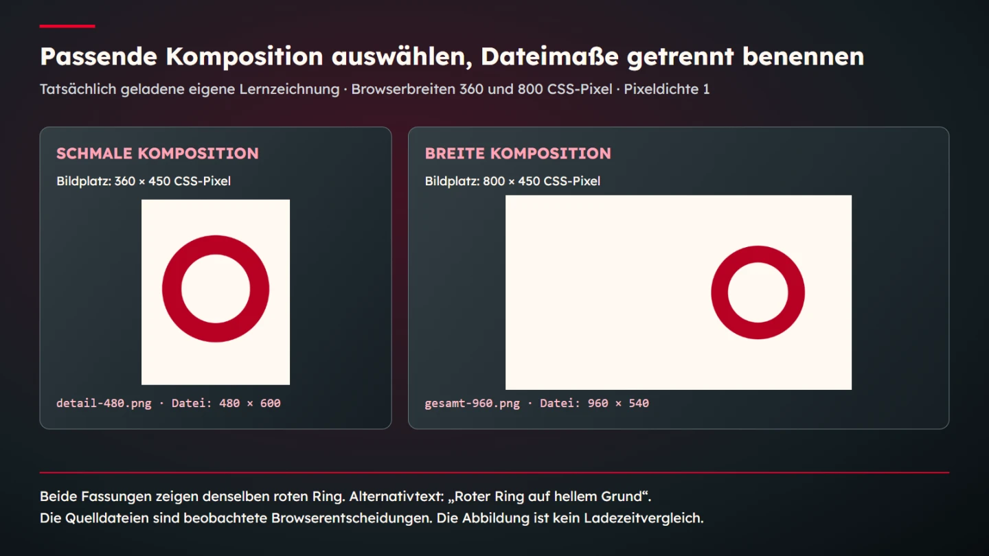
Investigate common errors at their cause
If an unexpectedly large source appears, first inspect the real slot and sizes. The component may claim full width while occupying less, or a resource may already be available. A filename alone does not establish the cause. Keep the environment and actual output together when recording the observation.
If the wrong crop appears, examine source order, media conditions and actual files. Increasing compression quality cannot correct that problem. Open the selected resource and inspect its content. A correctly named file can still accidentally contain the wrong composition.
If alternative text is unsuitable, adding another srcset candidate will not help. Review the image's purpose and description instead. Image alone rarely describes an informative subject adequately, while a decorative use needs another decision from a functional link. These editorial cases are not settled by identifying the largest file.
Update editorial and implementation decisions together
Replacing a subject can change technical preparation. The existing narrow crop may no longer fit or the old alternative may describe only the previous image. Review files, compositions and text together whenever the image changes. The technical component and editorial information are parts of the same task at this point.
Preserve suitable originals and delivered variants traceably. Someone needing another width should not enlarge a heavily reduced copy and call it a new source of detail. Candidate descriptions need to match actual files. A larger width descriptor or longer filename does not create information that was absent from the source.
Handover should identify uses too. A cover image is not automatically suitable for a technical close-up explanation. A deliberate detail has another role from a complete overview. Recording that relationship supports future changes without restarting every discussion from visual preference alone.
Review the actual delivered presentation
Final review uses the delivered files in the intended layout. Correct code in a development note is insufficient if the completed page uses other dimensions or paths. Inspect broad and narrow conditions, meaningful densities and the actual information shown. Record concrete observations rather than asserting better performance generally.
- The image's purpose and necessary information are identified.
- Resolution switching and composition changes are distinguished.
- Width descriptors match actual files.
- Sizes describes the intended slot.
- The appropriate composition group actually loads.
- Aspect ratios and crops remain useful.
- Alternative text fits every selected composition.
- Observed sources include their test conditions.
- Image replacement updates content and implementation together.
- Explanation, browser checking and real performance effects remain distinct.
A good responsive solution therefore connects suitable sources with a clear statement. The browser receives useful selection information, the layout receives an appropriate composition and alternative text conveys relevant content. None of these tasks is achieved merely by using an especially large image. Quality comes from their checked relationship.
Check boundaries and source groups deliberately
A media condition needs a clear transition. The narrow composition applies through 599 pixels, while 600 uses the wide group. These values are examined in addition to the main cases. This does not cover every possible width; it targets the point where the stated decision changes.
The composition boundary is distinct from resolution choice within a group. At 599 pixels, a larger narrow source may be useful without becoming a wide composition. At 600, the wide group applies despite only a one-pixel viewport difference. That relationship shows why file width and art direction need separate names.
If the boundary changes later, reconsider the source rule, layout description and cases together. A different narrow presentation can be justified. Changing only CSS while leaving another composition rule in the markup can create an unintended combination. The actual visible result remains the appropriate review target.
Keep a meaningful review record
Record viewport width, configured pixel ratio, selected source and measured slot. Add the raw dimensions of the associated file. These values help answer later questions concretely. Saying the image was large enough leaves uncertainty about whether that means transfer size, display area or available detail.
Fresh contexts make individual observations easier to attribute. A previously loaded large image can complicate interpretation when only the window is resized afterwards. Normal browser reuse is not wrong; the point is that an isolated check deliberately establishes its starting state. Keep the test method distinguishable from ordinary use.
The educational requests are answered from prepared original files, allowing source selection to be inspected without involving external services. This does not establish public connection performance or server speed. A real loading-time assessment needs its own suitable measurement setup and clearly stated conditions.
Include visual inspection in the record. A correctly selected source may still contain a faulty drawing, an unsuitable crop or an unreadable label. Technical selection and content suitability remain separate questions. Review them together without treating one successful check as approval of every aspect.
Preserve the image purpose and original drawing with its variants during handover. Another person can then understand why the narrow version differs and which information must survive. That rationale is more durable than one candidate filename observed under one set of conditions.
Relate the available candidates to the intended use
A candidate list can only offer files that exist. In this example, the largest wide source is 1440 pixels across. A 960-pixel slot at a configured ratio of two suggests a nominal 1920-pixel demand if one source pixel per output pixel is the objective. The offered maximum is lower. This does not make the markup syntactically wrong; it identifies a limit of the chosen teaching assets rather than a browser failure.
A real production decision would inspect whether the available source is suitable for that application. Fine labels and photographic texture may raise different concerns. Enlarging the existing file does not recover missing original detail. Obtain an appropriate source where the task requires it and compare the result at its actual display size. The useful question concerns visible adequacy under stated conditions, not whether a descriptor contains the largest impressive number.
Sources and technical scope
Sources checked on 9 November 2026. The linked MDN, WAI and WHATWG primary sources were opened. Drawing, dimensions and layout are original learning parameters. The checks document isolated browser selection, not public performance measurements, real product evidence or complete coverage of assistive technologies.