Test contrast, text enlargement and narrow layouts
Investigate WCAG criteria using actual browser values while identifying the enlargement mechanism precisely.

Readability combines color, available space and actual operation
A readable website requires more than an attractive typeface. People need to distinguish text, enlarge it and still reach the functions associated with it. Contrast, text enlargement and narrow layouts interact, but their test conditions differ. A strong color cannot prevent a clipped paragraph. A paragraph that wraps successfully does not establish that an important action remains distinguishable against its surrounding surface.
Our original example presents fictional course information with paragraphs, a long German word, a link, a text input and a small demonstration action. It accepts no registration and sends no information. Warm ivory surfaces, charcoal text and strong red accents form the light presentation. A dark presentation has deliberately selected alternative colors. The complete files and the investigations actually performed on them appear below.
A total of 192 conditions were executed in Node and Edge. They cover computed color pairs, three content widths, five text-size stages and real interactions. Deliberately introduced negative cases also check whether the chosen instruments react to faint text, an excessive minimum width and clipped content. These results concern the small displayed implementation. They do not establish full WCAG conformance or the legal compliance of an entire website.
Answer three distinct questions with appropriate evidence
The first question asks whether meaningful information can be distinguished from its surroundings. We investigate actual computed foreground and background colors. The second concerns text enlargement, so the experiment changes the root font and observes wrapping together with operation. The third concerns available room: can the content still be read and operated in a narrow region without repeatedly scrolling sideways to follow a line?
These questions cannot substitute for one another. A viewport configured to 320 CSS pixels is not an executed browser-zoom interaction. Doubling the root font is not full-page zoom either. Our report names the intervention actually performed. This lets a reviewer judge which claim the finding supports and which additional user path needs exercising in the real acceptance environment.
WCAG covers many related accessibility requirements. This article concentrates on these connected visual conditions while also exercising keyboard operation and visible focus in the original example. A small successful selection cannot stand in for complete assessment of structure, text alternatives, error handling, assistive technology or complex dialogs. Keeping the scope explicit makes the selected evidence useful rather than artificially comprehensive.
Calculate contrast using the colors the browser actually applies
WCAG 2.2 success criterion 1.4.3 generally requires a ratio of at least 4.5 to 1 for ordinary text. Qualifying large text has a lower threshold of 3 to 1. Our selected text pairs consistently use the stricter 4.5 threshold. The small checker therefore does not need to decide whether a particular font weight and size qualifies for the large-text provision.
Values come from getComputedStyle, so they describe the current resolved browser state rather than an unused design token. Button text is compared with its own button surface. A link on the page is compared with the actual page surface. Selecting the correct neighboring background is an explicitly written part of each case. Automatically using the body color for every element would be wrong for many real components.
The small parser accepts only resolved opaque rgb colors. It does not automatically composite transparency, photographs, gradients or stacked surfaces. Such input causes an explicit error instead of a deceptively precise number. A real component using different painting conditions needs an extended method to establish its relevant actual colors. A limited calculation is reliable only when its assumptions really match the tested situation.
Explain the arithmetic and keep thresholds unrounded
The helper converts three sRGB channels into linear values and uses the defined weights to obtain relative luminance. It then calculates the lighter-to-darker ratio with the specified offset. The full source is short enough to inspect directly, including its accepted input range. It is deliberately a function for opaque sRGB pairs rather than a universal image-analysis engine.
The executed checks establish exactly 21 to 1 for black against white and 1 to 1 for matching colors. Swapping the two colors leaves the ratio unchanged. Out-of-range channels and NaN are rejected rather than silently coerced. These cases investigate the arithmetic before the function is used to evaluate the browser-derived pairs. That separation helps distinguish an implementation mistake in the calculation from a genuinely weak palette choice.
Pass or fail uses the unrounded value. Formatting happens only when displaying a readable table. Gray channel value 119 against white remains below 4.5 even if careless rounding could create a friendlier impression. A display format must not move a failing result across a threshold. At the same time, a sufficient calculated ratio does not replace visual assessment of unusually thin or difficult-to-recognize lettering.
Interpret the measured pairs in their actual roles
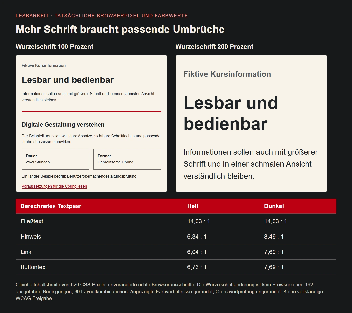
In the light presentation, ordinary text against the warm surface reaches approximately 14.03 to 1. The quieter hint reaches about 6.34. The red link reaches about 6.04, while white text on the red action surface reaches roughly 6.73. These figures come from resolved colors in the executed original example. They are not measurements of an unrelated production website or a universally required corporate palette.
In the dark presentation, the reversed ordinary text colors retain approximately 14.03. The lighter secondary hint reaches about 8.49. A light red accent against charcoal reaches roughly 7.69, and the action uses charcoal lettering on that accent. Simply carrying the dark red text from the light palette into the dark mode would not establish a workable design. Each presentation therefore has its own explicitly checked assignments.
The calculation covers selected representative elements and the exercised button hover state. It does not claim to discover every possible text instance automatically. Larger systems need to extend the pair inventory with variants, errors, placeholders, selected states and additional surfaces. A small traceable list is a useful starting point when its boundary remains visible. It becomes misleading only when described as a complete audit that it never performed.
Treat input boundaries and focus as their own information
Meaningful non-text information also needs sufficient distinction from adjacent colors. Success criterion 1.4.11 generally uses a 3 to 1 threshold for the information in its scope. Not every decorative line serves the same purpose. Our input boundary is explicitly compared with the neighboring page surface. Visible focus receives its own contrasting outline with a clear offset from the component.
The test actually presses Tab. It reaches the content link first, then the input and then the action. For the button it observes focus-visible and an outline at least three pixels wide. It also calculates the outline’s ratio against the surrounding surface. The offset places the outline outside the button rather than letting it disappear into the button fill. These are observations of the applied browser state.
This still does not establish every WCAG focus requirement. Fixed headers, overlapping dialogs and additional components are absent from this small implementation. The useful evidence combines a real keyboard action with its observed presentation. An outline declaration in a stylesheet would be insufficient if another rule overrode it or a parent clipped it in the final interface.
Build a traceable relationship between text and layout
The interface uses rem for its fundamental text sizes. Paragraphs inherit the root size, while headings build on it. Input and button use font inherit so that their text follows the same basis. No fixed text height hides a longer paragraph. Spacing can grow with content and the action label is allowed to wrap. The relationship is intentionally simple enough to inspect.
A maximum content width limits overly long lines without imposing a large minimum. Inner padding uses a bounded flexible value. The small information fields choose an appropriate number of columns through the grid. A zero minimum width lets the relevant components become narrower than an inflexible content assumption would otherwise allow. Sizing and wrapping cooperate instead of forcing the page outside its viewport.
Relative units do not guarantee success. Components expressed in rem can still collide through fixed heights, inappropriate minimum widths or overlapping positioning. The final browser state therefore remains the object of review. These units help establish an understandable text-to-space relationship. Acceptance still concerns actual information and reachable operation rather than whether a preferred unit appears somewhere in the source.
Actually change text through five size stages
The experiment sets the root font to 100, 125, 150, 175 and 200 percent. At each stage it reads back the introductory paragraph’s computed size. It genuinely grows from 16 to 32 CSS pixels. The same sequence runs at widths of 320, 390 and 1440 pixels in both light and dark presentation. This produces thirty clearly identified layout combinations.
Each combination checks page overflow, selected block geometry, retained heading text and an actual demonstration action. The button is not merely located in a photograph. A fictional value is entered and the action is performed, after which the expected status text appears. Larger text should leave the workflow usable rather than just making an isolated paragraph look impressive.
The intervention is a controlled root-font override introduced by an additional style rule. It is explicitly not an executed browser zoom and does not fully reproduce every personal text configuration. Real acceptance should also exercise the supported browsers’ actual enlargement paths. The small experiment remains valuable because it records its exact change and demonstrates its effect on executed content, without borrowing a stronger name for the test.
Use the relationship between 320 pixels and 400 percent correctly
For vertically read content, success criterion 1.4.10 describes presentation at a width equivalent to 320 CSS pixels without loss of information or functionality and without required scrolling in two dimensions. WCAG explains the relationship to an initially 1280-pixel-wide viewport at 400 percent zoom. This explains the target width; it does not turn every narrow preview into an actual zoom test.
Our browser is configured with a content viewport 320 CSS pixels wide and the report says exactly that. We do not change physical display resolution or pretend to select a browser-interface zoom setting. This reliably exercises the narrow layout variation. Performing the real zoom interaction on the actual target environment remains a separate useful acceptance step. Raster density changes would likewise not be an equivalent substitute.
The criterion recognizes exceptions for content whose meaning or use requires a two-dimensional arrangement. An ordinary course description needs no such exception. Its paragraphs, labels and action can follow one another vertically. A genuinely large data table needs different analysis from a text field that is wide only because of habit. Any exception should follow the actual content requirement rather than becoming a blanket excuse for difficult components.
Keep long words and meaningful content in the test
The example intentionally includes a long German compound word. Such content easily disappears from templates filled with short placeholder phrases. Overflow-wrap anywhere permits a break when necessary. The word is not replaced with an ellipsis or hidden by reducing the font. Its complete text and reading order remain in the document. The layout has to cope with the information rather than removing it to obtain a passing picture.
The action label may also span multiple lines. White-space normal prevents its longer name from forcing an oversized minimum width. The input uses the available width and inherits the text styling. An ordinary single-line input still has its own interaction behavior. The experiment does not claim that every arbitrarily long entered value can be simultaneously visible in one line.
Real product names, long addresses and language variants should subsequently join the website’s test content. Technical strings can have different needs from ordinary prose. For code or comparative data, a deliberately operable local scrolling area may sometimes be appropriate. The surrounding page should remain readable, and the particular content type should be assessed intentionally. Removing the hard case from the fixture would teach much less.
Exercise additional text spacing as a separate condition
The experiment also changes line height, paragraph spacing, letter spacing and word spacing. It uses the values described by success criterion 1.4.12: at least 1.5 times line height, paragraph spacing twice the font size, letter spacing of 0.12 em and word spacing of 0.16 em. These form a test condition for adaptability. They do not mean every website must initially use exactly those values.
At a width of 320 pixels, all four changes are applied together. The observed blocks remain free from the checked overflow and the demonstration action still works. Afterwards the additional rules are removed. This separates the ordinary presentation from the intentional spacing override. The experiment does not secretly widen the content area or reduce the font again to make the altered layout pass.
The condition covers only the original small content. Other writing directions, typefaces or complex embedded components can demand additional assessment paths. A count of successful cases does not replace that selection. The useful finding is the documented connection between the changes actually applied and the function actually performed afterwards. Keeping that evidence understandable is more valuable than presenting a large but ambiguous green total.
Negative cases establish that the instruments respond
For a negative color case, the introductory paragraph in light mode receives a deliberately faint gray. The calculation detects an insufficient ratio. Another case gives the main region a minimum width of 600 pixels. At the 320-pixel viewport, geometry detects horizontal overflow. The chosen instrument can therefore distinguish this known width failure from the passing original layout.
A third case restricts the introductory paragraph to twelve pixels high and hides overflow. The test detects the difference between content height and available block height. Every injected rule is removed afterwards. These failures are not published as part of the completed example design. They exist only to check whether the chosen observations react to deliberately known faults.
Even useful negative cases do not produce a universal detector. Not every overlap or readability problem creates one of these geometry differences. Actual browser images are therefore reviewed as well. Arithmetic, geometry and visual inspection complement one another. Reading only an automated green report could otherwise approve a situation that the instrument never examined in the first place.
Read the 192 executed conditions with their practical limits
The saved report identifies browser version, color pairs, content widths, font stages and each condition’s outcome. Ten selected text pairs span light and dark presentation. Further cases cover the input boundary, hover and focus. Thirty layout combinations connect computed sizes to actual interaction. The negative cases establish a response to three intentionally generated problems rather than implying complete automatic error discovery.
The illustration contains unchanged excerpts from the actual browser. The same 620-pixel-wide content is captured with ordinary and doubled root font. Its color table uses the computed values read from the browser. It is not an artificially generated measurement image and it makes no claim about a fabricated percentage improvement. The aim is to show the actual difference in wrapping alongside the relevant measured contrast.
This documentation supports later design changes. New colors can be checked against the surfaces where they are actually used. Longer content can be exercised at relevant sizes, and changed spacing receives its own observations. The benchmark remains the information and action that a person needs to distinguish and reach. A strong corporate identity and dependable readability can then be developed together with clear evidence.
Use the small implementation as a starting point
The following files provide the complete interface, styling, purely demonstrative action and bounded contrast helper. HTML, CSS and module are delivered through an ordinary original HTTP service under one origin. The action only changes a visible status. It makes no booking, sends no message and does not secretly persist the fictional note. Its limited behavior is intentionally easy to inspect.
A real website needs additional states and actual content, including errors, navigation, fixed-position components and the enlargement paths people genuinely use. Which legal obligations apply to the particular offering must be assessed against its scope separately. A small successful pattern does not replace that evaluation or establish compliance merely because it cites WCAG.
The practical starting point remains manageable: identify relevant color pairs, execute genuine text changes, operate narrow layouts and retain meaningful negative cases. This makes identity decisions reviewable. A color should not remain only because it appears in a brand palette. In its specific role it must work for readable information, available space and actual operation. The evidence makes those decisions concrete.
example.html
<!doctype html><html lang="de"><meta charset="utf-8"><meta name="viewport" content="width=device-width,initial-scale=1"><title>Lesbar und bedienbar</title><link rel="stylesheet" href="example.css"><main><header><p class="eyebrow">Fiktive Kursinformation</p><h1>Lesbar und bedienbar</h1><p id="intro">Informationen sollen auch mit größerer Schrift und in einer schmalen Ansicht verständlich bleiben.</p></header><section aria-labelledby="course-title"><h2 id="course-title">Digitale Gestaltung verstehen</h2><p>Der Beispielkurs zeigt, wie klare Absätze, sichtbare Schaltflächen und passende Umbrüche zusammenwirken.</p><dl><div><dt>Dauer</dt><dd>Zwei Stunden</dd></div><div><dt>Format</dt><dd>Gemeinsame Übung</dd></div></dl><p>Ein langer Beispielbegriff: <span class="long">Benutzeroberflächengestaltungsprüfung</span></p><p><a id="details" href="#requirements">Voraussetzungen für die Übung lesen</a></p></section><section id="requirements" aria-labelledby="requirements-title"><h2 id="requirements-title">Voraussetzungen</h2><p>Sie benötigen nur Interesse an verständlichen digitalen Angeboten. Die Beispielauswahl löst keine Anmeldung aus.</p><form id="demo"><label for="note">Eigene Notiz</label><input id="note" name="note" autocomplete="off" maxlength="120" aria-describedby="hint"><p id="hint" class="hint">Eine beliebige fiktive Notiz, keine persönlichen Daten.</p><button id="apply" type="submit">Beispielauswahl übernehmen</button><p id="result" role="status">Noch keine Beispielauswahl übernommen.</p></form></section></main><script type="module" src="example.mjs"></script></html>example.css
:root{font-size:100%;--paper:#f8f2e8;--ink:#202428;--muted:#55595d;--accent:#bb0011;--button:#bb0011;--button-ink:#ffffff;--edge:#686868;--focus:#9e0010}*{box-sizing:border-box}body{margin:0;background:var(--paper);color:var(--ink);font:1rem/1.55 Arial,sans-serif}main{max-width:58rem;margin-inline:auto;padding:clamp(1rem,4vw,3rem)}h1{font-size:2.25rem;line-height:1.2}h2{font-size:1.5rem;line-height:1.3}p,h1,h2,dt,dd,label,button,a{overflow-wrap:anywhere}header,section,form{min-width:0}section{border-top:.25rem solid var(--accent);margin-block:2rem;padding-block:1rem}.eyebrow,.hint{color:var(--muted)}.eyebrow{font-weight:bold}dl{display:grid;grid-template-columns:repeat(auto-fit,minmax(min(100%,12rem),1fr));gap:1rem}dl div{min-width:0;padding:1rem;border:1px solid var(--edge)}dt{font-weight:bold}dd{margin:0}a{color:var(--accent);text-decoration:underline;text-underline-offset:.2em}form{display:grid;gap:.75rem}label{font-weight:bold}input,button{font:inherit;max-width:100%;min-width:0;border:2px solid var(--edge);border-radius:.25rem;padding:.7em .8em;min-height:3rem}input{width:100%;background:var(--paper);color:var(--ink)}button{justify-self:start;white-space:normal;background:var(--button);color:var(--button-ink);border-color:var(--button);cursor:pointer}button:hover{background:#8d0010;border-color:#8d0010}a:hover{text-decoration-thickness:.15em}:focus-visible{outline:3px solid var(--focus);outline-offset:4px}.hint{margin:0;font-size:1rem}#result{font-weight:bold}@media(prefers-color-scheme:dark){:root{--paper:#202428;--ink:#f8f2e8;--muted:#c6beb3;--accent:#ff9b90;--button:#ff9b90;--button-ink:#202428;--edge:#b6b0a7;--focus:#ffb7ad}button:hover{background:#ffc1b9;border-color:#ffc1b9}}example.mjs
document.querySelector('#demo').addEventListener('submit',event=>{event.preventDefault();document.querySelector('#result').textContent='Die Beispielauswahl wurde übernommen. Es wurde nichts versendet.';});contrast.mjs
export function luminance(rgb) {
 if(!Array.isArray(rgb)||rgb.length!==3||rgb.some(v=>!Number.isFinite(v)||v<0||v>255))throw new TypeError('Expected opaque sRGB channels');
 const linear=rgb.map(value=>{const s=value/255;return s<=0.04045?s/12.92:((s+0.055)/1.055)**2.4;});
 return 0.2126*linear[0]+0.7152*linear[1]+0.0722*linear[2];
}
export function contrast(a,b){const x=luminance(a),y=luminance(b);return(Math.max(x,y)+0.05)/(Math.min(x,y)+0.05);}
export function opaqueRGB(css){const match=/^rgb\(\s*(\d+)\s*,\s*(\d+)\s*,\s*(\d+)\s*\)$/.exec(css);if(!match)throw new TypeError('Only resolved opaque rgb() values supported');return match.slice(1).map(Number);}
Computed text contrast in the actual browser
| Presentation | Role | Foreground / background | Ratio, rounded only for display |
|---|---|---|---|
| Light | Body text | rgb(32, 36, 40) / rgb(248, 242, 232) | 14.03 : 1 |
| Light | Hint | rgb(85, 89, 93) / rgb(248, 242, 232) | 6.34 : 1 |
| Light | Link | rgb(187, 0, 17) / rgb(248, 242, 232) | 6.04 : 1 |
| Light | Button text | rgb(255, 255, 255) / rgb(187, 0, 17) | 6.73 : 1 |
| Light | Input text | rgb(32, 36, 40) / rgb(248, 242, 232) | 14.03 : 1 |
| Dark | Body text | rgb(248, 242, 232) / rgb(32, 36, 40) | 14.03 : 1 |
| Dark | Hint | rgb(198, 190, 179) / rgb(32, 36, 40) | 8.49 : 1 |
| Dark | Link | rgb(255, 155, 144) / rgb(32, 36, 40) | 7.69 : 1 |
| Dark | Button text | rgb(32, 36, 40) / rgb(255, 155, 144) | 7.69 : 1 |
| Dark | Input text | rgb(248, 242, 232) / rgb(32, 36, 40) | 14.03 : 1 |
Acceptance checklist for readable layouts
- Identify the actual relevant color pairs and surfaces.
- Compare unrounded ratios with the applicable thresholds.
- Review hover, focus and meaningful non-text information.
- Document the actual text enlargement mechanism used.
- Exercise ordinary and intermediate enlargement stages.
- Operate narrow layouts using complete meaningful content.
- Allow long words and action labels to wrap appropriately.
- Apply text-spacing overrides without compensating layout changes.
- Retain actual negative cases and visual observations.
- Assess remaining WCAG and legal requirements separately.
Primary sources and review scope
Primary sources reviewed on 9 November 2026. Original fictional course interface, 192 executed Node/Edge conditions, thirty layout combinations and ten selected computed opaque text pairs. Root-font override is not browser zoom. A 320 CSS-pixel viewport is not an executed 400 percent zoom. No complete WCAG or legal compliance certification.