Operate a complete website task with the keyboard
Complete a real small task without a mouse and verify its transitions end to end.
Test the complete task, not one Tab press
A keyboard-usable website lets people complete their real task without a mouse. They need to reach controls, recognise current focus, activate actions and leave temporarily opened areas. One visible outline around a link does not establish that complete journey. Review the task through selection, confirmation, cancellation and return. That is more useful than counting how many elements can receive focus in isolation.
Our original example is a small fictional service overview with two offers and an optional dialog for filtering website or software services. The data are invented. We develop the actual HTML, CSS and JavaScript and exercise its keyboard paths in a browser. This gives us a bounded, reproducible workflow rather than a claim that every component of an entire production site has already been accepted.
Put the mouse aside and describe the intended route. A person should reach the main content, choose an area, apply it and continue to the relevant service. Repeat the route using cancellation. Only then broaden the review to other views, larger text and assistive technology. Keeping the task explicit makes it easier to recognise where an otherwise attractive component interrupts the person’s work.
Develop focus order from document order
Focus order should follow the content. Our example starts with a skip link, then navigation, followed by the filter action and visible service links in the main area. HTML provides that sequence. We do not use positive tabindex values to create a competing artificial numbering scheme that may become confusing after a layout change. The order remains readable in the source as well as in the design.
A tabindex of minus one has a different role here. The main area can receive focus after the skip link without becoming another ordinary Tab stop among the actions. The dialog heading also receives deliberate initial focus. These destinations support orientation; they are not a reason to insert every heading and paragraph into the regular keyboard sequence. Distinguish a purposeful destination from an additional sequential control.
Review the real page including headers, temporary notices and footer. A component can have a sound isolated sequence while its integration duplicates a region or obscures another route. Responsive rearrangement needs particular attention so that visual and keyboard order do not diverge without an understandable reason. Evaluate layout and document together rather than treating focus as an unrelated technical layer added after styling.
Use native controls for their intended jobs
A link leads to a destination and a button performs an action. The filter opener is consequently a button with type="button", not a clickable div. The dialog uses genuine radio inputs. These controls supply useful conventional behaviour instead of requiring a complete reimplementation. Their actual interaction still needs checking in the final context rather than being assumed from the element names alone.
Enter activates links and the filter action in this example. Space can also activate the focused button. Arrow keys change the radio selection. A review that only presses Tab repeatedly would miss these parts of the task. Interaction depends on the kind of element. Consistency means using appropriate conventions, not making one key perform every imaginable operation irrespective of the control’s purpose.
If a custom complex component is genuinely needed, define its entry, movement, activation and exit contract. ARIA roles do not supply that interaction logic automatically. This modest filter has no reason to recreate a radio group from arbitrary containers. Styling can build on its existing structure, preserving a simpler implementation while still allowing a coherent branded presentation.
Keep focus visible and available
The :focus-visible rule supplies a prominent outline separated from the element. Dark appearance uses a lighter red variant. The indicator identifies the current position rather than merely decorating an abstract selected state. We do not remove the browser indication without an alternative. Its visibility in the actual surroundings is inspected rather than inferred solely from the presence of a CSS declaration.
An outline is of little help if a fixed header, consent panel or another layer covers the control. We therefore review more than computed style. The example additionally checks the focused dialog title’s position at several widths. A complete deployment review must include the overlapping regions that really exist and their state changes. An isolated demonstration cannot establish the behaviour of unrelated notices added by another component.
WCAG distinguishes visible focus from whether author-created content obscures the focused item. As a practical design goal, we seek a clearly visible important control. That goal does not turn this example into a blanket conformance certificate. Evidence remains tied to the displayed design, browser and named cases. Standards help describe the questions, while the actual product determines what needs to be observed.
W3C: Focus Visible · Focus Not Obscured
Provide a direct route to main content
A skip link can bypass repeated navigation. The example labels it “Zum Inhalt” and makes it visible on the first Tab press. Activating it focuses the main area, after which the next Tab reaches the content’s filter action. We check that exact sequence. Scrolling the picture without changing keyboard position usefully would only solve part of the task.
The link receives a clear surface so it remains readable above surrounding styling. Its ordinary position is outside the visible upper area, becoming visible on focus. This technique must not permanently hide an important ordinary content link. It supports a deliberate extra route and needs review with the actual header and narrow layout. A working isolated selector does not guarantee appropriate placement in another page.
Larger applications may justify additional skip destinations such as results or a central toolbar. Each needs an understandable name and a useful purpose. Our small example only needs main content. A long list of technical jump points would not automatically improve orientation and might complicate the simple first step. Add navigation support in proportion to the actual structure people have to traverse.
Follow the complete HTML workflow
The following design contains navigation, main content, two services and a filter dialog. The opener is initially hidden and revealed only when the supported scripted feature is available. Without JavaScript, both services and their ordinary links remain readable. The base view does not claim a successful filtering operation it cannot perform. Fictional data are explicitly identified as part of this original demonstration.
The dialog’s name comes from its visible heading. Its form uses the native dialog method and clearly identified actions. Apply appears before Cancel in document order. The radio group has a shared legend and visible labels for individual choices. This structure communicates both the question and its answers without depending on the colour treatment. The markup is small enough to inspect as a complete interaction rather than as disconnected snippets.
<a class="skip" href="#main">Zum Inhalt</a>
<header><nav aria-label="Hauptnavigation">
  <a href="#services">Leistungen</a><a href="#contact">Kontakt</a>
</nav></header>
<main id="main" tabindex="-1">
  <h1>Passende Leistung finden</h1>
  <p>Eigener fiktiver Entwurf für die Tastaturprüfung.</p>
  <button id="open-filter" type="button" hidden>Bereich filtern</button>
  <p id="result-status" role="status">2 Leistungen</p>
  <section id="services" aria-label="Leistungen">
    <article data-kind="web"><h2>Webseitenwartung</h2>
      <p>Prüfen und dokumentieren.</p><a href="#maintenance-info">Wartung ansehen</a></article>
    <article data-kind="software"><h2>Schnittstellen</h2>
      <p>Datenwege verständlich verbinden.</p><a href="#interface-info">Schnittstellen ansehen</a></article>
  </section>
  <section id="maintenance-info"><h2>Wartung im Überblick</h2><p>Fiktive Leistungsinformation.</p></section>
  <section id="interface-info"><h2>Schnittstellen im Überblick</h2><p>Fiktive Leistungsinformation.</p></section>
  <section id="contact"><h2>Kontakt</h2><a href="#main">Zur Übersicht</a></section>
</main>
<dialog id="filter-dialog" aria-labelledby="filter-title">
  <form method="dialog">
    <h2 id="filter-title" tabindex="-1" autofocus>Bereich auswählen</h2>
    <fieldset><legend>Welche Leistungen möchten Sie sehen?</legend>
      <label><input type="radio" name="kind" value="all" checked> Alle Bereiche</label>
      <label><input type="radio" name="kind" value="web"> Webseiten</label>
      <label><input type="radio" name="kind" value="software"> Software</label>
    </fieldset>
    <div class="actions"><button id="apply-filter" value="apply">Anwenden</button>
      <button id="cancel-filter" value="cancel">Abbrechen</button></div>
  </form>
</dialog>
Enter and leave a modal dialog deliberately
Opening places initial focus on the dialog heading, giving the new context before movement to the selection. While modal, the surrounding page is set aside for normal interaction. Tab reaches the selected radio, arrow keys change the choice and Apply commits it before closing. These actions connect the temporary interface to a clear purpose rather than making the person explore an unexplained overlay.
Escape and Cancel close without accepting the current draft selection. Focus should then return to the filter opener so work can continue from the known position. Returning to the document start or a now-hidden result would create unnecessary reorientation. Our browser checks inspect the actual active element after closure rather than relying on a visual impression that the dialog disappeared successfully.
A contained modal focus path differs from an inescapable keyboard trap. The dialog has understandable reachable closing routes and standard Escape handling. Its temporary containment supports the current task while allowing it to end. WAI’s dialog pattern describes that relationship. Real deployment still requires the intended browser and assistive combinations, not just a successful desktop demonstration of the closing button.
Develop focus styling with layout
The CSS below belongs to the complete preceding markup. The dialog limits itself to available width and can scroll vertically when needed. Its action group can wrap. :focus-visible remains part of the component as its arrangement changes. Focus styling should not be an accidental outline painted over a finished layout without considering spacing, clipping or the position of temporary content.
Light and dark appearances share the same spacing and interaction, with suitable colour changes. Testing dark appearance therefore means more than confirming that a media query exists. We execute the same keyboard route in both. Narrow and wide cases provide explicit evidence without implying compatibility with every possible configuration. The layout remains a concrete design with stated test coverage.
* { box-sizing: border-box; }
body { margin: 0; font: 1rem/1.6 system-ui, sans-serif; color: #202326; background: #f8f3ea; }
header, main { max-width: 58rem; margin: auto; padding: 1.5rem; }
nav { display: flex; flex-wrap: wrap; gap: 1.5rem; }
a { color: #a60710; text-decoration-thickness: .1em; text-underline-offset: .2em; }
button { font: inherit; border: 2px solid #202326; border-radius: .3rem; padding: .7rem 1rem;
  color: white; background: #202326; cursor: pointer; }
:focus-visible { outline: 4px solid #ce0711; outline-offset: 4px; }
.skip { position: absolute; top: .5rem; left: .5rem; transform: translateY(-160%);
  background: white; padding: .6rem 1rem; z-index: 2; }
.skip:focus { transform: none; }
article { padding: 1rem; margin: 1rem 0; border: 1px solid #777; border-radius: .4rem; }
dialog { width: min(32rem, calc(100% - 2rem)); max-height: calc(100% - 2rem);
  overflow: auto; border: 2px solid #202326; border-radius: .5rem; padding: 2rem;
  background: #f8f3ea; color: #202326; }
dialog::backdrop { background: rgb(0 0 0 / .6); }
fieldset { padding: 1rem; }
label { display: block; padding: .5rem; }
.actions { display: flex; gap: 1rem; flex-wrap: wrap; margin-top: 1.5rem; }
@media (prefers-color-scheme: dark) {
  body, dialog { color: #f8f3ea; background: #202326; }
  a { color: #ffb3ad; } button { color: #202326; background: #f8f3ea; border-color: #f8f3ea; }
  :focus-visible { outline-color: #ff8a80; } .skip { color: #202326; }
}
Separate cancellation from committed selection
The JavaScript keeps the committed filter distinct from the choice currently being edited in the dialog. Opening restores the committed value, preventing a cancelled intermediate choice from quietly becoming the next default. Closing applies changes only for the explicit apply return value. Existing result elements remain in place and are shown or hidden appropriately instead of replacing the whole interaction area unnecessarily.
Repeated opening creates an important edge case. After a previous application, Escape on a later attempt must not accidentally reuse an old confirmation value. The opener therefore clears returnValue before each showModal call. The test first applies one selection, then changes and cancels another. That sequence gives more useful evidence than checking only the first successful opening of an untouched dialog.
The result count changes after actual application. It is marked as a status region. How a particular assistive setup announces that update needs its own real-environment review; the role alone does not prove the announcement. Our automated evidence establishes the actual text and visible offers. This keeps a useful DOM observation separate from an unperformed claim about every screen-reader interaction.
const opener = document.querySelector('#open-filter');
const dialog = document.querySelector('#filter-dialog');
const form = dialog.querySelector('form');
let committedKind = 'all';
opener.hidden = typeof dialog.showModal !== 'function';
opener.addEventListener('click', () => {
  for (const radio of form.elements.kind) radio.checked = radio.value === committedKind;
  dialog.returnValue = '';
  dialog.showModal();
});
dialog.addEventListener('close', () => {
  if (dialog.returnValue !== 'apply') return;
  committedKind = new FormData(form).get('kind');
  let visible = 0;
  for (const card of document.querySelectorAll('#services article')) {
    card.hidden = committedKind !== 'all' && card.dataset.kind !== committedKind;
    if (!card.hidden) visible++;
  }
  document.querySelector('#result-status').textContent =
    visible === 1 ? '1 Leistung' : visible + ' Leistungen';
});
dialog.addEventListener('keydown', event => {
  if (event.key !== 'Tab') return;
  const first = form.querySelector('input[name="kind"]:checked');
  const last = form.querySelector('#cancel-filter');
  if (!first || !last) return;
  if (event.shiftKey && (document.activeElement === first
      || document.activeElement.id === 'filter-title')) {
    event.preventDefault();
    last.focus();
  } else if (!event.shiftKey && document.activeElement === last) {
    event.preventDefault();
    first.focus();
  }
});
Keep the supplementary focus cycle narrow
At the dialog’s edges, the component adds a local Tab cycle using the selected radio and final Cancel action. Moving backwards from the first destination or initial heading reaches the final action; moving forwards from the final action returns to the radio group. This is a small enhancement for this fixed structure, not a global keyboard handler that takes over the whole page.
The actual browser run without that enhancement included an additional route through browser chrome. For the deliberately contained dialog, we added the local cycle and verified it. Escape remains native, and ordinary movement between the component’s controls is not reimplemented. Documenting that choice is more useful than asserting the desired behaviour solely from a role or an idealised interaction diagram.
If later changes add inputs or dynamically hidden actions, review the cycle again. Fixed first and last destinations remain appropriate only while the component structure supports them. A maintained established implementation may be more suitable for a broad dialog system. This example does not claim that a few handlers universally manage every possible interactive overlay without further integration work.
Interpret the 76 executed checks
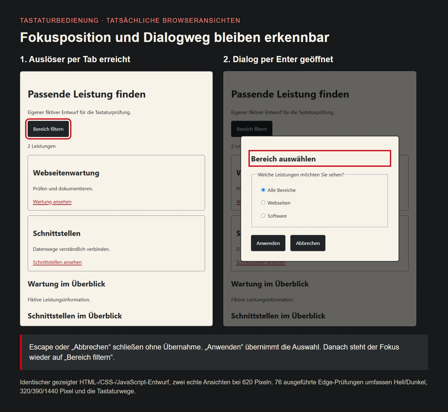
The design was exercised in desktop Edge through 76 checks. They cover the skip route, main focus, Enter and Space opening, arrow-key selection, application, Escape, the Cancel action and return to the opener. Applying a choice, reopening and cancelling another was checked explicitly. A cancelled switch to software does not change the previously committed website filter. Expected behaviour is named rather than inferred from a screenshot.
The same interaction runs in light and dark appearances. Page width remains contained at 320, 390 and 1440 pixels, and the focused dialog title is visible within the viewport. Without JavaScript, both offers remain and the opener stays hidden. This is a concrete interaction record, not a complete review of every assistive technology or legal approval of an entire production website.
The illustration contains two actual browser captures of the same sources. The opener has been reached by keyboard on the left, while Enter opened the dialog on the right. The red indicator is the genuine CSS focus treatment, not an outline added afterwards to manufacture evidence. The image explains position and transition; executed interactions provide evidence for the full keyboard path.
Look for related failures elsewhere
Expandable navigation deserves the same attention. Can someone reach its trigger, use the open content and continue meaningfully? Do visually hidden links remain focusable by mistake? A menu is not cleanly closed if Tab still enters invisible items. Review these cases in the actual navigation, including small-window variants, rather than assuming an animation that looks closed has also established the correct interaction state.
Updated result regions can also lose focus. Replacing a whole area may remove the active element. This small filter retains existing nodes and closes with focus on the unchanged trigger. A larger search system needs its own explicit strategy. Choose a new focus destination from the task rather than sending everyone arbitrarily to the top after every update.
Form correction needs a reachable problem description and useful route back to editing. A visually prominent warning far from its field may still be awkward without a mouse. Labels, instructions and focus need planning together. Keyboard review therefore accompanies entry, correction and completion as well as navigation links. The aim is completing the user’s activity, not merely making the first screen traversable.
Document acceptance in understandable task language
Write readable steps with expected outcomes. Opening the filter with Enter, choosing websites, applying and continuing to the relevant service communicates the task to business reviewers. Technical checks can additionally use selectors. Both describe the same journey, making a later deviation easier to identify than an unexplained list of internal element names or isolated successful assertions.
A second person follows the steps without a mouse and reports where orientation breaks down. Relevant assistive technologies are checked separately. Record the affected state, its consequence and the intended recovery. A broad label such as accessible or unusable is less actionable than the precise point where a task fails. Concrete findings give design and development a shared problem to solve.
After a change, repeat the affected route. A new dialog field, persistent banner or different mobile navigation may alter previous assumptions. Focus behaviour belongs in maintenance of an interactive component. The measure remains completing the task: reaching, understanding and operating controls, then continuing without an unintended loss of place. A good acceptance description survives changes in styling because it follows that work.
Match effort to the effect on the task
A small service overview can often use a straightforward native structure. This example needs neither a universal custom keyboard library nor positive numbering for every link. Clear controls, visible focus and carefully handled transitions provide the largest benefit. Check those foundations before elaborate visual extensions because they directly determine whether someone can carry out the activity at all.
Standards sources help interpret particular requirements without replacing observation of the product. Conversely, one successful browser probe does not replace every part of a comprehensive review. Useful acceptance combines explicit criteria with real interaction and describes its scope honestly. That makes the result practical for editors, designers and developers instead of turning it into an unsupported general badge.
Keyboard interaction is part of sound product work. It exposes sequence and state and often reveals ambiguous decisions in the interface. This example demonstrates one complete small journey with application and cancellation. A larger site deserves the same care for its own tasks rather than treating a successful isolated component as automatic approval of everything around it.
Keyboard route at a glance
| Step | Expected result |
|---|---|
| Tab at entry | Skip link becomes visible |
| Enter on skip link | Main content receives focus |
| Tab, then Enter | Reach opener and open dialog |
| Tab and arrow keys | Reach and change radio selection |
| Apply | Commit choice and return to opener |
| Escape or Cancel | Return without committing the new choice |
Checklist for an existing site
- Describe real tasks including cancellation and correction.
- Review natural order and appropriate native controls.
- Keep focus visible and free from obstructing layers.
- Actually test skip destinations and return position.
- Exercise dialog keys including Enter, Space, arrows, Tab and Escape.
- Check reopening after both application and cancellation.
- Include light/dark, narrow views and missing JavaScript.
- Review further browsers and actual assistive setups separately.
Sources and review scope
Primary sources reviewed on 9 November 2026. The service overview is an original fictional design. The 76 executed Edge checks concern the displayed sources, not a comprehensive assistive-technology review or legal approval of an entire site.