Focus management for navigation, dialogs and forms
Connect navigation, dialogs and corrections so the next meaningful action stays reachable.
Focus follows the next meaningful action
Focus management determines where someone can continue after an interface changes. Expanding a region, opening a dialog or reporting an invalid entry changes the working context. Each change does not automatically require moving focus. The relevant question is whether the current position still supports the next meaningful action. We decide this explicitly for each transition and then exercise it with the keyboard.
Our original fictional example combines three small tasks: exposing navigation links, removing a saved draft and checking two entries. It sends no messages and deletes no real customer records. This deliberately small surface makes different return paths observable from beginning to end. The complete HTML, CSS and JavaScript are included below and were actually executed in a browser rather than presented as untested pseudocode.
After each step, ask where work should continue. Merely expanding navigation can leave its trigger focused. Opening a modal dialog transfers the immediate task into that dialog. Removing an item can eliminate the original trigger altogether. Applying a single universal return rule to all three situations would hide differences that matter to the person using the interface.
Describe states before writing event handlers
Start with visible content and possible actions. Navigation is expanded or collapsed. The removal dialog is open or closed and refers to one specific draft. Form entries either pass the local checks or need correction. These are understandable task states that can be discussed without knowing a selector. The implementation should express this shared description instead of becoming its only available explanation.
For every transition, record its trigger, resulting state and focus destination. Dialogs also require a return destination. Ask whether that destination still exists after a successful change. If it does not, choose an alternative deliberately. This belongs in interaction design before someone repairs a JavaScript error. Removing a card is an especially useful example because the original control visibly disappears with its object.
Document order supplies the ordinary tab sequence. We do not assign positive tabindex numbers to manufacture another ordering. Only the draft heading and error summary use minus one as explicit transition destinations. They can receive focus when needed while avoiding an additional stop during every ordinary passage through the page. This keeps the normal route concise without losing contextual recovery.
Keep expanding navigation connected to its trigger
The German control labelled Bereiche reveals two ordinary navigation links. Its aria-expanded value changes together with actual visibility. Opening leaves focus on the control, and the next Tab reaches the first link. This makes the newly available content enterable through the expected sequence rather than unexpectedly moving someone into another part of the page immediately after activation.
Escape inside the open region closes it and restores focus to the trigger. Leaving navigation with Tab also closes the region, but that second case deliberately does not restore focus. Returning would take away the next control the person has just reached. The same collapsed visual state therefore requires different focus decisions depending on why the region was closed.
The links remain ordinary links. We do not turn this navigation into an application menu by assigning a menu role. This small group of page destinations does not need an additional arrow-key interaction contract. Appropriate native elements preserve familiar expectations. The WAI disclosure-navigation example explains that distinction; our own independent implementation applies it to this particular short route.
WAI APG: Disclosure Navigation
Preserve a useful baseline without enhancement
The original HTML exposes both navigation links and hides the optional disclosure trigger. Only the functioning script reveals that trigger and collapses the links. If JavaScript does not run, the destinations therefore remain directly reachable. The initial markup does not advertise an interaction whose behaviour is missing. This baseline is checked separately in a browser context with script execution disabled.
Removal controls also start hidden. The fictional drafts remain readable when their optional interaction is unavailable. The form initially retains native required-field validation. Only the custom error-summary implementation enables its explicitly managed checking flow. These baseline choices are part of the component rather than assumptions derived from a single successful script startup on the developer’s machine.
Such a baseline is not a substitute for a production service with server responses. A real enquiry needs its actual delivery path and accurate feedback. This example only checks entries inside the browser. Its confirmation therefore names that completed check precisely. It does not claim that a message was delivered, accepted by a mail server or already assigned to a member of staff.
Read the markup as one complete task
The following markup contains the entire small interaction surface. Visible headings name its regions, and each input has an associated label. The dialog receives its name from its heading and contains two clearly named actions. The error summary contains ordinary links to affected fields. This structure expresses the task independently of the particular red styling used in the illustrations.
The draft heading is the recovery destination when removal leaves no cards behind. It is not an extra ordinary tab stop. The error summary appears after a failed check and becomes the deliberate focus destination for that transition. These are specific task targets, not a general practice of making every paragraph or heading focusable. Their purpose should remain understandable when the component is maintained.
<header><nav aria-label="Hauptnavigation">
  <button id="nav-toggle" type="button" aria-expanded="false" aria-controls="nav-links" hidden>Bereiche</button>
  <div id="nav-links"><a href="#drafts">Entwürfe</a><a href="#contact">Anfrage prüfen</a></div>
</nav></header>
<main>
  <h1>Fokus am nächsten Arbeitsschritt</h1>
  <section id="drafts"><h2 id="draft-title" tabindex="-1">Gespeicherte Entwürfe</h2>
    <article class="draft"><h3>Wartung</h3><button class="remove-draft" type="button" hidden>Entwurf Wartung löschen</button></article>
    <article class="draft"><h3>Relaunch</h3><button class="remove-draft" type="button" hidden>Entwurf Relaunch löschen</button></article>
  </section>
  <section id="contact"><h2>Anfrage prüfen</h2>
    <p>Eigener fiktiver Eingabeentwurf. Die Prüfung versendet keine Nachricht.</p>
    <div id="error-summary" tabindex="-1" aria-labelledby="error-title" hidden>
      <h3 id="error-title">Bitte prüfen Sie die Angaben</h3><ul></ul>
    </div>
    <form id="enquiry">
      <label for="enquiry-name">Name</label>
      <input id="enquiry-name" name="name" required autocomplete="name">
      <p id="name-error" hidden></p>
      <label for="enquiry-email">E-Mail-Adresse</label>
      <p id="email-help">An diese Adresse soll die Rückantwort möglich sein.</p>
      <input id="enquiry-email" name="email" type="email" required autocomplete="email" aria-describedby="email-help">
      <p id="email-error" hidden></p>
      <button type="submit">Eingaben prüfen</button>
    </form>
    <p id="form-status" role="status"></p>
  </section>
</main>
<dialog id="remove-dialog" aria-labelledby="remove-title">
  <form method="dialog"><h2 id="remove-title">Diesen Beispielentwurf löschen?</h2>
    <p>Es wird nur eine Karte in diesem fiktiven Entwurf entfernt.</p>
    <button id="remove-cancel" value="cancel" autofocus>Abbrechen</button>
    <button id="remove-confirm" value="confirm">Entwurf löschen</button>
  </form>
</dialog>
Enter the dialog on a safe next action
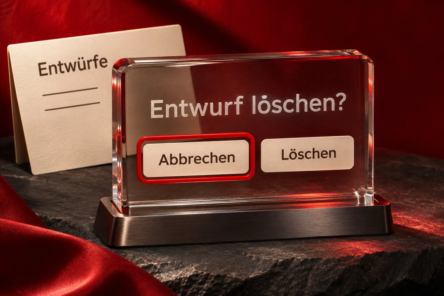
Our removal dialog begins on Abbrechen, meaning Cancel. Someone can understand the question before explicitly choosing removal. This is a decision for a short task with two actions. A different dialog containing substantial explanation or an editing form may need another initial destination. The starting position should support understanding and action rather than mechanically activating the first available field in every window.
The native showModal method opens the dialog modally. Content outside it is no longer part of the ordinary working route while it remains open. For the two fixed actions, the example adds a small local Tab cycle. Moving backwards from Cancel reaches Remove draft, and moving forwards from there returns to Cancel. Escape remains a native cancellation route. The handler belongs solely to this dialog.
Those fixed edge targets are a deliberate limitation. Additional fields, nested regions or conditionally visible actions would require reviewing the logic. This is not a universal focus manager. A larger component library needs maintained rules for starting position, currently reachable controls, nesting and return behaviour, followed by actual acceptance in the environments the product supports. A short example should not imply that all of those cases are solved.
Return to a surviving trigger after cancellation
Opening records the trigger and the affected draft card. After Cancel or Escape, that trigger still exists and receives focus again. The person returns to the object whose task was temporarily interrupted. Jumping to the beginning of the document or the first navigation link would add work and weaken the relationship between an action and the object it concerns.
Before every opening, the dialog return value is cleared. Only the explicit confirm result removes a card. This distinction matters when the same dialog is reused: a previous confirmation must not become a fresh confirmation after a later cancellation. Our test sequence consequently performs one removal before cancelling the next attempt. Testing only the first opening would miss this important state transition.
A saved reference alone does not guarantee a usable return target. The isConnected property establishes whether the old trigger still belongs to the document before this example uses it. A production component with additional visibility or permission states would also need to consider whether that target remains meaningful and reachable. Those further states are absent from this deliberately bounded implementation.
Choose a concrete destination when removal destroys the trigger
Successful removal deletes the original trigger together with its card. Calling focus on that detached node would not provide a meaningful continuation. The example therefore chooses the next remaining removal action. After the first removal, only the Relaunch draft remains. Its action becomes the new destination in the executed keyboard journey, preserving a direct route through the remaining collection.
Removing the last card leaves no further removal action. Focus then moves to the heading for saved drafts, and the next normal Tab reaches the following form. The empty collection still has an understandable place in the page. In a production product, an action for creating a new draft might instead be the appropriate next destination, depending on the actual task.
Choosing an alternative is a product decision. A long sorted collection might use the following item or the previous one. A completed workflow may sensibly return to an overview. What matters is a predictable route for that particular content. A general instruction to focus an arbitrary first button after every removal is too vague to express the intended continuation.
Design focus indication together with narrow layouts
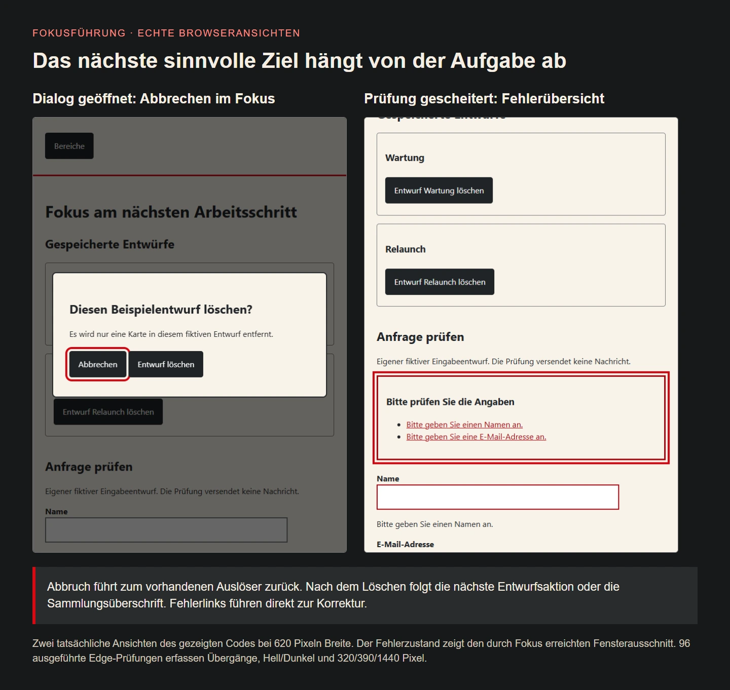
The CSS gives focused elements a clear outline with separation from the control. The dark appearance adjusts the colour. These indicators belong to the same elements whose interaction is tested. The explanatory image uses actual browser captures, with no focus outline painted over them afterwards. Readers can therefore relate the visible result directly to the rules supplied with the example.
The dialog limits its width to available space and can scroll vertically when necessary. Checks cover widths of 320, 390 and 1440 pixels in light and dark appearances. They examine the opened dialog and its focused Cancel action. This example has no additional overlapping banners. An actual integration must separately review any such layers and their interaction with the keyboard route.
* { box-sizing: border-box; }
body { margin: 0; color: #202326; background: #f8f3ea; font: 1rem/1.5 system-ui,sans-serif; }
header, main { max-width: 58rem; margin: auto; padding: 1.5rem; }
header { border-bottom: 3px solid #cf0711; }
nav a { display: inline-block; padding: .6rem; color: #a50710; }
button { font: inherit; padding: .75rem 1rem; margin: .4rem 0; border: 2px solid #202326;
  border-radius: .3rem; color: white; background: #202326; cursor: pointer; }
:focus-visible { outline: 4px solid #cf0711; outline-offset: 4px; }
.draft { border: 1px solid #777; padding: 1rem; margin: 1rem 0; border-radius: .3rem; }
section { margin-bottom: 2.5rem; }
label { display: block; font-weight: 700; margin-top: 1rem; }
input { display: block; max-width: 100%; width: 30rem; padding: .7rem; font: inherit; border: 2px solid #777; }
#error-summary { border: 3px solid #a50710; padding: 1rem; margin-bottom: 1.5rem; }
#error-summary a { color: #a50710; }
[aria-invalid="true"] { border-color: #a50710; }
dialog { width: min(34rem,calc(100% - 2rem)); max-height: calc(100% - 2rem); overflow: auto;
  color: #202326; background: #f8f3ea; padding: 2rem; border: 2px solid #202326; border-radius: .5rem; }
dialog::backdrop { background: rgb(0 0 0 / .6); }
@media (prefers-color-scheme: dark) {
  body, dialog { background: #202326; color: #f8f3ea; }
  button { color: #202326; background: #f8f3ea; border-color: #f8f3ea; }
  nav a, #error-summary a { color: #ffb2ab; }
  :focus-visible { outline-color: #ff8a80; }
  input { color: #202326; background: #fffaf0; }
}
Make form errors a reachable working list
Checking empty required entries creates a short summary with two links and moves focus to that summary. The next Tab reaches the first error link, and Enter reaches the affected field. Someone does not have to search the whole page for red marks or guess which input a message describes. Each message names the correction required for continuing with the task.
Affected fields receive aria-invalid and a reference to their corresponding error message. The existing email help remains connected as well. Reporting an error therefore does not accidentally remove the earlier explanation. Every subsequent check clears previous markers and list entries before building the current result. Text is assigned through textContent rather than inserted as unchecked HTML, keeping message construction straightforward.
A focused summary is the chosen response to an explicit checking action in this example. Focus is not repeatedly pulled into warnings while someone types. Such interruption would make correction harder. Other forms may benefit from additional feedback, but its timing and announcements need to fit the actual workflow. Merely adding more notifications does not automatically improve the experience.
Preserve corrections and name completion accurately
After a name and incomplete email address have been entered, only the email error remains. The correct name is preserved and its invalid marker is removed. The updated summary now leads directly to the remaining problem. This second pass is more informative than a single empty-form test because it demonstrates a transition between different error states rather than only the initial failure.
After correction of the email address, the summary disappears and focus stays on the checking action. A status region says the entries are prepared for further review. That describes only the browser check actually performed. No network submission occurs. The code supplies a verifiable input-guidance component and does not present itself as a completed contact-delivery workflow.
Server validation and actual error responses remain authoritative in a production application. Correct entries should survive a server rejection, and affected fields should remain understandable and reachable afterwards. Sensitive information must not casually appear in a URL or unnecessary diagnostic message. Focus behaviour belongs with the real data and submission process, rather than treating a positive-looking status as proof of successful processing.
Follow the complete JavaScript transitions
The following implementation keeps navigation, dialog and form as separate small flows. Navigation distinguishes closing with return from closing while someone continues onwards. The dialog distinguishes a surviving trigger from one removed with its card. The form distinguishes a failed check from successful local completion. These differences explain each explicit focus call and make the reasoning reviewable during maintenance.
No global handler focuses the first element after every action. Nor is ordinary Tab movement intercepted across the whole page. Only the two edges of the specific dialog receive a bounded supplement. The browser retains the remaining sequence. A transition failure can consequently be assigned to a small understandable section and corrected without inventing an alternative keyboard model for the entire document.
const navButton = document.querySelector('#nav-toggle');
const navLinks = document.querySelector('#nav-links');
function closeNavigation(restoreFocus) {
  navLinks.hidden = true;
  navButton.setAttribute('aria-expanded', 'false');
  if (restoreFocus) navButton.focus();
}
navButton.hidden = false;
navLinks.hidden = true;
navButton.addEventListener('click', () => {
  const open = navButton.getAttribute('aria-expanded') === 'true';
  navLinks.hidden = open;
  navButton.setAttribute('aria-expanded', String(!open));
});
document.querySelector('nav').addEventListener('keydown', event => {
  if (event.key === 'Escape' && !navLinks.hidden) {
    event.preventDefault(); closeNavigation(true);
  }
});
document.querySelector('nav').addEventListener('focusout', event => {
  if (!event.currentTarget.contains(event.relatedTarget)) closeNavigation(false);
});

const dialog = document.querySelector('#remove-dialog');
const cancelButton = document.querySelector('#remove-cancel');
const confirmButton = document.querySelector('#remove-confirm');
let opener = null, pendingCard = null;
for (const button of document.querySelectorAll('.remove-draft')) {
  button.hidden = typeof dialog.showModal !== 'function';
  button.addEventListener('click', () => {
    opener = button; pendingCard = button.closest('.draft');
    dialog.returnValue = ''; dialog.showModal();
  });
}
dialog.addEventListener('keydown', event => {
  if (event.key !== 'Tab') return;
  if (event.shiftKey && document.activeElement === cancelButton) {
    event.preventDefault(); confirmButton.focus();
  } else if (!event.shiftKey && document.activeElement === confirmButton) {
    event.preventDefault(); cancelButton.focus();
  }
});
dialog.addEventListener('close', () => {
  if (dialog.returnValue === 'confirm') pendingCard?.remove();
  const destination = opener?.isConnected ? opener
    : document.querySelector('.remove-draft') || document.querySelector('#draft-title');
  destination.focus();
  opener = null; pendingCard = null;
});

const form = document.querySelector('#enquiry');
const summary = document.querySelector('#error-summary');
form.noValidate = true;
form.addEventListener('submit', event => {
  event.preventDefault();
  const name = form.elements.name, email = form.elements.email;
  const errors = [];
  if (!name.value.trim()) errors.push({field:name, errorId:'name-error', text:'Bitte geben Sie einen Namen an.'});
  if (email.validity.valueMissing || email.validity.typeMismatch)
    errors.push({field:email, errorId:'email-error', text:'Bitte geben Sie eine E-Mail-Adresse an.'});
  for (const field of [name,email]) {
    field.removeAttribute('aria-invalid');
    if (field === email) field.setAttribute('aria-describedby','email-help');
    else field.removeAttribute('aria-describedby');
  }
  for (const id of ['name-error','email-error']) document.getElementById(id).hidden = true;
  const list = summary.querySelector('ul'); list.replaceChildren();
  for (const error of errors) {
    error.field.setAttribute('aria-invalid','true');
    error.field.setAttribute('aria-describedby', (error.field === email ? 'email-help ' : '') + error.errorId);
    const text = document.getElementById(error.errorId);
    text.textContent = error.text; text.hidden = false;
    const li = document.createElement('li'), link = document.createElement('a');
    link.href = '#' + error.field.id; link.textContent = error.text;
    li.append(link); list.append(li);
  }
  summary.hidden = errors.length === 0;
  document.querySelector('#form-status').textContent = errors.length ? ''
    : 'Die Eingaben sind für die weitere Prüfung vorbereitet.';
  if (errors.length) summary.focus();
});
Read 96 executed checks as bounded evidence
The original example was executed with 96 checks in desktop Edge. They include opening and leaving navigation, Escape, dialog entry, both Tab boundaries, cancellation, first removal, second removal and recovery after the collection becomes empty. Reopening after a previous confirmation is explicitly covered. The checks observe the actual active element at each relevant point rather than inferring focus from a visual class.
For the form, execution covers two errors, correction of one error and then valid entries. Error links, preserved values, updated descriptions and retained focus on the checking action are examined. Both colour appearances and several widths are included. Without JavaScript, navigation links remain visible, optional controls remain hidden and native form validation stays enabled. The evidence concerns these exact source files and their states.
These cases are not a comprehensive review of every browser, screen reader, magnification setting or production integration. The illustrations show genuine states from the same sources. Acceptance for a real release also needs manual task journeys and the intended assistive technologies. A successful automated run supports that review but cannot replace observation of the broader product in its actual working conditions.
Write acceptance steps the whole team can understand
Describe expected transitions in task language. For example: open a draft’s removal question, cancel and continue with the same draft. Or remove the final draft and understand the empty collection. Designers, developers and business reviewers can follow those statements together. Technical selectors can supplement the evidence without becoming the only comprehensible explanation of what the interface is meant to achieve.
When reporting failure, record the starting state, action and position actually lost. Saying focus is wrong is less actionable than observing that removing the last card sends the next Tab unexpectedly into the header. A concrete account exposes the consequence for the user and makes the intended correction easier to choose. It also provides a clear route for checking whether the fix worked.
Repeat affected journeys after a change. Another dialog action, new validation or a different mobile navigation can alter earlier assumptions. Focus management therefore belongs to ongoing component maintenance. The lasting quality question is whether a person can open, cancel, correct and confirm, then continue the real task without losing their place. This remains useful even when colours, wording or component layout are later redesigned.
Transitions at a glance
| Action | Expected destination |
|---|---|
| Expand navigation | Trigger retains focus |
| Leave navigation with Tab | Next target keeps focus |
| Escape in navigation | Return to trigger |
| Open dialog | Cancel receives focus |
| Cancel removal | Surviving trigger receives focus |
| Remove draft | Next action or collection heading |
| Check invalid entries | Error summary with field links |
| Check valid entries | Checking action retains focus |
Implementation checklist
- Describe state, trigger and continuation for every transition.
- Use normal document order instead of positive tab numbering.
- Update visibility and aria-expanded together.
- Avoid unwanted return jumps when someone continues onwards.
- Choose dialog entry and cancellation deliberately.
- Replace removed triggers with meaningful task destinations.
- Clear previous dialog results before reopening.
- Check error links, descriptions and preserved values after correction.
- Review keyboard focus at narrow widths in both appearances.
- Review actual submission and server errors through the same task journey.
Sources and review scope
Primary sources reviewed on 9 November 2026. Original fictional example with 96 executed Edge checks. These browser checks are not a complete assistive-technology assessment or legal evaluation of an entire site.