Writing AI image briefs for subject, material, light and composition
From vague quality words to a reviewable visual idea, with reference roles, focused revisions and a clear handover.

A useful AI image brief describes more than the impression an image should create. It explains the image's job, what must appear and how an unsuitable result will be recognized. Modern, premium and emotional are too vague on their own. They can suggest an attitude but establish neither subject, lighting nor crop. A reviewable brief turns those preferences into decisions someone can inspect.
The following workflow uses an original editorial example: a red metal clip holds a warm-white glass plate. It illustrates a clearly defined connection while making material, light and composition discussable. This is a staged illustration, not evidence of an actual client product. The concrete scene supports a brief, a review of variants and a documented handover. Its usefulness lies in explaining the decisions rather than implying an existing commercial project.
1. Start with the image's job
First state what the reader should understand from the image. For this example, the illustration shows how a precisely defined subject gains a clear statement through material, lighting and framing. It is not an advertisement for an existing clamping device. That boundary matters. A freely invented mechanism must not accidentally be presented as a technically evaluated product. A plausible-looking surface is insufficient evidence of real performance.
Decide whether the image introduces an idea, explains a relationship or documents evidence. A metaphorical cover has different freedoms from a record of work actually performed. Evidence must refer back to its real foundation. A generated image can explain an idea, but cannot establish a project state that never existed. Make this decision before selecting the subject so later creative freedom does not silently change the editorial claim.
Then write one sentence limiting the statement. The example asserts no holding force, manufacturing specification or product availability. Such information appears neither as a label nor as an apparently measured scale. This prevents a technical-looking image from introducing unsupported facts. A useful creative idea stays understandable within its actual editorial purpose. It does not need invented numbers to look professional or to make its visual relationship worth examining.
2. Describe a specific subject and relationship
A brief needs an identifiable subject and a relationship. Red metal names a surface. A red metal clip holding a warm-white glass plate additionally identifies an action or arrangement. That connection is the main idea. Include further props only when they help explain it. A laptop or cup contributes no necessary information here. Their familiarity would not make the image more specific to this article.
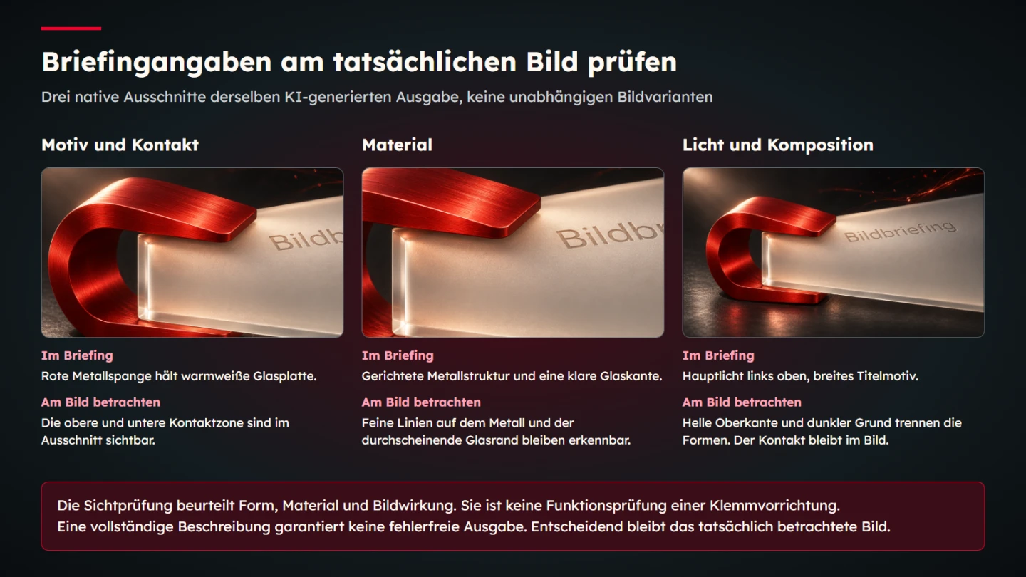
Describe which parts must remain visible. The plate needs an understandable edge. The clip must reveal where it embraces that edge. A hidden contact point can undermine the intended statement. Attractive reflections do not replace the missing relationship. Review the proposal against its assigned job rather than its surface appeal alone. This also gives a designer a concrete reason to choose another viewpoint or reject a candidate.
The Imagen image-description guide distinguishes subject, context and style among its organizing ideas. That is a useful description framework. The working brief proposed here adds an editorial purpose and specific review questions. It does not claim that every model version will respond identically to the same wording. Product documentation supplies context, while this article's review method remains an explicit editorial proposal.
3. Define material through visible properties
Do not stop at the word metal. Identify the surface that matters. Brushed red metal should show a fine directional texture. Its edges may catch light while larger areas avoid unreadable white glare. The warm-white glass plate needs credible thickness and a visible rim. Those are properties that can be examined in the result. They are more actionable than asking vaguely for better material quality.
Separate material from colour. Red plastic can share a hue with metal and still appear fundamentally different. If material matters to the statement, colour correction alone is insufficient. Conversely, every red surface need not become metallic simply because the wider image direction uses metal. The decision follows the subject and its function. A coherent visual language permits different materials when the reason for using each remains clear.
Inspect transitions carefully. Does the plate retain plausible thickness along its visible edge? Does metal turn unintentionally into a soft mass around one corner? Does a reflection agree with the depicted form? Such faults can disappear in a small preview. Examine the selected candidate as a complete image and at its critical details. The overall lighting may be persuasive even when a local material transition fails.
4. Describe lighting in relation to form
The example uses a main light from the upper left to reveal the brushed direction and front edge of the plate. A restrained opposing light may separate the dark side from the background. This is more specific than dramatic lighting. It states which parts should become visible and which shadows can retain depth. The result can be reviewed against that purpose without pretending that a generated scene is a calibrated studio setup.
Avoid conflicting requirements. A completely shadowless image and strongly modelled depth call for different choices. If both appear equally important, the target remains unclear. Select a primary intention and subordinate supplementary preferences to it. During review, ask whether the lighting reveals the essential contact point or creates distracting glare precisely there. A more elaborate light description is not helpful if it obscures the thing the image must explain.
The Adobe guidance on image prompts encourages descriptive, specific wording and revision based on results. For this workflow, observability is the important principle. Another style adjective contributes little when the actual problem is a hidden edge. The correction should identify that edge. Keep the feedback tied to something another person can locate in the candidate.
5. Plan composition alongside its eventual use
The example is intended as a wide sixteen-to-nine cover. The clip and its contact with the plate must remain understandable within that crop. An essential detail should not sit at an extreme edge if the article list later uses a different crop. The brief therefore identifies the critical subject zone and actual uses. This is a content decision as much as a layout preference.
Empty space is useful when it has a job. If real page text will appear beside the subject, provide suitable room. If the headline sits outside the image, there is no need to force the subject sideways. Composition follows the actual page design. A habitual request for lots of space on the left does not answer the underlying question. It can even make a thumbnail weak when no text occupies that space.
Distinguish aspect ratio from output dimensions. A properly composed subject needs suitable pixel sizes for its uses. A large export does not repair an unsuitable crop. Review the statement in its intended shape first, then generate controlled technical variants. Baked borders or side bars do not satisfy a request for a full-bleed composition. Inspect the delivered file rather than assuming the wording in the brief produced the requested geometry.
6. Write a compact complete draft
| Brief component | Example decision |
|---|---|
| Purpose | Explain a precise image brief through one concrete subject |
| Subject | A red metal clip holds a warm-white glass plate |
| Material | Directional metal texture, a clear glass edge and visible thickness |
| Light | Main light from upper left, restrained separation from the dark background |
| Composition | A wide cover with the important contact point fully understandable |
| Limits | No real product claim, technical measurements or third-party logos |
This becomes a connected description: a red brushed-metal clip visibly embraces the edge of a warm-white glass plate. Both rest plausibly on an anthracite surface. Directed light from upper left reveals texture and the edge. A subtle red light trace connects the scene to the broader visual language. The result remains an editorial staging, with no claim to demonstrate technical performance.
The description is a working draft. Before generation, establish which references and output controls the chosen tool actually supports. Record tool settings separately from descriptive text. Requesting a ratio in prose is not automatically equivalent to setting a supported output option. What matters is the file eventually produced and inspected. A useful record lets a later reviewer distinguish intention from the parameters actually supplied.
7. Give references an explicit role
A reference may concern material, lighting, composition or an exact subject to preserve. Name those roles. In the example, existing brand imagery supplies the colour and material direction. That does not authorize redrawing its identity mark or importing every depicted object. The new scene remains specific to its own article. The reference supports a decision rather than becoming a template copied without regard to meaning.
Record which files were actually supplied. A reference stored in a project folder has not necessarily been included in the image tool's input. This distinction matters when somebody asks how a result was made. The record names the actual input and its role. It does not claim reference conditioning when a file was never attached. Keeping that evidence is more useful than relying on a general note saying the image followed the brand.
Before providing client material, establish whether that use is permitted and commissioned. Public visibility does not automatically make a picture freely available as a style or identity reference. Internal drafts may contain confidential information. Include only references genuinely needed for the task, without unnecessary personal or confidential details. The brief should explain the required relationship without turning a large unrelated document collection into an accidental image-tool input.
8. Use focused exclusions rather than endless lists
A short exclusion list can identify recurring wrong directions. Here it includes office desks, cups, people, third-party logos and invented measurements. The list supplements the positive description. It should not compensate for an unclear subject. If the scene itself is undefined, a long collection of forbidden props still fails to provide a concrete job. Positive relationships give the result its meaning.
Give each exclusion a reason. People are unnecessary because their activity would not contribute to this explanation. A real device is not asserted because the scene is a material illustration. These reasons help with review. Judge a newly introduced prop by whether it supports the job, rather than solely by whether its name happens to appear in the exclusion list. This avoids an unmanageable attempt to anticipate every possible irrelevant object.
Tools differ in how they process negative instructions. Do not regard a particular phrase as a guaranteed switch. Inspect the output. If an unwanted element appears, identify it specifically and remove it through a focused revision or rebuild the scene. Repeating the same prohibition is not always the most useful response. The result determines whether the correction worked, rather than the presence of a familiar negative phrase in the prompt.
9. Resolve contradictions before generating
Read the brief as a spatial instruction. Can the clip embrace the plate where described? Is the plate resting on the surface or standing freely? Where do shadows and reflections originate? An unclear arrangement can encourage attractive but implausible transitions. The description should not demand a connection made impossible by its own geometry. Reducing complexity at this stage is often more useful than trying to repair every contradiction in the result.
Next inspect priorities. A view close enough to emphasize surface texture requires a different distance from an overview of every object. An extreme close-up and a completely visible large scene can conflict. Decide which information matters most. In this example, material and the contact point must remain visible. Additional surroundings stay restrained. The image does not need to prove that every possible detail was included.
Text requirements also deserve a decision. Does the image need readable writing at all? If it does, provide the exact wording and check it afterwards. A cover often works without an embedded headline. Here a short German identifier supplies editorial context. It does not replace the real article title and must remain correct and legible in the final export. Treat a plausible-looking misspelling as an error, not an acceptable interpretation of the brief.
10. Review the result in two separate passes
The first pass concerns factual coherence and completeness. Are the required objects present? Is the contact understandable? Do material and geometry remain consistent? Are any labels correct? Where a scene includes people or devices, inspect anatomy, controls and connections. An attractive stylistic result can still fail these questions. Do not let enthusiasm for lighting turn into an assumption that the depicted arrangement is sound.
The second pass concerns design. Is the main idea immediately visible? Does light support the form? Does the image belong to the established visual language without simply repeating an earlier composition? Answer these after the factual pass. A correct object is not automatically a strong cover. Conversely, striking light must not hide a material or geometry error. The two judgements support one another while remaining distinct.
Record observation separately from decision. The clip does not touch the plate is a concrete observation. The proposal does not convey the intended connection is its editorial evaluation. Together they lead to an actionable revision. The image is not premium enough leaves the required change ambiguous. Precise review language also makes handover easier because someone else can locate the problem without reconstructing an unstated preference.
11. Make individual revisions traceable
For a focused edit, change the affected aspect as narrowly as possible. If the glass thickness is unclear, retain subject, light and position where feasible. Name the invariant elements explicitly. Then inspect the entire image again. A small intervention can introduce a new spelling error or another contact point. A successful request to edit a file is not proof that the intended visual correction succeeded.
Preserve the original. Give the new candidate its own identifier and a short reason for change. The record then shows which version was actually reviewed. An automatically named file should not replace an approved output merely because it has a newer timestamp. Selection and review belong to that precise version. This is particularly important when several candidates remain visually similar but differ at one critical detail.
If several central elements are wrong, regeneration may be more useful than a sequence of small edits. Make that decision from the result. A fixed permitted number of revisions is not a quality standard. What matters is whether the selected candidate fulfils its job through plausible form and appropriate design. Keep the earlier files so the choice can be explained without presenting abandoned candidates as approved work.
12. Prepare provenance and publication together
Store the exact description, references actually supplied, selected output and performed edits. The IPTC metadata standard includes properties for source and rights information. A traceable project record can complement such metadata. Neither substitutes for missing usage foundations or professional review. The record should state what is known instead of converting an empty field into an assumed permission.
Revisit image function for publication. The WAI alternative-text decision tree helps distinguish informative, decorative and functional uses. Alternative text does not automatically enumerate every visible detail. It must fit the actual occurrence. Explanatory imagery also needs an accessible textual route to its important information. The final page context therefore remains part of the editorial decision.
Inspect the delivered size and crop. A correctly spelled identifier may become unreadable in a small output. A critical contact point may disappear from a preview. These observations belong to publication and cannot be inferred from the large working image alone. The brief does not end with the first attractive result. It ends with an appropriately reviewed asset for an actual use, supported by a record of how that decision was reached.
13. Use a short shared acceptance review
- The image's job and statement limits are expressed clearly.
- The main subject and important relationship are concretely visible.
- Material, lighting and composition support the same idea.
- References actually supplied and their roles are recorded.
- Geometry, contact points and any anatomy are plausible.
- Readable image text is correct and appropriate for the use.
- No invented project evidence or measurements are presented.
- The final crop and exports have been inspected.
- Originals, edits and the selected version remain traceable.
A complete checklist is not automatic proof of image quality. It makes decisions discussable. The practical benefit is being able to correct an unsuitable output precisely and explain a suitable selection. This supports editorial image production whose results fit their subjects and identity without forcing every publication into the same motif. The process remains useful when a different tool or another person performs the next generation.
14. Set up a useful small comparison round
If two lighting ideas remain open, first compare that decision. Keep the subject, statement limits and intended ratio unchanged in the brief. One candidate emphasizes the front edge through side lighting; another distributes softer light across the surface. Both may produce interesting images. Selection asks which version makes contact between clip and plate clearer. This turns general preference into a specific design question.
Generated outputs can nevertheless differ in other details. Such a comparison is not a controlled experiment proving that one wording alone caused a particular effect. Describe the actual differences in the images. If viewpoint or material form also changed, include that observation. Selection can consider those differences without claiming an unsupported explanation of their cause. This distinction keeps a practical design exercise from becoming an invented model-performance finding.
A shared review needs only a few clearly identified candidates. Each addresses the same intended idea and names the deliberate difference. A large unordered folder of similar files makes decisions harder. The team may lose track of whether it is discussing subject, light, material or an accidental geometry error. A short selection with concrete questions is often a better working foundation than a larger quantity of unannotated results.
Give a rejected version a factual reason: perhaps a reflection hides the contact point or an edge disappears into the background. That information helps with the next task without turning one defect into a universal rule. A successful subject also need not become the template for every article. Retain the useful decision, such as keeping a material edge visible. The next visual idea remains responsible to the next article's content.
Sources and scope
Sources were opened on 9 November 2026. The linked Google, Adobe, IPTC and WAI primary material was actually consulted. The brief structure and example scene are original learning material. No particular model performance, identical repetition, real product characteristic or commercial outcome is guaranteed.