Explaining technical processes through diagrams
Connect a reader question with checked cases, accurate branches and an equivalent prose account rather than decorative boxes and arrows.

A technical process can be described correctly and still be difficult to follow. Several conditions, return paths and exceptions demand attention from the reader. A diagram can make these relationships visible, but boxes and arrows alone do not create useful explanation. The drawing needs to answer a specific question and represent the intended process accurately.
Start by deciding the task and boundary. Should the diagram show a next step, separate responsibilities or explain a failure? This guide uses an original calculation: deriving target dimensions from known image dimensions with a maximum width of 1440. The example reads no image file and exports no image. Its limited task makes the logic possible to draw precisely and check through actual execution.
Let the reader's question determine the scope
A complete technical environment often contains more relationships than one explanation can usefully present. Image export may involve file inspection, size decisions, processing, storage and delivery. Explaining when a width remains unchanged does not require showing the whole storage process simultaneously. A clearly named slice is more honest than an apparently complete diagram with hidden omissions.
State the question in one sentence. Here it is: which target dimensions does this calculation return for valid and invalid numeric inputs? That identifies the diagram's content. File quality, actual readability and a later output format do not belong to the decision shown. The text and explanatory figure both state this boundary.
The intended audience matters too. Someone reviewing the logic needs different detail from someone dealing with a particular error message. An overview can summarize implementation details, but it should make that simplification understandable. A missing condition should not disappear behind a reassuringly named box.
Write a brief plain-language account first. Validate the inputs. Reject unsuitable values. Otherwise use the width to decide whether to retain the dimensions or calculate a target. That description is the substantive foundation. Spatial arrangement comes afterwards and should not change the logic merely to produce a more symmetrical drawing.
Name actions, decisions and results separately
An action describes work, a decision asks a question and a result identifies the resulting state or data. Make these roles distinguishable in the wording. Check width is vague if the point is a branch. Width at most 1440? states the condition directly and provides a clear basis for its outgoing paths.
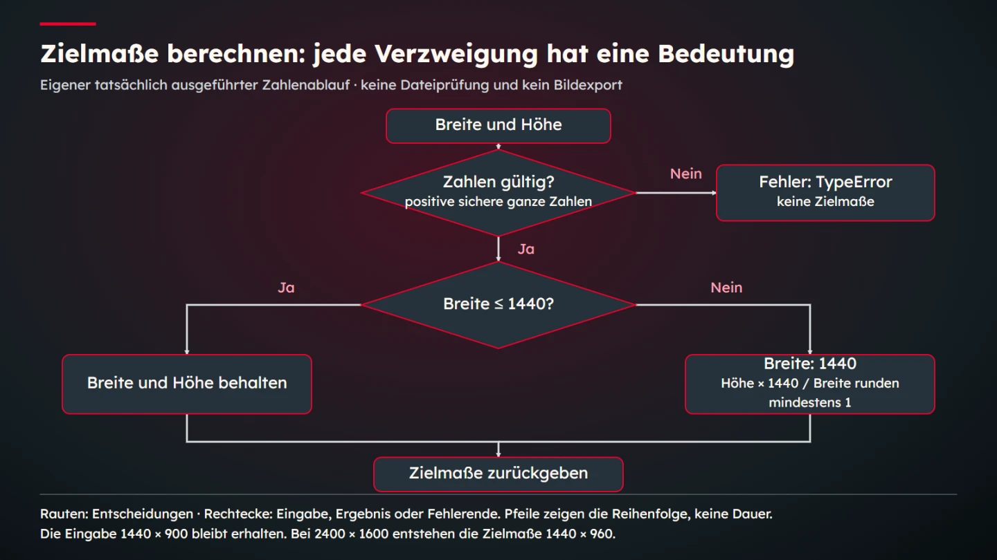
The example needs two decisions. First establish whether both inputs are positive safe integers. Then compare width with the threshold. The first is not a general file-validation step. It checks only the agreed numeric inputs. A damaged file cannot be detected because the function receives no file at all.
Use concise labels with consistent terminology. If the code uses width and height, do not alternate without explanation between size, format and resolution. Those terms can mean different things. A dependable term reduces mental translation and makes the later comparison with actual outputs easier to follow.
The Mermaid flowchart documentation describes nodes, connections and different shapes. A tool can support drawing those relationships. Their substantive meaning still comes from the process being described. Syntactically valid diagram source does not prove that a depicted decision matches the actual function.
Bound the calculation example completely
The function expects numeric width and height. In this demonstration, valid values are positive numbers classified by JavaScript's Number.isSafeInteger as safe integers. The corresponding MDN reference explains that check. This is a technical input contract for the teaching case, not a statement about which image dimensions every processing system should accept.
function zielmasse(breite, hoehe) {
  if (!Number.isSafeInteger(breite) ||
      !Number.isSafeInteger(hoehe) ||
      breite <= 0 || hoehe <= 0) {
    throw new TypeError("Positive ganze Zahlen erforderlich");
  }
  if (breite <= 1440) {
    return { breite, hoehe, schritt: "behalten" };
  }
  return {
    breite: 1440,
    hoehe: Math.max(1, Math.round(hoehe * (1440 / breite))),
    schritt: "verkleinern"
  };
}
The German identifiers remain the same in both language versions so one exact example can be compared. If width is at most 1440, both numbers remain unchanged. A larger width is reduced to 1440, and target height follows the original ratio with integer rounding. Math.max prevents a target height of zero, so a very small calculated result still receives at least one pixel.
The MDN Math.round reference explains the rounding operation. Integer dimensions cannot represent every calculated ratio exactly. The diagram therefore names rounding explicitly. A shortened label such as scale proportionally would explain that relevant detail less accurately in this case.
The function calculates numbers only. It does not inspect an image format or file size, crop a picture, account for orientation metadata or write an output file. Those tasks could belong to a larger pipeline, but this example neither performs nor verifies them. Stating that boundary prevents a small correct calculation from being mistaken for complete image processing.
Treat each connection as a claim
Every arrow asserts a relationship. It may say which step follows a decision. Here an invalid input immediately produces an error. It should not also connect to a regular dimension result. Adding an attractive extra arrow would make the explanation factually wrong rather than merely visually different.
Label decision exits. Yes and No need an unambiguous relationship with the question being asked. Direction should remain clear without relying on colour. A legend can explain the roles of shapes, but it should not need to rescue a connection whose meaning is unclear in the diagram itself.
Avoid unnecessary crossings. Overlapping lines can make it uncertain whether a junction or only a spatial overlap is intended. Rearranging the drawing is often better than adding more colours. Readers should be able to follow the process without first solving the diagram as a visual puzzle.
The ending needs the right meaning as well. Both regular branches return target dimensions. The error branch instead throws an exception and returns no such object. Showing that as a separate ending preserves the distinction. A merged conclusion labelled Done could conceal exactly the difference the explanation needs to convey.
Follow concrete inputs through the drawing
Selected cases make the diagram reviewable. Dimensions of 960 by 640 remain unchanged. A 2400 by 1600 input becomes 1440 by 960. Width exactly equal to 1440 stays unchanged, while zero width violates the input contract. These cases exercise different decisions rather than merely supplying different numbers along the same path.
| Input | Relevant relationship | Teaching-case result |
|---|---|---|
| 960 × 640 | Valid and below the threshold | 960 × 640, retain |
| 1440 × 900 | Valid and exactly at the threshold | 1440 × 900, retain |
| 2400 × 1600 | Valid and above the threshold | 1440 × 960, reduce |
| 2000 × 1333 | Height calculation requires rounding | 1440 × 960, reduce |
| 0 × 640 | Width is not positive | Error, no target dimensions |
The table comes from actual executions of the published function. It is not an image-processing result or a quality measurement. Pixel dimensions here identify numeric values in the calculation. A correct pair does not establish that a later image will be sharp, complete or suitable for a particular use.
A counterexample deliberately changes the threshold condition. Replacing less-than-or-equal with less-than sends width 1440 down another branch. The resulting numeric pair can look identical, yet the named step changes. This demonstrates why checking final numbers alone can miss a difference in process logic.
Review the example, results and diagram together. Prose may state the threshold correctly while an arrow reverses the branch in the image. A correct diagram can also accompany an outdated code block. Inspect the actual published combination. Individually correct pieces do not automatically produce a correct explanation.
Arrange the drawing around its reading path
Choose a clear main direction and maintain it where possible. A small process can run from top to bottom, while a broad comparison may begin on the left and progress right. The arrangement should suit the available space. A wide drawing intended only for a large monitor can produce tiny labels in a narrow article column.
Group closely related elements. The two exits of one decision should read as alternatives. A distant error box can accidentally resemble another process. Sometimes a short region label helps; sometimes rearrangement is clearer. Judge the information path rather than treating uniform gaps as the only layout goal.
Labels need enough room. Long sentences inside small shapes become difficult to read. Distribute the explanation deliberately: the node contains the decisive question and nearby prose supplies its precise meaning. Do not lose the boundary through that simplification. Valid numbers? needs the stated input contract in the text.
The technical representation of labels also affects maintenance. The MDN SVG-text tutorial explains native text elements. Fixed coordinates and actual text nodes can be useful for precise original diagrams. Their wrapping, typography and exports still require visual inspection. Correct coordinates alone do not prevent overlapping labels.
Provide prose as an equivalent information route
A complex image should not carry the entire explanation alone. The WAI complex-images tutorial addresses additional detailed descriptions. For this process, the prose account is straightforward: invalid numbers produce an error, valid dimensions at or below the width limit remain unchanged and larger widths receive the threshold with a rounded positive height.
A concise text alternative can identify the diagram and its main purpose. It does not need to enumerate every coordinate or shape colour. The detailed explanation and case table are available in the article itself. Readers can therefore understand the relationship without visually tracing all the arrows.
Use colour as support. Decisions and labels should remain understandable without recognizing red accents as red. Different routes do not automatically require many colours. Clear arrows, consistent terms and spatial relationships can matter more. A polished visual direction and an understandable information route are compatible goals.
Review the actual delivered size as well. A legible original can become too small during export or display. If necessary details disappear, use another arrangement or an appropriate larger view. More source resolution alone cannot make tiny labels comfortable to read within a narrow display area.
Maintain the process and diagram together
A diagram ages with its subject. Changing the width rule requires checking the question, code and expected values together. A new colour or frame does not correct an obsolete decision. Record which version is described and where its substantive foundation is kept.
A small mapping between node names and rules supports maintenance. The width decision corresponds to the example's specific condition. The error node corresponds to the exception for unsuitable inputs. This relationship is more traceable than saying the image shows the technical process, and it makes focused review questions easier.
Expanding the teaching example into a production description requires explicit additions. File inspection, actual resizing and storage are distinct tasks with their own failure cases. Renaming an existing box cannot make them completed steps. Each extension needs suitable content and renewed review of the whole relationship.
- The reader question and represented scope are identified.
- Actions, decisions and results have distinct roles.
- Arrows and branch labels match the intended logic.
- Thresholds and error paths have been considered.
- Example inputs and results come from executed checks.
- The drawing claims no processing that was not performed.
- Labels remain legible in the intended output.
- Prose explains the same relationships.
- Changes update code, image and case values together.
- Version and ownership are traceable.
A useful technical diagram is therefore a checkable explanation. It shows the right relationships for a question rather than as many shapes as possible. In this example, those are input validation, a threshold decision and target dimensions. Executed cases make that relationship traceable while limiting what the illustration can reasonably establish.
Explain the difference between sequence and time
An arrow can describe logical order without specifying duration. Here successful validation precedes the width decision. That does not measure how many milliseconds an invocation takes. Equal arrow lengths do not imply equal processing times. If duration matters, the drawing needs an explicit basis for representing it.
Spatial proximity has limits too. Two neighbouring result boxes are alternatives, not simultaneous work in this example. Their meaning comes from the labelled decision branches. Without those connections, the arrangement could look like parallel processing. Layout therefore needs to communicate more than an even distribution of elements across a canvas.
A return arrow would add another claim. It might indicate new input after an error, but this function does not conduct that interaction. It throws an exception. A surrounding application would decide whether and how someone corrects the values. The error remains a separate endpoint here. Adding a friendly-looking retry loop without that foundation would be misleading.
Inspect implied responsibilities as well. An error box does not automatically mean a visible website message appears. In the actual code, an exception is thrown. Prose should explain that relationship. If the subject is an interface, its handling of the exception needs to become another explicit step with an appropriate check.
Conduct review through a concrete case
One reviewer can propose an input while another explains its route through the diagram. The case 1440 by 900 is especially useful because it lies exactly on the boundary. Describing its route requires taking at most seriously. Execution then confirms that the named step is behalten, meaning retain.
Another case clarifies the input contract. The string 2400 looks numeric to a person but is not an acceptable numeric input to this function. No automatic conversion occurs, so the error route is correct. A vague question such as Recognizable number? would describe this less accurately than the agreed validity decision and its explanation.
These conversations are useful professional reviews, not representative user studies. Record the cases discussed and the uncertainty corrected. A branch label may have been too far from its arrow, or a threshold explanation may have been missing. Such a concrete correction is understandable without inventing a percentage improvement in comprehension.
After revision, inspect more than the boxes. The prose and case table should describe the same process. Changing a label can invalidate a nearby reference. Final review should therefore include the whole explanation. Its value lies in the dependable relationship among its parts rather than an isolated attractive drawing.
Preserve editable diagram source alongside review notes. A final raster alone makes later changes to wording and connections difficult. Source records the labels and relationships belonging to the current version. Regenerate the export from it and inspect the result. A threshold update then remains a reviewable explanation change instead of an improvised image retouch. This teaching figure uses an original native graphics source for its exact shapes and labels.
Extreme aspect ratios also illustrate why the scope matters. An input of 2000 by 1 produces a target height of one because of the explicit minimum. The integer output cannot preserve that exceptionally thin ratio exactly. This is a stated feature of the teaching rule rather than a universal image-quality recommendation. A real processing pipeline would need its own requirements for such unusual inputs and its own actual visual checks.
Sources and limits
Sources checked on 9 November 2026. The linked WAI, Mermaid and MDN primary sources were opened. Function, threshold and cases are original teaching parameters. Numbers were calculated and compared. No actual image export, file-security assessment or measured comprehension effect is claimed.