Presenting product images and screenshots clearly
Choose views by their purpose, inspect actual crops and distinguish real evidence from editorial illustrations.
A product image should answer a question. What does the surface look like? Where is a connection located? Which parts are included? A screenshot has a similar responsibility: it should explain a particular state or a traceable step. A large gallery does not automatically achieve either purpose. Without a clear crop, caption and context, visitors may see plenty of imagery while still having to guess the information that matters.
Useful presentation therefore connects visual content with a reader's task. An overview establishes the whole object. A detail explains a specific feature. A screenshot documents a displayed state under stated conditions. These roles can be designed deliberately. This guide uses an original demonstration interface without customer data. Its actual rendering is checked to show what different image-fitting choices retain and what they cut away.
1. Define the question before choosing the frame
Start with the information someone needs. For a physical object, that might concern its shape, finish or dimensions. For software, the important question may involve available inputs or the result of an action. The appropriate view follows from that question. A beautiful arbitrary crop rarely compensates for a missing overview.
Write a short purpose for each proposed image. Examples include showing the overall form, explaining a surface detail or locating a save action. These statements make selection easier. Two images can legitimately address the same subject when they reveal different relevant sides. Without additional information, however, they may only increase the number of files a visitor must consider.
The purpose also guides sequence. Someone unfamiliar with an object normally needs orientation before a tightly framed detail becomes meaningful. A tutorial can begin with a specific problem if the broader context follows clearly. The sequence should help readers move from the overview they need to the detail that resolves their next question.
2. Separate overview, detail and application
An overview shows the essential form and the parts needed to understand it. A detail concentrates on a limited characteristic. An application image places the subject in a relevant use context. These views complement one another. A close-up does not establish that every relevant side has been shown. An attractive lifestyle image does not replace a dependable view of the actual object being described.
The same distinction works for screenshots. An overview locates a feature within the interface. A detail makes a label legible. A sequence explains a change of state. Name these roles clearly. Without that context, a narrow screenshot may be mistaken for the complete interface and a reader may misunderstand where the pictured control belongs.
A small image register can support this planning. Record the image number, its purpose, the required view and the relevant passage. Missing connections become visible before production starts. Do not let the available files decide the entire explanation by accident. A missing view is a specific production requirement that can be addressed deliberately.
3. Inspect the actual information lost through cropping
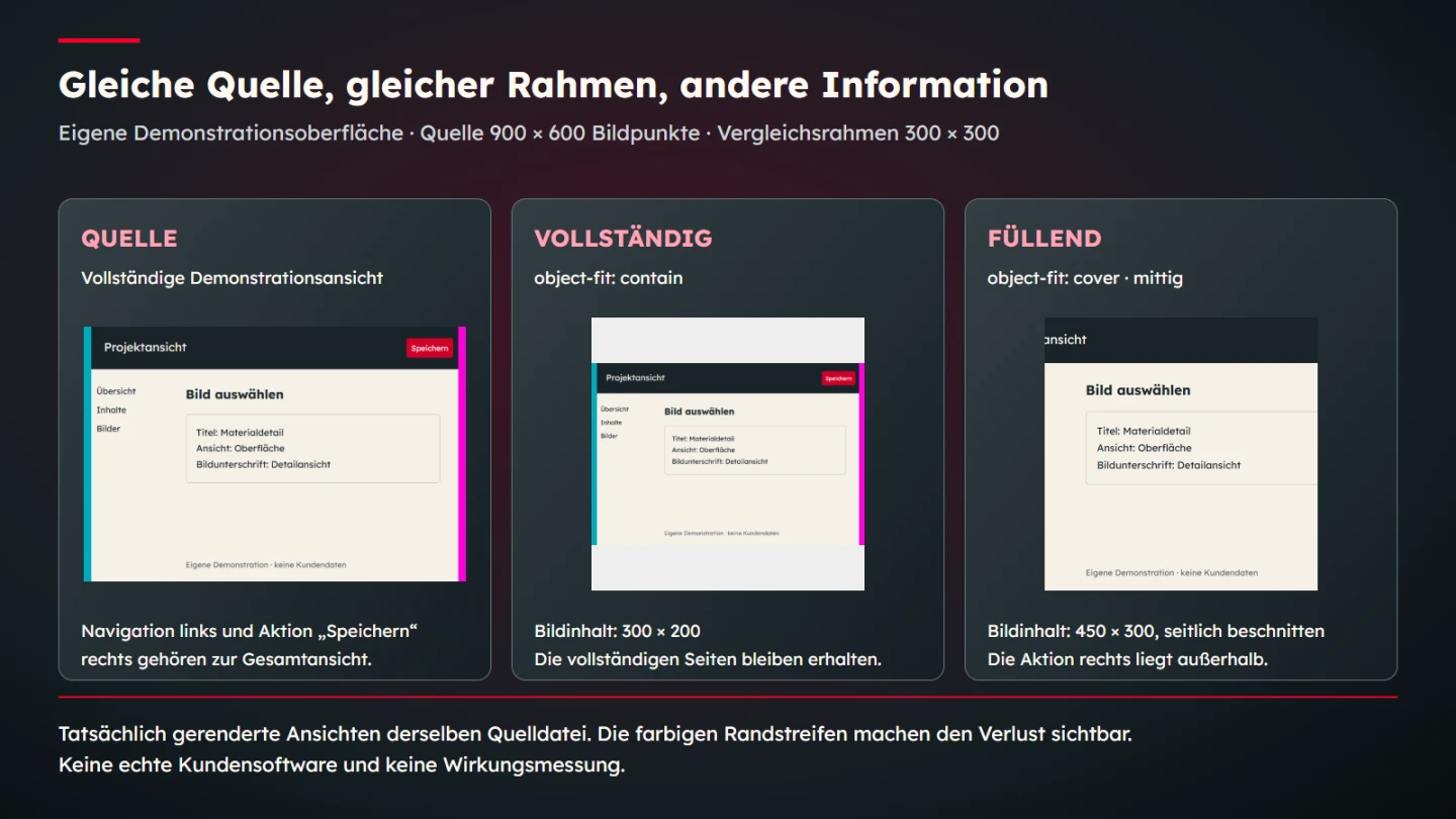
A source can contain the whole subject while its published presentation hides important parts. The fitting behaviour inside the chosen frame determines what remains visible. The MDN object-fit reference describes how replaced content fits its box. Preserving the whole image can leave unused space; filling the box can crop part of the source.
Both outcomes can be appropriate. A deliberate atmospheric cover crop may retain everything its editorial role requires. A screenshot with an essential control near an edge may need a complete view. Choose according to the information. One global treatment for every kind of image would ignore those different tasks.
The demonstration source measures 900 by 600 image pixels. It contains navigation on the left, working content on the right and an action near the upper right. Proportional cover fitting into a 300 by 300 square requires a 450 by 300 rendered source. With a centred position, portions of both sides fall outside the visible frame. Contain fitting produces a 300 by 200 source with vertical spare space.
.abbildung {
  display: block;
  width: 300px;
  height: 300px;
  object-position: 50% 50%;
}
.vollstaendig { object-fit: contain; }
.fuellend { object-fit: cover; }
This is a bounded geometric explanation, not a claim that cover fitting is always unsuitable. It demonstrates why a particular frame and source aspect ratio need review. Changing the position can move the emphasis towards one side. It cannot automatically restore both sides that were excluded by the proportional fill.
4. Present a detail honestly as a detail
If a relevant label becomes too small in the overview, an additional detail may be more useful than enlarging the entire image. The crop should retain enough surrounding information to explain the target. Cutting too closely can remove nearby labels and leave the reader uncertain about what the isolated element represents.
Connect the detail to its source. A caption can identify it as the upper-right area of the preceding demonstration view. When several details are needed, use consistent numbering and clear reference points. Those labels provide orientation. They do not replace an explanation of the actual information the detail is supposed to convey.
Avoid editing that silently changes the depicted state. If explanatory annotations are added, make them distinguishable from the interface itself. A highlighting rectangle should not look like an original interactive element. If the interface is reconstructed for teaching, identify it as a demonstration directly within its editorial context rather than allowing it to look like customer evidence.
5. Document screenshots as states with conditions
A screenshot records a particular visible state. By itself, it says little about how that state arose. Selected inputs, an open tab or a preceding action can be essential to an instruction. State the conditions that readers need to understand the example. Irrelevant internal testing details do not belong in the public explanation merely because they exist.
Time matters for changing information. Prices, performance figures and interfaces can differ after capture. The caption should preserve the historical nature of such evidence. Putting a new border around an old measurement does not make it a new measurement. This remains true when an older article receives a complete visual redesign.
Remove confidential material with an appropriate final edit before publication. Inspect filenames, browser tabs and other edge areas as well as the main subject. Decorative blur does not amount to a careful content review. An original, clearly labelled demonstration can be a useful teaching alternative. It must not subsequently be presented as actual customer software or proof of a delivered project.
6. Show visible characteristics without inventing product properties
A photograph can show an apparent finish. It does not automatically establish a tested material property. A shiny surface proves neither a particular alloy nor scratch resistance. Connect broader properties with dependable product information where those properties matter. Imagery supports the description; it does not supply a missing technical foundation.
Scale also needs a clear basis. A prop can suggest approximate size without serving as an exact measurement reference. When dimensions affect a decision, state the actual values in text or in a clearly explained drawing. An invented ruler or an unverified dimension label would create apparent precision without a dependable measurement behind it.
Generated illustrations have a different role from real product evidence. They can explain an idea or support an editorial visual direction. Without an actual basis, they should not promise particular connections, product details or included parts. Photorealistic material treatment makes accurate framing especially important because a plausible illustration can easily be mistaken for a photograph of a real item.
7. Give captions and text alternatives distinct jobs
A caption is visible and explains why the image belongs in the article. It can identify a crop, explain an annotation or state capture conditions. A text alternative serves a different purpose. The WAI informative-images tutorial explains the importance of the information an image conveys within its particular context.
For this demonstration, the relevant alternative concerns the difference between the complete and cropped views. A lengthy list of colours would miss the main point. The same screenshot might convey a different useful fact in another article. Its description should therefore reflect its current editorial use rather than being copied mechanically from a generic asset record.
Some explanations need more than a concise alternative. The WAI complex-images tutorial addresses additional detailed descriptions. Here, the source dimensions, fitting choices and consequences also appear in the surrounding prose. The diagram helps readers understand the relationship; it is not the only place where the explanation is available.
8. Build a gallery that is coherent without hiding differences
Consistent frames can make a collection calmer to browse. They should not silently force all content into the same crop. A narrow object and a broad screenshot may need different fitting choices within equal outer boxes. Inspect the subject inside each frame. Equal edges do not guarantee equivalent information.
For multiple views of one object, comparable perspectives and understandable transitions help maintain orientation. A detail should not suddenly show a different colour variant without identifying the change. Different variants are legitimate subjects, but their relationship must remain clear. Otherwise visitors may reasonably wonder which item the description actually concerns.
Place important images near the passages they explain. A long gallery at the beginning makes readers reconstruct the relationship later. A connection detail is often more useful beside the paragraph discussing it. Layout should support reading rather than requiring people to remember several image positions across many unrelated paragraphs.
9. Derive resolution and file size from actual use
A small preview does not automatically need the same delivered file as a large detail. Conversely, a heavily reduced source can lose fine labels when enlarged later. Establish the intended display sizes and create appropriate variants. Preserve the original for further justified outputs rather than repeatedly compressing an already reduced copy.
The MDN responsive-images guide explains selecting suitable image sources. Different resolutions of one view and deliberately different crops address distinct problems. A smaller delivered file should not quietly discard the information the illustration exists to show. Check fine labels in the actual selected output.
Compression requires judgment about the content. Flat colour, fine type and photographic texture respond differently to visible artefacts. A fixed quality setting is not universal evidence of suitability. Compare the output at its intended size and inspect the transfer requirements as well. A useful check considers visible adequacy and reasonable delivery cost together.
10. Connect presentation choices with a decision table
A compact table links a treatment to its purpose. It helps prevent an attractive pattern from being applied to every illustration without thought. Keep each conclusion specific: a chosen fit is suitable for a particular role under stated conditions. It is not automatically a rule for the entire image library.
| Image role | Required information | Useful check | Common risk |
|---|---|---|---|
| Product overview | Overall form and relevant parts | Completeness inside the published frame | Important components cropped out |
| Material detail | A limited visible surface | Identify the crop and its origin | Claiming an unverified material property |
| Software overview | Orientation within the interface | Retain edges and necessary labels | Navigation or an action disappears |
| Step illustration | A state following an action | Check sequence and conditions | Combining different states misleadingly |
| Editorial motif | Thematic orientation | Explain its illustrative role | Reading an illustration as real evidence |
When purposes conflict, two different views are often the more accurate solution. A broad overview can remain complete while a separate detail explains its small label. Trying to provide orientation, close detail and atmosphere in one square image can instead produce a compromise that does none of those jobs clearly.
11. Review mobile presentation as its own reading situation
A view that is legible on a large display can become an undecipherable pattern in a narrow article column. Inspect the actual image width together with its caption. If essential information requires enlargement, provide an appropriate additional view or a suitable way to inspect the image at a larger size.
A targeted detail can help more than another high-resolution overview on a small screen. Resolution alone cannot solve a space constraint. Technically sharp but tiny text remains hard to read. Editorial selection must consider which information can actually be understood at the intended presentation width rather than assuming that a large source file resolves the problem.
Check sequence after reflow as well. Keep each explanation with its image. A comparison should remain understandable when its columns become a vertical stack. Name variants as complete and filling rather than referring only to left and right. Explicit names preserve the relationship across layout changes and also make the accompanying prose clearer.
12. Distinguish a rendering check from a measured effect
The demonstration can establish that both variants use the same source and what scaling the selected frame requires. It can show their actual visible crops. It does not measure increased sales or prove universal comprehension. Those outcomes would require an appropriate separate investigation rather than a confident caption attached to a rendering comparison.
A bounded professional judgment is still possible. If a required control falls outside the visible frame, that crop cannot serve as a complete view of its position. No invented performance percentage is necessary. The conclusion connects a specific information task with an observable loss in the rendered image.
Describe improvements accordingly. The revised presentation retains a previously cropped action or links a detail to its overview. Those statements are checkable and useful. A general assertion that the gallery has been proven more persuasive would extend beyond the evidence supplied by this example.
13. Finish with a concrete publication check
Open the delivered images in the actual article before release. Reviewing only the master inside a design application leaves the final presentation unchecked. A wrong export, an unexpected fit or a swapped caption can undo otherwise sound planning. The final review should connect the file, its display and the accompanying text.
- Each illustration answers an identifiable reader question.
- Overviews, details and demonstrations are clearly identified.
- Necessary parts remain visible within the actual frame.
- Annotations are distinguishable from genuine interface controls.
- Capture conditions and historical figures remain accurately attributed.
- Confidential content and irrelevant edge details have been removed.
- Text alternatives and visible captions suit the current context.
- Essential information is also available in prose.
- Small outputs and mobile sequencing have been reviewed.
- Illustrations are not presented as real product or project evidence.
Clear imagery follows a specific purpose. A suitable overview, an honestly identified detail and a precise explanation often provide more value than a large decorative collection. Presentation and traceability belong together. A polished frame can guide attention, but the content still needs to answer the question that justified the picture.
14. Resolve image feedback through the missing information
A comment that a screenshot is too small can describe several different problems. Perhaps the whole interface occupies too little space. Perhaps the relevant label lacks contrast. Perhaps the crop includes too much unrelated material. First identify which information the reviewer cannot understand. That leads to a more useful adjustment than enlarging everything without diagnosis.
If the task is to explain an action's position, an enlarged button alone may be insufficient. It makes the label readable while removing its location within the interface. A complete overview plus an associated detail can answer both questions. Give those images different explicit purposes so the caption preserves the distinction.
Product photographs need similar care. An unclear surface cannot be addressed reliably by adding an arbitrary extra angle. Controlled light or a closer view may be needed. The new view must still belong to the product being described. Do not mix materials or variants silently merely because they look visually compatible in a gallery.
Compare the revision under the same output conditions. A new source file alone does not establish that the published article is clearer. Record which information was added, retained or connected more accurately. That short rationale helps future updates preserve a purposeful view instead of replacing it with a purely decorative crop.
Sources and scope
Sources checked on 9 November 2026. The linked WAI and MDN primary sources were opened. The demonstration interface, source dimensions and comparison frames are original teaching parameters. They document rendering behaviour and do not measure outcomes for actual customers or products.