Native HTML elements for dialogs and expandable content
Three concrete file-handover explanations distinguish visibility, document flow and modality.

Expandable content, modal dialogs and supplementary overlays solve different problems. They can look similar while changing the context of a website in different ways. Choosing an appropriate native HTML feature first provides a clearer foundation than showing and hiding an arbitrary container. Ask whether the content should extend the document, interrupt a bounded task or add a short explanation without making the rest of the page unavailable.
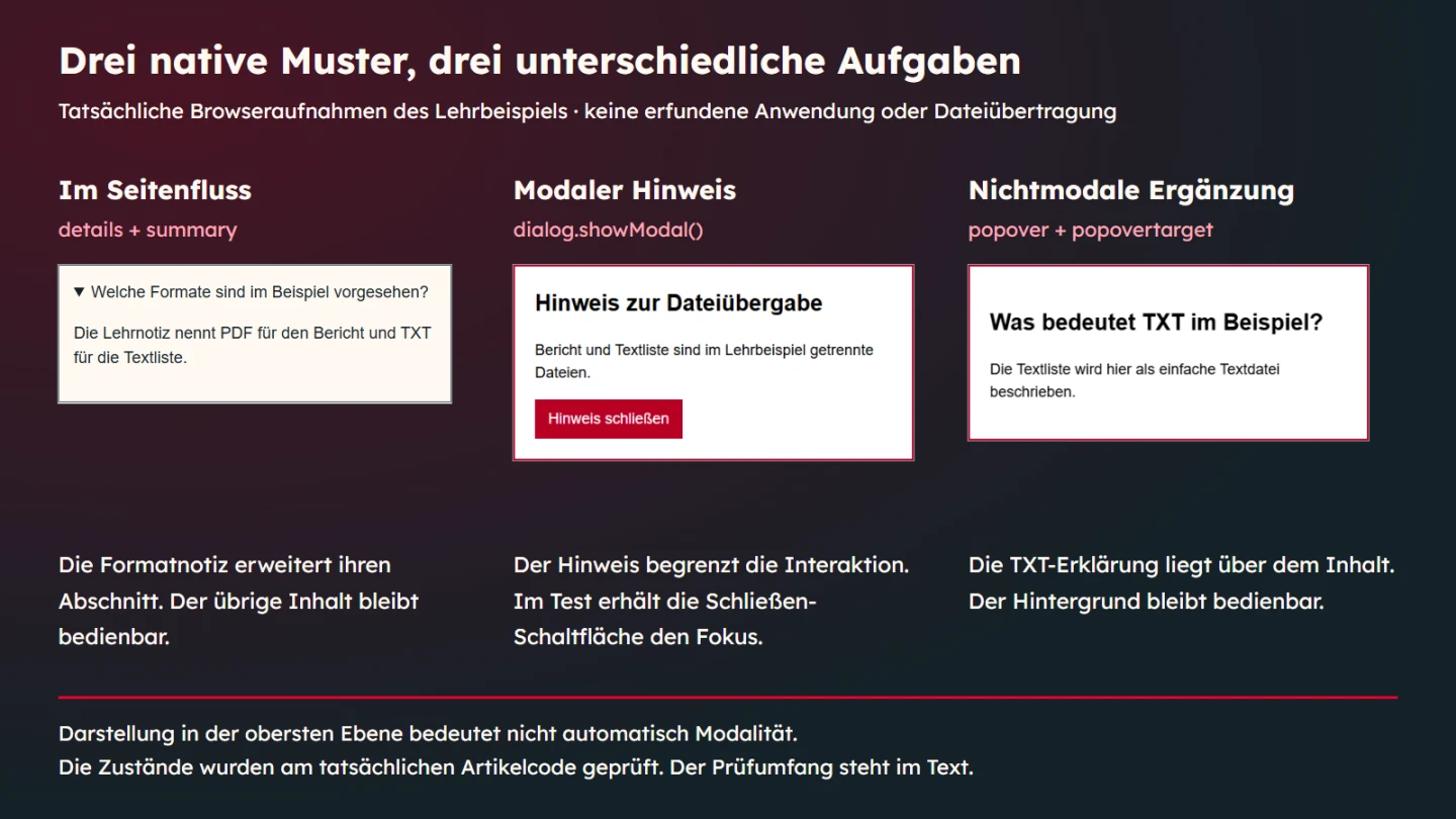
This article compares those choices through an original file-handover example. A format note uses details, a separate notice opens as a modal dialog and a short term explanation uses popover. There is no deletion, saving or sending. The focus is native states and appropriate use. The reported checks were actually executed and concern the stated test environment rather than every possible browser or assistive technology.
Distinguish three tasks before choosing an element
An optional format note should become readable without making the whole page unavailable. An expandable section suits that purpose. Its summary remains visible, and the additional content appears at the same point in the document. People can continue following the surrounding explanation and close the note when they no longer need it.
A separate modal notice changes the working situation more strongly. While it is open, interaction is restricted to its area. Choose that interruption deliberately. Not every additional sentence deserves a dialog. Frequently needed information may be more comfortable as ordinary content because it avoids movement between separate interaction contexts.
A brief term explanation can instead appear as a non-modal supplement. The example explains TXT without making it a compulsory separate task. A popover does not automatically become a correctly implemented menu or acquire every semantic role its contents might require. Determine the purpose of the content independently of the layer in which it appears.
| Example task | Native foundation | Important property |
|---|---|---|
| Read an optional format note | details with summary | Content expands the document flow |
| Read a separate handover notice | dialog with showModal() | Outside interaction is unavailable while open |
| Briefly explain TXT | An element with popover and its control | Non-modal supplement in the top layer |
Details preserves the document context
A details element uses summary as its visible summary. Name the real question or subject. Asking which formats are intended is more informative than saying more. The wording helps people decide whether they need the content. A decorative arrow alone would not explain that purpose.
The teaching note is optional. It identifies PDF for a report and TXT for a text list. It does not conceal a prerequisite for a consequential financial or legal decision. Before collapsing content, establish whether it really is supplementary. Essential limits of an offer should not exist only behind an inconspicuous extra action.
The open state is represented by the Boolean open attribute. Presence matters. Consequently, open="false" does not mean closed. The executed checks confirmed that the section remained open. Setting its property to false closed it. This distinction matters especially when templates produce string values without considering HTML attribute semantics.
Avoid immediately adding your own click handling to the summary. Native operation and extra scripts can interfere. A manually maintained aria-expanded can create a second state source that drifts away from the actual element. Start with the native behaviour and add only what a concrete requirement calls for.
A visible dialog is not necessarily modal
The dialog element can be displayed in different ways. show() opens it non-modally, while showModal() opens it modally. The example also checks the distinction through the :modal CSS state. Both methods make the dialog visible. They are not interchangeable notations for the same interaction state.
The modal version appears in the top layer and makes the remainder of the document unavailable for interaction. With native modal opening, the browser provides that behaviour. A darkened background by itself would not establish it. A custom overlay therefore requires more than a translucent rectangle and an elevated stacking value.
Do not treat the dialog as an arbitrary styled box. Give its content a visible heading and an accurate naming relationship. The teaching notice uses a heading identifying the file-handover subject. Its aria-labelledby points to that actual element. A copied identifier that resolves to nothing does not provide a useful name.
A modal dialog also needs a reachable way back. The short notice gives its close button autofocus. That choice fits this limited informational task. A long or complex dialog may need a different initial focus location. Choose according to the next understandable action instead of applying one fixed rule to every interface.
Closing should change the whole state coherently
The notice includes a form using method="dialog". Its button closes the dialog. It does not send a message to a server or confirm a file transfer. The article names this explicitly because forms are often associated with submission. Here, the particular method serves a different purpose.
Escape was checked as well. In the tested sequence it closed the modal notice and focus returned to the existing trigger. That is an observed state of this example. If an application removes the trigger or replaces its content, the appropriate continuation needs separate consideration. An unchanged demonstration cannot prove that different workflow.
Do not simply remove the open attribute as a custom way to close a modal dialog. The HTML standard describes problematic consequences for its state. Use the intended methods or an appropriate dialog form. Visibility, events and modality should change together. A container disappearing visually is not sufficient evidence of a completed dialog transition.
Popover adds information without modal interruption
The example connects an element carrying popover to a button with a matching popovertarget. The browser can establish that relationship from the markup. The empty attribute notation corresponds to the automatic popover state here. Its invoking control can show it, and the relevant dismissal mechanisms can hide it again.
The explanation appears in the top layer without making the entire background modal. That combination is the essential difference from the dialog in this example. Position above other content does not by itself determine whether someone can continue interacting outside. A strong shadow or high stacking level cannot answer the modality question.
A short supplementary explanation is sufficient for TXT. Do not automatically apply the same pattern to long instructions or indispensable warnings. Its temporary character may be unsuitable. Supplementary content still needs an understandable trigger. Information available only while hovering a mouse would be a different interaction design requiring its own assessment.
Read the complete teaching markup
The extract brings the three tasks together. German labels remain in the English article so that the tested source and native explanatory view match. All file-handover statements are original teaching material. They describe neither a real engagement nor a confirmed transfer. The TXT explanation is a small glossary supplement rather than a second confirmation dialog.
<main>
  <h1>Dateiübergabe erklären</h1>
  <p>Eine optionale Formatnotiz bleibt im Seitenfluss. Ein modaler Hinweis wird gesondert geöffnet.</p>
  <details id="formats">
    <summary>Welche Formate sind im Beispiel vorgesehen?</summary>
    <p>Die Lehrnotiz nennt PDF für den Bericht und TXT für die Textliste.</p>
  </details>
  <button id="open-dialog" type="button">Übergabehinweis öffnen</button>
  <dialog id="handover" aria-labelledby="handover-title">
    <h2 id="handover-title">Hinweis zur Dateiübergabe</h2>
    <p>Bericht und Textliste sind im Lehrbeispiel getrennte Dateien.</p>
    <form method="dialog">
      <button id="close-dialog" autofocus>Hinweis schließen</button>
    </form>
  </dialog>
  <p><button id="open-glossary" type="button" popovertarget="glossary">TXT erklären</button></p>
  <div id="glossary" popover>
    <h2>Was bedeutet TXT im Beispiel?</h2>
    <p>Die Textliste wird hier als einfache Textdatei beschrieben.</p>
  </div>
</main>
<script>
  const trigger = document.getElementById('open-dialog');
  const dialog = document.getElementById('handover');
  trigger.addEventListener('click', () => dialog.showModal());
</script>
The dialog opening logic is short because the browser handles important states. This does not make every design correct automatically. Bounded content, an appropriate name and a reachable close action remain implementation responsibilities. The popover pattern also needs to fit its content. Native elements provide particular mechanisms, not the entire design decision.
Ask concrete questions in the browser check
The example was executed in the installed Edge environment at viewport widths of 360 and 960 pixels. Its summary was keyboard reachable. Enter expanded the format note, and Space collapsed it. The deliberately misleading open="false" string confirmed the open state rather than closing the section.
The modal was activated through its real button. Checks covered its open state, :modal and focus inside the notice. A programmatic attempt to focus the background trigger left focus in the dialog. Escape and the form button closed the notice. By contrast, show() produced an open dialog that did not match :modal.
The supplementary popover tests examine its own state and dismissal routes. They explicitly demonstrate that showing a popover does not make it a modal dialog. Keeping these checks separate prevents a visually similar surface from being mistaken for equivalent behaviour. The code is extracted from both article versions and actually exercised.
These checks do not cover every browser, operating system or assistive-technology combination. They provide one concrete reproducible scope. A real project additionally checks its intended environments and actual content. Longer passages, additional controls and changing triggers can create requirements that this short teaching notice does not address.
Styling should preserve the mechanism
An expandable section needs a recognisably operable summary. A dialog needs a clear relationship to the background and an evident close action. A popover needs enough room for its content and should not disappear outside the usable viewport. Check those properties with real text. Three short placeholder words cannot reveal how a longer translation wraps.
Review focus indication together with sizing. Custom styling should not remove an existing focus marker without a suitable replacement. A dialog also needs to remain readable at narrow widths. The example limits width according to the available viewport. Longer content would additionally require checking useful scrolling. A width constraint alone cannot establish complete usability.
A dimmed background visually supports the modal situation. It should neither harm dialog text nor serve as the sole explanation of the interaction boundary. The actual modal state comes from the appropriate mechanism. Reproducing colour, shadow and position still leaves the functional layer to solve.
Choose according to the content in an existing project
A frequently asked questions section may work with individual disclosures when its answers genuinely suit that organisation. Essential instructions should not be collapsed entirely out of habit. Ask whether readers need an overview or expect to open known questions selectively. A native element is a tool rather than a universal editorial strategy.
A dialog is not a general replacement for a page either. If people need to compare content, link to it or read at length, an ordinary section or separate address may suit them better. The interruption should have a defensible benefit. Additional information does not become more important or understandable merely because it is modal.
A glossary popover remains supplementary. If a term is central to the whole task, the explanation may belong directly in the main text. People should not need to open numerous small overlays simply to understand the core instructions. Clear foundational wording can reduce the need for extra interaction altogether.
Keep a small acceptance record
Describe the expected states before treating a component as complete. Record which content begins hidden, which trigger reveals it and which action closes it. For the dialog, identify the initial focus choice and appropriate return destination. For the popover, distinguish automatic dismissal from manually controlled variants. The record should match the actual implementation rather than a generic checklist copied from another project.
Then document what was actually observed. A useful record names the environment and the executed task. It does not turn a passing narrow-screen check into a claim about every device. When content changes, repeat the checks affected by that change. Adding an input or removing a trigger can alter the relevant behaviour even when the outer container looks identical.
The most valuable result may be a simpler design. If an essential explanation can stay visible, there may be no need for a dialog at all. If a short optional note fits naturally under its summary, avoid creating a more complex custom overlay. Mechanisms should follow the task rather than becoming goals of their own.
Investigate a mismatch through its actual state
If an overlay is visible but behaves incorrectly, begin with its real state. Is the dialog merely open or actually modal? Is the popover open, or has a stylesheet only changed its display? Did a Boolean attribute leave the disclosure expanded? These questions lead towards the cause. More shadow or a higher stacking value cannot repair an incorrectly chosen state.
Next inspect the connection between control and target. Identifiers should be unique in the intended document. Repeatedly copied examples can accidentally share them, making a selector find the first element instead of the intended one. An accurately labelled button can then open the wrong content. Check this relationship separately rather than inferring it from appearance.
Then consider project-specific additions. An event handler may suppress native behaviour. A broad CSS rule may override hidden presentation. A trigger may have been removed while its dialog remains open. Isolate these changes. A small reproducible example helps distinguish the browser mechanism from the extra behaviour introduced by the application.
Keep ownership of each state clear
Multiple independent representations of one state can drift. A custom flag may say open after the native element closes. An icon may point in a direction that no longer matches the disclosure. Identify which state is authoritative and derive supplementary presentation from it rather than maintaining a disconnected second truth.
An application may still need other states. Edited form data, for example, can exist independently of whether a dialog is visible. That is a different responsibility. This teaching example stores no input, so it cannot establish whether closing another application's dialog commits or discards data. Close, cancel and apply may have different real consequences.
The three patterns also have different script dependencies here. The disclosure uses its native summary. The popover is connected through HTML. The modal notice depends on the shown event handler. A production implementation must consider delivery and failure conditions. Standardised functionality is useful only when the actual page reaches it correctly.
Do not add a large custom fallback before defining the requirement. Essential information may simply belong in ordinary visible content. A genuinely separate task may need a considered alternative. Choose from the real user need and failure condition rather than assuming that more custom machinery automatically produces a more robust result.
Before reusing one of these patterns, write down what closing it should mean for the surrounding task. In this example the notice has no stored draft to discard. An application with edited data needs a separate decision about preserving, applying or abandoning those changes. The native open state alone does not answer that product question.
Implementation checklist
- Identify whether the content belongs inline, in a modal interruption or in a non-modal supplement.
- Keep indispensable information available in a suitable form.
- Use actual identifiers and clear visible names.
- Distinguish Boolean attribute presence from string values.
- Open and close dialogs through the intended mechanisms.
- Check the actual keyboard route, narrow layout and changed content.
- State the test scope without claiming universal accessibility.
Sources and review date
Sources were checked on 9 November 2026. The WHATWG HTML Living Standard describes native elements and dialog states. MDN explains dialog, details and the popover attribute. The WAI-ARIA modal-dialog pattern explains interaction expectations. The file-handover scenario is an original teaching example.